

Campus directory touchscreen displays represent critical wayfinding infrastructure for modern universities and colleges, transforming confusing navigation experiences into intuitive visual journeys that orient visitors, prospective students, and community members within complex institutional environments. Yet most campus directories fail to deliver the seamless, confidence-building experiences users expect—relying on outdated interface patterns, cluttered layouts, and confusing information hierarchies that generate frustration rather than providing the instant clarity modern touchscreen users demand.
The stakes extend far beyond simple convenience. First impressions formed during campus visits directly influence enrollment decisions, with prospective families unconsciously associating navigation ease with overall institutional quality. Alumni returning to campus for events carry expectations shaped by smartphone interfaces and consumer kiosks. And daily community members navigating between classes, meetings, and facilities deserve efficient wayfinding that respects their time while reducing cognitive load during busy schedules.
This comprehensive design guide explores the visual, interactive, and strategic frameworks required to create campus directory touchscreen displays that truly serve institutional communities. From layout blueprints and navigation hierarchies through content zone strategies and accessibility integration, you’ll discover actionable design principles for crafting intuitive directory experiences that guide every visitor effortlessly while showcasing institutional sophistication through thoughtful, user-centered touchscreen design.
Modern campus wayfinding demands more than digital versions of printed maps. Effective directory displays combine spatial information architecture, visual storytelling, and interaction design principles into cohesive experiences that serve diverse user populations with varying familiarity levels, technological comfort, and navigation objectives. Solutions like Rocket Alumni Solutions integrate wayfinding with institutional storytelling, creating comprehensive campus information platforms rather than isolated utility tools.

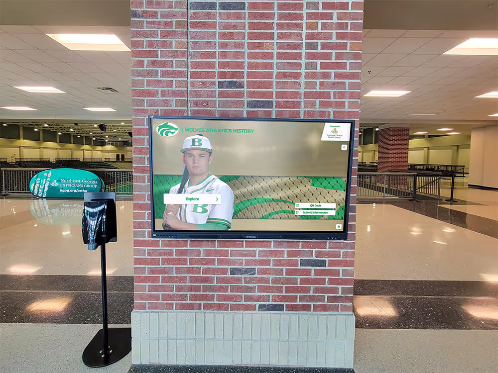
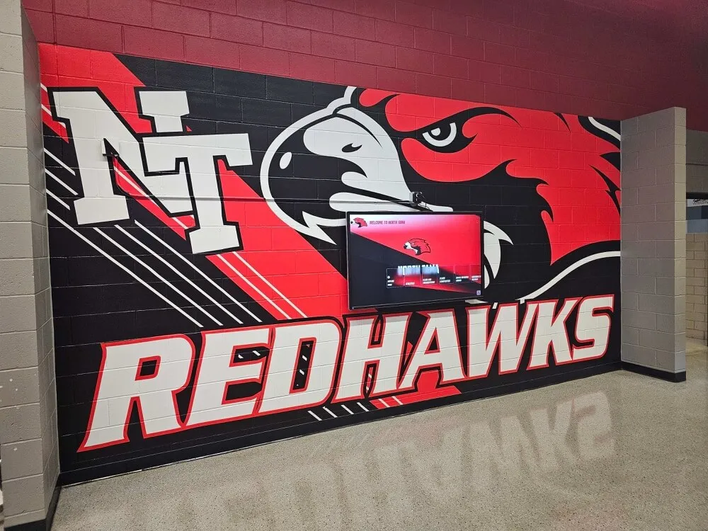
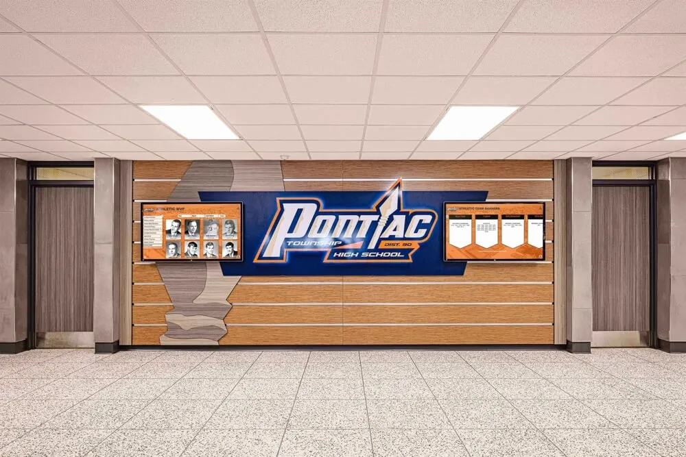
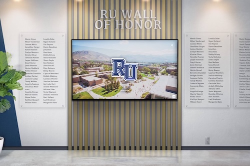
Professional directory installations anchor campus lobbies and entrance areas, providing immediate wayfinding assistance at critical decision points
Understanding Campus Directory Design Challenges
Before implementing specific layout solutions, understanding the unique constraints and opportunities facing campus directory systems establishes the design foundation for creating truly effective wayfinding experiences.
The Diverse Campus Directory User Spectrum
Unlike corporate building directories serving relatively homogeneous daily users, campus directories must accommodate extraordinarily diverse populations with dramatically different needs, technological literacy levels, and familiarity with campus geography.
Prospective Students and Visiting Families
First-time campus visitors represent the highest-stakes directory audience. These prospective students and their families arrive with zero campus knowledge, heightened stress about finding admissions offices or tour meeting points, and powerful unconscious judgment about institutional organization and investment in visitor experience. Their directory interactions directly influence enrollment decisions worth tens of thousands of dollars in tuition revenue.
Design implications include assuming zero prior knowledge in all interface language and visual cues, prioritizing admissions-related destinations in navigation hierarchies, providing estimated walking times preventing lateness anxiety, and showcasing institutional quality through polish and sophistication that builds confidence in academic excellence.
Alumni and Community Members Returning to Campus
Alumni visiting for events, athletic competitions, or nostalgic exploration carry mental maps of campus—but often outdated by years or decades of construction, renovation, and organizational change. They expect to navigate independently but frequently discover that buildings have relocated, departments have merged, or entire campus sections have transformed beyond recognition.
Directory design must honor existing spatial knowledge while gracefully accommodating change through clear building identification showing both current and legacy names, timeline features contextualizing campus evolution, and visual map elements highlighting major landmarks that persist across decades serving as orientation anchors.
Daily Campus Community Members
Students, faculty, and staff use campus directories regularly but under time pressure, seeking quick answers without extended interaction. They know campus generally but may need specific room numbers, temporary event locations, or recently opened facilities not yet part of mental maps.
These power users benefit from prominent search functionality bypassing browsing interfaces, recent searches and favorites enabling instant destination access, and minimal-click pathways to most common queries reflecting usage analytics.
Balancing Information Density with Visual Clarity
Campus directories must present substantial information—dozens or hundreds of buildings, academic departments, administrative offices, amenities, and points of interest—without overwhelming users through visual clutter that obscures rather than reveals navigation pathways.
The Cognitive Load Constraint
Research on information processing consistently demonstrates that human working memory handles approximately 7±2 discrete information chunks simultaneously. When interfaces present more choices than cognitive capacity accommodates, users experience decision paralysis—spending excessive time evaluating options, making mistakes, or abandoning tasks entirely.
Campus directory home screens commonly violate this constraint, presenting 15-30 simultaneous options that exceed comfortable processing capacity. Effective designs organize information into categorical chunks reducing apparent complexity. Rather than listing 25 buildings, present 5-7 building categories users mentally parse as single chunks. Rather than showing every amenity individually, group into logical categories like “Student Services,” “Dining,” and “Recreation.”
Approaches to designing touchscreen experiences provide cognitive load frameworks applicable specifically to directory interface development.
Progressive Disclosure as Design Strategy
The progressive disclosure principle involves revealing information gradually as users narrow focus, presenting only immediately relevant choices at each decision point rather than displaying everything simultaneously. Campus directories implement progressive disclosure through category-first navigation where users select building type before viewing specific buildings, searchable databases showing results only after query entry, and detail views appearing only when users select specific destinations.
This layered approach maintains clean, scannable interfaces at every interaction stage while ensuring comprehensive information remains accessible when needed—balancing competing demands for simplicity and completeness that plague most campus directory implementations.

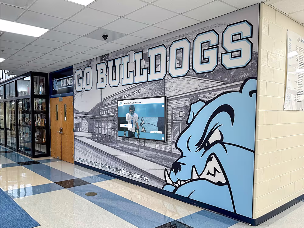
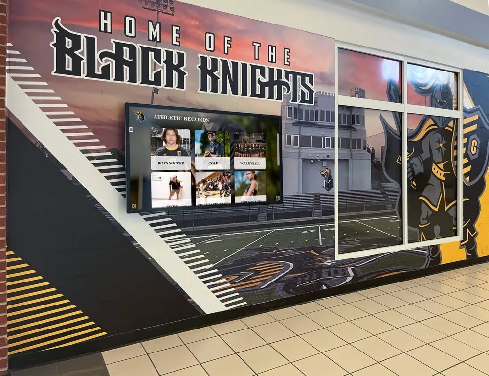
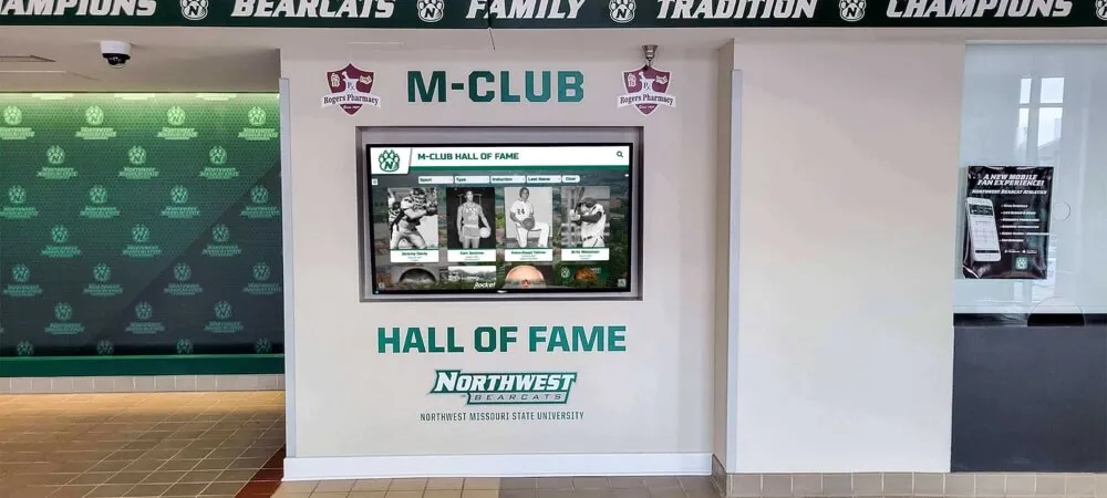
Strategic hallway placement ensures wayfinding assistance reaches users throughout campus facilities at natural decision and transition points
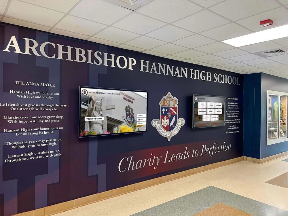
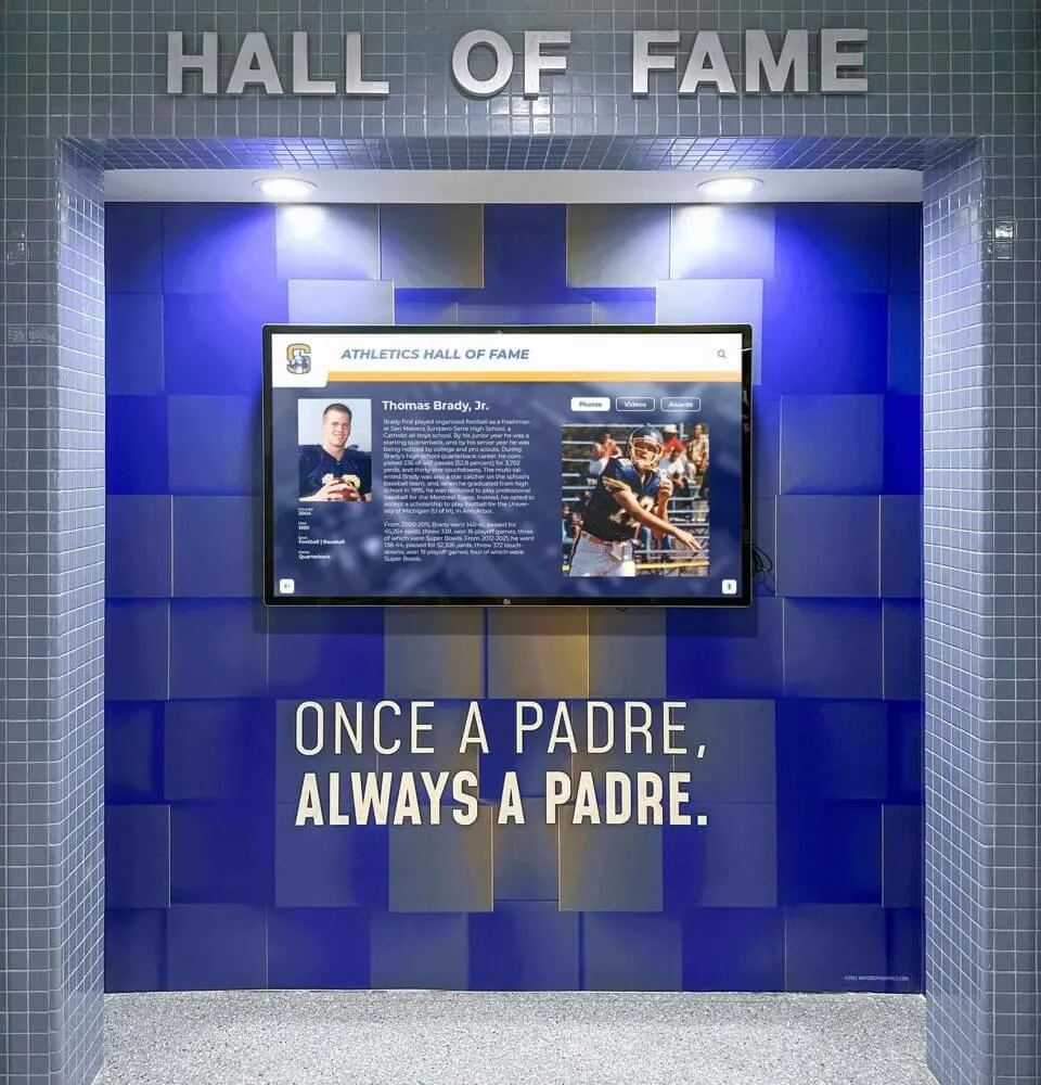
Integrating Wayfinding with Institutional Storytelling
Campus directories serve utilitarian navigation functions but also present opportunities for communicating institutional identity, celebrating achievements, and building emotional connections that transform functional tools into engagement platforms advancing broader communication objectives.
The Dual-Purpose Directory Framework
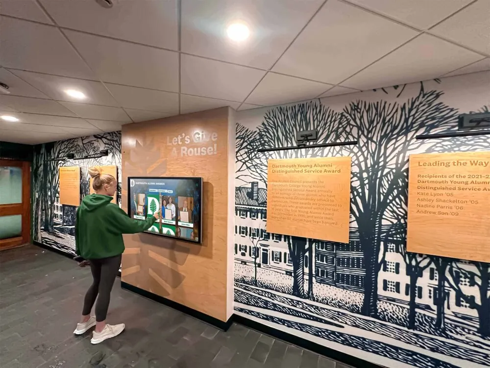
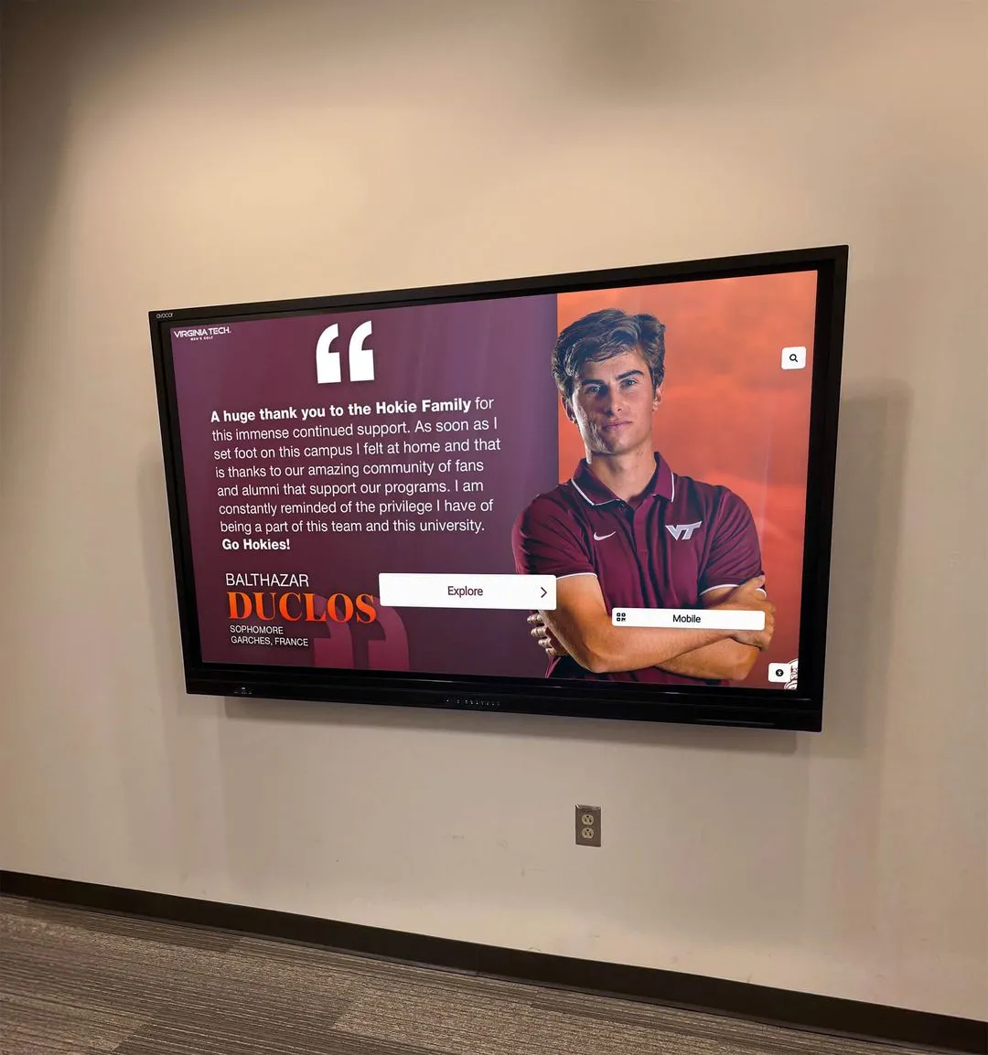
Effective campus directories integrate two seemingly disparate functions: immediate wayfinding utility and ongoing institutional storytelling. The key involves designing interfaces where both purposes coexist without conflict—where users seeking directions receive instant assistance while ambient display modes showcase achievements, upcoming events, and campus life that build pride and connection.
Implementation approaches include attract-loop content displaying when directories sit idle, showcasing recent achievements, campus highlights, and upcoming events that draw attention while providing passive information to passersby. Once users engage, the interface immediately prioritizes wayfinding functionality, with institutional content accessible through optional exploration paths that don’t impede primary navigation tasks.
Resources on college tour directory displays demonstrate integration strategies balancing wayfinding with admissions storytelling during high-stakes campus visits.
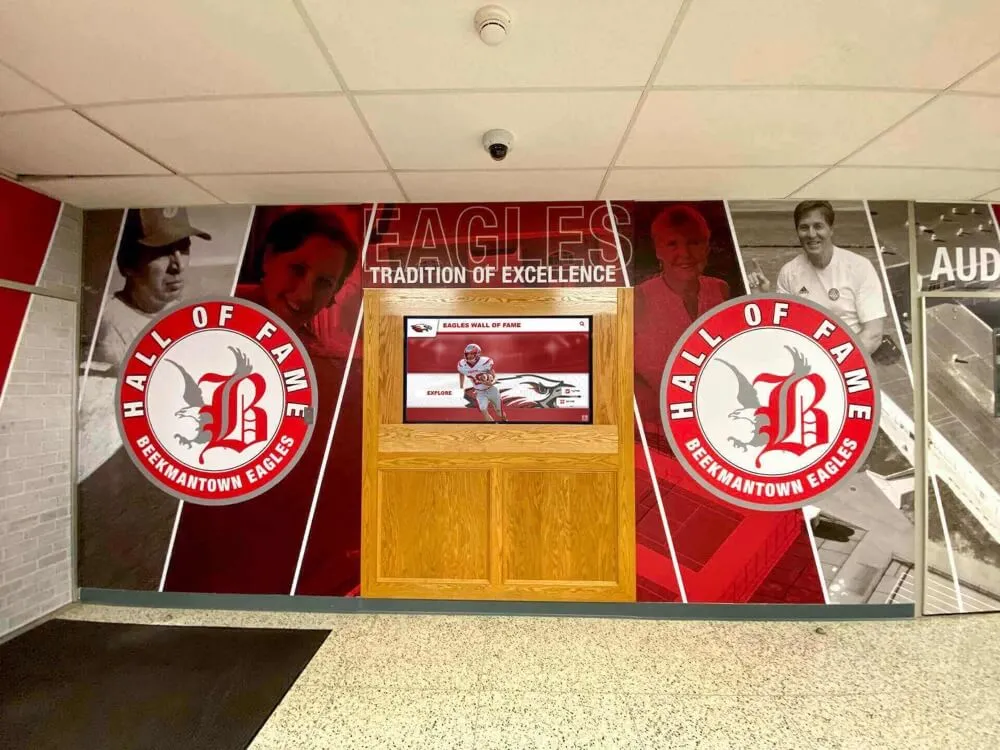
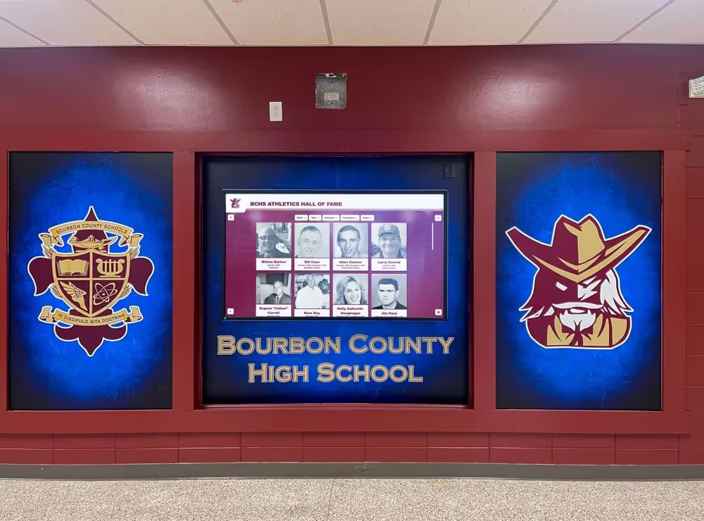
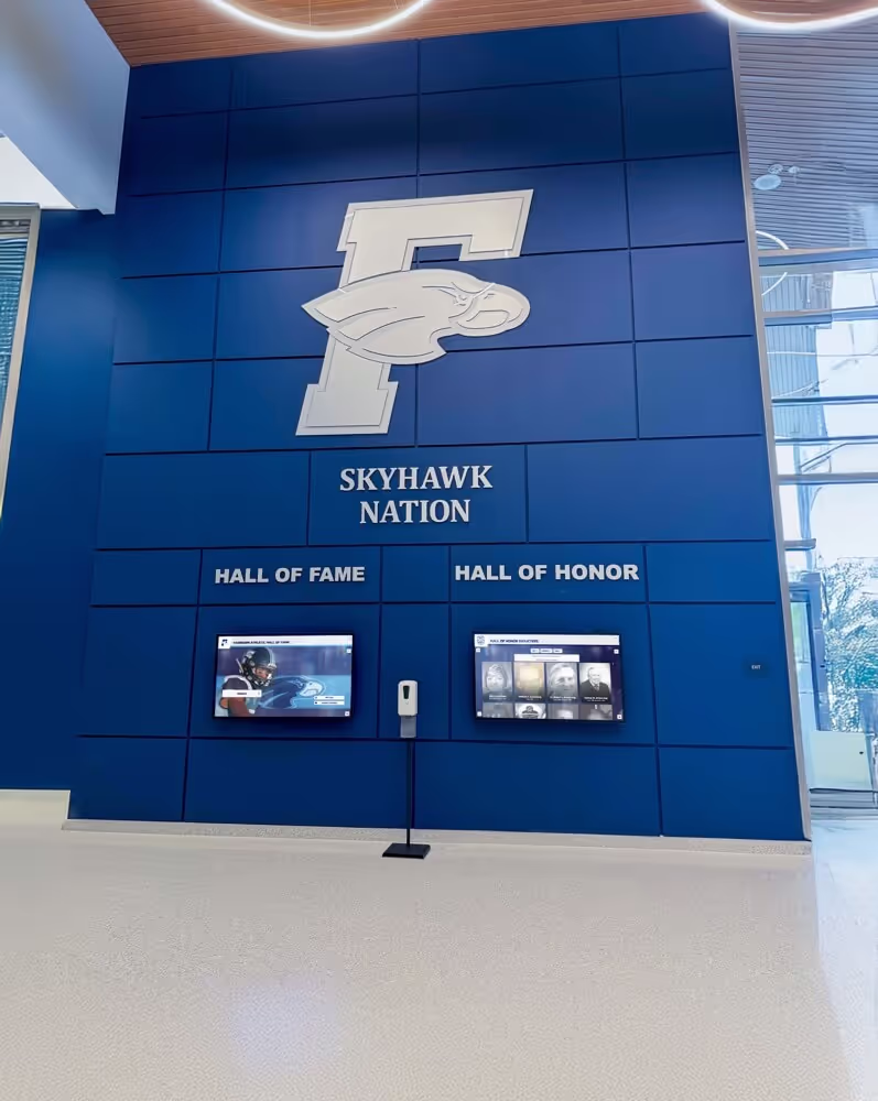
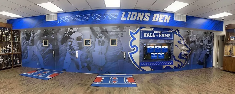
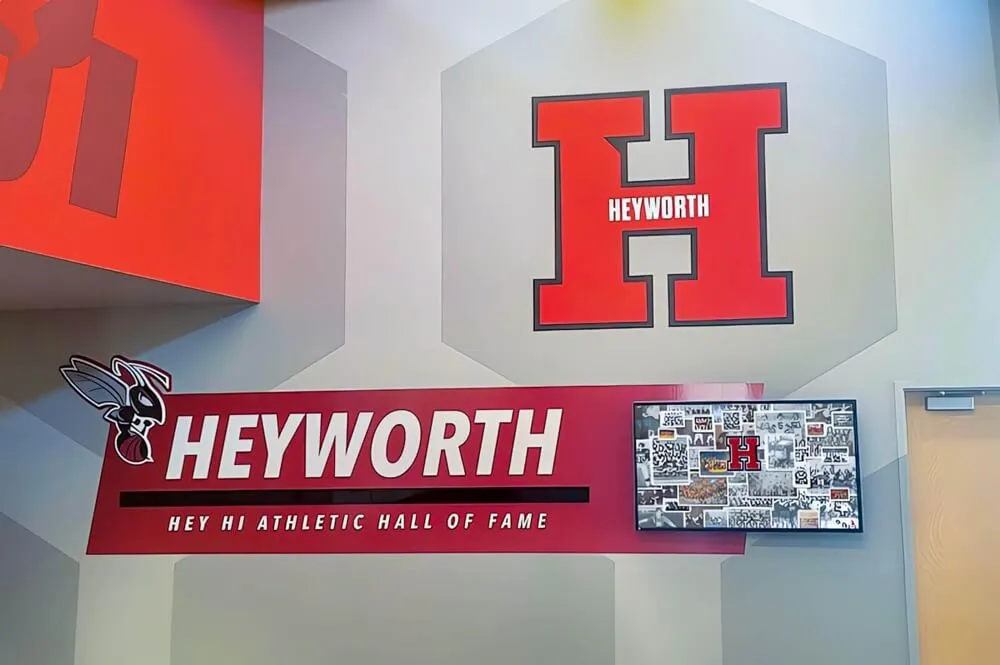
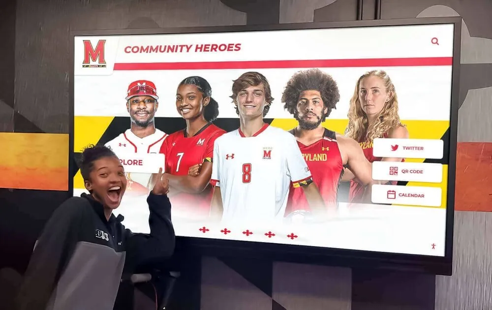
Recognition Integration Opportunities
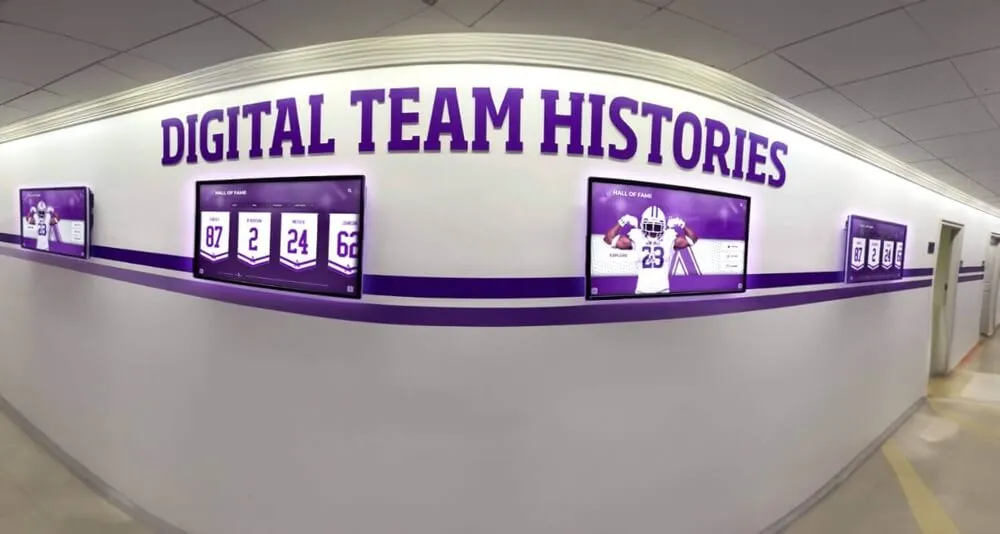
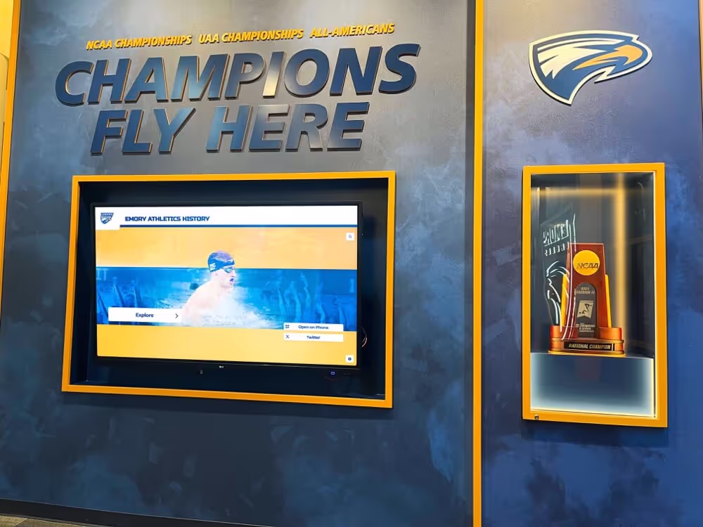
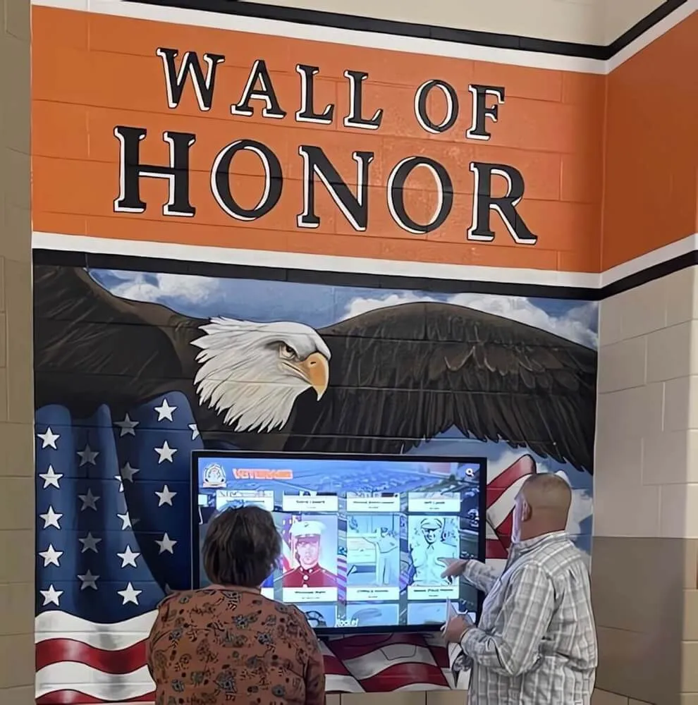
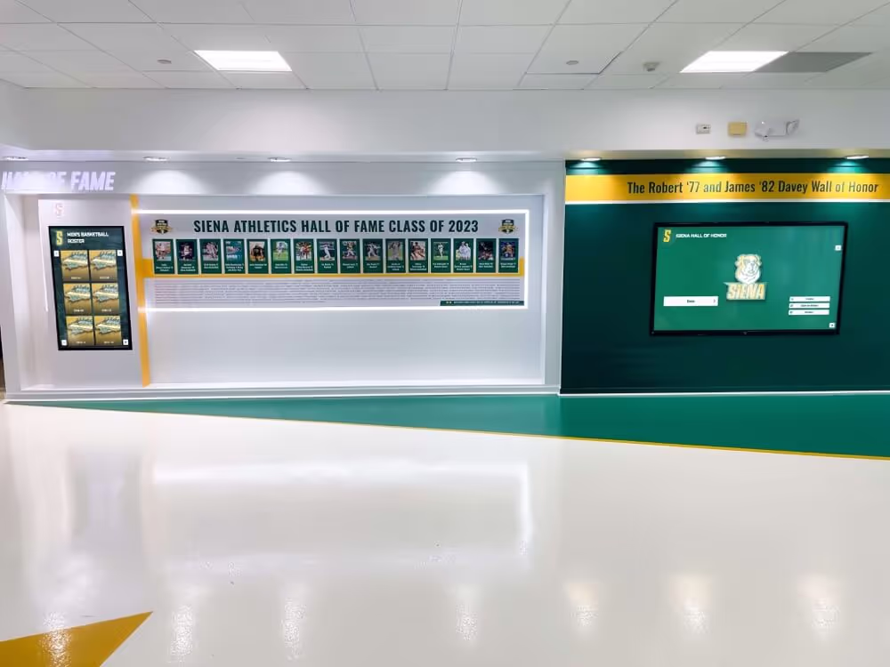
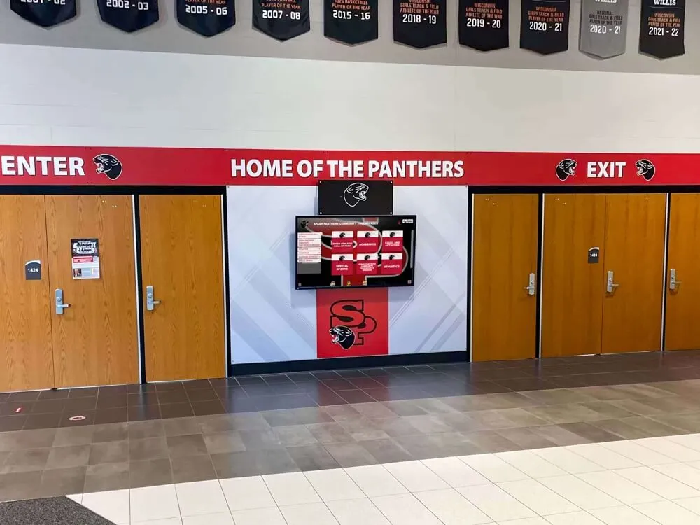
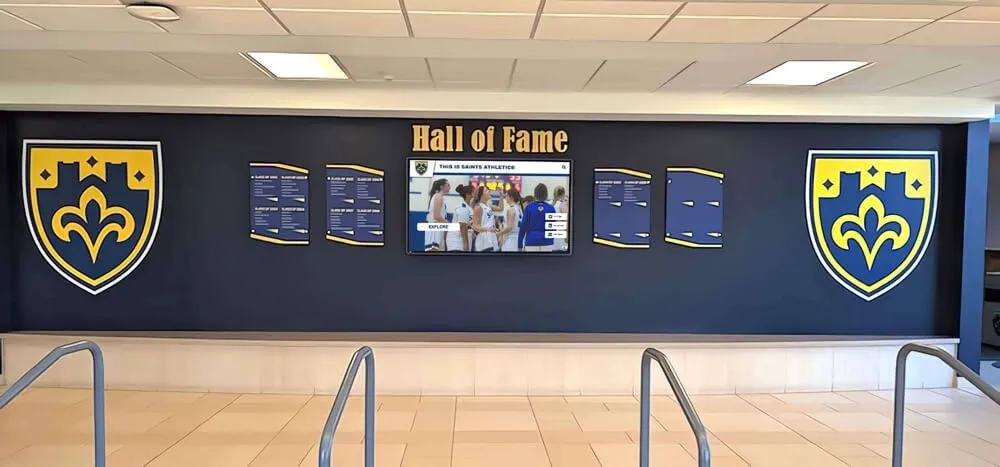
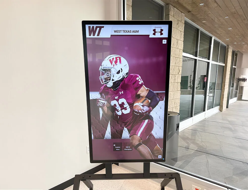
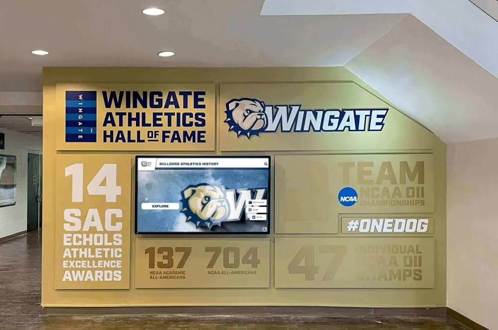
Campus directories positioned in athletic facilities, academic buildings, or alumni spaces provide natural opportunities for integrating achievement recognition into wayfinding infrastructure. Wall-mounted displays can feature recognition content above or beside interactive directory screens. Kiosk idle states can cycle through hall of fame inductees, distinguished alumni, or student achievements. And directory interfaces themselves can include optional “Explore Our Community” navigation paths revealing recognition galleries that prospective families and returning alumni naturally gravitate toward.
This integration maximizes infrastructure investment while creating cohesive campus communication environments where every touchpoint reinforces institutional values and celebrates community excellence.
Essential Layout Components for Campus Directory Displays
Effective campus directory interfaces share common structural elements that provide wayfinding utility while maintaining visual clarity across diverse content types and usage scenarios.
The Hero Zone: First Impression and Instant Orientation
The hero zone occupies the top portion of directory screens, establishing immediate visual identity while orienting users to interface purpose and navigation pathways. This critical real estate determines whether users confidently engage or hesitate uncertain about system capabilities.
Institutional Branding and Visual Identity
Hero zones should incorporate university logos, official color schemes, and visual elements consistent with broader campus wayfinding signage—creating immediate recognition and trust. This branding signals official institutional endorsement distinguishing directory systems from generic kiosks while reinforcing visual identity that helps visitors recognize they’re in the right location and accessing authoritative information.
Branding elements should occupy 15-20% of hero zone height, maintaining presence without dominating. Oversized logos waste valuable space, while insufficient branding creates generic, institutional-void experiences that fail to leverage the pride and emotional connection campus brands generate.
Wayfinding Headline and Purpose Clarity
Clear headline text immediately below branding should explicitly state interface purpose: “Campus Directory & Navigation,” “Find Your Destination,” or “Interactive Campus Map.” This redundant-seeming clarity proves essential—many users approach touchscreens uncertain about capabilities and reluctant to experiment. Explicit purpose statements eliminate ambiguity, encouraging immediate engagement from users who might otherwise walk away uncertain whether displays provide needed wayfinding assistance.
Headlines should use 48-60 pixel font sizes ensuring readability from 4-6 feet, the typical approach distance for freestanding kiosks and wall-mounted displays. Smaller text forces users to step closer before understanding interface purpose, creating friction at the critical first-impression moment.
Primary Navigation Zone: Clear Pathway Hierarchy
The primary navigation zone presents the core wayfinding options users need to accomplish the vast majority of directory tasks. This zone typically occupies 50-60% of screen real estate, organized into clearly delineated sections that enable rapid scanning and confident selection.
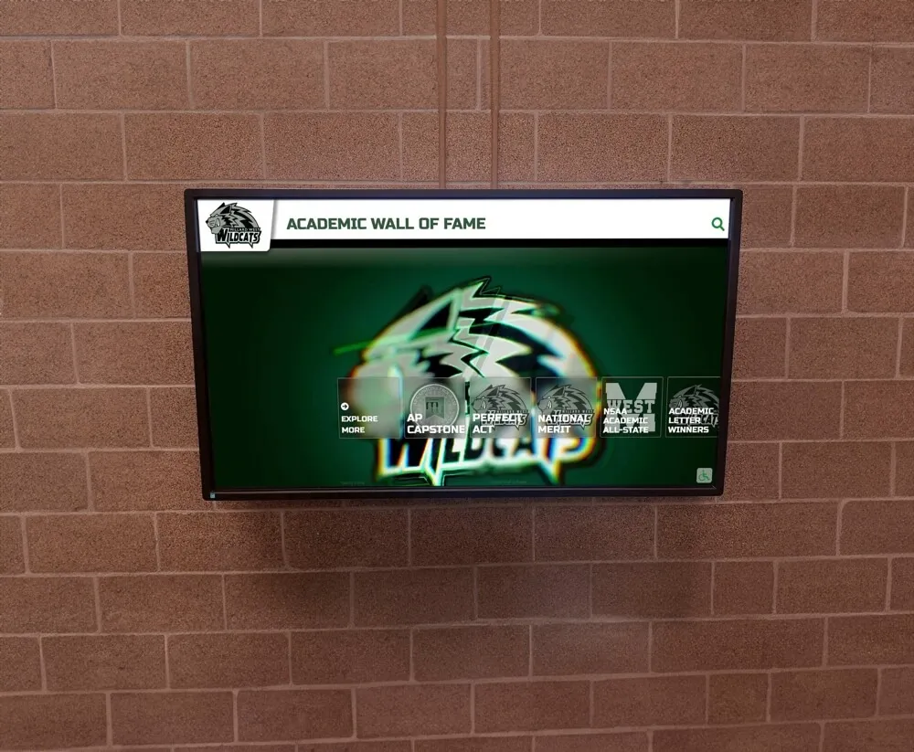
Category-Based Organization
Most effective campus directory navigation uses categorical organization presenting 5-8 major pathways rather than overwhelming users with exhaustive building lists. Common categories include:
- Academic Buildings (colleges, departments, classrooms)
- Administrative Offices (admissions, financial aid, registrar)
- Student Services (health center, counseling, career services)
- Campus Amenities (dining, bookstore, recreation)
- Residential Facilities (dormitories, housing offices)
- Athletic Venues (stadiums, recreation centers, practice facilities)
- Visitor Services (parking, tours, information)

Categorical navigation reduces cognitive load by organizing dozens of destinations into manageable choice sets enabling confident selection
Visual Design for Touch Interaction
Primary navigation buttons require substantial sizing accommodating finger-based interaction: minimum 80×80 pixels, with 100-120 pixel dimensions providing comfortable targeting. Each button should include descriptive icon imagery supplementing text labels—visual differentiation enables faster recognition and serves users with language barriers or reading difficulties.
Adequate spacing between buttons prevents miss-taps that frustrate users and erode confidence. Minimum 12-16 pixel gaps ensure clear visual separation while providing touch target forgiveness when users tap near boundaries between adjacent options.
Resources on touchscreen kiosk software provide technical specifications for implementing responsive navigation optimized for public touchscreen contexts.
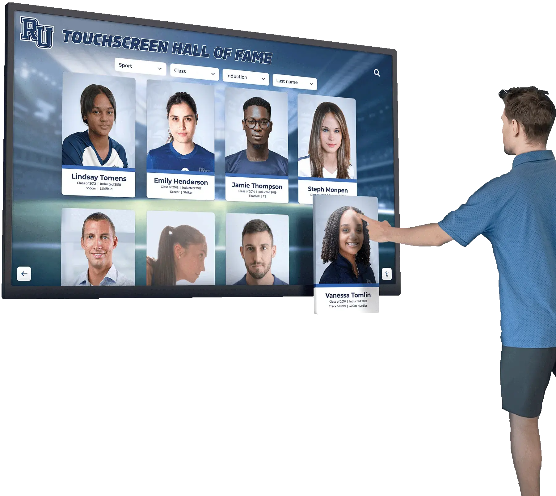
Search Functionality: Power User Efficiency
While categorical navigation serves most users effectively, search functionality provides efficient pathways for users who know exactly what they’re seeking and want to bypass browsing interfaces entirely.
Prominent Search Placement
Search input fields should occupy consistent locations across all directory screens—typically top-right or top-center positions mirroring web convention that users automatically check for search functionality. The search field should maintain minimum 60-pixel height with 18-20 pixel placeholder text reading “Search buildings, departments, or services…” that communicates searchable content types.
Intelligent Auto-Complete and Error Tolerance
As users type, auto-complete suggestions should appear showing matching destinations. This real-time feedback confirms the system understands queries while enabling selection before complete typing, dramatically reducing interaction time. Auto-complete should match partial words, common abbreviations, and legacy building names—accommodating diverse mental models and knowledge levels users bring to search tasks.
Error tolerance proves equally important. Searches should accommodate spelling variations, transposed letters, and phonetic matches. When searches return no results, the interface should suggest alternatives: “No matches for ‘Admisions’. Did you mean: Admissions Office?”

Intuitive interfaces enable independent exploration without instruction, essential for serving diverse user populations with varying technological familiarity
Map Visualization Zone: Spatial Orientation and Route Planning
Beyond text-based navigation, visual map representations provide essential spatial orientation that helps users understand campus geography, identify walking routes, and contextualize destinations within larger institutional environments.
Simplified Cartographic Design
Campus directory maps should prioritize clarity over cartographic accuracy, using simplified building footprints, straightened pathways, and enhanced contrast that communicate spatial relationships without geographic precision that adds complexity without utility. Effective simplification includes:
- Color-coded building categories matching navigation taxonomy (academic buildings in blue, residential in green, administrative in purple)
- Emphasized major pathways and pedestrian routes with minimized or removed vehicular roads
- Prominent landmarks and orientation features (quads, monuments, distinctive architecture)
- Clear “You Are Here” indicators with surrounding context showing immediate area in detail
- Directional compass and scale reference enabling distance estimation
Interactive Map Features
Static maps provide orientation but interactive capabilities dramatically enhance utility. Touch-enabled campus maps should support pinch-zoom gestures enabling detail inspection without cluttering default views, tap-to-select building interaction revealing names and navigation options, and route visualization showing walking paths between current location and selected destinations with estimated times.
Frameworks for building directory wayfinding systems demonstrate map integration strategies balancing visual clarity with interactive functionality.
Accessibility Zone: Universal Access and Multilingual Support
Inclusive campus directories accommodate users with disabilities, limited English proficiency, and varying technological comfort through dedicated accessibility features and multilingual support that shouldn’t require extensive navigation to discover and activate.
Persistent Accessibility Controls
Accessibility features should appear as persistent interface elements rather than hiding in settings menus most users never discover. Effective implementations include text size controls with large, medium, and small options positioned in consistent screen locations, high-contrast mode toggles for users with visual impairments, and audio assistance buttons triggering screen reader functionality or spoken directions.
These controls should maintain minimum 60×60 pixel dimensions ensuring users with motor control challenges can reliably activate accessibility features without frustration that defeats their purpose.
Language Selection Interface
For institutions serving international populations or located in multilingual regions, language selection requires prominent placement enabling immediate discovery. Flags or language names appearing in top navigation corners provide universal recognition, with selection triggering complete interface translation including navigation labels, search placeholders, and map annotations.
Approaches to college residence hall displays demonstrate multilingual implementation serving diverse student populations.

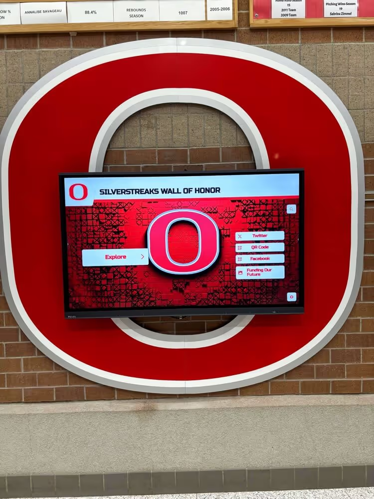
Wall-mounted installations at accessible heights serve users with varying physical abilities while maintaining space efficiency in constrained hallways
Content Strategy and Information Architecture
Layout structure provides the framework, but content strategy determines whether directories deliver actual wayfinding value or simply digitize confusion through poorly organized information and inadequate detail.
Destination Database Development
Campus directories require comprehensive, accurate, and consistently maintained destination databases covering every location users might reasonably seek. Database development represents substantial initial work but provides the foundation for all subsequent directory utility.
Essential Destination Attributes
Each destination entry should include multiple attributes supporting different search and browsing pathways:
- Official building names and common abbreviations (both “Student Union” and “SU”)
- Legacy names for buildings renamed but still known by former designations
- Categorical assignments enabling browsing within building types
- Geographic coordinates enabling map positioning and route calculation
- Address information for users familiar with campus addressing systems
- Departments or services housed within buildings enabling department-based searches
- Accessibility information about entrances, elevators, and routes
- Hours of operation preventing navigation to closed facilities
This rich attribution enables flexible navigation serving users regardless of how they conceptualize destinations—whether knowing official building names, department locations, or simply needing “the nearest restroom.”
Maintaining Database Currency
Campus environments change constantly through construction, renovation, department relocations, and organizational restructuring. Directory databases require regular maintenance ensuring accuracy that preserves user trust and utility. Successful maintenance approaches include:
Assigning specific administrative ownership for overall database management, distributing update responsibilities to facilities management for building changes and academic affairs for department relocations, implementing quarterly review cycles catching drift before significant inaccuracy accumulates, and creating simple submission forms enabling any community member to report errors or outdated information.
Outdated directories generate frustration that undermines all design sophistication—users encountering incorrect information quickly abandon directory systems, resuming the wandering and asking for directions that directories should eliminate.
Visual Content: Photography and Iconography
Text-based navigation serves functional requirements but visual content dramatically enhances usability while making interfaces more engaging and memorable.
Building Photography for Recognition
Destination listings and map interfaces benefit enormously from building photography enabling visual recognition. Many users struggle matching text building names to physical structures but immediately recognize buildings from photos. Effective building photos include:
- Distinctive architectural features that differentiate buildings
- Standard viewpoints showing typical approach angles visitors encounter
- Seasonal neutrality avoiding winter-only or fall-only imagery
- Clear visibility without excessive shadows, backlight, or obstructions
- Consistent photographic style maintaining visual coherence across database
Photography proves particularly valuable for prospective students and visitors who’ve never seen campus, enabling them to identify destinations confidently when approaching even if they struggle remembering official building names.
Iconography for Category and Service Recognition
Visual icons supplement text labels throughout directory interfaces, enabling faster recognition while serving users with language barriers or reading difficulties. Icon sets should include:
- Category representations (graduation cap for academic buildings, bed for residential)
- Service types (dining utensils for food, medical cross for health services)
- Accessibility features (wheelchair symbol, hearing loop indicator)
- Transportation options (parking, bus stops, bike racks)
- Amenities (restrooms, water fountains, ATMs, elevators)
Icons should follow established convention when it exists—avoiding creative interpretations that require learning. The wheelchair symbol universally indicates accessibility; creating novel alternatives that users don’t instantly recognize defeats icon purpose.

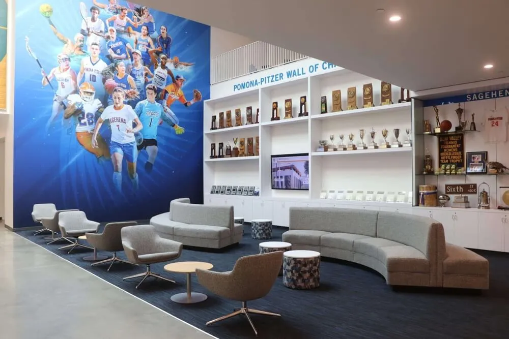
Integrated installations combining traditional architectural elements with digital displays create cohesive campus environments that enhance overall facility aesthetics
Interaction Design and User Flow Architecture
Static layout excellence means little if interaction patterns frustrate users or create confusion about navigation pathways and available options. Thoughtful user flow architecture ensures every interaction advances users confidently toward wayfinding goals.
The Three-Click Maximum Principle
Research on interface usability consistently demonstrates that users abandon tasks requiring more than 3-4 interactions to accomplish primary objectives. Campus directory interfaces must enable destination identification and route display within three touches for the vast majority of wayfinding tasks.
Optimizing Navigation Depth
Three-click limits demand careful information architecture balancing breadth and depth. Most effective structures use:
- Click 1: Category selection from 6-8 major building types
- Click 2: Specific destination selection within chosen category
- Click 3: Route display with walking directions and map visualization
This shallow hierarchy ensures rapid goal achievement while maintaining manageable choice sets at each decision point. Deeper structures requiring 4+ clicks to reach common destinations should trigger redesign—either consolidating categories, featuring high-traffic destinations on home screens, or providing search shortcuts bypassing categorical navigation.
Persistent Navigation Controls
Users should never feel trapped in interface dead ends uncertain how to return to previous screens or restart navigation. Persistent controls must include:
- Large “Home” buttons visible on every screen returning to main navigation
- “Back” controls enabling step-by-step navigation reversal
- Breadcrumb trails showing current position within navigation hierarchy
- Automatic timeout and reset after 60-90 seconds of inactivity preventing abandoned sessions that confuse subsequent users
These safety nets encourage exploratory behavior—users confidently investigate unfamiliar categories knowing they can easily return if they’ve navigated incorrectly.
Touch Gesture Standards and Interaction Feedback
Campus directory users arrive with expectations shaped by smartphone interaction patterns. Interfaces violating these expectations through unfamiliar gestures or unexpected behaviors generate immediate friction that interrupts engagement.
Standard Gesture Implementation
Directory touchscreens should support smartphone-standard gestures users attempt automatically:
- Single tap activates buttons and selects destinations
- Swipe scrolls through long lists and content that extends beyond visible area
- Pinch-zoom enables map detail inspection
- Two-finger pan moves maps without selecting buildings
Custom gestures requiring instruction should be avoided entirely—users won’t read instructional text and rarely experiment with novel interaction patterns on public kiosks they encounter briefly.
Immediate Visual and Haptic Feedback
Every touch interaction must generate instant feedback confirming system registration. Visual feedback includes button state changes (color shifts, shadows, highlights) appearing within 100 milliseconds of touch, scroll indicators showing position within long content lists, and loading animations for operations exceeding 2 seconds preventing uncertainty about system responsiveness.
Where hardware permits, haptic feedback—subtle vibration on button press—provides additional confirmation especially valuable for users with visual impairments or when viewing screens from suboptimal angles in bright ambient light.
Understanding ultra-responsive touchscreens helps ensure technical implementation supports instant feedback requirements.

Dual-purpose displays integrate wayfinding utility with institutional storytelling, maximizing infrastructure value while serving multiple communication objectives
Design System Implementation: Colors, Typography, and Visual Consistency
Cohesive visual design transforms functional directory interfaces into polished experiences that communicate institutional sophistication while enhancing usability through consistent patterns users quickly internalize.
Institutional Color Palette Integration
Campus directory displays should embrace official university color schemes creating immediate brand recognition and visual connection to broader campus wayfinding signage. However, direct adoption of marketing color palettes often fails in interface contexts requiring careful adaptation.
Primary and Accent Color Assignment
Institutional primary colors (typically 2-3 signature hues) should anchor directory visual identity through header backgrounds, primary button fills, and category color-coding. However, these colors must satisfy contrast requirements ensuring text readability—many university colors fail WCAG accessibility standards when used behind white or black text.
Effective implementations include:
- Darker tints of institutional colors for primary interface elements ensuring 7:1+ contrast
- Lighter tints for secondary elements and backgrounds maintaining brand connection with better readability
- Neutral gray scaling for text content, providing maximum legibility while allowing color focus on interactive elements
- Strategic accent color placement drawing attention to calls-to-action and important information
Color Coding for Cognitive Categories
Color provides powerful categorical signaling enabling faster navigation when used systematically. Campus directory implementations commonly use color to differentiate:
- Building categories (academic=blue, residential=green, administrative=purple, athletic=red)
- Map zones distinguishing campus regions or neighborhoods
- Route visualization showing different path options with distinct colors
- Status indicators (open=green, closed=red, limited hours=yellow)
Consistency proves essential—once color meanings establish, maintaining them throughout interfaces prevents confusion and builds user confidence in interpretation.
Typography Hierarchy and Readability Standards
Text content comprises substantial directory information requiring careful typographic treatment ensuring readability across viewing distances, ambient lighting conditions, and user visual capabilities.
Font Selection and Sizing
Directory typography should prioritize legibility over aesthetic novelty. Sans-serif typefaces (Arial, Helvetica, Open Sans) provide cleaner rendering at display resolutions while remaining readable from various angles. Minimum text sizing should include:
- Headlines: 48-60 pixels for primary wayfinding instructions
- Navigation buttons: 32-40 pixels for category and destination labels
- Body text: 24-28 pixels for descriptions and detailed information
- Secondary information: 18-20 pixels minimum for hours, addresses, and metadata
These sizes exceed typical desktop interface standards accounting for standing viewing distances of 18-30 inches (compared to 20-24 inches for seated computer use) and public environment challenges including bright ambient light and suboptimal viewing angles.
Information Hierarchy Through Type Treatment
Beyond sizing, typographic weight, color, and positioning establish clear information hierarchies that guide attention and enable rapid scanning:
- Bold weight primary information (destination names, category labels)
- Regular weight secondary details (departments, addresses, hours)
- Muted gray tertiary information (building codes, metadata)
- Generous whitespace separating information groups preventing visual crowding
Resources on exciting hallway displays demonstrate typographic strategies balancing information density with visual clarity in public display contexts.

Coordinated visual design integrating directory displays with environmental graphics creates cohesive campus wayfinding systems reinforcing institutional identity
Technical Considerations and Platform Selection
Design excellence requires technical foundations supporting responsive performance, content flexibility, and reliable operation across years of continuous public use.
Hardware Requirements for Responsive Touch Interaction
Directory user experience depends entirely on hardware capabilities supporting instant touch response, clear visibility, and durable operation in public institutional environments.
Display Technology and Resolution
Commercial-grade displays designed for 16-24 hour daily operation provide reliability consumer displays cannot match. Minimum specifications for campus directory applications include:
- 43-55 inch diagonal display sizes for freestanding kiosks and prominent wall mounts
- 1920×1080 resolution (Full HD) minimum, with 4K preferred for larger screens
- 400-500 nit brightness ensuring visibility in bright atrium and entrance areas
- Anti-glare glass treatments reducing reflection in windowed spaces
- Wide viewing angles (178°) maintaining color and contrast from side positions
Capacitive Touch Technology
Modern touchscreens predominantly use capacitive technology sensing fingertip electrical conductivity. Capacitive screens provide multi-touch gesture support, excellent responsiveness, and durability through continuous use without pressure-sensitive degradation affecting resistive alternatives.
Directory implementations should specify commercial capacitive touch overlays rated for millions of touches and designed for public kiosk applications rather than consumer tablet components inadequate for continuous institutional use.
Guidance on selecting touchscreens for schools provides procurement specifications applicable to campus directory installations.
Software Platform Capabilities and Flexibility
Directory software determines content management ease, update frequency, and long-term platform sustainability as campus environments and wayfinding needs evolve.
Cloud-Based Content Management
Modern directory platforms should provide web-based content management systems enabling authorized staff to update building information, modify maps, add photography, and revise navigation categories without technical expertise or IT department intervention. Essential capabilities include:
- Role-based access controlling who can edit different content areas
- Preview functions showing changes before publication
- Scheduled publishing enabling advance content preparation
- Audit trails tracking who changed what information and when
- Mobile-responsive editing interfaces enabling updates from any device
Cloud architecture eliminates local server infrastructure requirements while enabling updates immediately deployed across distributed directory installations throughout campus.
Analytics and Usage Insights
Quality directory platforms provide analytics revealing how users actually interact with systems:
- Popular destinations showing most-searched buildings and services
- Category usage indicating which navigation pathways users prefer
- Search query analysis identifying content gaps and terminology mismatches
- Session duration and completion rates measuring interface effectiveness
- Time-of-day patterns informing content prioritization and feature placement
These insights drive continuous improvement, ensuring directories evolve to serve changing campus populations and usage patterns rather than remaining static after initial deployment.
Solutions like Rocket Alumni Solutions provide integrated platforms combining directory wayfinding with recognition capabilities and robust analytics supporting data-driven optimization.

Commercial-grade kiosk hardware ensures reliable performance under continuous public use while integrating seamlessly into campus environments
Strategic Placement and Installation Design
Even perfectly designed directory interfaces deliver minimal value if positioned where users rarely encounter them or where environmental conditions compromise visibility and usability.
High-Impact Location Identification
Campus directory utility depends fundamentally on strategic placement ensuring systems provide wayfinding assistance at precise moments when visitors need navigation guidance.
Primary Entrance and Arrival Points
The most critical directory locations include:
- Main campus entrance gateways where visitors first arrive and need immediate orientation
- Parking structure entrances and exits serving visitor lots
- Admissions office lobbies where tour groups gather and prospective families begin visits
- Building lobbies serving multiple departments or functions where internal navigation proves challenging
- Transit stops where students and visitors arrive via campus shuttles or public transportation
These high-traffic positions maximize exposure while providing assistance at navigation decision points rather than mid-route positions where users have already committed to directions that may prove incorrect.
Secondary Distribution Throughout Campus
Beyond primary installations, distributed directory networks ensure wayfinding assistance remains accessible as users move throughout campus:
- Major academic building entrances serving as daytime congregation points
- Student union and dining facility locations where community members naturally gather
- Library entrances serving as campus hubs and study destinations
- Athletic facility approaches attracting prospective student-athletes and game attendees
- Residence hall lobbies assisting new students and visiting families
This distributed approach transforms campus-wide wayfinding into seamless experience rather than requiring users to remember directions from distant primary directories they encountered 15 minutes earlier.
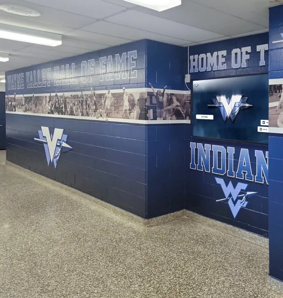
Environmental Design Integration
Directory displays should integrate thoughtfully into campus architecture and interior design rather than appearing as afterthought technology installations that clash with established aesthetic standards.
Architectural Coordination
Professional directory installations coordinate with surrounding environments through:
- Materials and finishes complementing existing interior design (matching metal tones, wood accents, color palettes)
- Scale proportional to installation spaces (avoiding oversized displays dominating small lobbies or undersized screens lost in vast atriums)
- Lighting design ensuring visibility without creating glare or dark patches on screens
- Cable management concealing power and network connections maintaining clean appearance
Custom enclosures and millwork integrate directories into campus architectural vocabulary rather than presenting generic kiosks that communicate “temporary technology” rather than permanent institutional infrastructure.
Approaches to high school wall of fame design demonstrate environmental integration strategies applicable to directory installations requiring architectural coordination.

Integrated installations combining digital directory technology with traditional recognition elements create comprehensive campus communication environments
Measuring Success and Continuous Improvement
Effective campus directory implementation extends beyond initial deployment, requiring ongoing measurement, refinement, and adaptation ensuring systems continue serving evolving institutional needs and user populations.
Key Performance Indicators for Directory Effectiveness
Multiple quantitative and qualitative metrics illuminate directory impact and identify optimization opportunities.
Usage and Engagement Metrics
Analytics platforms should track:
- Daily and weekly active sessions quantifying overall directory utilization
- Average session duration indicating engagement depth (ideal: 60-90 seconds)
- Popular destinations revealing what information users most commonly seek
- Search query analysis showing terminology users employ and failed searches indicating content gaps
- Category usage patterns indicating which navigation pathways users prefer
- Time-to-destination measuring efficiency from initial touch to route display
Operational Impact Indicators
Beyond direct usage, directories should reduce operational burdens:
- Reduced directional questions to admissions staff, security personnel, and department receptionists
- Decreased visitor lateness to scheduled tours, interviews, and appointments
- Fewer complaints about campus navigation difficulty in satisfaction surveys
- Increased self-guided visitation during off-hours when staff support proves unavailable
Research demonstrates that comprehensive directory implementations reduce navigation-related inquiries by 30-40%, freeing staff capacity while improving visitor experience through instant self-service assistance.
Iterative Design Refinement Based on Data
Initial directory designs rarely prove optimal—effective implementations embrace continuous refinement based on observed usage patterns and user feedback.
A/B Testing for Interface Decisions
When uncertainty exists about optimal design choices, A/B testing provides empirical resolution. Common testing candidates include:
- Category organization and labeling (testing whether users better understand “Academic Buildings” vs. “Classrooms & Departments”)
- Navigation layout variations (comparing grid arrangements vs. list formats)
- Search prominence (testing top placement vs. secondary positioning)
- Map style preferences (simplified vs. detailed cartographic representation)
Testing involves randomly assigning users to design variants while tracking completion rates, task times, and success metrics—revealing which approaches serve actual user populations rather than relying on designer assumptions.
User Observation and Qualitative Feedback
Quantitative analytics reveal what users do but not why. Complementary qualitative research provides context including:
- Observing first-time users interacting with directories, noting confusion points, hesitations, and error patterns
- Brief intercept interviews asking users about experience quality and improvement suggestions
- Usability testing with prospective students and families revealing whether directories successfully serve highest-stakes audiences
These insights frequently surface issues analytics miss—confusing labels that users interpret differently than designers intended, desired features users expect but don’t find, and subtle interaction patterns causing friction without generating obvious error metrics.
Resources on implementing digital recognition effectively provide measurement frameworks applicable to directory systems serving both wayfinding and institutional storytelling objectives.

Distributed directory networks with consistent design create cohesive campus wayfinding systems ensuring navigation assistance throughout institutional facilities
Future Directions in Campus Directory Technology
Campus directory design continues evolving through emerging technologies and changing user expectations shaped by advancing consumer experiences and interface standards.
Mobile Integration and Seamless Transitions
Modern directory experiences increasingly extend beyond fixed installations to personal devices, creating continuous wayfinding assistance throughout campus visits.
QR Code and Web Links for Route Persistence
Physical directory kiosks can generate QR codes or send web links to user smartphones, transferring selected routes and destination information to personal devices for continuous access during navigation. Users select destinations on directory touchscreens, then scan QR codes or text links to their phones—receiving mobile-optimized maps and turn-by-turn directions that persist throughout walks across campus.
This seamless transition combines fixed touchscreen advantages (large displays, prominent placement, no app installation required) with mobile device benefits (portability, GPS location tracking, persistent access beyond kiosk interaction).
Progressive Web Applications for Unified Experiences
Modern web technologies enable directory platforms functioning identically across fixed touchscreen kiosks and personal smartphones through progressive web applications (PWAs). Users beginning navigation on campus directories can continue exploration on personal devices without switching platforms or losing context—routes, recent searches, and saved favorites persist across devices through cloud synchronization.
This unified approach eliminates the fragmentation where campus websites provide different information and interfaces than physical directories, confusing users and requiring parallel content management that most institutions struggle maintaining.
AI-Powered Personalization and Predictive Assistance
Artificial intelligence and machine learning enable directory systems that adapt to individual users and anticipate needs rather than providing identical static experiences to everyone.
Context-Aware Content Prioritization
Directory interfaces can adjust content based on usage context:
- Emphasizing admissions-related destinations during scheduled tour times when prospective families predominate
- Highlighting currently occurring campus events and their locations
- Prioritizing open facilities during evening hours when many buildings close
- Adjusting for seasonal patterns (emphasizing parking during busy enrollment periods, residence hall information during move-in weeks)
This dynamic prioritization ensures most relevant information appears prominently without requiring users to navigate through less-relevant content matching different campus seasons or user populations.
Natural Language Search and Conversational Interfaces
Advanced directory platforms increasingly support natural language search enabling queries like “Where’s the admissions office?” or “Take me to the closest coffee shop” rather than requiring precise building name knowledge. Natural language processing interprets user intent, delivering appropriate destinations even when queries don’t match official terminology.
Voice interfaces extend this further, enabling hands-free directory interaction particularly valuable for users with motor control challenges or when carrying belongings that prevent comfortable touchscreen interaction.
Platforms like Rocket Alumni Solutions continue advancing directory capabilities, integrating wayfinding with institutional storytelling and community recognition through comprehensive touchscreen platforms designed specifically for educational environments.

Next-generation touchscreen platforms integrate multiple content types—wayfinding, recognition, and engagement—into unified interfaces serving comprehensive institutional communication needs
Conclusion: Designing Campus Directories That Truly Guide
Campus directory touchscreen displays represent far more than digital maps—they embody institutional values around accessibility, visitor experience, and communication excellence while serving critical wayfinding infrastructure determining whether every person entering campus feels oriented, confident, and welcomed or frustrated, lost, and uncertain.
The design strategies explored throughout this guide provide comprehensive frameworks for creating directory experiences that genuinely serve diverse user populations with varying needs, technological literacy levels, and familiarity with campus environments. From layout architecture and visual hierarchy through interaction patterns and content strategy, thoughtful directory design transforms navigation from persistent institutional challenge into seamless experience that visitors barely notice—the ultimate mark of successful wayfinding design.
Transform Campus Navigation Through Thoughtful Directory Design
Discover how purpose-built touchscreen solutions create intuitive wayfinding experiences while showcasing institutional excellence through modern directory technology designed specifically for educational environments.
Implementation success requires moving beyond assumptions that basic building lists and static maps adequately serve modern campus navigation needs. Today’s visitors—prospective students comparing institutions, alumni returning after decades, international families navigating unfamiliar environments—deserve intuitive directory experiences meeting contemporary user experience standards while communicating institutional investment in their success and comfort.
Start where you are with strategic directory installations at highest-impact locations, then systematically expand into comprehensive wayfinding networks your campus community deserves. Every confused visitor searching for buildings, every prospective family frustrated by inadequate signage, every missed appointment due to navigation difficulty—these represent missed opportunities and diminished institutional impressions that thoughtful directory design prevents while creating the welcoming, navigable environments where campus visits become the beginning of lifelong institutional relationships.
Your institution’s commitment to accessibility and visitor experience deserves visibility and implementation that guides every person effortlessly. With careful planning, evidence-based design decisions, and systematic implementation, you can create directory systems that transform campus navigation from persistent frustration into seamless experience—building the positive, memorable first impressions where prospective students become enrolled students and visiting alumni become engaged donors.
Ready to explore campus directory design solutions? Learn about college tour directory displays showcasing prospective family wayfinding, discover building directory implementation strategies for comprehensive campus systems, explore residence hall information displays serving student populations, understand campus wayfinding design principles applicable across institutional environments, and when you’re ready to discuss your specific campus directory needs, book a demo to explore comprehensive platforms supporting both wayfinding and recognition through integrated touchscreen technology designed for educational excellence.