Touchscreen experiences have transformed how educational institutions, museums, corporate facilities, and public spaces engage audiences. Yet many organizations struggle to move beyond basic digital signage to create truly interactive experiences that capture attention, facilitate intuitive exploration, and leave lasting impressions on users who increasingly expect smartphone-level responsiveness and sophistication from every touchscreen interface they encounter.
The challenge extends beyond simply purchasing touchscreen hardware and loading content. Research consistently demonstrates that poorly designed interactive experiences generate frustration rather than engagement—with users abandoning confusing interfaces within seconds. Meanwhile, thoughtfully designed touchscreen experiences keep visitors engaged three to five times longer than static displays, creating meaningful interactions that accomplish communication objectives while building positive associations with organizations and brands.
This comprehensive guide explores the principles, strategies, and practical techniques for designing touchscreen experiences that truly engage users. From understanding the psychology of interaction through implementing specific design patterns proven to maximize engagement, you’ll discover actionable frameworks for creating intuitive, accessible, and compelling interactive displays that achieve your organizational goals while delivering exceptional user experiences.
Organizations implementing evidence-based touchscreen design strategies report dramatic improvements in visitor engagement metrics, with properly designed interactive experiences achieving completion rates above 80 percent compared to under 30 percent for poorly designed interfaces. These engagement differences directly translate to improved information retention, stronger emotional connections, and measurable outcomes across recognition programs, wayfinding systems, educational exhibits, and visitor information applications.

Well-designed touchscreen interfaces create natural exploration behaviors through clear visual hierarchy and intuitive navigation patterns
Understanding Touchscreen User Experience Fundamentals
Before implementing specific design techniques, understanding how users approach and interact with touchscreen displays provides essential context for making informed design decisions.
The Psychology of Touchscreen Interaction
Touchscreen interaction differs fundamentally from traditional computer interfaces in ways that significantly impact user behavior and expectations.
Direct Manipulation and Cognitive Load
Unlike mouse-based interfaces where users operate through indirect manipulation—moving a cursor to click objects—touchscreen interaction provides direct manipulation where users physically touch the objects they want to interact with. This directness creates stronger sense of control and more intuitive interaction, but also raises expectations for immediate responsiveness and obvious affordances.
Research on touch interfaces consistently demonstrates that direct manipulation reduces cognitive load compared to indirect interfaces. Users don’t need to maintain mental models of cursor position separate from targets. However, this advantage disappears when touchscreen interfaces require precise targeting of small elements or fail to provide clear visual feedback confirming touch registration.
The Expectation of Familiarity
Modern users approach all touchscreens with expectations shaped by smartphones and tablets—billions of people worldwide use these devices daily, creating universal baseline expectations for how touch interfaces should behave. When institutional touchscreens violate these expectations through unfamiliar gestures, unexpected behaviors, or inconsistent responsiveness, users experience friction that interrupts engagement and damages credibility.
This familiarity expectation means effective touchscreen design must embrace, not fight, the interaction patterns users already know. Swipe gestures should scroll content. Pinch gestures should zoom. Tap gestures should activate buttons and links. Departing from these conventions requires compelling justification and exceptionally clear instruction.
Standing Interaction Considerations
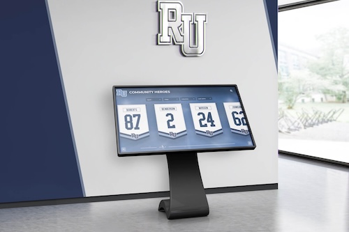
Public touchscreens differ from personal devices in critical ways affecting design requirements. Users typically stand rather than sit, often at awkward angles depending on installation height. Groups may interact together, requiring larger targets and content visible from multiple viewing positions. And dwell times remain shorter than seated experiences, demanding faster information access and simpler navigation structures.
Research on public kiosk interaction shows average session durations of 60-90 seconds for self-service applications and 2-4 minutes for exploratory content like digital halls of fame or wayfinding systems. These time constraints mean interfaces must communicate value immediately while enabling goal completion within these natural attention spans.

Public touchscreen installations must accommodate standing users at various heights while maintaining comfortable viewing angles
Core Principles of Engaging Touchscreen Design
Several fundamental principles distinguish engaging touchscreen experiences from frustrating ones regardless of specific content or application domain.
Principle 1: Obvious Interactivity and Affordances
Users should instantly recognize what elements are interactive without hunting or experimentation. Buttons must look unmistakably like buttons through size, shape, color, and shadow effects. Interactive areas require clear visual distinction from non-interactive content through borders, backgrounds, or other obvious design treatment.
Research on interface design demonstrates that users spend minimal time examining screens before attempting interaction—typically under three seconds for initial orientation. During this brief evaluation period, unclear affordances cause confusion that many users resolve by simply walking away rather than investing effort in experimentation.
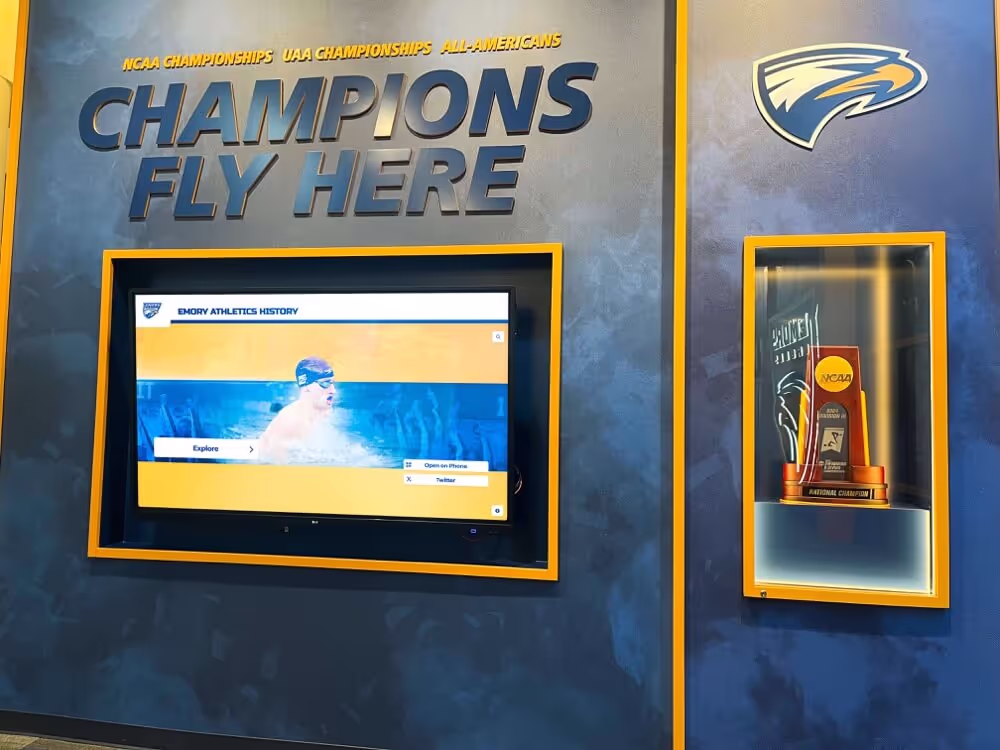
Solutions like digital hall of fame displays demonstrate effective affordance design through large, clearly labeled navigation elements that communicate interactivity instantly to users approaching displays.
Principle 2: Immediate and Appropriate Feedback
Every touch interaction must generate immediate visible feedback confirming the system registered input. Research on interaction design shows users begin perceiving delays at 100 milliseconds, with frustration increasing dramatically above 200 milliseconds. Delays exceeding 500 milliseconds cause users to question whether touches registered, leading to repeated tapping that compounds problems.
Feedback takes multiple forms depending on context. Button taps should trigger immediate visual state changes—color shifts, shadows, or size modifications confirming activation. Scroll gestures should move content fluidly in direct correspondence to finger movement. Loading operations exceeding two seconds require progress indicators preventing uncertainty about system state.
Principle 3: Forgiveness and Easy Recovery
Users make mistakes—tapping wrong buttons, getting lost in navigation structures, or simply changing their minds about desired actions. Forgiving interfaces anticipate these inevitable errors through easily accessible undo options, persistent home buttons returning to known safe states, and confirmation dialogs for destructive actions preventing accidental data loss.
Designing for forgiveness doesn’t mean cluttering interfaces with excessive confirmations. Rather, it means distinguishing between low-risk actions requiring no confirmation and high-risk actions warranting verification while always providing escape routes returning users to familiar states without penalty.

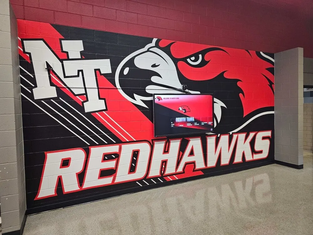
School hallway installations benefit from foolproof navigation that enables independent exploration without staff assistance
Essential Design Elements for Touchscreen Engagement
Translating general principles into specific design decisions requires attention to concrete interface elements and interaction patterns proven to maximize engagement.
Touch Target Sizing and Spacing
Perhaps the most fundamental touchscreen design consideration involves the physical size and spacing of interactive elements.
The 44-Pixel Minimum Standard
Apple’s Human Interface Guidelines established the 44 x 44 pixel minimum touch target size based on average fingertip dimensions—approximately 10-14 millimeters for most adults. This standard has become widely adopted across interface design communities, though many designers argue for larger targets in public kiosk contexts where users may wear gloves, have motor control challenges, or interact from suboptimal angles.
For educational institutions and public spaces, 60 x 60 pixels represents a safer minimum providing forgiveness for less precise targeting. Primary navigation buttons and frequent-use controls benefit from 80+ pixel dimensions ensuring reliable activation even from hasty interactions.
Spacing to Prevent Miss-Taps
Touch target size alone proves insufficient without adequate spacing preventing accidental activation of adjacent elements. Research on touch accuracy shows users commonly miss intended targets by 5-10 pixels in any direction, with accuracy degrading further under rushed conditions or awkward viewing angles.
Minimum 8-pixel spacing between touch targets prevents most miss-taps, though 12-16 pixel spacing provides greater reliability. Critical actions like “delete” or “reset” buttons should maintain 24+ pixel clearance from surrounding elements preventing catastrophic accidents.
Accessible Design for All Users
Accessibility requirements often exceed minimum standards significantly. Users with motor control challenges may require 80+ pixel targets with 20+ pixel spacing. Elderly users benefit from simplified layouts with fewer total elements, each substantially larger than baseline minimums. And diverse user populations demand flexible interfaces accommodating wide range of interaction capabilities.
Organizations implementing touchscreen kiosk software must balance accessibility with information density, typically through progressive disclosure that presents essential controls prominently while hiding advanced options until needed.
Visual Hierarchy and Layout Strategies
Clear visual organization enables users to quickly understand interface structure and locate desired information without careful study.
The F-Pattern and Z-Pattern Reading Behaviors
Eye-tracking research consistently demonstrates that users scan screens in predictable patterns based on reading conventions. Left-to-right readers follow F-patterns for text-heavy content—scanning top horizontal area, moving down, scanning shorter horizontal section, then scanning vertically along left edge. For graphical interfaces with minimal text, users often follow Z-patterns—top-left to top-right, diagonally to bottom-left, then across to bottom-right.
Effective touchscreen layouts position most important elements within these natural scan patterns. Primary navigation occupies top or left regions. Key calls-to-action fall within central areas attracting focus. Less critical content inhabits periphery areas users scan last if at all.
Grid-Based Layouts for Clarity
Grid systems create visual order through consistent alignment and spacing. Well-executed grids enable users to predict where information types appear, reducing cognitive load from arbitrary layouts requiring careful examination of every screen.
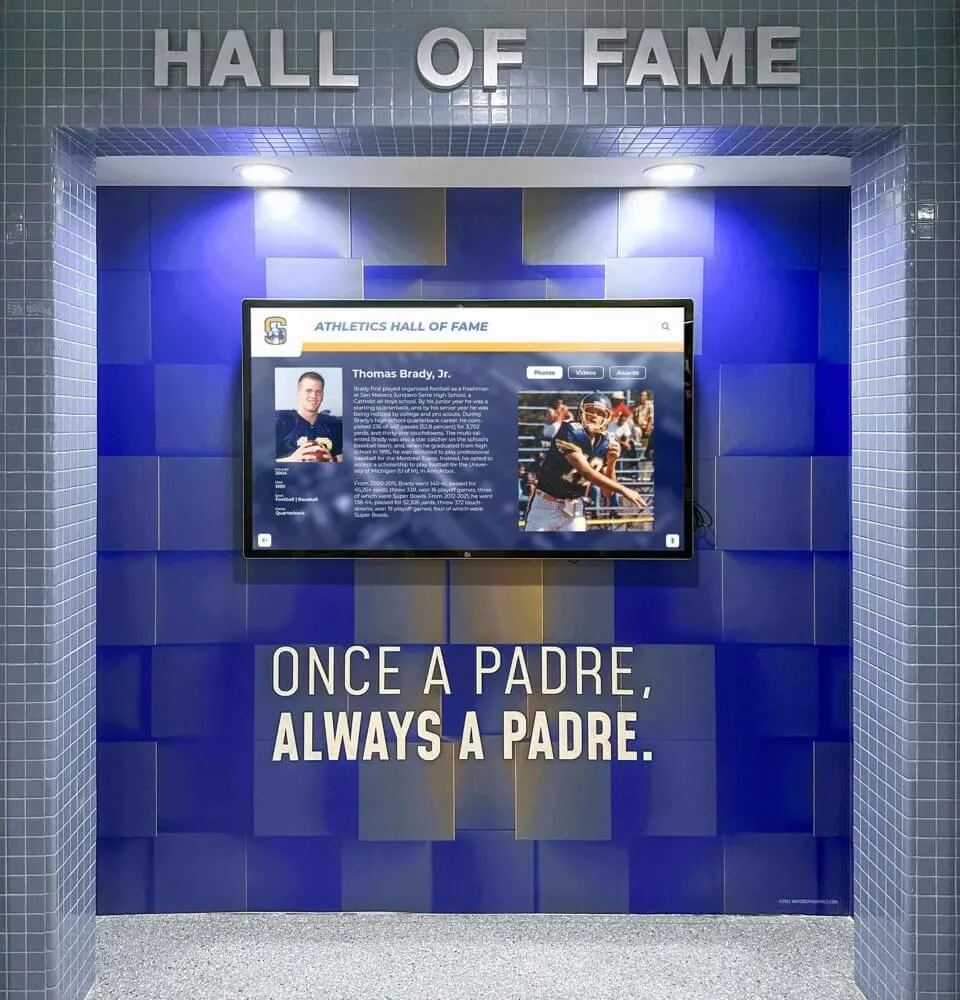
Educational institutions implementing interactive boards for student achievements commonly use grid layouts presenting honoree profiles in consistent card formats, enabling quick scanning while maintaining visual interest through varied photos and content.

Grid layouts organize large content collections while enabling efficient browsing and comparison across multiple items
Color and Contrast for Readability
Public touchscreen displays face challenging viewing conditions—bright ambient lighting, viewing from angles, and reflection from glass surfaces all degrade legibility. These conditions demand higher contrast ratios than desktop applications where users control lighting and positioning.
The Web Content Accessibility Guidelines (WCAG) recommend minimum 4.5:1 contrast ratio for normal text and 3:1 for large text or graphical objects. However, public touchscreen contexts benefit from exceeding these minimums significantly—7:1 or higher for body text and 5:1 for large elements ensures readability across diverse lighting conditions.
Gesture Design and Multi-Touch Interactions
Modern touchscreen hardware supports complex multi-touch gestures, but implementation requires careful consideration of discoverability and user expectations.
Standard Gestures Users Expect
Smartphone ubiquity created universal gesture literacy for core interactions: single tap activates, swipe scrolls, pinch zooms, and long-press reveals contextual options. These gestures require no instruction—users automatically attempt them on unfamiliar touchscreens based on smartphone experience.
Effective touchscreen design embraces these standard gestures rather than inventing novel alternatives. Users automatically swipe to scroll through content lists. Photo galleries support pinch-zoom exploration. Maps enable pan-and-zoom navigation through familiar touch patterns.
Custom Gestures and Discoverability Challenges
While standard gestures require no instruction, custom gestures face severe discoverability problems. Users won’t spontaneously attempt three-finger swipes or rotate gestures without explicit instruction. And instruction itself creates friction—users must stop, read, understand, and remember gestural commands before proceeding with primary objectives.
Research on gesture interfaces demonstrates that unless custom gestures provide compellingly superior experiences, they typically reduce rather than enhance engagement. When custom gestures prove necessary, animated demonstrations showing gestural interactions prove more effective than text instructions alone.
Organizations developing digital showcase platforms generally limit interaction vocabularies to standard smartphone gestures ensuring immediate usability without instruction requirements that interrupt engagement.

Natural touch gestures should mirror smartphone interactions users already understand without requiring instruction or adaptation
Content Strategy for Sustained Engagement
Technical interface design alone proves insufficient without compelling content structured to maintain attention throughout complete interactions.
Information Architecture and Navigation Design
How content organizes into hierarchies and navigation structures dramatically impacts whether users successfully find desired information or abandon frustrated searches.
Shallow vs. Deep Hierarchies
Navigation structures face fundamental tradeoff between breadth and depth. Shallow hierarchies present many options per level, requiring few clicks to reach destinations but potentially overwhelming users with choice. Deep hierarchies present fewer options per level, creating simpler individual decisions but requiring many steps to reach content.
Research on information architecture generally favors shallow structures for touchscreen applications. Public kiosk users demonstrate limited patience for multi-level navigation—studies show abandonment rates above 40 percent for interfaces requiring four or more navigation levels. Conversely, presenting 6-12 clear options per level maintains manageable choice complexity while minimizing clicks.
Persistent Navigation Elements
Users should never feel trapped in dead-end screens without obvious return paths. Persistent navigation elements—particularly prominent “Home” buttons visible on every screen—provide psychological safety encouraging exploration. When users know they can always return to starting points without penalty, they demonstrate greater willingness to explore unfamiliar areas compared to interfaces where navigation mistakes require backtracking through complex breadcrumb trails.
Secondary navigation elements like “Back” buttons prove less critical than persistent “Home” access, though both contribute to confident exploration. The key principle involves ensuring users always have obvious escape routes from any interface state.
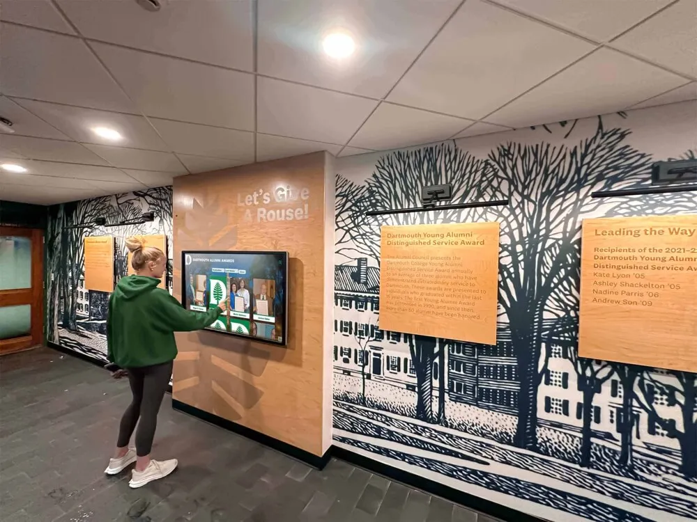
Writing for Touchscreen Experiences
Text content demands different approaches for standing touchscreen interactions compared to seated reading experiences.
Brevity and Scannable Formatting
Standing users won’t read long paragraphs regardless of content quality. Effective touchscreen text follows strict brevity—short sentences, short paragraphs, bullet points extracting key facts, and generous whitespace preventing visual density that intimidates would-be readers.
For comprehensive content requiring depth, progressive disclosure strategies present summaries initially with optional “read more” expansions for interested users. This approach serves both audience segments—casual browsers get essential information immediately while motivated users access full details without constraint.
Active Voice and Clear Calls-to-Action
Touchscreen content benefits from direct, active language telling users exactly what to do. Passive constructions and vague suggestions create ambiguity that generates hesitation. “Explore alumni profiles” works better than “Alumni profiles may be viewed here.” “Search by sport” proves clearer than “Sport-based searching is available.”
Calls-to-action should use precise action verbs—tap, swipe, explore, discover, search—that communicate exactly what interactions users should perform. Vague language like “click here” (wrong input method) or “view” (unclear activation method) introduces friction through imprecision.

Rich multimedia profiles balance comprehensive information with scannable formatting enabling quick orientation followed by optional deeper exploration
Accessibility and Inclusive Design Practices
Truly engaging touchscreen experiences serve diverse user populations including those with varying abilities, technological familiarity, and interaction preferences.
Physical Accessibility Considerations
Touchscreen installations must accommodate users with different heights, reach capabilities, and motor control abilities.
Installation Height and Reach Zones
The Americans with Disabilities Act (ADA) provides specific guidance for touchscreen positioning. Control buttons and interactive elements must fall within reach ranges: 48 inches maximum height for side approaches, 44 inches for front approaches where users cannot get close due to display depth. Lower interactive elements should remain above 15 inches accommodating wheelchair users unable to reach very low positions.
For displays serving diverse populations, primary interactive areas benefit from 36-42 inch positioning serving both standing adults and seated wheelchair users comfortably. Tall installations hosting secondary content may extend higher, but critical navigation and primary features must remain within universal reach zones.
Touch Sensitivity and Tremor Accommodation
Users with motor control challenges, tremors, or limited fine motor skills struggle with interfaces requiring precise targeting or sustained touch pressure. Inclusive design accommodates these users through generous touch targets (80+ pixels minimum), forgiving hit areas exceeding visible button boundaries by 8-10 pixels, and single-tap interactions avoiding long-press or multi-touch requirements.
Time-based interactions like double-taps or gesture timings should provide generous recognition windows—at least 500 milliseconds for double-tap recognition and minimal speed requirements for gesture completion allowing slower movement patterns.
Cognitive Accessibility and Comprehension
Visual and motor accessibility receives considerable attention, but cognitive accessibility proves equally important for creating broadly engaging experiences.
Consistent Interface Patterns
Users with cognitive disabilities, learning differences, or simply limited technological experience benefit enormously from consistent interface patterns. When similar actions always produce similar results through similar interactions, users develop reliable mental models enabling confident navigation.
Inconsistency creates confusion disproportionately affecting users with cognitive challenges. If tapping sometimes activates while other times requires double-tap, or if “back” buttons appear in different locations across screens, users must carefully study each interface state rather than developing confident automatic behaviors.
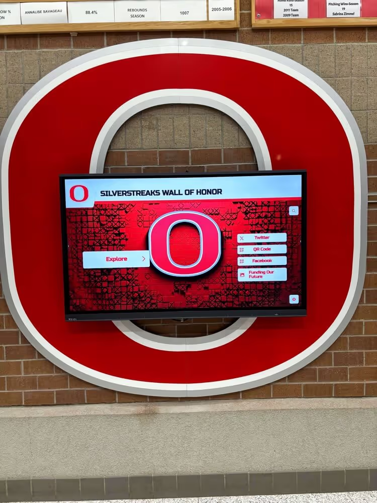
Solutions like digital donor walls serving diverse visitor populations prioritize ruthless consistency enabling intuitive navigation without requiring technological sophistication or extended familiarization.
Multiple Representation Modes
Different users process information through different cognitive channels. Some prefer visual information through images and diagrams. Others comprehend better through text descriptions. And many benefit from audio narration supplementing visual presentation.
Comprehensive touchscreen experiences provide multiple pathways to equivalent information. Photo galleries include text descriptions. Text content includes supporting visuals. And where feasible, audio descriptions enable non-visual content access supporting both accessibility needs and learning style preferences.

Properly positioned touchscreen installations serve users of varying heights and abilities through thoughtful placement within universal reach zones
Technical Considerations for Smooth Performance
Even perfectly designed interfaces frustrate users when poor technical implementation creates laggy responses or unreliable touch registration.
Hardware Selection and Touch Technology
Touchscreen hardware varies significantly in capabilities, responsiveness, and durability—choices directly impacting user experience quality.
Capacitive vs. Resistive Touch Technologies
Modern touchscreens predominantly use capacitive technology sensing electrical conductivity of fingertips. Capacitive screens support multi-touch gestures, provide excellent responsiveness, and resist damage from repeated use. However, they require direct skin contact, creating challenges for users wearing gloves or holding styluses.
Resistive touchscreens respond to physical pressure, working with gloves, styluses, and any contact. However, they typically support only single-touch interaction, provide less precise tracking, and suffer durability issues as pressure-sensitive layers degrade over time.
For institutional applications in educational facilities and public spaces, capacitive technology represents the clear choice despite glove limitations. The superior responsiveness and multi-touch capabilities create expectations-meeting experiences, while resistive limitations frustrate users accustomed to smartphone interfaces.
Commercial-Grade Hardware for Reliability
Consumer tablets and displays prove inadequate for public installations expected to operate reliably for years under continuous use. Commercial-grade touchscreen displays designed for 16-24 hour daily operation provide critical durability including higher touch cycle ratings (millions vs. thousands of touches), thermal management for continuous operation, industrial-grade components resisting environmental factors, and typically three-year+ manufacturer warranties vs. one-year consumer standards.
Organizations implementing touchscreen digital signage software must balance initial hardware costs against total lifecycle expenses—cheaper consumer hardware typically requires replacement within 1-2 years while commercial displays reliably operate 5-7 years, yielding lower long-term costs despite higher initial investments.
Software Performance and Responsiveness
Hardware capabilities matter little if software implementation creates delays or unreliable interactions.
Response Time Requirements
Research on interaction design establishes clear thresholds for acceptable interface responsiveness. 100 milliseconds represents the limit for feeling instantaneous. 100-300 milliseconds feels snappy but perceptibly delayed. 300-1000 milliseconds feels sluggish, generating user frustration. Beyond 1000 milliseconds, users question whether inputs registered at all.
Meeting these standards requires careful software development including immediate visual feedback acknowledging touch registration (within 100ms), efficient code execution avoiding processing delays, background loading of content and media preventing interaction blocking, and deliberate performance testing across full range of content and interaction patterns.
Offline Capability and Reliability
Network-dependent touchscreen applications face reliability challenges from connectivity interruptions, slow network responses, and complete connection failures. Public installations in schools, museums, or corporate facilities often lack guaranteed high-speed connectivity, while mobile installations may operate without any network access.
Effective touchscreen systems separate network-dependent features from core functionality, enabling offline operation for primary use cases. Content loads locally, user interactions respond immediately without network roundtrips, and network features gracefully degrade when connectivity proves unavailable rather than rendering entire systems unusable.
Modern solutions like LG touchscreen software platforms provide robust offline capabilities ensuring reliable operation even during network outages or in locations lacking consistent connectivity.

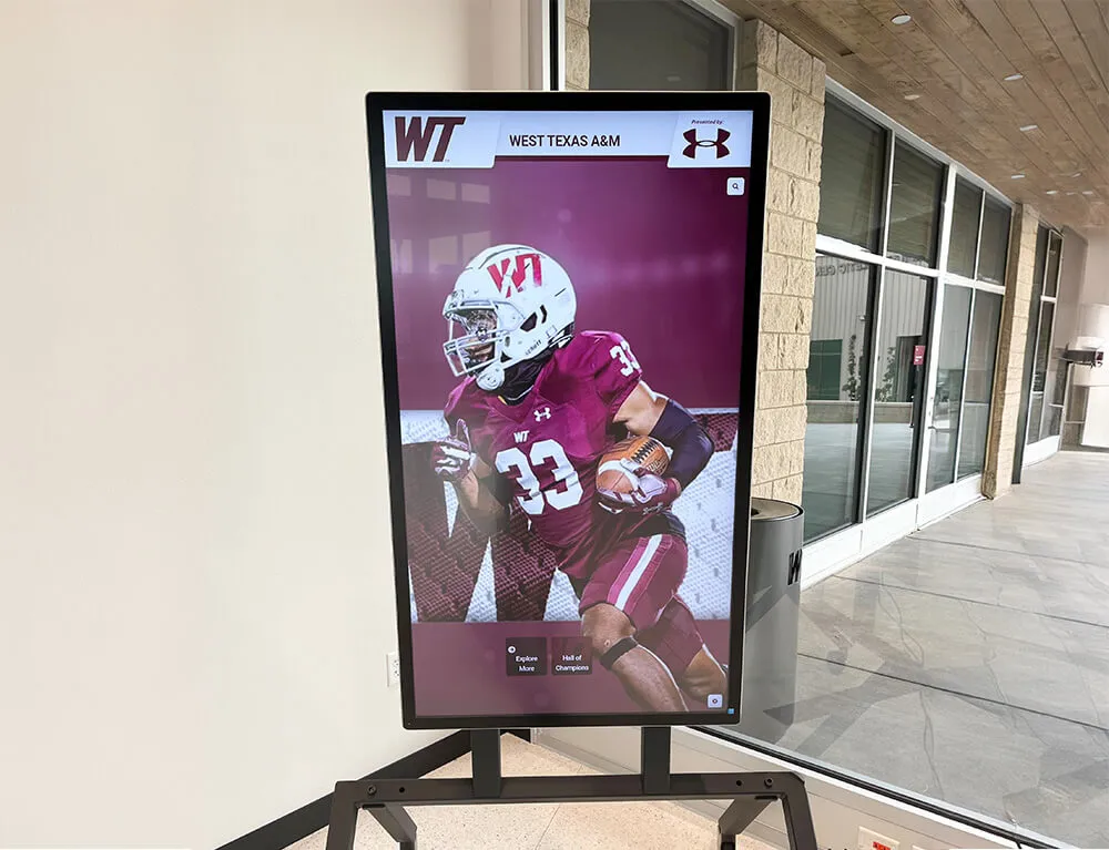
Commercial-grade touchscreen installations integrate seamlessly into institutional environments while providing reliable performance under continuous public use
Creating Contextually Appropriate Experiences
Effective touchscreen design adapts to specific use contexts, user populations, and organizational objectives rather than applying one-size-fits-all approaches.
Educational Institution Applications
Schools, colleges, and universities implement touchscreens for diverse purposes from wayfinding through recognition displays, each requiring context-specific design considerations.
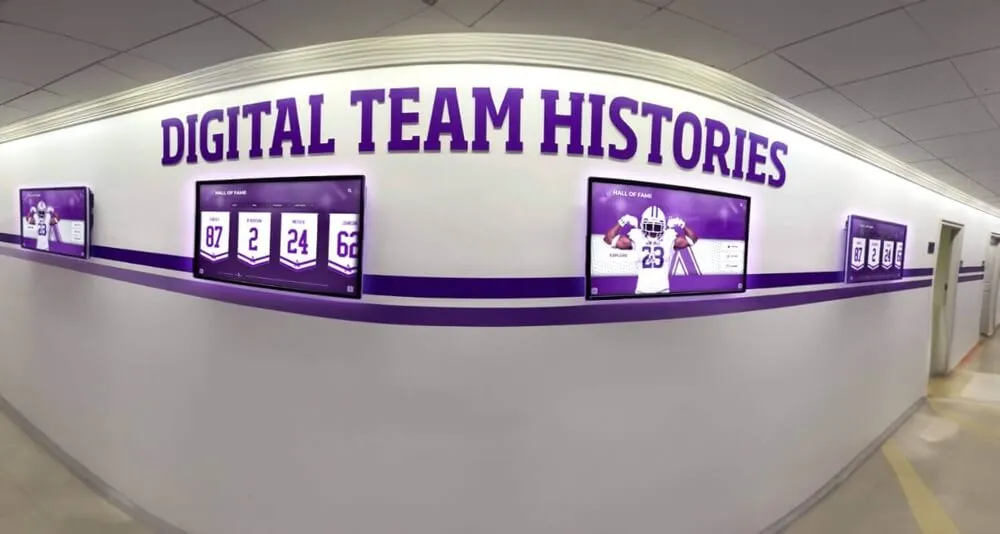
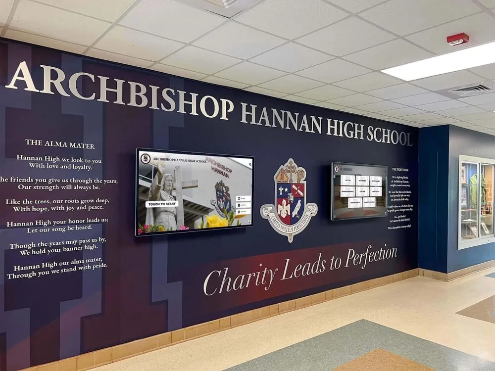
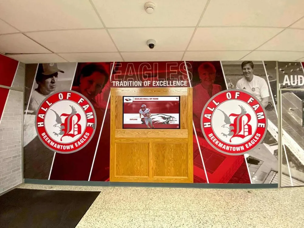
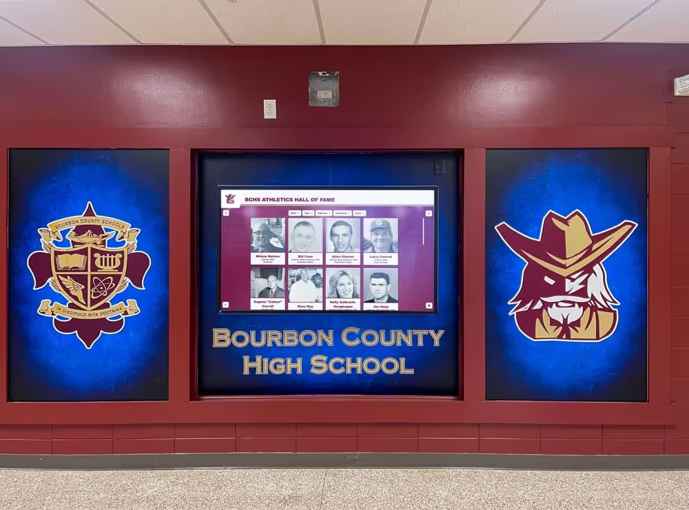
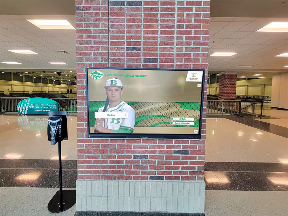
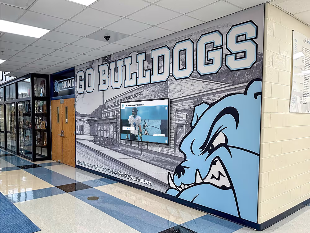
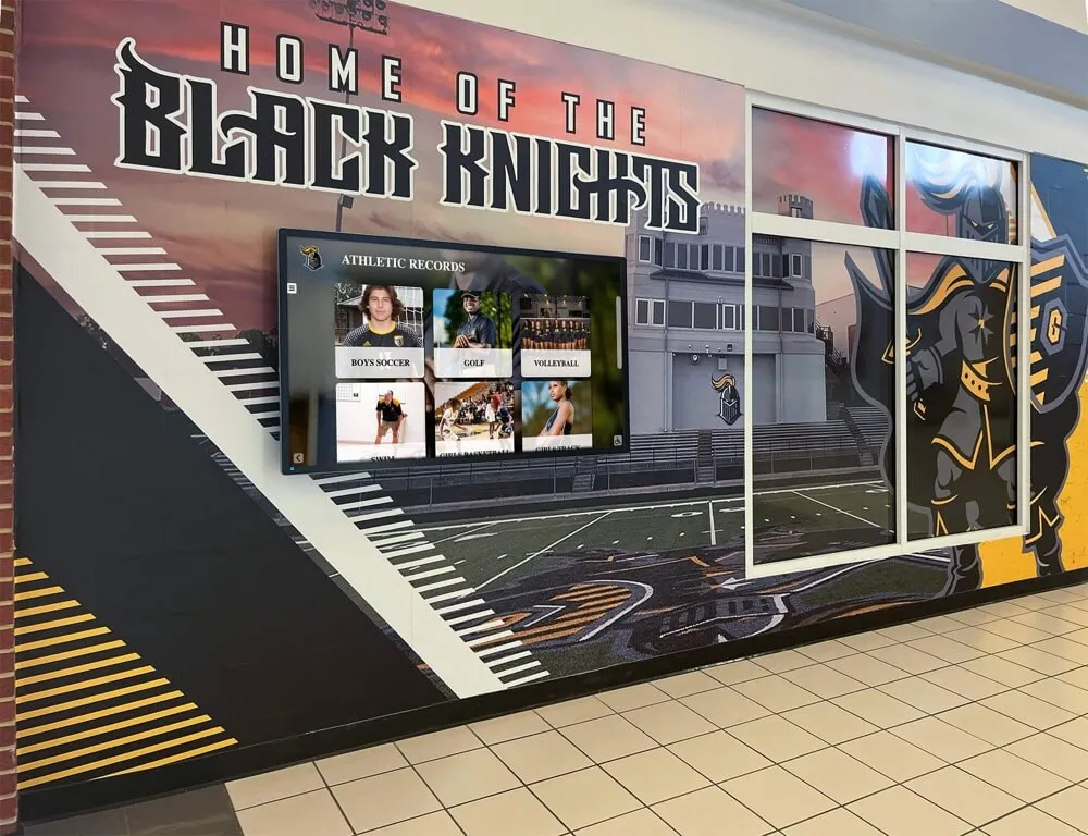
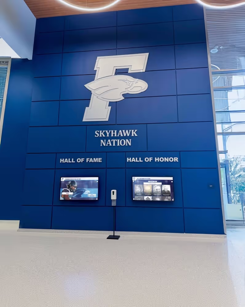
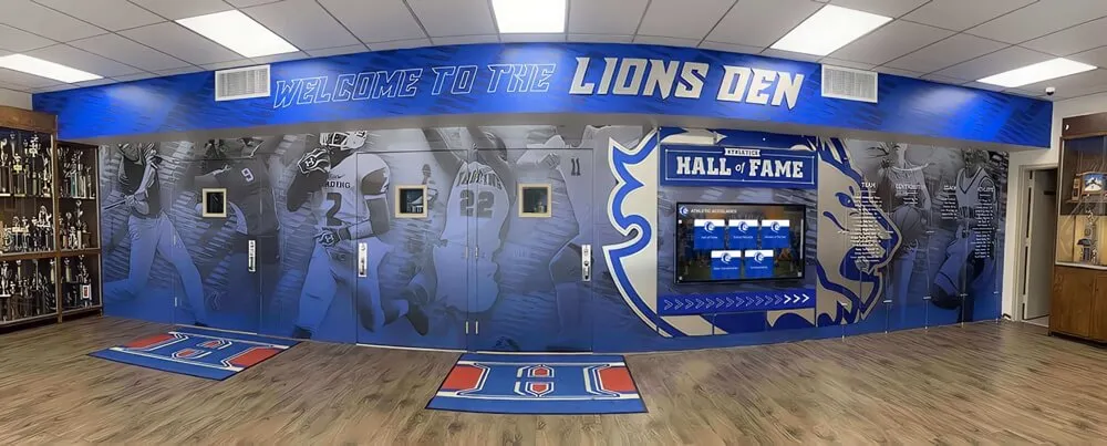
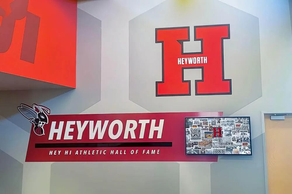
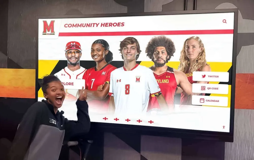
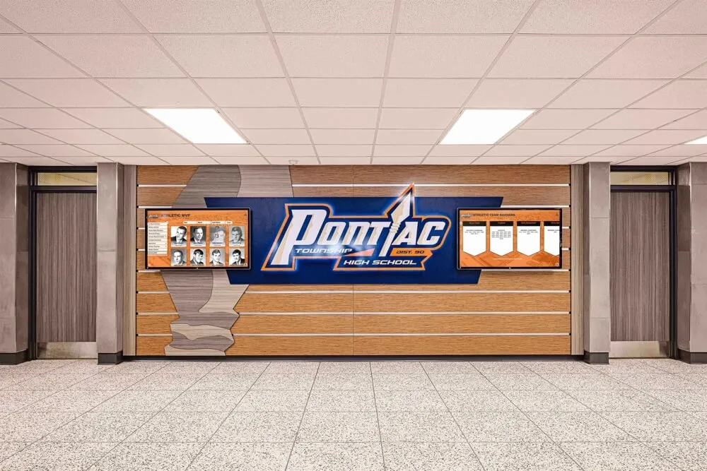
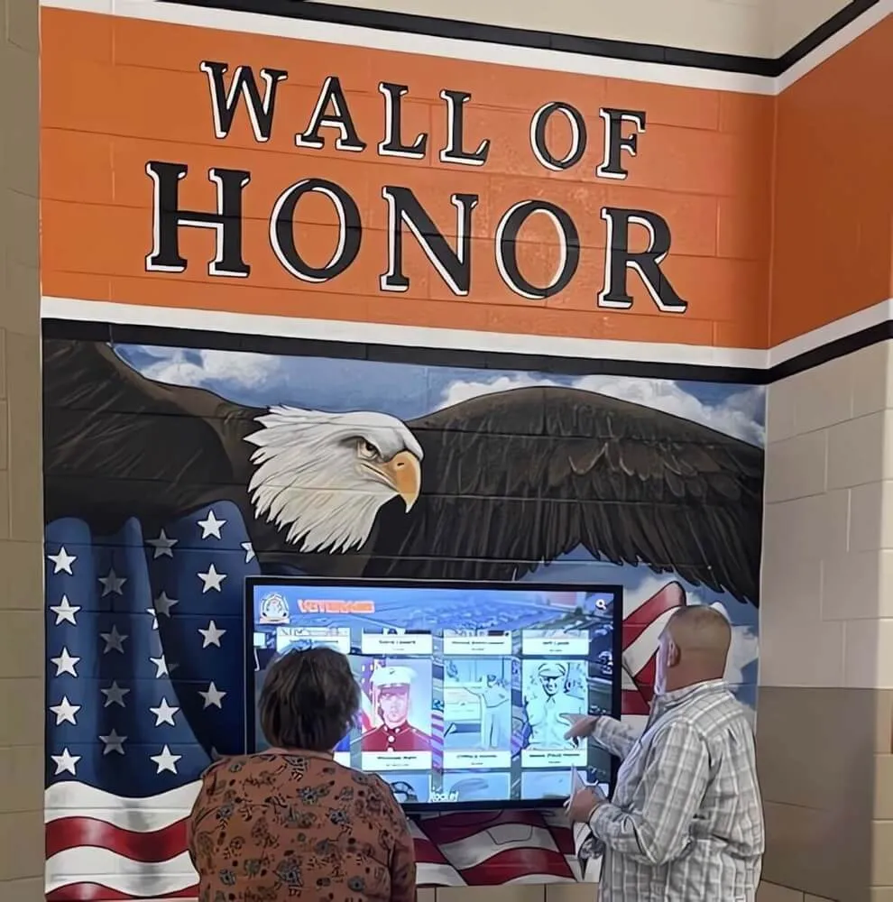
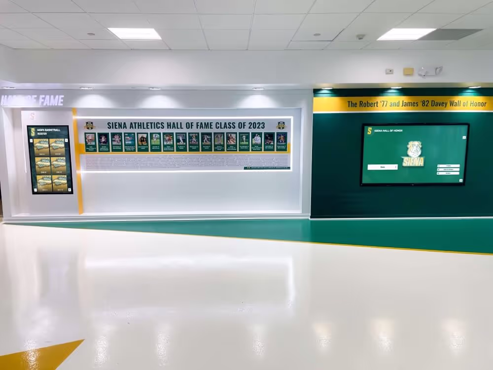
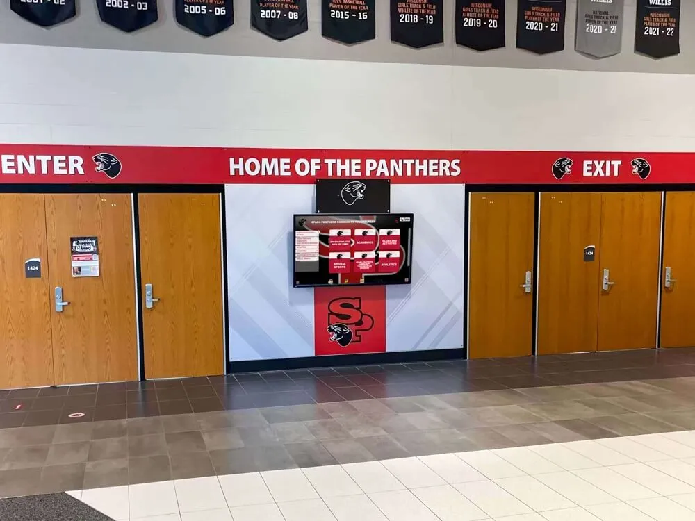
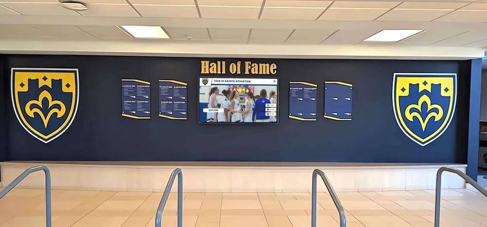
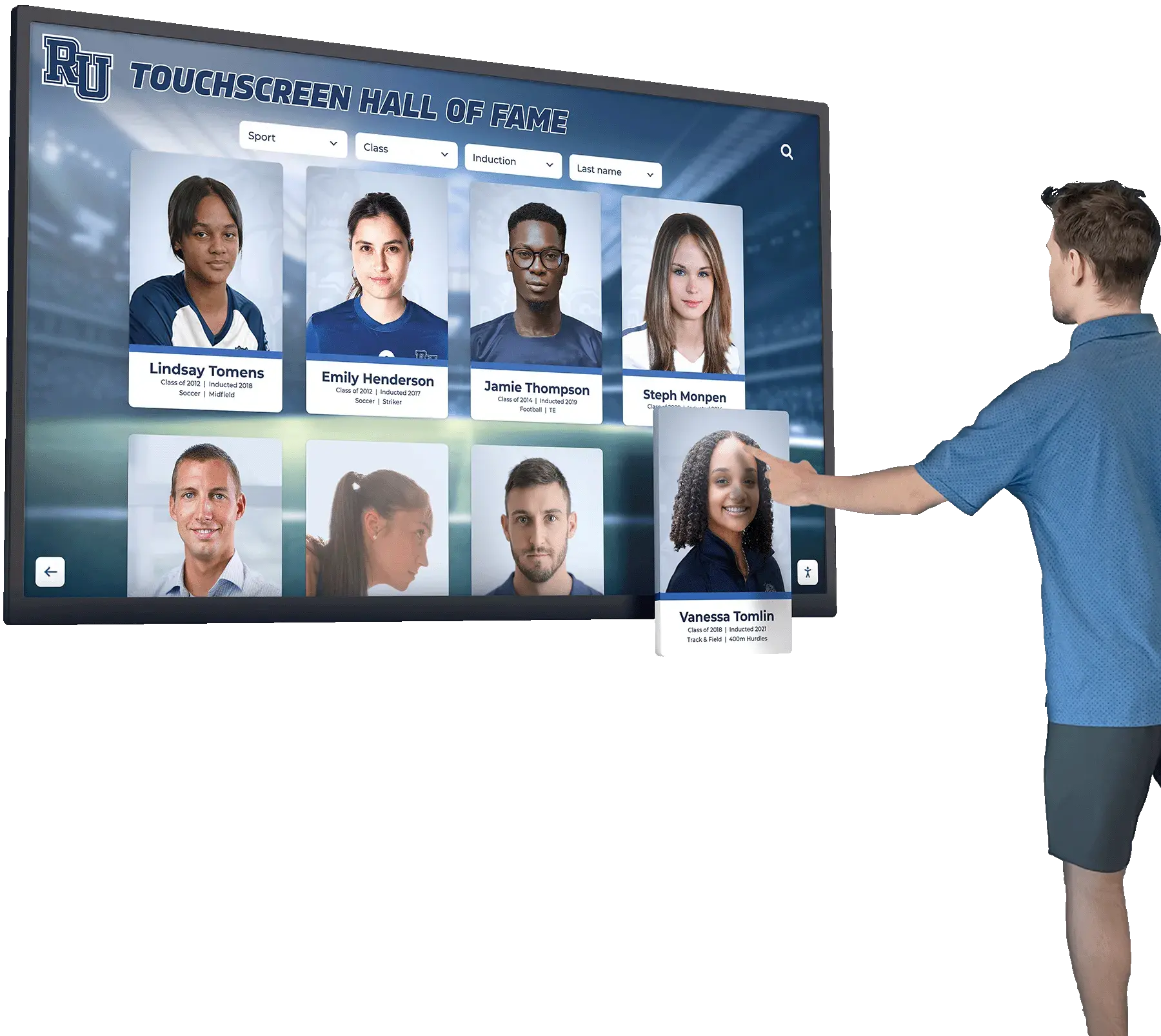
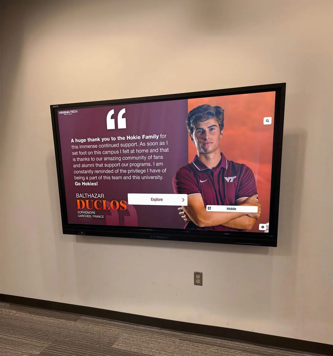
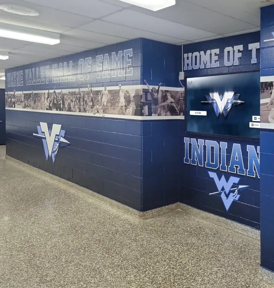
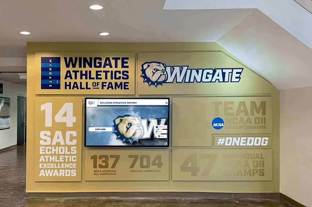
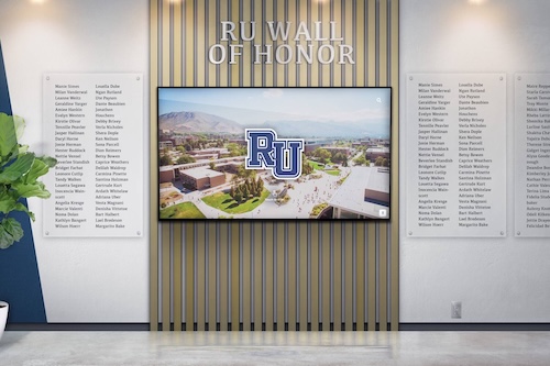
Recognition and Hall of Fame Displays
Digital recognition systems celebrating student achievements, alumni accomplishments, and institutional history face unique engagement challenges. Users typically include current students seeking inspiration, alumni revisiting their own recognition, visiting families exploring school culture, and prospective students evaluating institutional character.
These varied audiences demand flexible exploration supporting both goal-directed searches (finding specific individuals) and casual browsing discovering interesting stories. Effective recognition interfaces provide powerful search and filtering enabling instant location of specific honorees while also presenting engaging browsing experiences through timeline views, category exploration, and related content suggestions connecting individual profiles into larger narratives.
Resources on designing digital hall of fame touchscreen layouts provide specific frameworks for organizing recognition content maximizing both findability and serendipitous discovery.
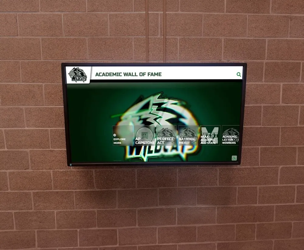
Student-Facing Interactive Information Systems
Touchscreens serving student populations for daily information access—campus maps, event calendars, directory information, resource guides—require exceptional simplicity given frequent use under time pressure. Students checking room locations between classes won’t tolerate multi-level navigation or unclear search interfaces.
These high-frequency use cases benefit from minimal initial screens presenting core functions prominently with one-tap access. Search functionality should default to screen top with large, obvious input fields. Most frequent queries deserve dedicated quick-access buttons bypassing search entirely. And information displays must communicate essential details at-a-glance without requiring interaction or screen transitions.
Museum and Cultural Institution Contexts
Museums, visitor centers, and cultural institutions implement touchscreens for educational exhibits, collection exploration, and interpretive experiences with distinct requirements from transactional applications.
Exploratory Learning Interfaces
Educational exhibits support open-ended exploration rather than goal-directed tasks. Users don’t arrive knowing exactly what content they seek—instead, they browse, discover, make connections, and follow curiosity-driven paths through information landscapes.
These exploratory experiences benefit from rich visual navigation presenting many entry points simultaneously. Image-based menus showing collection thumbnails invite browsing more effectively than text lists. Related content suggestions appearing alongside primary information encourage deeper engagement. And multiple navigation pathways—by topic, by time period, by collection type—accommodate diverse mental models and exploration preferences.
Group Interaction Considerations
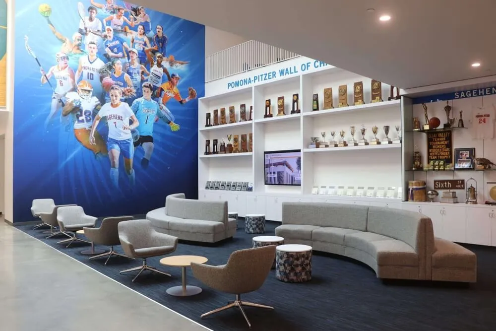
Museum exhibits often serve groups rather than individuals. Families explore together, school groups cluster around displays, and friends discuss content collectively. These social contexts create design implications including larger text and images visible from 3-4 feet rather than intimate viewing distances, positioning avoiding body blocking where one user obscures screen from others, and pacing allowing conversation and discussion rather than rushing through predetermined sequences.

Museum-style interfaces balance rich content depth with intuitive exploration enabling visitors to follow curiosity-driven learning paths
Measuring and Optimizing Engagement
Creating effective touchscreen experiences requires ongoing measurement and refinement based on actual usage patterns rather than assumptions about user behavior.
Analytics and Usage Tracking
Modern touchscreen software platforms provide detailed analytics revealing how users actually interact with interfaces compared to designer intentions.
Essential Engagement Metrics
Several key metrics illuminate interface effectiveness and user engagement quality. Session duration shows how long users actively interact, with longer times typically indicating engaging content though excessive duration may signal confusing navigation. Screen depth measures average navigation levels reached, revealing whether users explore beyond initial screens or abandon quickly. Completion rates for goal-oriented tasks indicate whether interfaces successfully enable intended objectives. And touch heatmaps visualize where users actually interact, often revealing that assumed primary navigation receives less attention than expected while unexpected elements attract focus.
Identifying Friction Points
Analytics data often reveals friction points where users struggle, abandon, or exhibit confusion behaviors. Unusually short time on screens before navigation may indicate content failed to engage or users couldn’t find next steps. High “back” button usage suggests users encounter dead ends or disappointing content. And repeated touches in non-interactive areas demonstrate affordance failures where users expect interactivity that doesn’t exist.
Solutions like Rocket Alumni Solutions provide integrated analytics helping educational institutions and organizations understand engagement patterns, identify improvement opportunities, and measure recognition program impact through concrete usage data rather than assumptions.
Iterative Refinement Based on Real Usage
Initial interface designs rarely prove optimal—effective touchscreen development embraces continuous refinement based on observed user behavior.
A/B Testing for Interface Decisions
When design decisions involve uncertainty between alternatives, A/B testing provides data-driven resolution. Should primary navigation use icons or text labels? Test both with real users measuring completion rates and task times. Would category browsing or search-first approaches better serve users? Implement both, randomize assignment, compare engagement metrics.
Small interface modifications often yield surprisingly large engagement impacts. Button color changes alter click rates 20-30 percent. Touch target size increases improve success rates 40 percent. And navigation simplification doubles completion rates for complex tasks.
User Observation and Feedback
Quantitative analytics reveal what happens but not why. Complementary qualitative research through user observation provides crucial context for understanding behavior patterns. Watching real users interact with touchscreens often surfaces issues analytics alone miss including confusion about ambiguous labels, uncertainty about touch target boundaries, frustration with unresponsive areas, and abandonment during specific task flows.
Brief intercept interviews asking users about their experiences gather direct feedback on satisfaction, ease of use, content relevance, and improvement suggestions providing actionable insights for iterative refinement.
Implementing Touchscreen Experiences in Your Organization
Translating principles into practice requires systematic approaches from initial planning through ongoing operation and content maintenance.
Planning and Requirements Definition
Successful touchscreen implementations begin with clear understanding of objectives, audiences, contexts, and success criteria before design begins.
Defining Primary Objectives and Use Cases
What should touchscreen experiences accomplish? Common objectives include enabling self-service information access reducing staff workload, celebrating recognition and achievements building community pride, educating visitors about organizational history and values, facilitating navigation and wayfinding in complex facilities, generating engagement and leads at events or public spaces, and showcasing products or services advancing marketing goals.
Different objectives demand different interface approaches. Self-service efficiency prioritizes speed and simplicity. Recognition celebrates comprehensive content and serendipitous discovery. Education balances information depth with accessible presentation. Clear objective definition prevents feature creep and focuses design on delivering specific outcomes effectively.
Understanding Your User Populations
Who will interact with touchscreens and in what contexts? Audience analysis considers demographic factors (age ranges, technological familiarity, abilities), situational contexts (time pressure, environmental conditions, social dynamics), prior knowledge (newcomers vs. familiar users, guests vs. community members), and motivation (required vs. optional use, specific goals vs. casual exploration).
Designing for varied populations often requires progressive disclosure accommodating both novice users needing guidance and experienced users wanting efficient access. Clear labeling and obvious affordances serve unfamiliar users while shortcuts and advanced features reward frequent users.
Content Strategy and Ongoing Maintenance
Touchscreen effectiveness depends as much on content quality and freshness as on interface design and technical performance.
Developing Sustainable Content Workflows
Who creates, approves, and publishes touchscreen content? Successful implementations establish clear content workflows including defined roles and responsibilities, standardized content templates maintaining consistency, review and approval processes ensuring quality, publishing schedules maintaining freshness, and content management systems enabling updates without technical expertise.
Organizations implementing interactive kiosk software features benefit from cloud-based content management enabling distributed content creation where multiple departments or individuals contribute content within their areas of expertise while administrative oversight maintains overall quality and consistency.
Planning for Content Lifecycle Management
Content requires ongoing attention beyond initial creation. Recognition displays need regular updates as new inductees join halls of fame. Event information becomes outdated requiring removal or archiving. And even evergreen content benefits from periodic refresh maintaining visual interest and reflecting current design standards.
Sustainable touchscreen programs plan for content lifecycle including regular update schedules (monthly, quarterly, annually), content audit processes identifying outdated material, archive strategies preserving historical content while emphasizing current information, and performance reviews ensuring content achieves intended objectives measured through analytics and user feedback.

Cloud-based content management enables authorized staff to maintain current, relevant touchscreen content without requiring technical expertise or IT department intervention
The Future of Touchscreen Engagement
Touchscreen technology and user expectations continue evolving, with several emerging trends shaping future interactive experiences.
Advanced Interaction Modalities
Beyond traditional touch input, emerging technologies expand interaction possibilities while creating new design challenges.
Voice Integration and Multi-Modal Interfaces
Voice control increasingly supplements touch interaction, particularly for accessibility and hands-free scenarios. Multi-modal interfaces accepting both touch and voice input provide flexibility—users might browse visually but search vocally, or explore verbally but select visually. However, voice integration requires acoustic design considering ambient noise levels, privacy concerns in public settings, and clear feedback indicating voice recognition states.
Gesture Recognition and Touchless Interaction
Computer vision systems detecting hand gestures without physical touch gained prominence during pandemic concerns about shared surface contact. While completely touchless interaction faces discoverability challenges—users don’t know what gestures systems recognize—hybrid approaches combining touch with touchless options provide flexibility for users preferring either interaction mode.
Personalization and Adaptive Experiences
Modern touchscreen systems increasingly adapt to individual users and usage contexts rather than presenting identical experiences to everyone.
Context-Aware Content Presentation
Location awareness, time-of-day adaptation, and usage pattern recognition enable dynamic content optimization. School displays might emphasize current events and recent achievements during prospective family visits while highlighting historical content during alumni reunions. Museum exhibits could adjust content depth based on observed visitor engagement patterns—presenting simplified overviews to rushed visitors while offering comprehensive details to those demonstrating sustained interest.
Connected Experiences Across Devices
Touchscreen interactions increasingly extend beyond physical displays to personal devices. Users might begin exploration at physical kiosks then continue on smartphones through seamless transitions preserving context and position. QR codes or NFC technology enable content transfer from touchscreens to personal devices, letting users save information for later review or share discoveries with others.
Solutions like Rocket Alumni Solutions provide integrated experiences across physical touchscreen installations and web-based platforms, ensuring recognition content remains accessible to entire communities regardless of physical proximity to campus installations.
Conclusion: Designing for Genuine Engagement
Creating touchscreen experiences that truly engage users requires moving beyond surface-level aesthetics to address fundamental interaction design, accessibility, content strategy, and technical performance. Well-designed interactive displays transform passive viewing into active exploration, creating memorable experiences that achieve organizational objectives while respecting user needs and constraints.
The investment in thoughtful touchscreen design delivers measurable returns through increased engagement, improved information retention, stronger community connections, and more effective communication of organizational values and achievements. Whether implementing recognition displays in educational institutions, wayfinding systems in public spaces, or interpretive exhibits in cultural facilities, applying evidence-based design principles creates experiences users genuinely enjoy while accomplishing goals organizations prioritize.
Success requires ongoing attention beyond initial deployment. Regular content updates maintain freshness. Analytics review identifies improvement opportunities. User feedback guides iterative refinement. And technological evolution demands periodic reassessment ensuring implementations remain current with user expectations shaped by ever-improving personal devices.
Organizations approaching touchscreen design with commitment to user-centered principles, accessible implementation, compelling content, and continuous improvement create lasting interactive experiences that engage, inform, and inspire audiences for years to come.