

A recognition display Delta E color accuracy test converts a common but vague complaint—“the colors look wrong on that screen”—into a structured, repeatable acceptance procedure that athletic directors, school IT staff, and facilities teams can run before any newly installed or relocated touchscreen goes live in an athletic lobby, hallway hall-of-fame installation, or trophy case alcove. Delta E, written as ΔE, is a numerical measure of the perceptible difference between a color as it should appear and a color as a specific display actually renders it. The measurement comes from the CIELAB color space, which organizes colors in a way that correlates with how the human visual system perceives differences. When two colors have a Delta E value of zero, they are identical under the measurement conditions. As the value rises, the perceptual difference between the target and the actual color grows—predictably enough that display engineers, color scientists, and AV technicians use ΔE thresholds to specify pass/fail requirements for professional displays.
For school recognition programs, color accuracy matters at three specific points where a miscalibrated display undermines the purpose of the recognition system itself. First, school colors—the navy blue, cardinal red, or forest green that defines a program’s visual identity—must render accurately so that digital recognition content is consistent with jerseys, banners, printed programs, and physical trophies in the same room. A display showing a muddy or shifted version of the school’s primary color creates a dissonance that visitors and alumni notice immediately, even when they cannot name the cause. Second, athlete portrait photography depends on accurate skin tone rendering to convey the dignity that recognition programs require. A display with warm color drift makes photographs look jaundiced; a display with cool drift makes skin tones appear pale and clinical. Third, award photography—championship trophies, gold medals, engraved plaques—uses warm metallic tones that shift dramatically with even modest color inaccuracy: a gold trophy against a black case that should gleam distinctly yellow-gold can appear bronze, tan, or brass-colored depending on the display’s red and green channel calibration.
Running a Delta E acceptance test before signing off on an installation—whether performed visually using printed color references or instrumentally with a colorimeter—catches these problems at the moment when correction is fastest and least disruptive.
Quick answer: To run a recognition display Delta E color accuracy test, compare the screen’s color output against a reference at three priority targets: the school’s official primary color (checked against a printed Pantone swatch or brand standards document), a neutral skin tone reference (checked against a calibrated print or reference image), and a white point reference (checked against a known D65 standard white). Without a colorimeter, conduct this comparison visually at the actual installation viewing distance and record each target as Pass, Marginal, or Fail. With a colorimeter and appropriate software, measure the screen’s ΔE value at each target and record the numerical result against your acceptance threshold—typically ΔE less than 3 averaged across targets, with no individual target exceeding ΔE 5 for recognition display applications. Adjust the display’s color temperature, saturation, and individual RGB gain controls until measurements fall within the acceptance range, then document the final display settings and test results as the acceptance baseline.

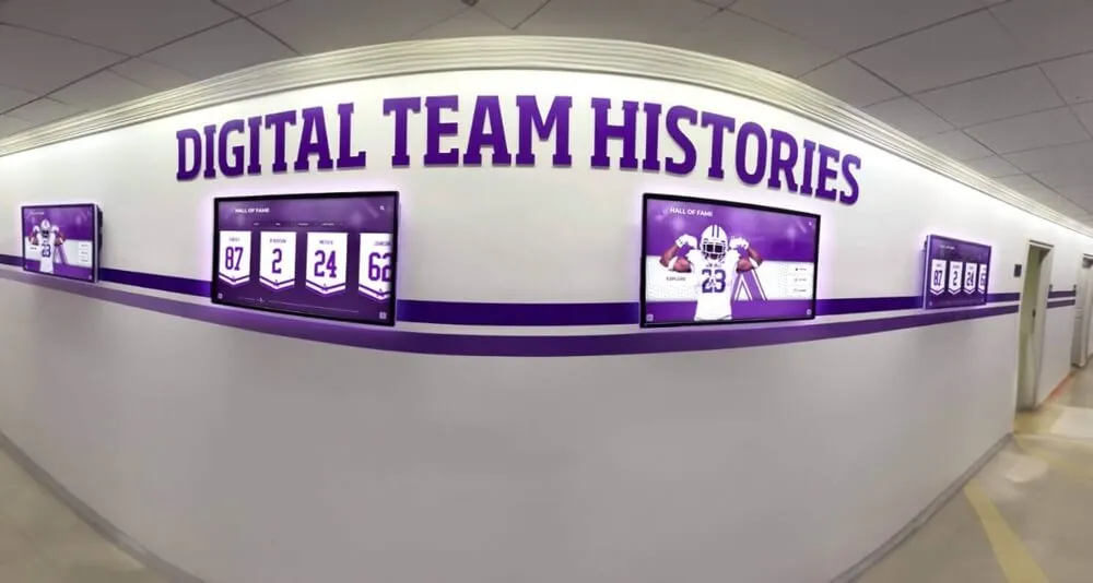
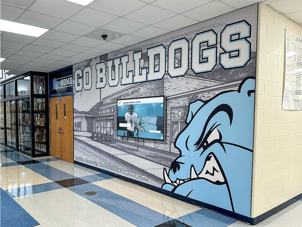
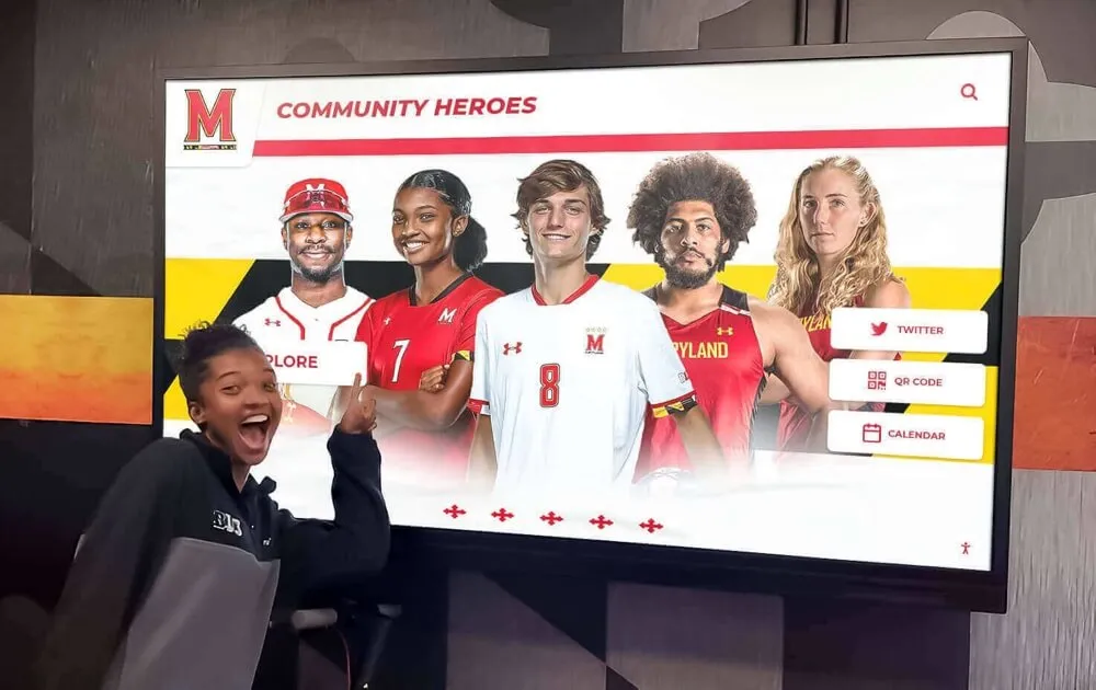
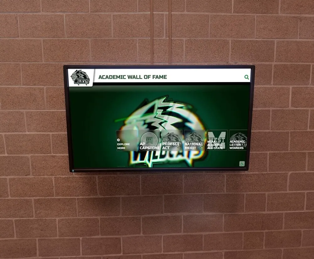
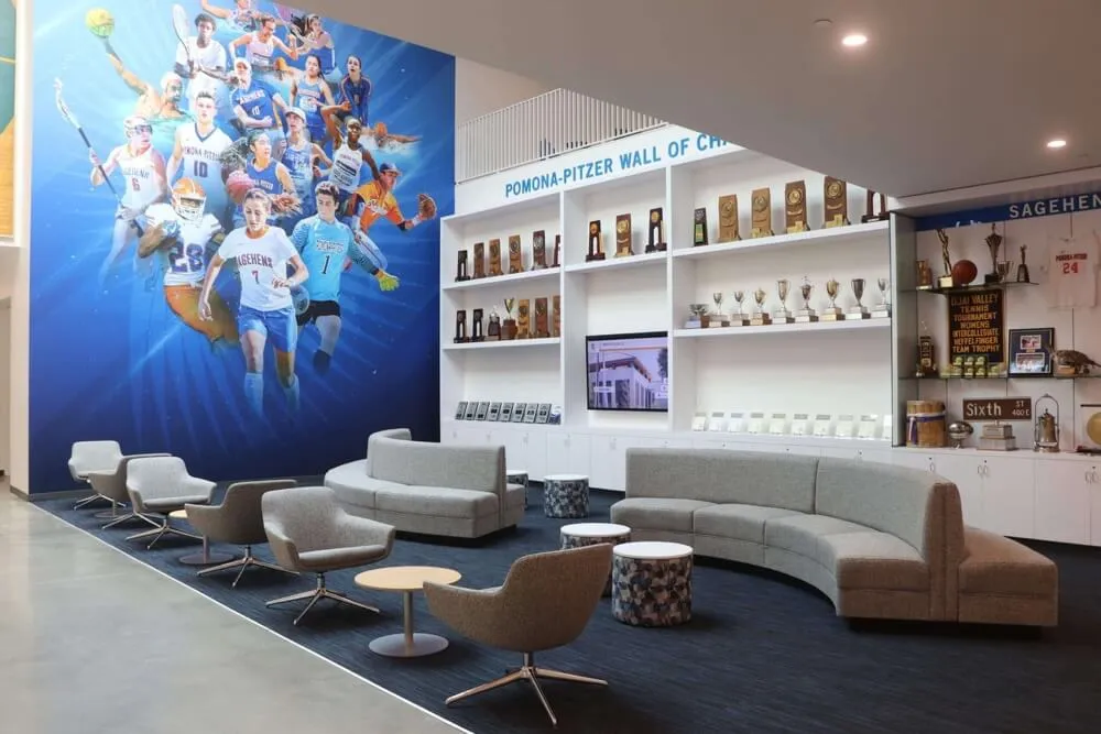
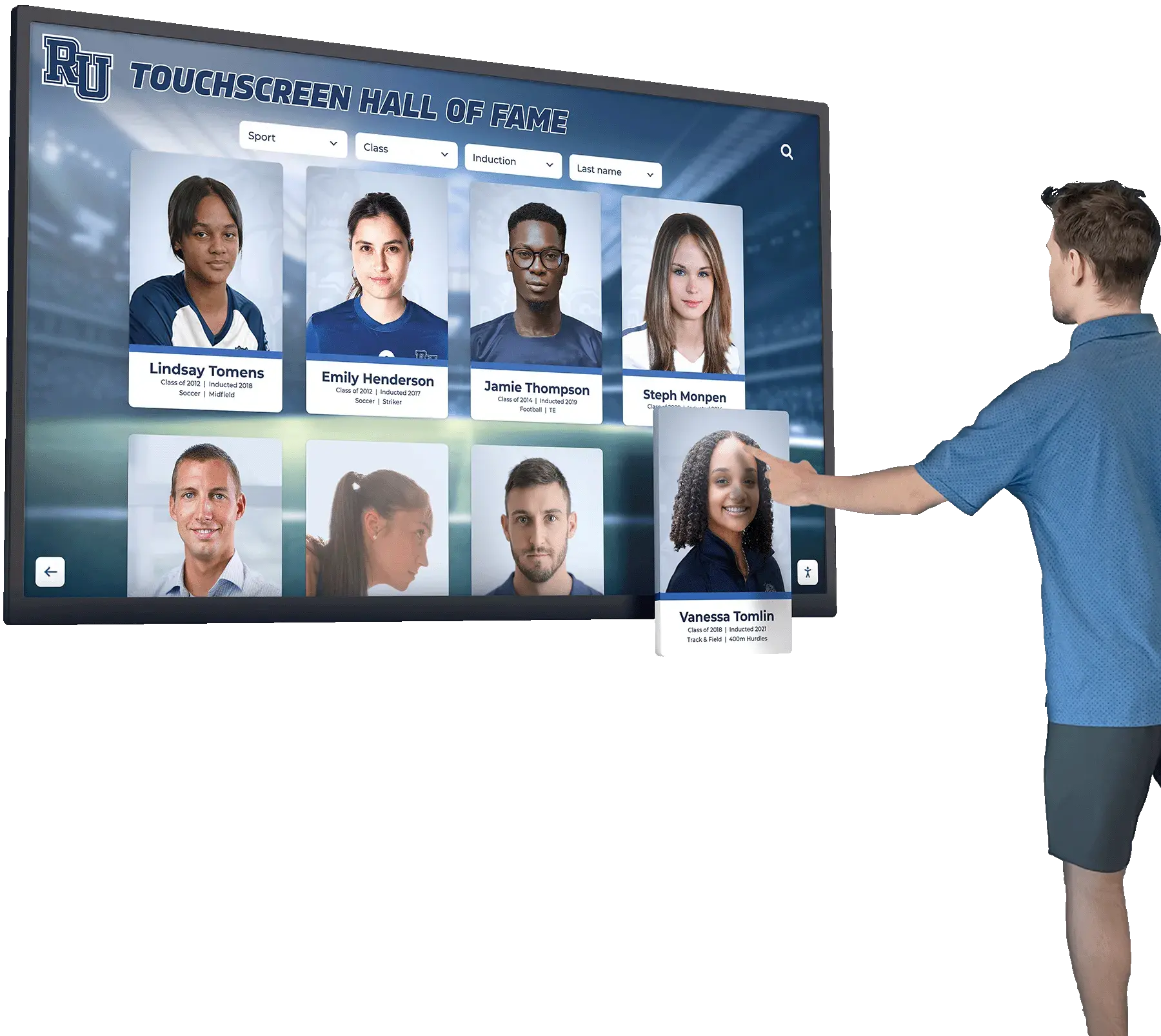
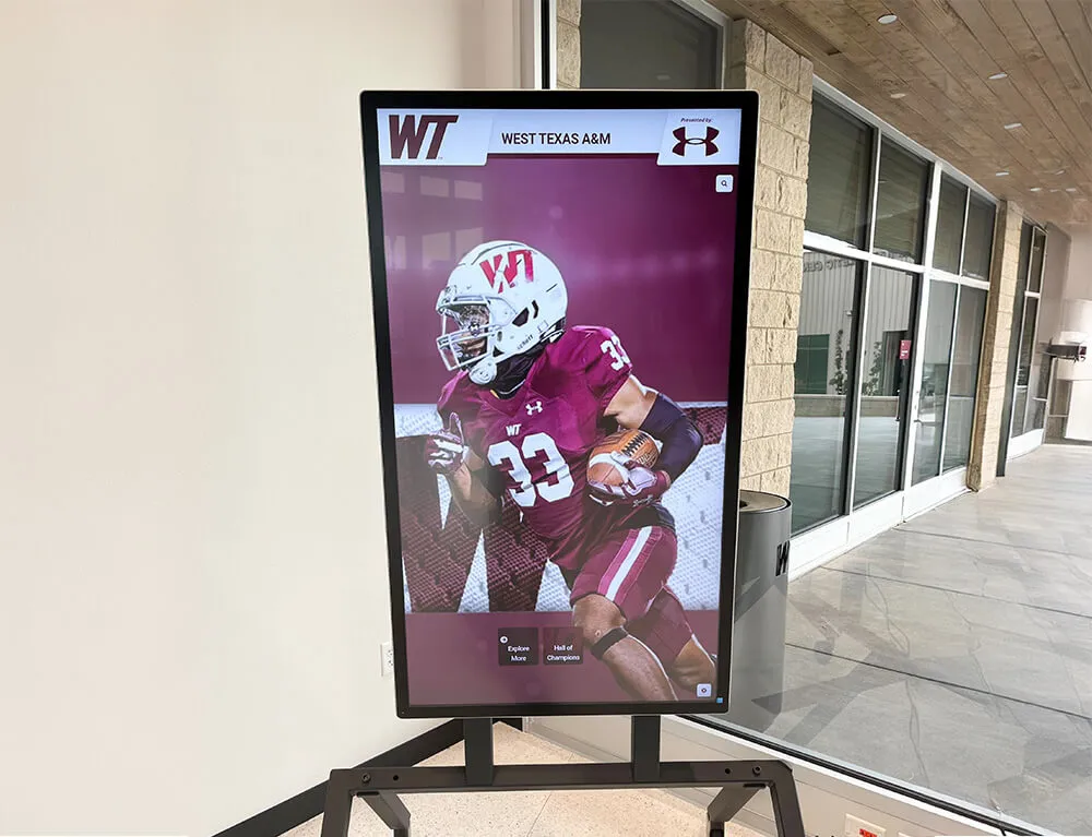
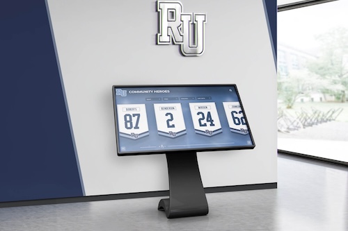
Recognition displays showing athlete portraits, school color backgrounds, and award photography require color accuracy at typical viewing distance — a Delta E acceptance test confirms the display's output matches the program's visual standards before the screen goes live
Why Delta E Matters for School Recognition Displays
Color accuracy is an engineering concern for broadcast monitors, a design concern for print prepress workflows, and a daily frustration for anyone who has ever printed a poster that looked different from the screen. For school recognition displays, it is something more specific: a fidelity concern for the archival record. The photographs, award images, and event video that recognition programs display were produced with the intention of faithful color reproduction. When a display renders those images with systematic color error, it misrepresents the record it was installed to honor.
The Delta E metric makes this problem measurable rather than subjective. A complaint of “the colors look off” is difficult to evaluate, prioritize, or track over time. A documented Delta E measurement at the school’s primary color target—showing, for example, that the display renders the school’s navy blue at ΔE 7.3 from the reference—gives the installer a specific failure, a corrective target, and a post-correction verification point. The same measurement taken after adjustment confirms whether the correction brought the display within acceptance range, and the documented baseline supports annual calibration reviews years later.
Academic recognition programs that span athletics, academics, and donor engagement depend on visual consistency across all content categories. School colors appear in every category—athletic award backgrounds, honor society display templates, donor recognition header graphics—so a primary-color Delta E failure affects every content type on the display, not only athletic photography. Catching and correcting it during acceptance testing rather than after public use prevents a systematic visual error from becoming the first impression of an entire recognition program.
Understanding Delta E: Reading the Numbers
Before running any test, understanding what Delta E values mean in practice helps staff correctly interpret results and prioritize corrective action.
Delta E is expressed as a single number representing the straight-line distance between two color points in a three-dimensional color space. The color space most commonly used for display evaluation is CIELAB (also written CIE L*a*b*), which organizes colors along three axes: L* (lightness from black to white), a* (green to red), and b* (blue to yellow). A Delta E calculation takes the coordinates of a reference color and a measured color in this space and returns the Euclidean distance between them. Because CIELAB was designed to approximate human perceptual uniformity—equal numerical distances correspond approximately to equal perceived differences across the color space—Delta E values translate directly into practical statements about what observers will see.
| Delta E Range | Perceptual Description | Relevance for Recognition Displays |
|---|---|---|
| 0–1 | Imperceptible difference | Exceeds recognition display requirements; typically achievable only with instrumented calibration |
| 1–2 | Perceptible only to trained observers under controlled side-by-side comparison | Excellent; acceptable for any recognition display application |
| 2–3 | Perceptible to trained observers; may not be noticed in normal viewing | Acceptable for most recognition display installations |
| 3–5 | Noticeable to most observers; borderline acceptable | Marginal — document and flag for correction; acceptable for secondary content, not school primary color |
| 5–8 | Obvious color difference under normal viewing conditions | Fail — corrective adjustment required before acceptance |
| Above 8 | Large color difference; readily visible to any observer | Fail — significant adjustment or hardware investigation required |
The threshold values above are practical guidelines for recognition display applications, not industry-wide standards. Different applications use different thresholds: medical imaging displays are held to ΔE less than 1 requirements; commercial print proofing monitors target ΔE less than 2; general commercial signage may accept ΔE up to 5 or 6. For recognition displays in schools—where school colors have brand significance, athlete portraits carry reputational weight, and award photography should convey prestige—a practical acceptance threshold of ΔE less than 3 averaged across the primary test targets (school color, skin tone reference, white point) provides a meaningful quality gate without requiring broadcast-grade hardware or professional calibration equipment.
One important caveat: standard Delta E formulas (ΔE*ab, the original 1976 formulation) and improved versions (ΔE*94 and ΔE 2000, which weight hue, chroma, and lightness differences differently to better match human perception) produce different numerical results for the same color pair. Colorimeter software typically specifies which formula it uses. When comparing measurements taken by different instruments or at different times, confirm that the same formula is applied consistently. For visual acceptance tests without instrumentation, the formula distinction is irrelevant—the test compares the screen’s output against a physical reference by eye, without numerical calculation.
Step-by-Step: Running the Recognition Display Delta E Color Accuracy Test
This procedure covers two parallel paths: a visual-only path that requires only printed color references (suitable for any school with access to a color printer and the school’s brand standards), and an instrumented path that adds a colorimeter for numerical ΔE measurement. Complete the pre-check steps before either path. Budget 20 to 30 minutes for the visual path; allow an additional 20 to 30 minutes for the instrumented path if a colorimeter is available.
Pre-Check Steps
Power the display on and allow at least 20 minutes of warm-up before testing. Panel color temperature and backlight output shift during the first 15 to 20 minutes of operation. Measurements taken before stabilization do not reflect operational conditions. If the display was cold-started for the test, allow the full warm-up time before beginning any color comparisons.
Confirm the display’s input signal source and color space settings. Navigate to the display’s OSD and confirm it is receiving the signal from the same input channel and at the same resolution it will use in production. Verify that the display’s color space setting is appropriate for the signal source: most recognition platforms output sRGB content, which pairs correctly with an sRGB or Standard color preset on the display. A display set to a Wide Color Gamut, Vivid, or Cinema color mode will render sRGB content with exaggerated saturation, producing Delta E failures on nearly every measured target.
Document the display’s current preset settings before making any adjustments. Record the color preset name, color temperature setting, individual RGB gain values if shown, and any saturation or hue offset controls. This documentation is the before-state baseline. If adjustment is needed during the test, you will adjust from this baseline; if adjustment is not needed, the documented settings become the acceptance record.
Prepare your reference materials. For the visual path, you need: a printed copy of the school’s primary color in a patch large enough to hold against the display (at least 3 inches square), a calibrated skin tone reference photograph printed on a color-managed printer at standard indoor viewing illumination, and a neutral white reference (a blank sheet of the same printer paper used for the school’s letterhead is adequate). For the instrumented path, you additionally need a colorimeter with its accompanying software loaded on a laptop, and a set of software-generated color targets on screen matching the manufacturer’s measurement workflow.
Visual Path: Color Comparison Without Instrumentation
Display the school’s primary color as a full-screen solid color block. Use the recognition platform’s content system, a presentation file, or a browser window to fill the display with a solid block rendered at the school’s official digital color values (the RGB or hex code from the school’s brand standards document). If brand standards specify only Pantone or CMYK values, convert to sRGB using a color conversion reference—most graphic design tools and online converters provide this conversion accurately enough for a visual test. Hold the printed color reference patch against the display surface at arm’s length and compare the two colors under the actual ambient lighting of the installation space.
Evaluate the school color comparison. Observe whether the display’s rendered color and the printed reference differ in hue (the color appears to be a different color—bluer navy vs. more purple navy), chroma (the color appears more or less saturated—a vivid print vs. a dull screen), or lightness (the color appears lighter or darker on screen than in print). A large hue difference is the most noticeable and most critical failure: if the display’s version of the school color has shifted toward a different hue family (navy that appears purple, cardinal that appears orange, forest green that appears teal), the display will misrepresent school branding on every piece of recognition content. Record the comparison as Pass (no visible difference at normal viewing distance), Marginal (slight difference visible only under direct side-by-side comparison), or Fail (visible difference at normal viewing distance).
Display the skin tone reference image and evaluate athlete portrait rendering. Display a photograph of an athlete or recognized individual—ideally from the school’s actual recognition program content library—and compare the portrait rendering against the printed reference photograph of the same image. Evaluate skin tone accuracy: does the display version appear warmer (orange-shifted), cooler (blue-shifted), or with reduced chroma compared to the print? Evaluate shadow and highlight rendering: do dark uniform areas and bright face highlights match the print’s tonal rendering at typical viewing distance? Record each dimension as Pass, Marginal, or Fail.
Display a white field and evaluate white point and neutral gray rendering. Fill the display with a solid white field (RGB 255, 255, 255) and observe its color temperature compared to the neutral white reference sheet held adjacent to the screen. A warm white (visibly yellow or cream compared to the paper) indicates the display’s color temperature is set below 6500K. A cool white (visibly blue compared to the paper) indicates the setting is above 6500K. Neither extreme is necessarily a failure—some installations benefit from warmer or cooler whites depending on ambient light and content type—but a visible warm or cool cast that differs from the school’s print materials indicates a mismatch that may affect all content rendered on the screen. Record as Pass, Marginal, or Fail based on whether the mismatch is visible at typical viewing distance.
Display award photography and evaluate metallic and color-critical rendering. Display a photograph of a championship trophy, gold medal, or award plaque from the recognition program’s content library. Evaluate whether the metallic tones (gold, silver, brass) appear as distinct, natural-looking metal colors or whether they have shifted toward other hue families. Gold trophies should appear distinctly yellow-gold, not orange, bronze, or tan. Silver trophies should appear cool-neutral, not blue, green, or warm-gray. Record as Pass or Fail.
Instrumented Path: Colorimeter Measurement
Connect the colorimeter and launch measurement software according to the manufacturer’s workflow. Position the colorimeter against the display surface at the center of the screen. Most colorimeters include a suction cup or fixture that holds the sensor against the panel; use this rather than hand-holding, as position variation affects measurements. Ensure the ambient light is at its normal operational level—testing with ambient light blocked produces results that do not reflect the display’s real-world color output.
Measure the display’s white point and record color temperature and ΔE from D65 reference. The D65 standard illuminant (6500K daylight) is the widely adopted reference white for sRGB content. Most colorimeter software will measure the white point, report the color temperature in Kelvin, and calculate ΔE from D65. A measurement within ΔE 3 of D65 at the school’s typical operating color temperature preset is acceptable for recognition displays. Values above ΔE 5 from D65 indicate a significant white point error that will cascade through all color measurements—correct the color temperature setting before proceeding.
Measure the display’s rendering of the school primary color and record ΔE. Display the school’s primary color as a full-screen solid block at its official sRGB values. Measure at the center of the screen. The software will compare the measured color to the target reference value you enter (the school’s official sRGB values) and report ΔE. Record this value. Repeat for the school’s secondary color if applicable. A ΔE below 3 passes. ΔE 3–5 is marginal and should be noted in the acceptance record. ΔE above 5 fails and requires corrective adjustment.
Measure a standard skin tone reference and record ΔE. Display a standard skin tone target patch—many colorimeter software packages include an IT8 or Macbeth ColorChecker target that includes multiple skin reference patches. Measure the dark-skin and medium-skin reference patches. Record ΔE for each. Skin tone accuracy is a particularly sensitive indicator of display color accuracy because the eye is well-tuned to detect errors in familiar human colors.
Measure a near-black and near-white reference and record ΔE. Display near-black (RGB 16, 16, 16) and near-white (RGB 240, 240, 240) neutral targets. Measure each. Shadow and highlight neutrality—confirmed when near-black and near-white patches measure as neutral gray without visible color cast—is essential for archival photography rendering.
Average the ΔE values across all targets and compare to the acceptance threshold. A display that passes the instrumented test should show an average ΔE below 3 across all measured targets, with no individual target above ΔE 5. If any individual target fails, adjust the display’s relevant color controls (color temperature for white point errors; individual RGB gain for specific hue or chroma errors; saturation for overall chroma failures) and re-measure. Continue until all targets pass or until it is clear that display-level adjustment cannot bring the display within the acceptance range.

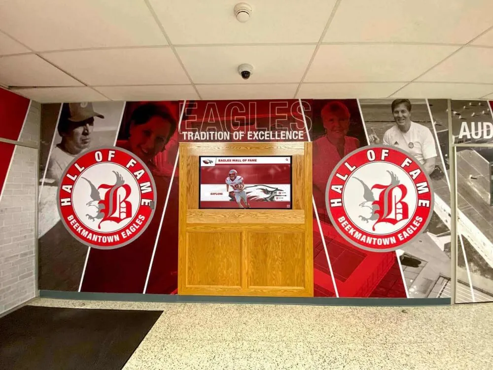
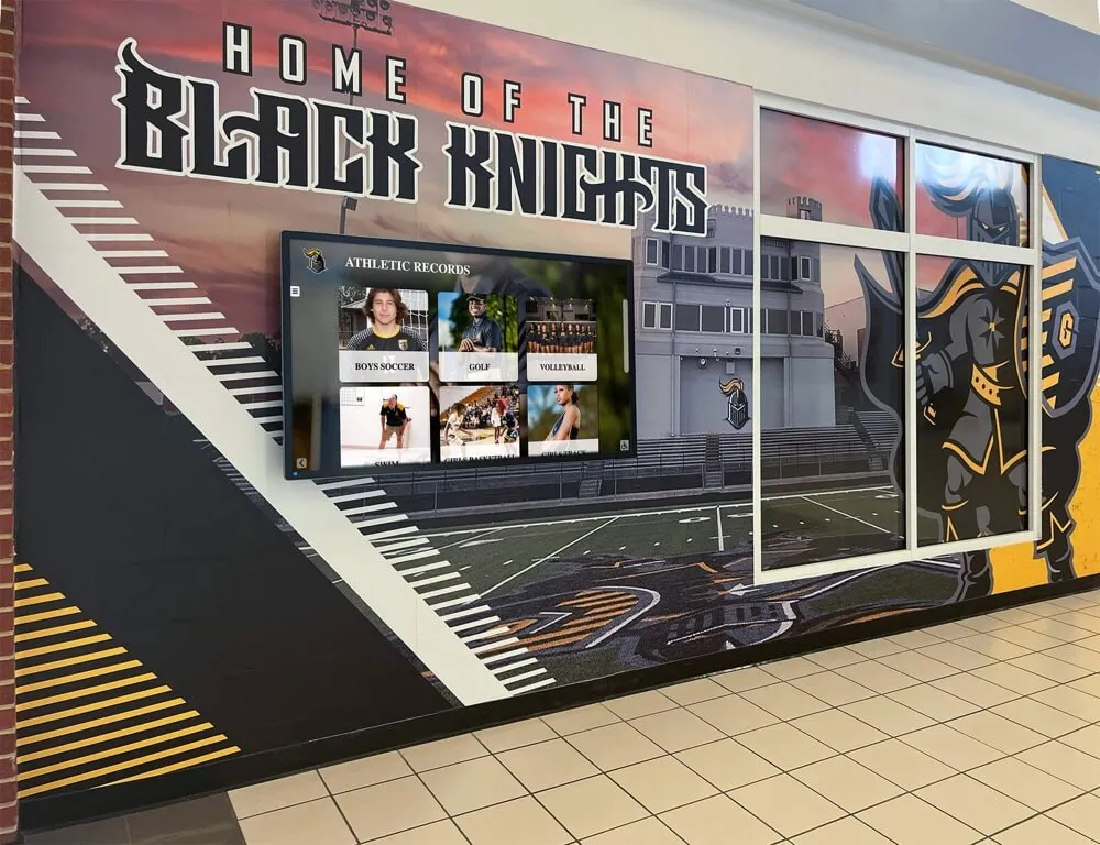
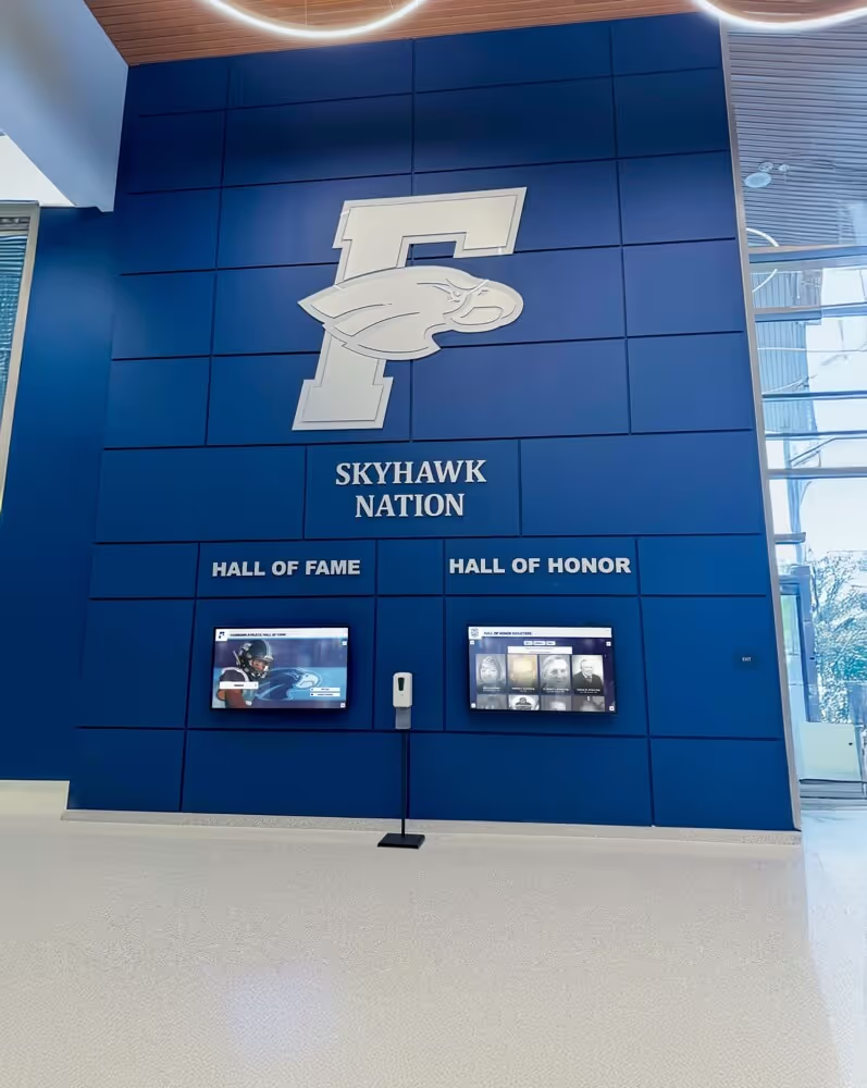
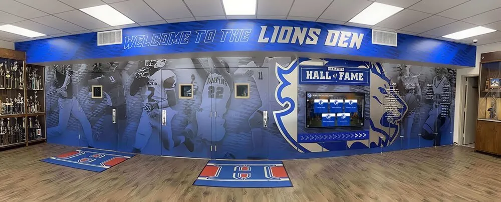
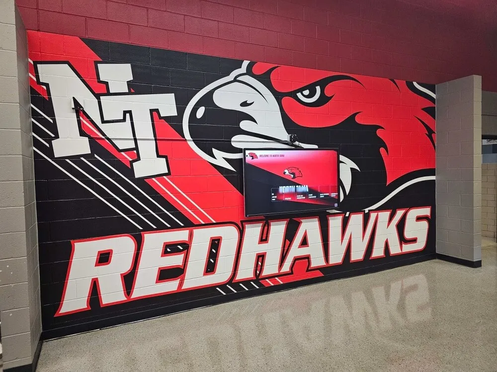
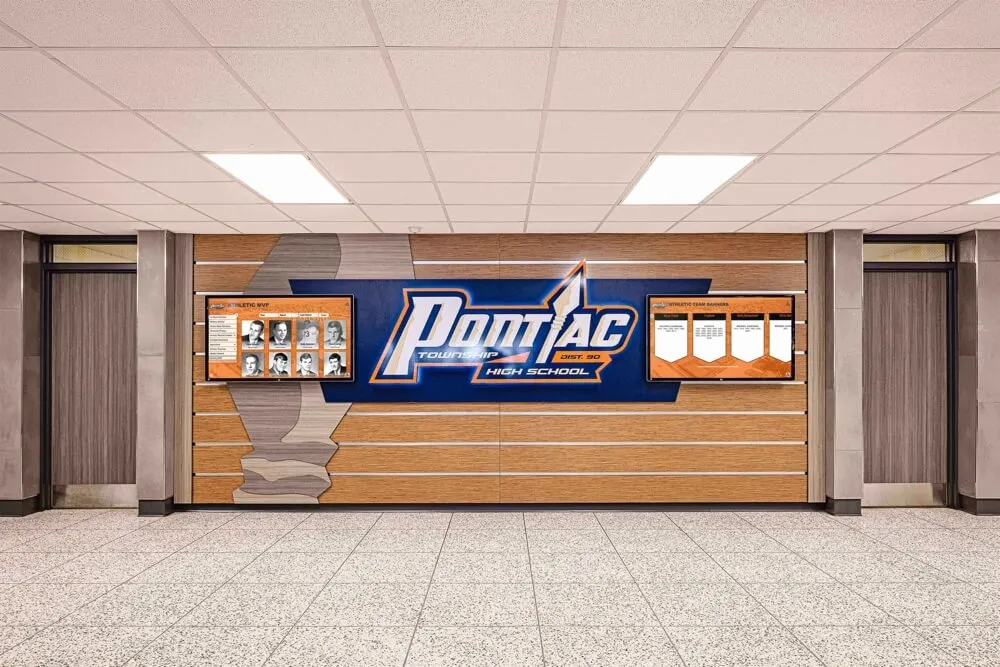
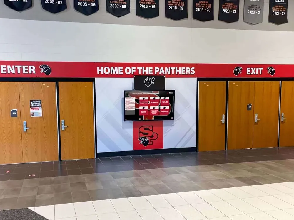
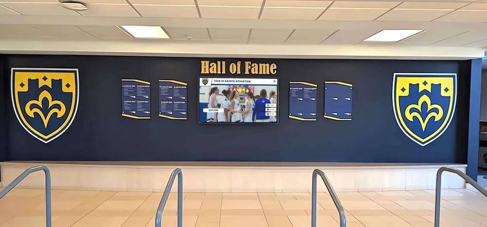
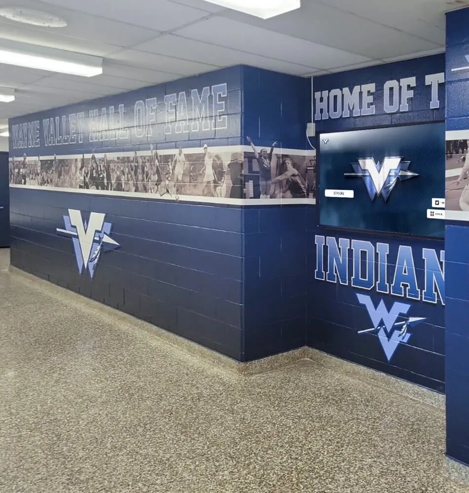
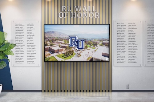
Recognition displays installed alongside physical hall-of-fame wall graphics and printed team signage are immediately compared by visitors — Delta E color accuracy failures are most apparent when a digital screen and a physical print reference are visible simultaneously
The Pass/Fail Acceptance Log
Record each test result in the log below before accepting the display. All Pass results are required for acceptance. Marginal results must be documented; they do not block acceptance but must be noted in the asset register. Any Fail result requires corrective adjustment and re-test before acceptance.
| Test Target | Method | Observation | ΔE Result (if measured) | Result | Action Required |
|---|---|---|---|---|---|
| School primary color — hue accuracy | Visual and/or instrumented | Color on screen compared to printed swatch or brand reference | — | Pass / Marginal / Fail | If Fail: adjust individual RGB gain controls targeting hue shift direction; re-test |
| School primary color — chroma accuracy | Visual and/or instrumented | Saturation level compared to reference | — | Pass / Marginal / Fail | If Fail: adjust saturation control; re-test |
| School secondary color | Visual and/or instrumented | Color on screen compared to printed swatch | — | Pass / Marginal / Fail | If Fail: same corrective action as primary color |
| White point — color temperature | Visual and/or instrumented | White field compared to neutral paper reference; measured vs. D65 | — | Pass / Marginal / Fail | If Fail: adjust color temperature preset toward 6500K; re-test |
| Skin tone — warm reference | Visual and/or instrumented | Athlete portrait skin rendering vs. calibrated print | — | Pass / Marginal / Fail | If Fail: adjust red and green gain; re-test |
| Skin tone — cool reference | Visual and/or instrumented | Rendering of lighter skin tones vs. calibrated print | — | Pass / Marginal / Fail | If Fail: adjust blue gain; re-test |
| Award photography — metallic tones | Visual | Trophy or medal gold vs. print reference | — | Pass / Fail | If Fail: adjust color temperature and individual RGB gain; re-test |
| Near-black neutrality | Visual and/or instrumented | Near-black patch appears neutral gray, no color cast | — | Pass / Marginal / Fail | If Fail: adjust individual RGB black level controls; re-test |
| Near-white neutrality | Visual and/or instrumented | Near-white patch appears neutral gray, no color cast | — | Pass / Marginal / Fail | If Fail: adjust color temperature or RGB gain; re-test |
| Platform content — school template colors | Visual | Recognition platform home screen, hall-of-fame template, and award display template reviewed against reference screenshots | N/A | Pass / Fail | If Fail: check platform color space settings; re-evaluate display color preset |
| Average ΔE across all instrumented targets | Instrumented only | Average of all ΔE measurements | — | Pass (below 3) / Fail (3 or above) | If Fail: identify highest individual target; correct and re-measure |
| Maximum individual ΔE | Instrumented only | Highest single target ΔE value | — | Pass (below 5) / Fail (5 or above) | If Fail: targeted correction for failing color; re-measure |
When Visual Checks Are Enough
The visual comparison path described above requires no specialized equipment beyond a color printer and the school’s brand standards document—resources that most schools already have. Visual checks are sufficient for a meaningful acceptance decision in several circumstances.
Secondary installations in lower-visibility spaces. A display in a team equipment room, a locker-room hallway accessed only by student athletes, or an auxiliary storage corridor does not face the same scrutiny as a main lobby installation. For displays where the primary audience is internal and not making comparison judgments against print materials in the same space, a visual check that identifies only large, obvious color failures (Delta E values that would score well above 5 under measurement) is proportionate to the installation context.
Installations where physical print materials are not adjacent. When a recognition display operates in isolation—mounted in a space where no printed materials with school colors, no physical trophies, and no competing color references are in the viewer’s visual field simultaneously—visual errors that would be immediately apparent in a side-by-side comparison may not be noticeable in daily use. A display that passes a visual check in isolation may have a Delta E of 4 or even 5 at the school color target and still produce a result that most visitors would not notice.
Budget-constrained acceptance timelines. When the display installation is part of a facilities project with limited IT staff time for commissioning, a structured visual check that produces a documented Pass/Marginal/Fail record for each major target is significantly more useful than no acceptance test at all. A visual check that catches a severe white-point error (the display rendering everything with a warm yellow cast) or a primary-color hue shift (school navy appearing purple) will prevent the most noticeable failures, even if it cannot detect marginal ΔE failures in the 3–5 range.
The visual path is not an approximation of the instrumented path—it is a different test with different detection sensitivity. Visual checks reliably detect ΔE failures above approximately 5; they may detect failures in the 3–5 range under favorable conditions (close comparison, appropriate reference material, experienced observer), but they cannot produce the numerical record that a colorimeter measurement provides. For schools where accurate school color rendering is a meaningful quality requirement—and the academic achievement award displays and recognition installations that serve donors, accreditation reviewers, and community events certainly qualify—the visual check establishes a minimum standard, not a ceiling.
When a Colorimeter Is Worth the Effort
A colorimeter adds instrument cost (hardware ranges from professional-grade devices at several hundred dollars to consumer-grade colorimeters significantly below that) and measurement time to the acceptance workflow. The investment is justified in circumstances where the visual path’s detection sensitivity is insufficient.
High-visibility lobby and event space installations. A recognition display in the main athletic lobby, the entrance to a new gymnasium, or a space used for induction ceremonies and community events will be viewed by hundreds of alumni, donors, and community members who will compare the screen’s rendering against physical materials in the same space. The delta between ΔE 3 (passing visual check in many conditions) and ΔE 7 (obvious color error under any observation) represents the difference between a display that honors the recognition program and one that quietly undermines it. For installations with this visibility level, a colorimeter measurement provides the confirmation that a visual check cannot.
Multi-screen installations requiring consistency documentation. When a school deploys recognition displays across several locations—a main lobby kiosk, an athletics hallway installation, a gymnasium entrance display—color consistency across screens is a quality requirement that visual comparison cannot verify numerically. A visitor who encounters the same athlete’s portrait on three different screens in the same building and perceives different school colors or skin tones on each screen notices the inconsistency even without knowing its cause. Colorimeter measurements at each display, using the same color targets and reference values, produce a documented consistency record: the acceptable ΔE variation between displays, the corrective adjustments made to each panel, and the baseline values for annual calibration reviews.
Instrumented measurements as part of formal vendor acceptance. When a recognition display installation is part of a larger facilities project with vendor contractual requirements, a numerical ΔE acceptance threshold in the contract scope is enforceable only when measurement methodology is specified. A contract that requires “accurate color rendering” is unenforceable; a contract that specifies “ΔE less than 3 averaged across the school primary color, D65 white point, and standard skin tone reference targets as measured by [specified colorimeter model or equivalent]” gives both parties a defined acceptance criterion. For athletic directors and facilities managers accepting display installations as part of capital renovation projects, interactive athletic hall of fame display tools that combine hardware and software delivery under a single vendor relationship benefit from this specificity in the acceptance scope.
Post-firmware-update verification. Display firmware updates occasionally change color processing pipeline behavior in ways that shift factory calibration. A display that passed acceptance testing at installation may render school colors differently after a firmware update, even if all OSD settings appear unchanged. An instrumented measurement after any firmware update catches this shift early; a visual check may miss the ΔE 1–3 shift that a firmware update typically produces.
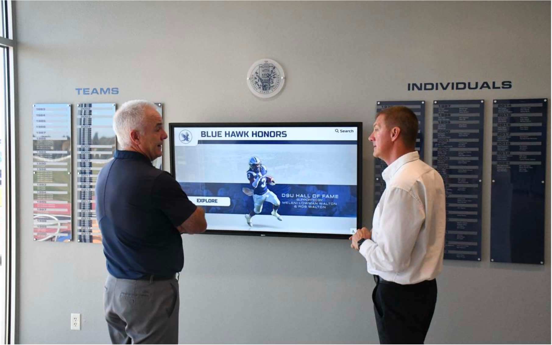
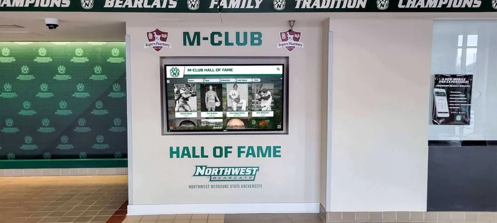
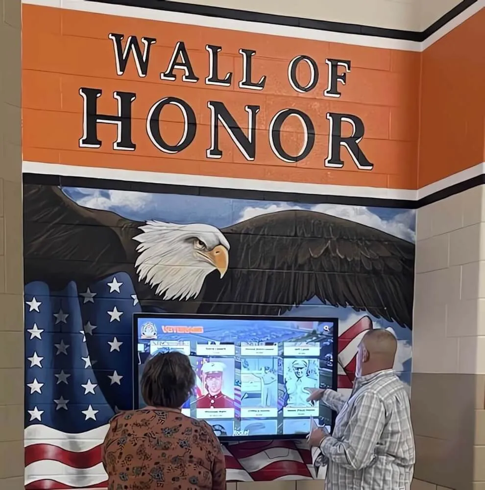
Side-by-side review of the display against physical reference materials is the most reliable visual acceptance method — having two observers compare color rendering at typical viewing distance catches failures that a single observer might discount
Common Color Accuracy Failures in School Recognition Environments
Factory Vivid or Dynamic preset active at delivery. Commercial displays shipped to schools frequently arrive with a factory preset intended to appear vivid and attention-grabbing on a showroom floor with bright ambient lighting and marketing content designed to exploit high saturation. The Vivid or Dynamic preset boosts saturation, often raises color temperature toward cooler blue-white, and applies picture enhancement processing that systematically shifts color away from accuracy. This preset produces Delta E failures above ΔE 5 on nearly every color target. Changing the preset to sRGB or Standard before running any other test is the single most important corrective step for most new installations.
Color temperature set to Warm for “natural” appearance. Some display installers set color temperature to the Warm preset because it appears more “natural” or “like print” compared to the cool-white showroom appearance. A display color temperature in the 5000K range (common for Warm presets) produces a visible yellow-cream cast on white fields, shifts all colors toward the warm end of the spectrum, and renders school colors that were designed for 6500K reference conditions with a systematic hue error. For recognition content produced in sRGB environments (the standard for web-based recognition platforms), a 6500K (D65) color temperature reference is the appropriate starting point.
Individual RGB gain controls out of balance. Some display installers or previous maintenance adjustments may have changed individual red, green, or blue gain controls without restoring them after the original adjustment purpose was accomplished. An elevated red gain produces warm, reddish skin tones and shifts school colors toward warmer hues. An elevated blue gain produces cool, bluish rendering and makes dark team colors appear more purple. An elevated green gain shifts neutral whites toward green and affects the rendering of skin tones and award photography backgrounds. Returning all three channels to their default gain values (usually 50 or 100 on a 0–100 scale) before beginning the acceptance test ensures the test is evaluating a neutral starting point.
Ambient light color temperature mismatch. A display that passes a visual check under cool fluorescent overheads may appear warm and yellowish when overhead lighting is switched to LED fixtures with a different color temperature. Conversely, a display calibrated under warm LED ambient light may appear cold in a space that uses cool-white overheads. The visual acceptance check must be conducted under the actual ambient lighting conditions at their normal daytime operating state. If the school is transitioning between lighting types during a facilities renovation, the display acceptance should be postponed until the final lighting environment is in place—or the display should be re-tested after the lighting transition is complete.
Display color processing applied on top of platform output. Some commercial displays apply proprietary color enhancement processing—labeled as “Color Enhancement,” “Natural Color Expert,” “Noise Reduction,” or similar—that adjusts the color of incoming content based on scene analysis. This processing can produce accurate rendering for some content categories while systematically distorting others: skin enhancement modes that warm portrait photography can shift athletic jersey colors toward orange; noise reduction modes that smooth gradients can remove tonal detail from shadow areas of award photography. All such enhancement features should be disabled for recognition display applications, where accurate content rendering is the goal rather than consumer entertainment optimization.
Multiple display panels from different production batches. Schools installing several identical display models across a recognition program may receive panels from different manufacturing batches that have inherent color variation at the panel level, even with identical OSD settings. Panel-to-panel variation within the same model can produce ΔE 2–4 differences in white point and primary color rendering without any OSD adjustment. When consistency across a multi-screen installation is a quality requirement, instrumented measurement of each panel and individual OSD adjustment per panel—rather than applying uniform settings across all displays—is the only way to achieve documented color consistency.
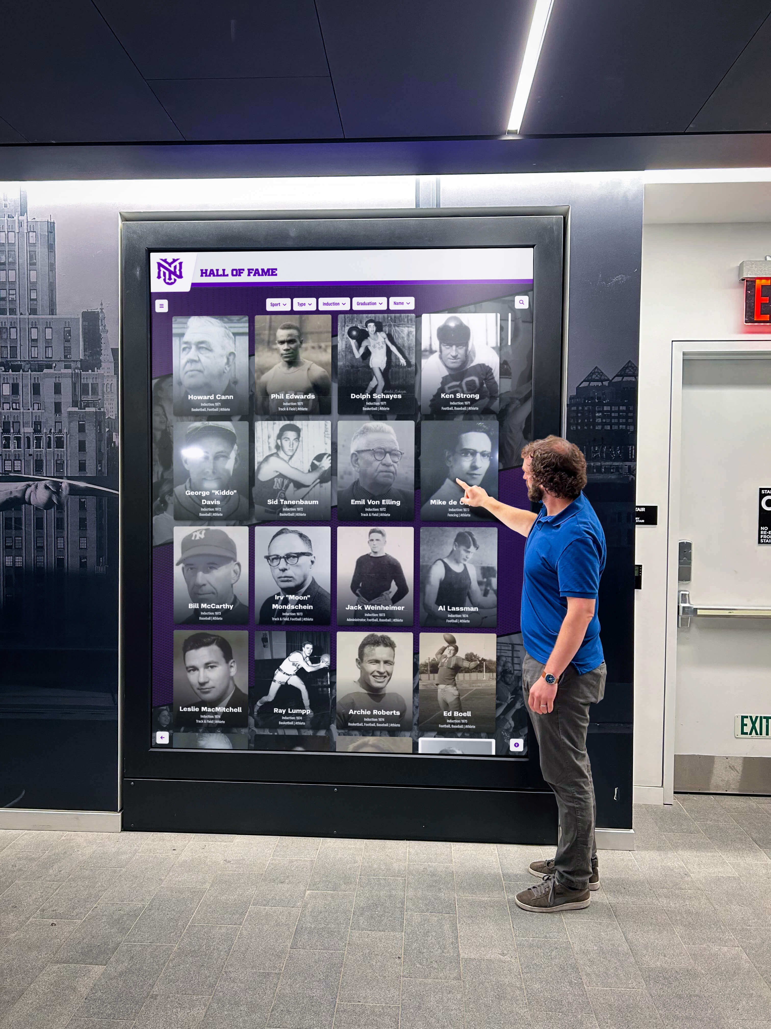
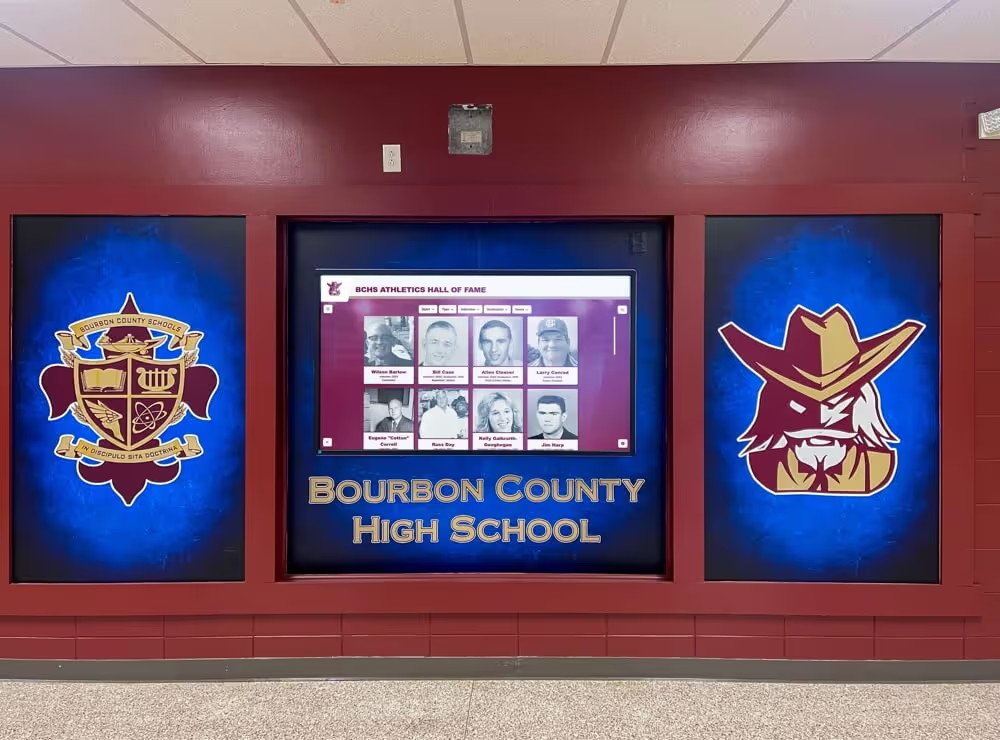
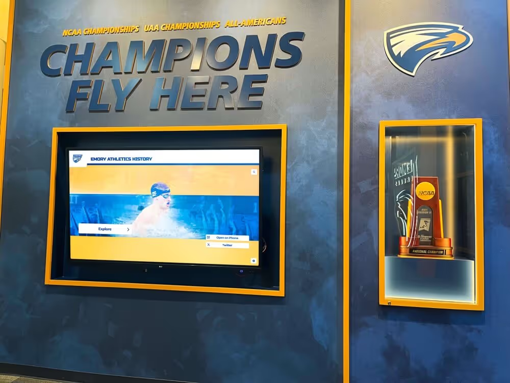
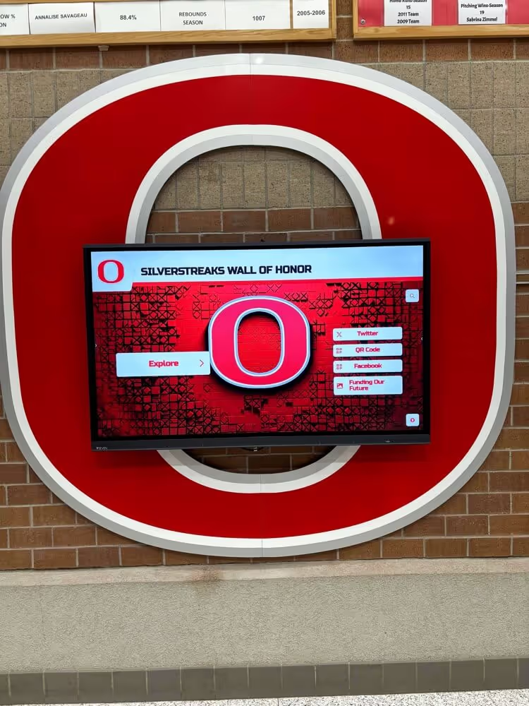
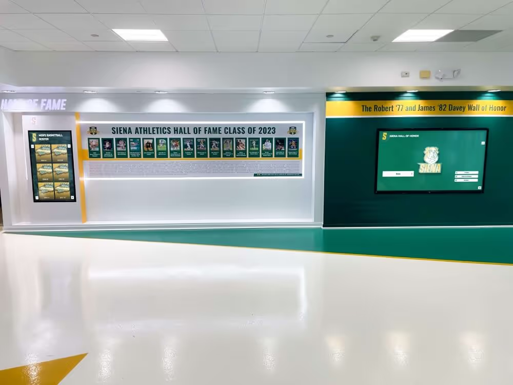
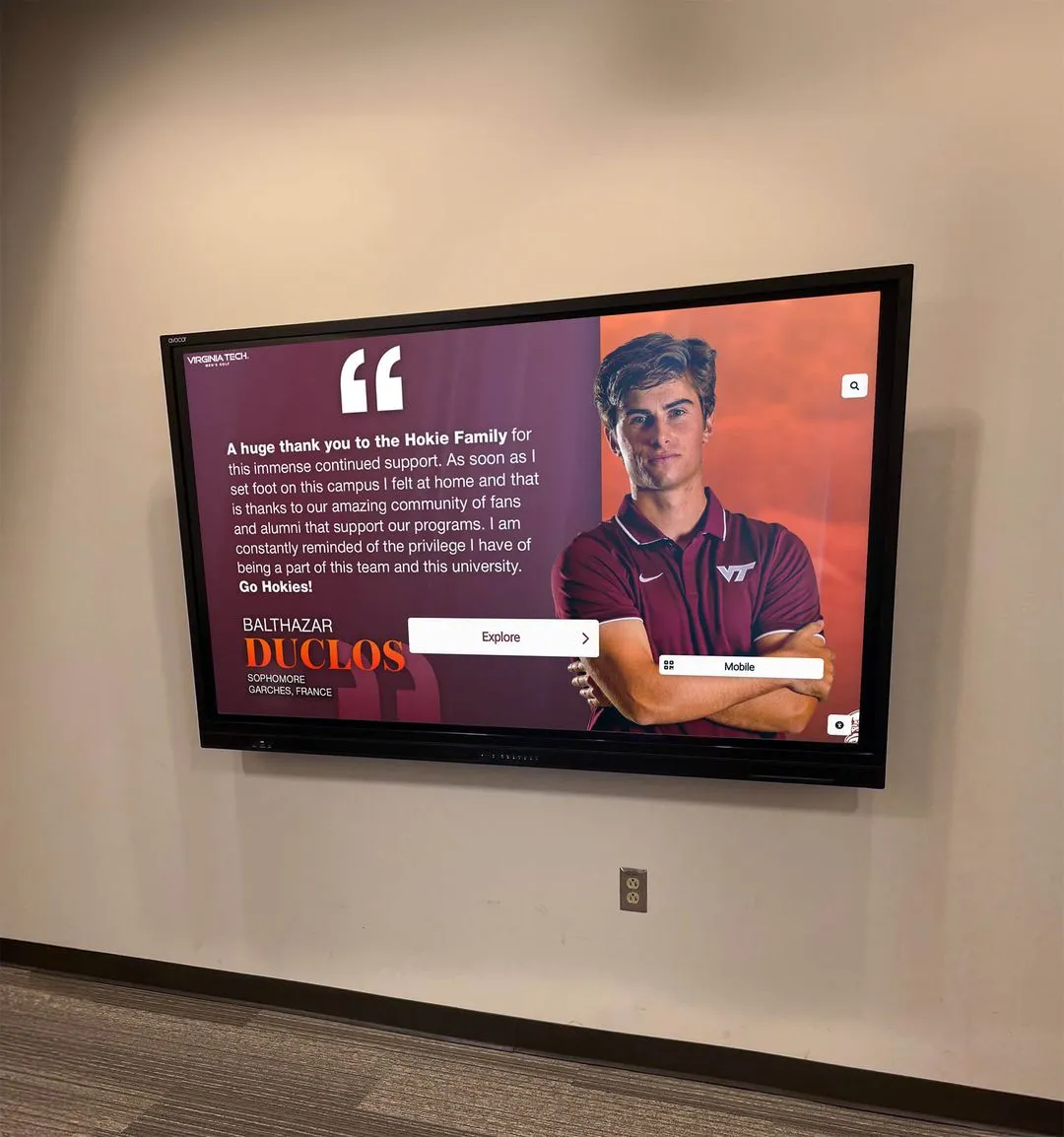
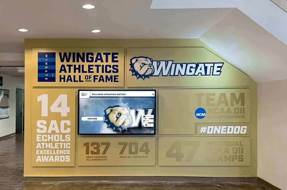
Visitor-facing recognition displays are judged against print materials, team colors, and physical trophies visible in the same space — a Delta E acceptance test confirms the display's color rendering holds up under the real-world conditions that matter most
Multi-Screen Color Consistency
Schools deploying recognition displays across multiple locations face a color calibration challenge that extends beyond the individual-screen acceptance test: ensuring that a visitor who encounters the same content on different screens throughout the building experiences recognizably consistent color rendering.
Multi-screen color consistency does not require identical OSD settings on every display. Different panels—even from the same manufacturer and model line—may require different OSD adjustments to reach the same visual result because of panel-to-panel manufacturing variation and differences in ambient lighting conditions at each installation location. A display in a south-facing lobby alcove with significant window light may require a higher backlight setting and a slightly cooler color temperature than an identical display in a north-facing corridor—but both should render the school’s primary color with a ΔE below 3 from the reference value.
The practical approach for multi-screen consistency:
- Complete the full Delta E acceptance test for the primary display—the one in the highest-visibility location—first, and document all settings and measurements as the reference baseline.
- For each additional display, complete the same acceptance test procedure independently, using the same reference materials and the same color target values.
- Compare results across displays: if the primary display measured ΔE 1.8 at the school primary color target and a secondary display measures ΔE 4.2 at the same target, the secondary display requires additional adjustment to match the reference display’s accuracy level.
- For instrumented testing across a multi-screen installation, recording the ΔE values in a shared acceptance log (a spreadsheet or maintenance tracking system) creates a consistency record that can be referenced during annual calibration reviews.
- If visual consistency between displays is the acceptance criterion—rather than absolute numerical Delta E from a reference—place both displays side-by-side (or use photographs taken at the same camera settings from the same position) to identify panels that diverge from the reference display’s rendering.
Schools that use interactive hall of fame touchscreens across multiple athletic and academic recognition spaces benefit from building multi-screen color consistency into the initial vendor acceptance scope rather than addressing each display individually after installation. Specifying that all displays in a recognition installation must render the school’s primary color within ΔE 2 of each other—regardless of absolute ΔE from a standard reference—is a practical consistency specification that holds vendors accountable for cross-unit variation.
How the Delta E Test Fits Into the Full Acceptance Protocol
The Delta E color accuracy test addresses a specific category of display quality failure: systematic color error that makes the rendered content look wrong compared to the original. It does not replace other acceptance tests that address different failure categories.
A recognition display that passes the Delta E test but has not been evaluated for gamma calibration may render colors accurately at mid-tone levels while crushing shadow detail or clipping highlight detail—a common failure in displays with aggressive contrast enhancement settings. Accurate colors on a display with severe gamma errors will produce recognition photography that looks correctly colored but tonally distorted: athlete jerseys that render with accurate hue but without fabric texture detail, or trophy photography with accurate gold color but without the reflective surface detail that makes the trophy visually compelling.
Similarly, a display that passes Delta E testing but has not been evaluated for white uniformity may render colors accurately at the center of the screen while showing visible color shifts toward the edges or corners—a failure mode common in backlit LCD panels with uneven backlight distribution. Athlete portraits or award photography spanning the full screen width may appear accurately colored at center and noticeably shifted in hue at the edges.
The best touchscreen platforms for school recognition programs provide content delivery pipelines that preserve accurate color rendering from the source image through to screen display—but even a well-designed platform cannot compensate for systematic display hardware color error. The Delta E acceptance test verifies the hardware foundation that all platform content rendering depends on.
For a complete recognition display acceptance protocol, the Delta E test should be run alongside gamma calibration, uniformity evaluation, and—where local dimming is present—the local dimming performance test. Each test addresses a distinct display characteristic; together they confirm that the display is ready to serve the recognition program’s content faithfully.
Frequently Asked Questions
What is the difference between a Delta E test and a color calibration for a recognition display?
A Delta E test is an acceptance evaluation that measures how far the display’s current color output deviates from a reference target—it tells you whether the display passes or fails a color accuracy standard. A color calibration is a corrective procedure that adjusts the display’s color output to reduce Delta E errors—it produces an accurate display from an inaccurate one. Running a Delta E test is how you determine whether calibration is needed and whether calibration has succeeded. For recognition displays, the typical workflow is: run a Delta E test, identify failures, apply OSD adjustments, and re-test until the display passes. Schools with access to a colorimeter can document this workflow with numerical measurements; schools using the visual path document it with recorded observations at each test target.
Can we rely on the display vendor’s factory calibration and skip the acceptance test?
No. Factory calibration data, when provided, documents the display’s color accuracy as measured under factory conditions—controlled temperature, neutral ambient light, a specific signal source, and fresh-from-production hardware. By the time a display has been shipped, stored, installed in a school lobby with ambient daylight, connected to a school network signal source, and configured with the settings an installer applied, factory calibration data no longer represents the display’s actual performance. A display that left the factory at ΔE 1.5 may arrive in the school at ΔE 6 due to any combination of color temperature preset, installer OSD adjustments, and ambient light conditions. The acceptance test verifies performance in the actual deployment environment, not factory conditions.
Our school colors are only defined as a Pantone number. How do we convert to a screen reference for the Delta E test?
Pantone colors are defined as physical ink formulations and have documented sRGB approximate equivalents that are suitable as visual reference targets on screen. Pantone publishes sRGB values for its standard colors; these are also available through most graphic design software applications and brand standards resources. Use the sRGB equivalent for your school’s Pantone color as the reference value in the instrumented test. Note that Pantone-to-sRGB conversions are approximations, not exact equivalents—the CMYK ink gamut includes colors that fall outside the sRGB display gamut, and those out-of-gamut colors cannot be represented exactly on any sRGB display regardless of calibration. For the acceptance test, the relevant question is whether the display’s rendering matches the sRGB reference value, not whether the display can reproduce a physical Pantone chip exactly.
Do we need to repeat the Delta E acceptance test after a display firmware update?
Yes, if the firmware update changes the display’s color processing pipeline. Firmware updates can reset OSD settings to factory defaults, change how color space metadata is interpreted, or modify built-in color enhancement algorithms—any of which can shift the display’s measured color output without changing any visible OSD setting. After any firmware update, run at minimum the school primary color visual comparison and, if a colorimeter is available, the white point and primary color ΔE measurements. If both pass with the same results as the acceptance baseline, the firmware update did not affect calibrated color. If either fails, re-calibrate using the acceptance test procedure and document the new settings.
How often should we repeat the Delta E test on a display already in service?
Annual visual comparison reviews are appropriate for most recognition display installations. Panel backlight aging shifts white point and effective gamma over time, which can gradually introduce color accuracy drift—but display hardware typically does not change fast enough to warrant more frequent testing. A practical annual review consists of the school primary color visual comparison and the white point evaluation; a full instrumented re-test is warranted only if annual review identifies a change from the acceptance baseline. Additionally, repeat the full test after any display relocation (ambient lighting conditions change), any significant change to the installation’s ambient lighting (new fixtures, changed window treatments), or any OSD settings reset.
What should we do if the display fails the Delta E test and OSD adjustment cannot bring it within the acceptance range?
If all available OSD adjustments—color temperature preset, individual RGB gain controls, saturation, and any color management settings—cannot bring the display’s primary color rendering within the acceptance threshold, escalate in three steps. First, confirm with the display manufacturer’s technical support that all available color adjustment controls have been utilized; some commercial displays have secondary color management menus not accessible from the standard OSD that allow finer adjustment. Second, investigate whether the display’s color accuracy failure is consistent across all measurement positions on the panel or whether it is concentrated in a specific area—a failure concentrated at center may indicate a defective backlight segment or a local panel defect that warrants a warranty service request. Third, if full-panel ΔE failure persists after all available adjustment and the display is within its warranty period, file a warranty claim citing the specific ΔE measurements as evidence that the display does not meet its specification.
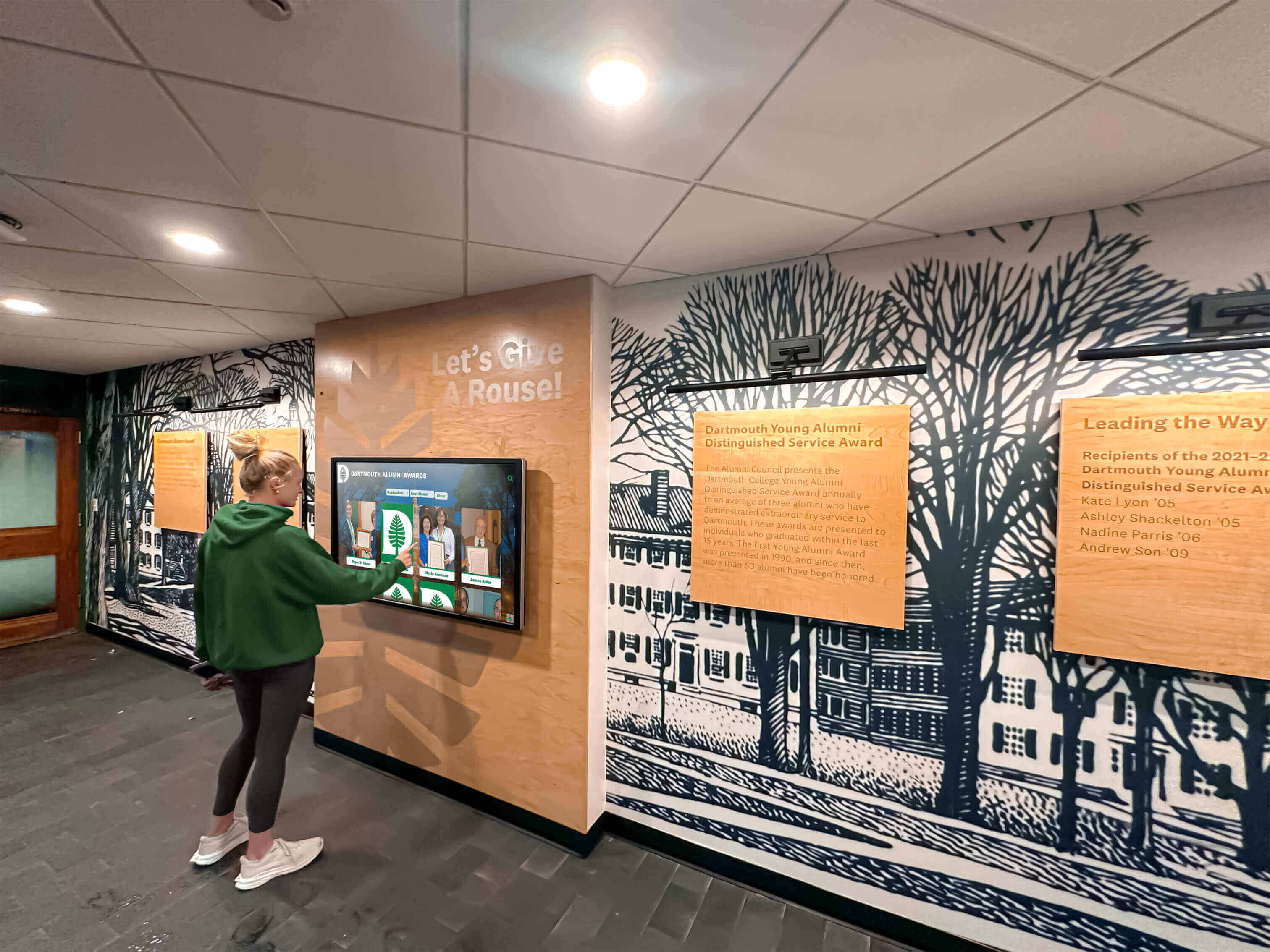
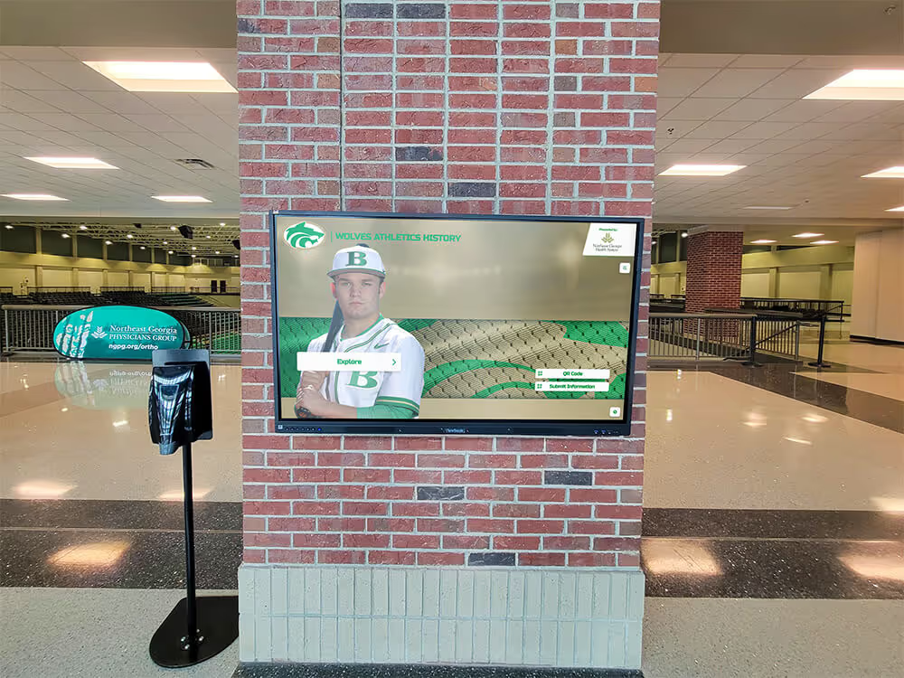
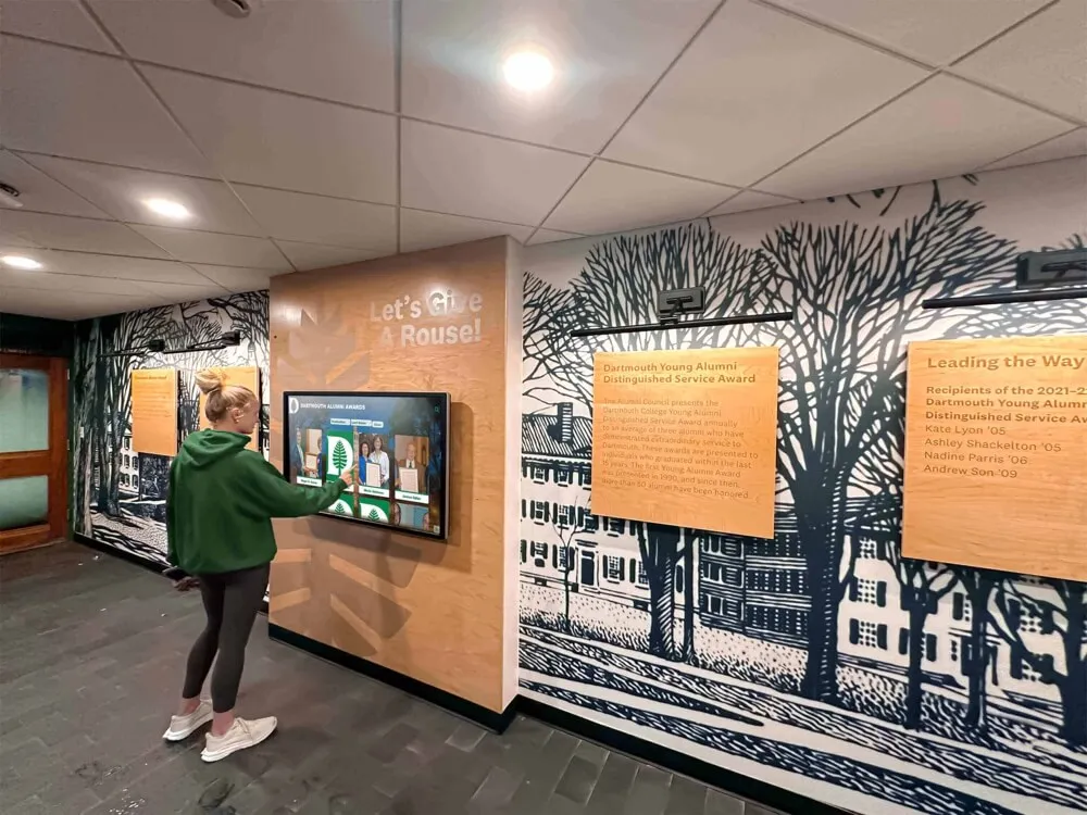
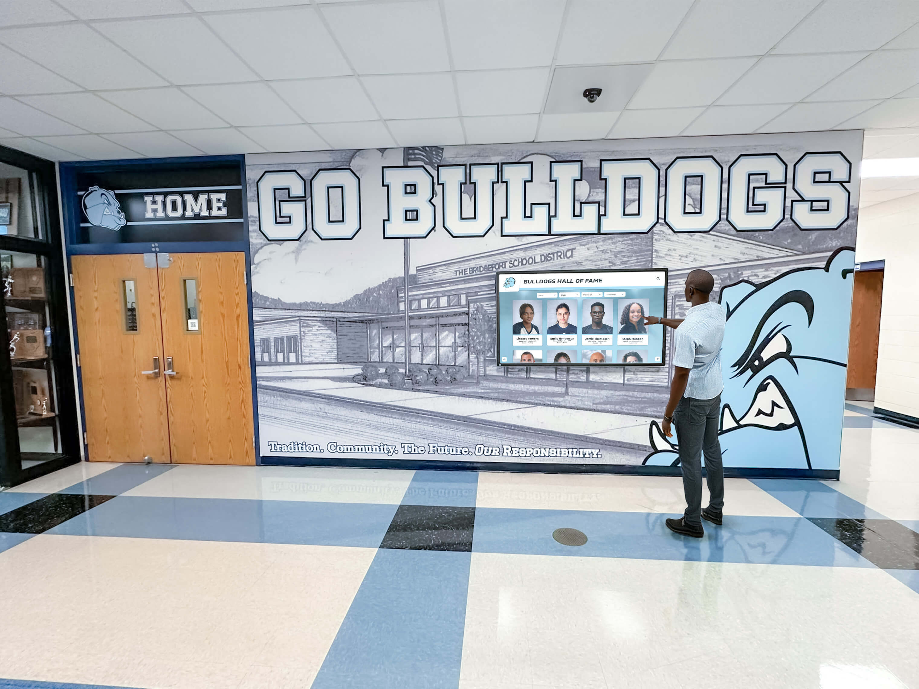
Students and alumni interacting with recognition displays throughout the year will encounter school colors, athlete portraits, and award photography on the same screen — the Delta E acceptance test confirms the display's color foundation before the recognition program depends on it
Scheduling Color Accuracy Reviews Into Recognition Program Operations
The Delta E acceptance test produces a one-time baseline. Maintaining that baseline over the operational life of a recognition display requires scheduling color accuracy reviews into the school’s recognition program maintenance calendar.
At installation acceptance: Complete the full visual or instrumented test before any content is loaded. Document all settings, print or file the comparison photographs, and record the acceptance date and tester in the display asset register.
After firmware or operating system updates: Any update that could change the display’s color processing pipeline requires at minimum the school primary color visual check. Re-run the full test if the visual check identifies any change from the acceptance baseline.
After environment changes: Changes to the installation’s ambient lighting—new overhead fixtures, added window treatments, switch from fluorescent to LED ambient sources—can make a calibrated display appear miscalibrated without any change to OSD settings. Repeat the visual check after any significant lighting change in the installation space.
Annual review: A brief visual comparison of school primary color, white point, and a representative recognition photograph against the acceptance baseline documents whether the display has drifted. If annual review passes, record the review date and note no change from baseline. If review identifies drift, complete a full re-test and adjustment cycle.
Before high-visibility events: Award ceremonies, induction events, alumni receptions, and donor recognition events bring audiences who will compare the display’s rendering against physical recognition materials—trophies, banners, printed programs—in the same space. A brief visual check before these events confirms that the display’s color accuracy holds at the moment when it matters most.
Schools evaluating recognition display tools for athletics, donors, and school history programs should ask prospective vendors whether their platform delivery pipeline preserves sRGB color management from source image to display output—accurate color on the display hardware is only meaningful if the content pipeline does not introduce systematic color shifts before the content reaches the screen.
Recognition Displays That Honor the Details
Rocket Alumni Solutions builds its school recognition platform to deliver athlete portraits, school colors, and award photography with the color fidelity your program deserves. See how the platform performs on real recognition content — request a demo and evaluate display quality with your own eyes before making any commitment.
Request a DemoA recognition display Delta E color accuracy test turns a subjective complaint into a structured acceptance decision. Working through the visual path or the instrumented path — or both — produces a documented Pass/Fail log that confirms the display renders school colors, athlete portraits, and award photography with the fidelity your recognition program requires. The test takes 30 to 60 minutes at installation acceptance and a few minutes annually thereafter, and it ensures that decades of carefully preserved recognition content look as credible on screen as the program that assembled it.