

A school crest is not a logo. While the two terms are often used interchangeably, they represent fundamentally different design traditions — and confusing them leads to recognition walls, diplomas, and hall of fame displays that feel visually hollow rather than ceremonially significant. A logo is a modern graphic mark optimized for marketing materials and digital screens. A school crest design, by contrast, draws on centuries of heraldic tradition: a structured composition of shields, charges, supporters, mottos, and symbolic imagery that encodes institutional values into a single authoritative emblem.
That distinction matters enormously when schools invest in physical and digital recognition infrastructure. Plaques, donor walls, championship banners, and touchscreen hall of fame displays all carry weight as institutional statements — artifacts that alumni will photograph at reunions, that recruits will notice during campus visits, and that current students will internalize as expressions of who their school is and what it stands for. A crest applied to those surfaces communicates permanence. A stretched wordmark or clip-art mascot does the opposite.
This guide walks through every layer of school crest design: the heraldic vocabulary schools should understand, the design process for creating or refreshing a crest, technical specifications for carving crests into physical recognition surfaces, and the strategies for adapting heraldic identity into modern interactive touchscreen displays — where the goal is not merely to replicate print materials but to build layered digital environments that bring institutional heritage to life.
Schools that treat their crest as a strategic design asset — not just a decorative flourish — consistently build stronger alumni engagement, more cohesive recognition environments, and recognition infrastructure that appreciates in perceived value rather than dating quickly. The investment in getting the design right pays dividends across every surface where institutional identity appears.

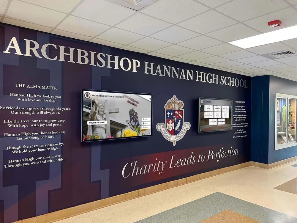
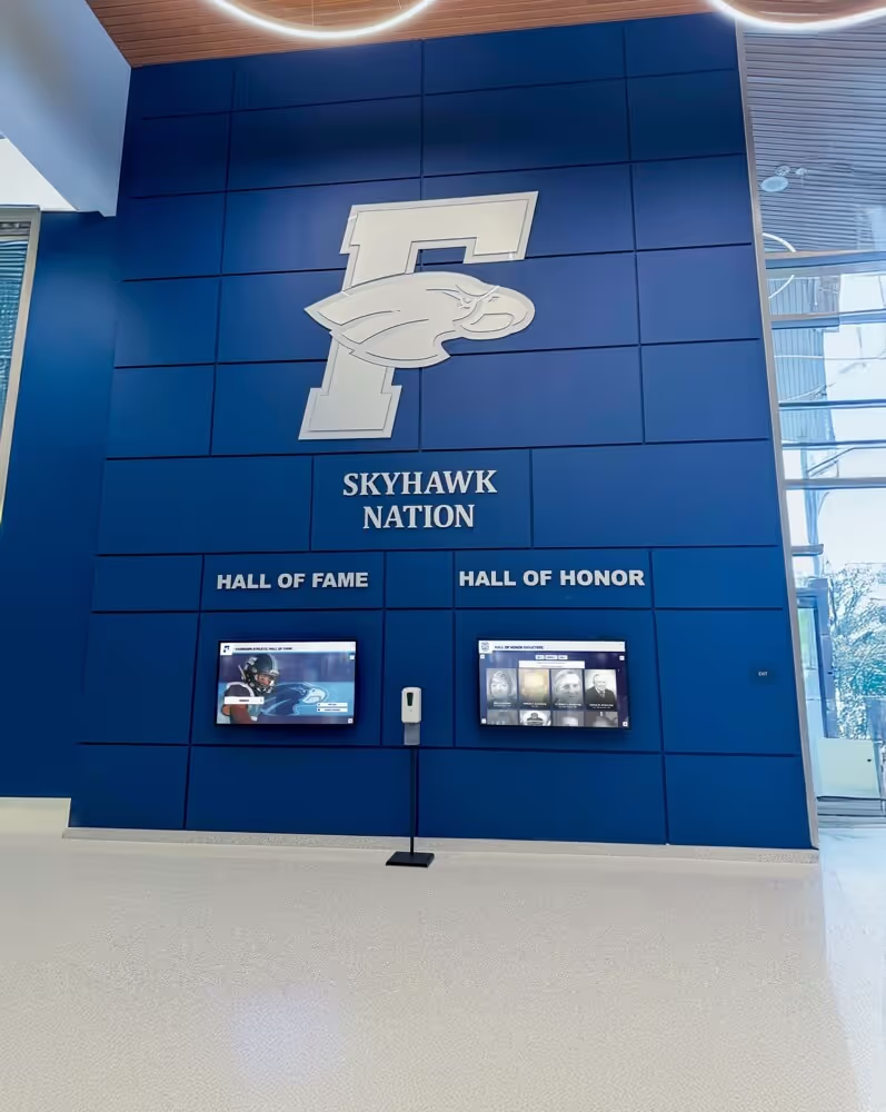
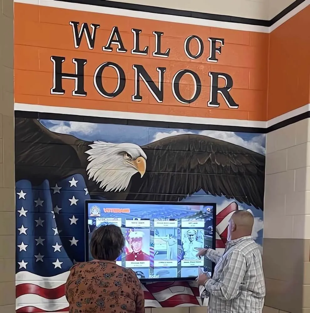
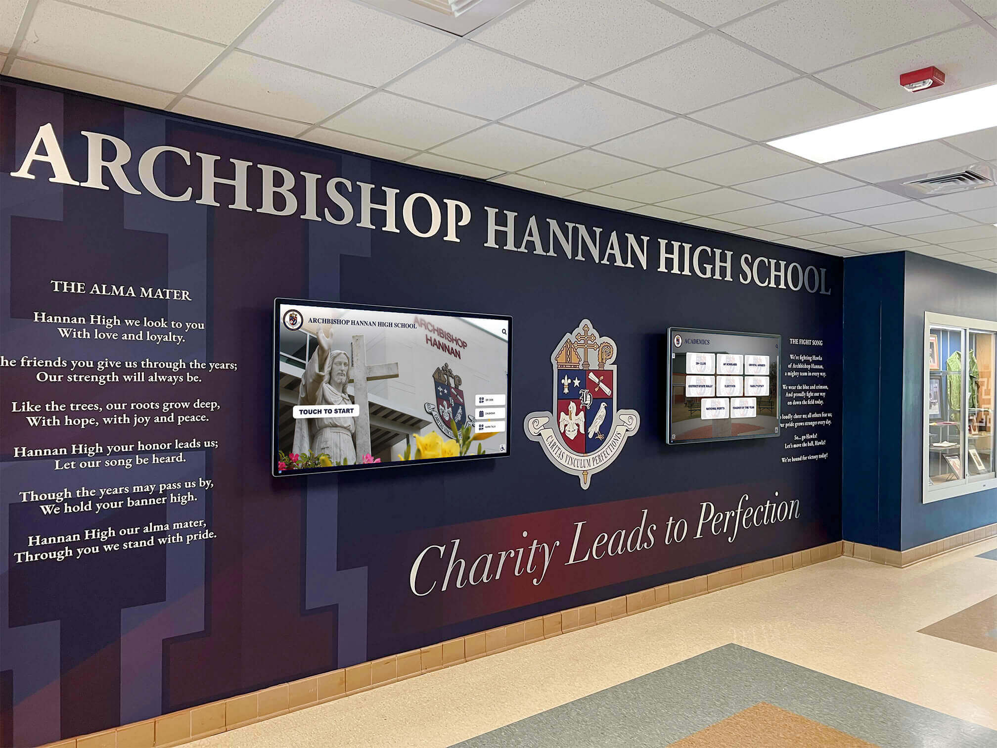
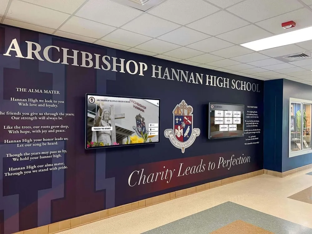
Archbishop Hannan High School demonstrates how a heraldic crest can anchor an entire lobby environment — unifying hand-painted murals with digital recognition displays through a single authoritative identity element
Heraldry Basics: The Vocabulary Every School Design Team Should Know
Understanding heraldic structure prevents the most common school crest mistakes — compositions that look decorative but communicate nothing, or that mix incompatible traditions creating visual incoherence.
The Shield: Foundation of Every Crest
The shield (called the “escutcheon” in heraldic terminology) is the central element of any coat of arms or crest composition. Everything else — supporters, helm, mantling, motto — exists in relation to the shield. For school crests, the shield performs two functions simultaneously: it signals formal authority, and it provides a bounded field for symbolic imagery.
Shield shapes vary and carry their own connotations. The heater shield (the familiar triangular form with a flat top and pointed base) reads as classical and academic. The cartouche (an oval field) feels more ornate and suits traditional private school contexts. The lozenge (diamond orientation) appears in some ecclesiastical institutions. For most K–12 and collegiate contexts, the heater shield remains the strongest choice — instantly legible as heraldic, scalable to small sizes, and balanced when reproduced in stone, metal, or digital environments.
Tinctures: Heraldic Color Rules That Still Apply
Heraldic color theory predates modern color science by centuries, but its core rule remains visually sound: never place a color on a color, or a metal on a metal. In practice, this means designs must alternate between the two “metals” (gold/or and silver/argent) and the named colors (gules/red, azure/blue, sable/black, vert/green, purpure/purple).
This rule exists because heraldry was designed to be read at distance — on battlefields, at tournaments, across recognizing-systems where the flag or shield needed instant identification. For school recognition environments, the same legibility requirement applies. A navy-on-forest-green crest element will disappear at ten feet. A gold charge on azure field remains visible across a gymnasium.
When mapping tincture rules to school colors, most schools find workable alignments. Schools with blue and gold are operating with the ideal heraldic palette (azure field, or charge). Red-and-white schools have gules and argent. The challenge arises with green-and-white combinations (both light) or maroon-and-black combinations (both dark), where designers must introduce a bridging metal or carefully manage relative values to maintain contrast.
Charges: Symbols Inside the Shield
Charges are the symbols placed on the shield’s field. In traditional heraldry, charges carry specific meanings. For school crests, charges typically encode:
Academic values — open books, torches, lamps of learning, quill pens, stars suggesting enlightenment or aspiration. These translate well to academic institutions emphasizing scholarship.
Geographic or community identity — regional animals, local landmarks, native flora or fauna, geographical features. A school in the Rocky Mountain region might use a mountain charge; a coastal institution might incorporate waves or an anchor.
Founding heritage — dates of establishment rendered in roman numerals, founding figures represented in silhouette, historical tools or symbols referencing the community’s origins.
Mission and values — shields within shields (representing protection and integrity), crosses or stars representing guidance, oak branches representing strength and endurance, laurel suggesting achievement and recognition.
The most common mistake in amateur school crest design is overcrowding the shield with too many charges. Classical heraldry uses a single primary charge, sometimes with secondary charges. Complexity should increase through quartering (dividing the shield into quadrants with different charges) rather than layering multiple symbols in a single field.
The Motto: Where Heraldry Meets Institutional Voice
The motto ribbon or scroll beneath the shield carries the school’s motto — often in Latin, occasionally in English or other languages. In traditional heraldic composition, the motto is set in a specific typeface appropriate to the period of the crest’s design. For schools without existing mottoes, the crest design process becomes an opportunity to crystallize institutional values in a brief, resonant phrase.
Effective school mottoes share several characteristics: they are short enough to be memorable (three to seven words), they articulate aspiration rather than description, and they work in visual contexts where text will be small. Long mottoes lose legibility when the crest appears on a lapel pin, engraved on a plaque header, or rendered as a watermark behind recognition content on a digital display.
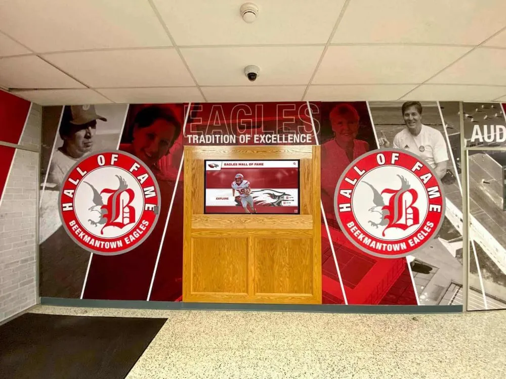
When the school crest anchors environmental branding, every digital touchscreen and physical recognition surface gains immediate institutional context — creating recognition environments that feel designed rather than assembled
Designing or Refreshing a School Crest: The Process
Whether a school is creating its first formal crest or refreshing a dated one, the design process follows a predictable arc that benefits from structure.
Audit: What Does the School Already Have?
Most schools have some version of institutional identity in circulation — even if it is inconsistently used. Before commissioning new design work, audit every touchpoint where school identity appears:
- Letterhead, diplomas, and official documents
- Athletic uniforms and team equipment
- Website headers and social media profiles
- Physical signage including entrance signs, gymnasium banners, and trophy cases
- Hall of fame displays, donor recognition walls, and award plaques
This audit typically reveals that most schools have multiple competing versions of their identity — different treatments on different surfaces with no governing document defining the authoritative version. The audit creates the starting brief for crest design: what elements have equity worth preserving, what is inconsistent and should be unified, and what surfaces will the new crest need to perform across.
Schools exploring school hallway décor and recognition infrastructure often discover during the audit process that hallways represent the highest-visibility expression of institutional identity — making crest application in those environments particularly high-stakes.
Brief: Defining the Design Parameters
A strong design brief answers five questions before any visual work begins:
What values should the crest communicate? Distill the institutional mission into three to five adjectives. These become the evaluative criteria for any design concepts.
What are the mandatory elements? Some schools have charter requirements to include founding date, official colors, or specific symbolic references. Identify these as non-negotiable constraints.
What are the application contexts? List every surface where the crest will appear — both physical (plaques, banners, carved stone, embossed leather, embroidery) and digital (touchscreen displays, website headers, digital signage, social media). Each context creates technical requirements that should influence design decisions.
What is the competitive landscape? Review nearby schools’ crests and institutional marks to identify differentiation opportunities. Regional schools sharing similar mascots or color combinations should find heraldic approaches that create visual distinction.
What is the timeline and budget? Comprehensive crest design with professional heraldic illustration, multiple application variants, and usage guidelines is a significant investment. Setting realistic expectations prevents scope creep and compromised outcomes.
Design Phase: Heraldic Illustration and Digital Variants
School crest design demands a specialist. General graphic designers can produce attractive logos, but heraldic compositions require understanding of tincture rules, conventional charge placement, historical typeface traditions, and the visual conventions that make a crest read as genuinely authoritative rather than as a logo wearing costume.
The deliverable set for a comprehensive school crest should include:
Full heraldic composition — the complete crest with shield, charges, supporters (if included), helm or coronet (appropriate to institutional type), mantling, and motto ribbon. This is the formal version used on diplomas, official documents, and premium recognition materials.
Shield-only version — the escutcheon isolated from the full composition. This variant appears on athletic materials, standard signage, and digital displays where the full composition would be too complex to read.
Simplified icon version — a further reduction suitable for small-scale use: lapel pins, watermarks, app icons, and favicon-scale digital applications.
Reversed and single-color versions — white-on-dark-background, embossed/blind-embossed, and single-color variants for contexts where full color reproduction is not available.
Vector source files — all variants delivered as scalable vector artwork (AI, EPS, or SVG format) ensuring the crest reproduces sharply at any size, from wax seals to gymnasium banners.
For schools pursuing AI-assisted school graphics development, modern tools can accelerate early concept iteration — but heraldic finishing work requires human expertise to ensure tincture compliance and historical authenticity.
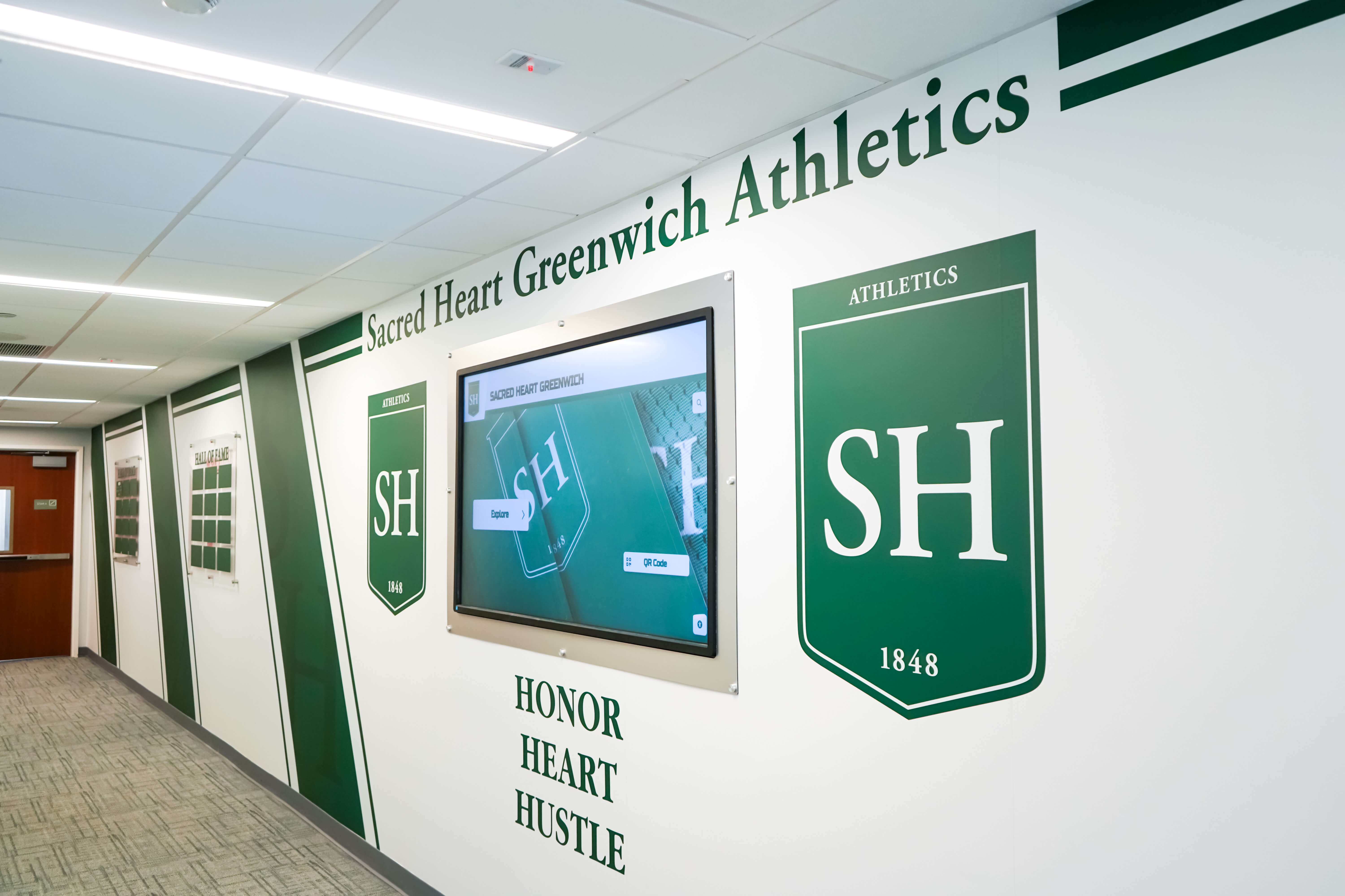
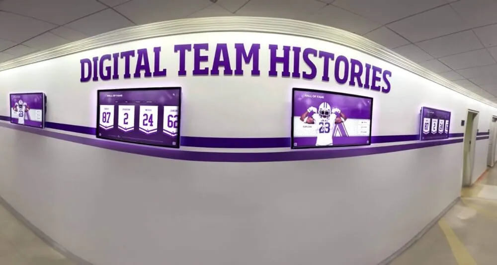
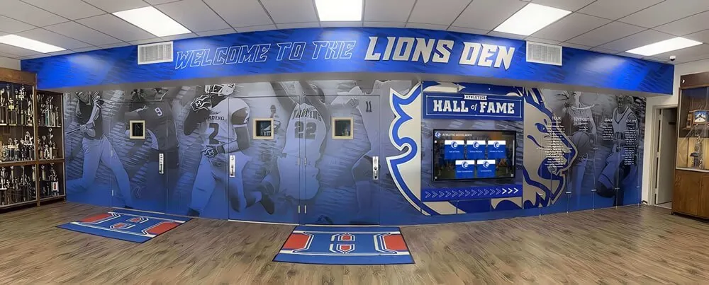
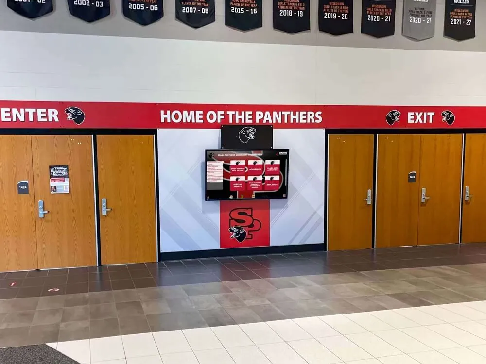
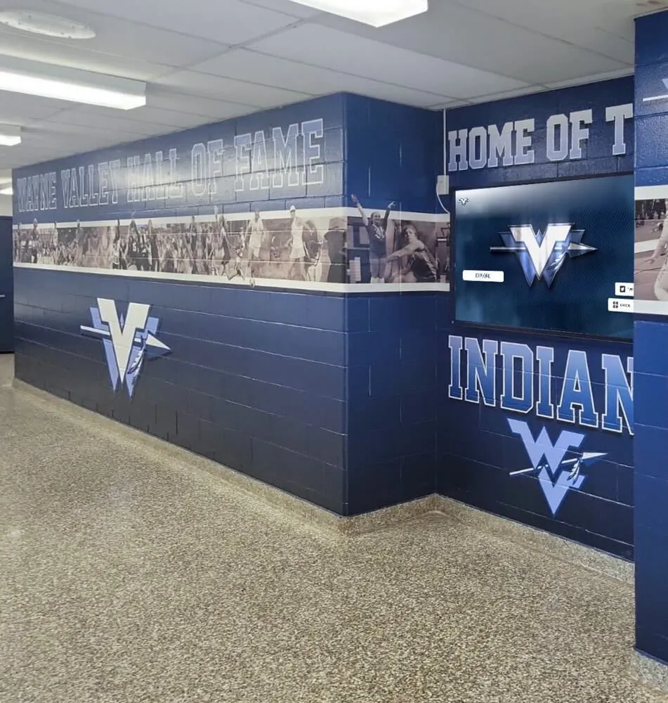
Coordinated shield-format displays create immediate heraldic authority in athletic hallways — each shield represents an achievement, reinforcing the institutional crest's visual vocabulary throughout the space
Applying the Crest to Physical Recognition Surfaces
Physical recognition surfaces — honor walls, donor plaques, championship displays, hall of fame installations — represent the highest-permanence expression of a school crest. Materials and production methods should be selected to honor the weight of what these surfaces represent.
Material Selection and Crest Reproduction
Different physical surfaces interact with crests differently, and design decisions must account for the reproduction method.
Cast bronze and aluminum plaques — The traditional choice for institutional recognition. Crests are typically modeled in bas-relief (raised from the surface) or engraved (recessed into it). For cast plaques, the shield and primary charges translate well to three-dimensional form; fine text details like motto script require careful attention at the modeling stage. Bronze plaques develop a patina over time that can enhance the heraldic authority of a crest if properly maintained.
Dimensional letters and cut-metal shields — Recognition walls using cut aluminum or steel shields in school colors can adopt the shield shape from the school crest, creating visual consistency between individual recognition elements and the institutional mark. Schools profiled in recognition wall layout guides for K–12 schools frequently use shield shapes as the organizing unit for inductee plaques — creating recognition systems that reinforce heraldic language across every element of the wall.
Carved stone and wood — Entry vestibules, courtyard installations, and building dedication elements frequently incorporate crests in stone or hardwood. These materials favor simplified crest variants with clean lines and generous negative space that translate to the constraints of carving tools and the viewing distances typical of architectural contexts.
Vinyl and print banners — Athletic spaces frequently use large-format printed banners where crests appear prominently. For these applications, the shield-only or icon variant typically performs better than the full heraldic composition at gymnasium scale. Ensuring the print version originates from the vector master prevents the pixelated, blurry crest reproduction that undermines the credibility of recognition environments.
Recognition Wall Layout: Integrating the Crest as Anchor
The school crest functions most effectively on recognition walls when it anchors the composition rather than floating as an isolated decorative element. Design approaches that work:
Masthead position — The crest appears at the top-center of the recognition wall, above all inductee names, plaques, or portrait panels. This position communicates that the recognition derives its authority from the institution the crest represents. Every name below exists within the frame established by the crest above.
Cornerstone position — For long horizontal recognition walls, the crest occupies one end (typically left, following reading direction), with content flowing rightward from it. This treatment works well for donor walls and championship record boards where content expands over time.
Background watermark — The shield-only version appears as a large, low-opacity watermark behind inductee portrait panels or donor name columns. This approach creates heraldic presence without competing with the recognition content, allowing the institutional mark to establish atmosphere rather than dominate.
Dimensional centerpiece — For hall of fame installations designed as destination experiences, a three-dimensional crest in cast metal or carved stone can become the focal centerpiece around which portrait panels, display cases, and digital screens are organized. School history and recognition installations that enhance community pride frequently use this approach to create a sense of arrival — visitors understand immediately that they are in a space devoted to institutional legacy.
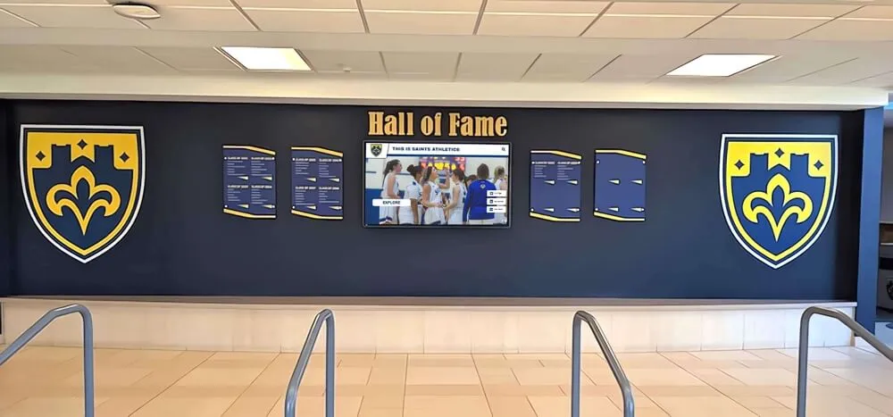
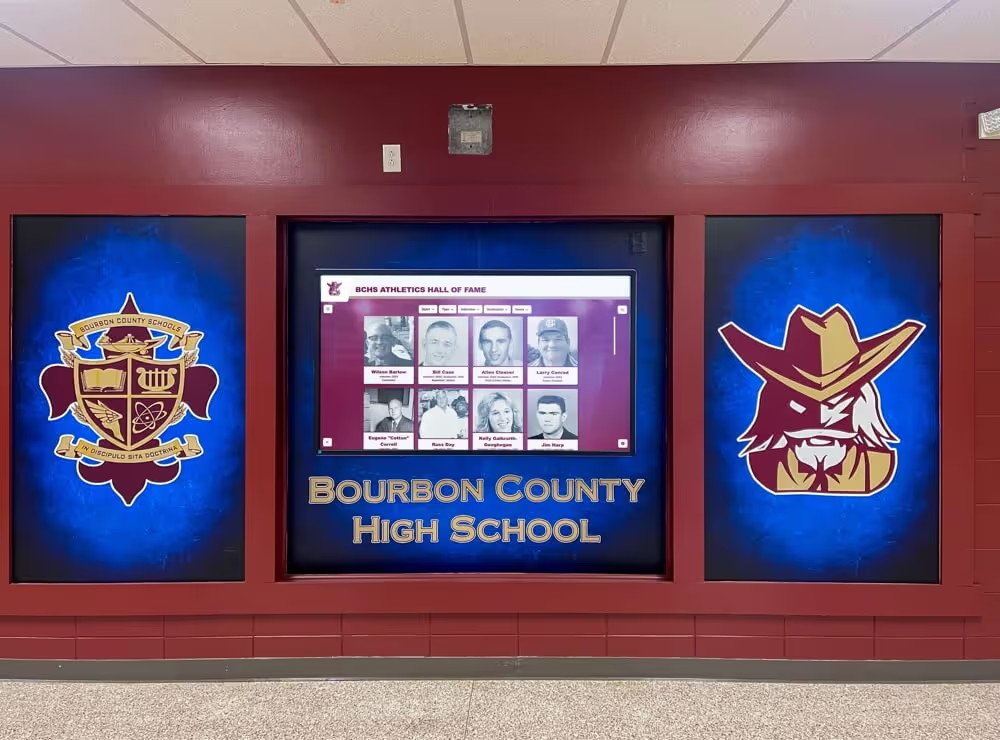
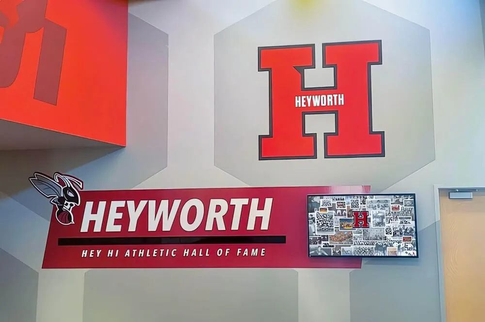
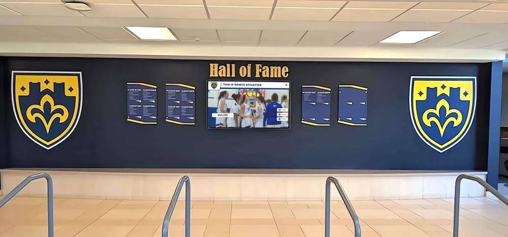
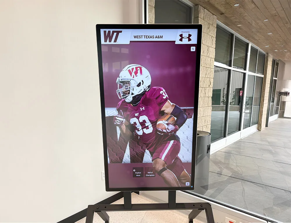
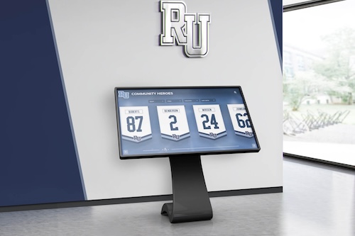
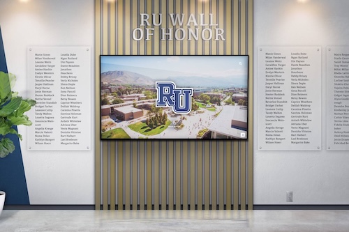
Heraldic shield displays and interactive digital screens create a recognition environment where traditional credentialing authority and modern dynamic content reinforce each other
Experience Layout: Crest-Anchored Digital Recognition Display
When the school crest moves from physical surfaces into interactive touchscreen environments, the design challenge shifts from static composition to experience architecture. The following layout framework describes a crest-integrated touchscreen recognition wall optimized for school hall of fame and donor recognition contexts.
ZONE 2: HERO / FEATURED CONTENT (next 40%) [ ROTATING FEATURED HONOREE CARD ] — Full-bleed portrait photography — Name, sport/discipline, class year — Achievement summary overlay — Crest watermark at 15% opacity behind content
ZONE 3: NAVIGATION MODULES (next 25%) [ HALL OF FAME ] [ CHAMPIONSHIPS ] [ DONORS ] [ HISTORY ] — Card-stack carousels for each category — Touch-to-expand individual honoree profiles — School color accent bars on active tab
ZONE 4: TICKER / RECENT ACHIEVEMENTS (bottom 10%) [ SCROLLING RECENT HONORS — auto-advancing ]
ZONE 5: CTA STRIPE (bottom 5%) [ QR code for mobile access ] [ “Explore Full Archive” ]
This layout uses the crest in three distinct roles simultaneously: as a masthead authority mark (Zone 1), as an atmospheric watermark lending institutional credibility to featured content (Zone 2), and implicitly as the design vocabulary source for the shield shapes used in navigation modules (Zone 3). The result is a display environment where the crest permeates without overpowering.
Interactive class composite displays and full digital hall of fame systems both benefit from this crest-anchored architecture — creating coherent brand environments that honor institutional legacy while delivering modern interactive experiences.
Adapting School Crests for Digital Display Environments
Physical crests and digital crests face different technical constraints. A crest designed only for stone carving or bronze casting will likely fail in digital contexts — and vice versa. Adaptation is a deliberate design discipline, not simply exporting a file to a different format.
Color Management for Screen Reproduction
Heraldic tinctures defined in paint or enamel translate to screen colors through careful RGB and hex specification. Schools should define authoritative screen values for every tincture used in the crest, ensuring consistency across:
- Interactive touchscreen displays
- Digital signage systems (which often use different panel technologies with varying color gamuts)
- Website and social media environments
- Video and animated content
The most common failure mode is allowing display vendors, web designers, and sign fabricators to interpret school colors independently — resulting in a crest that appears navy blue on the entrance sign, royal blue on the website, and slate blue on the digital display, communicating institutional disorganization rather than heraldic authority.
Understanding which screen types are used for digital signage helps design teams specify colors correctly for different display panel technologies — since IPS, VA, and OLED panels all render colors differently at the hardware level.
Motion and Animation Guidelines
Digital recognition displays increasingly incorporate animation — looping hero reels, transitioning content panels, animated entrance effects for featured honorees. Crests require specific animation guidelines to maintain dignity and authority:
Appropriate crest animation — Slow fades (2–3 second transitions), subtle scaling on enter (scale from 95% to 100%, not dramatic zooms), gentle opacity pulses for ambient presence. These movements signal life without undermining permanence.
Inappropriate crest animation — Spinning or rotating crests, dramatic fly-in effects with trailing particles, color-shifting animations that alter tinctures for visual effect. These treatments undermine the authority the crest is meant to convey.
The guiding principle is that a crest should animate the way a flag moves — with dignity, subject to forces greater than decoration.
Accessibility and WCAG 2.1 AA Compliance
Recognition displays integrating school crests must maintain accessibility standards that serve all community members, including those with visual impairments.
Contrast requirements — All text rendered against crest imagery must meet minimum 4.5:1 contrast ratio (WCAG 2.1 AA) for normal text and 3:1 for large text (18pt+ or 14pt bold+). When the crest appears as a background element, ensure text layers above it in the visual hierarchy with sufficient contrast. The traditional heraldic metal-on-color system naturally supports high contrast, but digital implementations introducing gradients or transparency can inadvertently create inaccessible contrast conditions.
Text scaling — Digital displays used in accessible contexts should support text scaling without breaking crest compositions. Design layouts that accommodate 150% text scale without displacing crest elements into content areas.
Alternative access — QR codes embedded in recognition displays provide mobile access paths for users who cannot interact effectively with large-format touchscreens. Student photo privacy and digital display best practices should be observed alongside accessibility planning when deploying recognition content on public-facing displays.
Non-text content — Crest imagery appearing on interactive displays should include appropriate alt text descriptions for screen reader compatibility, describing both the visual elements and their institutional significance.
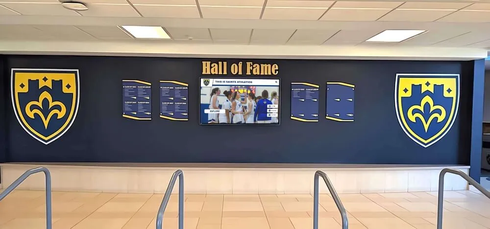
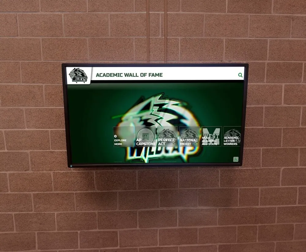
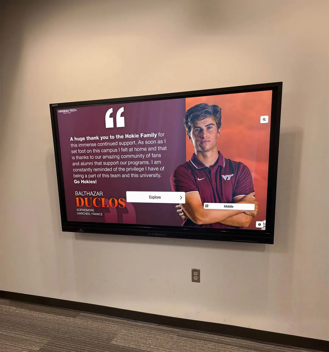
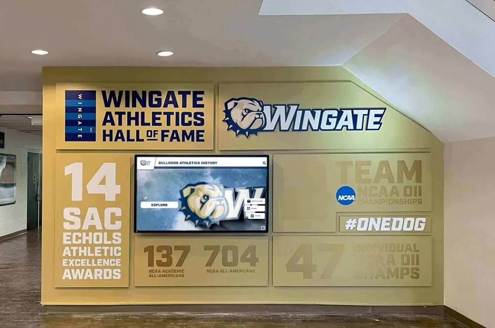
Coordinated heraldic shield shapes across recognition walls create visual systems where individual achievement plaques speak the same design language as the institutional crest — building cumulative recognition authority
Brand Integration Checklist: School Crest Across All Recognition Surfaces
Use this checklist to audit whether a school crest is being applied consistently and effectively across the full recognition environment:
Physical Surfaces
- Entrance signage (dimensional letter or carved crest)
- Official diploma and transcript header
- Athletic hall of fame centerpiece
- Donor recognition wall masthead
- Championship banner header element
- Award plaque header
- Building dedication plaques
Digital Environments
- Interactive touchscreen hall of fame (masthead + watermark)
- Digital signage content template header
- School website header and favicon
- Social media profile image (icon/shield variant)
- Video intro and outro cards
- Email signature block
- Digital diploma/certificate templates
Ceremonial and Printed Materials
- Graduation programs and invitations
- Awards ceremony materials
- Alumni communications and magazines
- Capital campaign donor materials
Consistency Checks
- All touchpoints use vector master files (no rasterized versions)
- School color hex/RGB values are documented and distributed
- Crest usage guidelines prohibit stretching, recoloring, or unauthorized modifications
- All vendors receive the official file package before production
For schools developing comprehensive digital archives that preserve institutional history, the crest functions as the consistent identity thread connecting decades of content — ensuring that a yearbook page from 1968 and a digital touchscreen profile from 2026 visibly belong to the same institution.
Common School Crest Design Mistakes to Avoid
Understanding failure modes helps schools make better design decisions and brief designers more effectively.
Designing for a single medium — A crest created only for the diploma header will fail when embossed on the gymnasium floor, reproduced on a bronze plaque, or displayed at 4K resolution on a 65-inch touchscreen. Always design with the full application suite in mind from the beginning.
Overloading the shield — More symbolic meaning does not come from more symbols. A shield with seven charges communicates visual noise, not institutional depth. Heraldic authority comes from confident simplicity — one or two charges, cleanly rendered, with strong tincture contrast.
Ignoring tincture rules — Placing a dark charge on a dark field because “it looks good on screen” produces recognition materials that fail at distance and in varying lighting conditions. The heraldic contrast rule exists for exactly the contexts where school recognition surfaces are used.
Using rasterized files — Allowing JPG or PNG versions of the crest to proliferate as the working file across departments guarantees degraded reproduction. Every department that touches the crest should receive the vector master.
Neglecting the motto treatment — Typographic choices for motto ribbons disproportionately influence whether a crest reads as genuinely heraldic or as a costume. Avoid novelty display fonts, inappropriate script choices, and letterspacing that distorts legibility. Period-appropriate serif types — Garamond, Palatino, IM Fell — or custom lettering from a heraldic specialist deliver authenticity that generic font choices cannot.
Treating the crest as an afterthought — The most common mistake: schools invest significantly in donor walls, touchscreen displays, and athletic hall of fame installations without ensuring the crest that anchors those systems is well-designed and properly implemented. The crest’s authority radiates to everything it touches — when it is weak, the recognition systems it anchors feel less credible. When it is strong, it elevates every surface where it appears.
Schools can reference examples of community accomplishment recognition to understand how institutional identity elements function in recognition contexts across different community types.
Crest-Integrated Touchscreen Recognition: What Schools Should Expect
When Rocket Alumni Solutions builds recognition wall experiences, the school crest functions as a first-class design element — not an afterthought placed in a corner after the layout is otherwise complete. The experience architecture begins with the crest and flows outward.
Custom crest backgrounds — School crests are incorporated into display backgrounds as atmospheric watermarks or hero elements, with proper color management ensuring on-screen tinctures match the documented school color specifications.
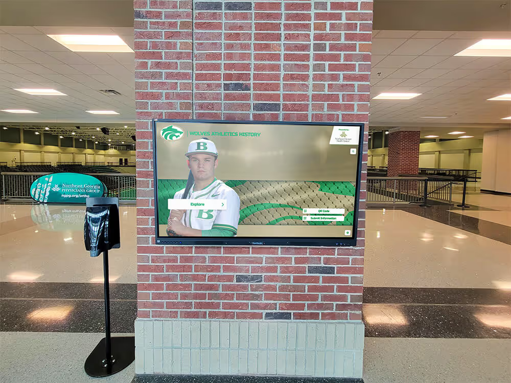
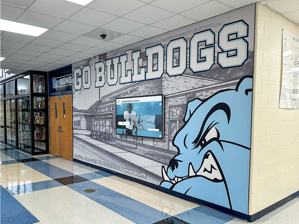
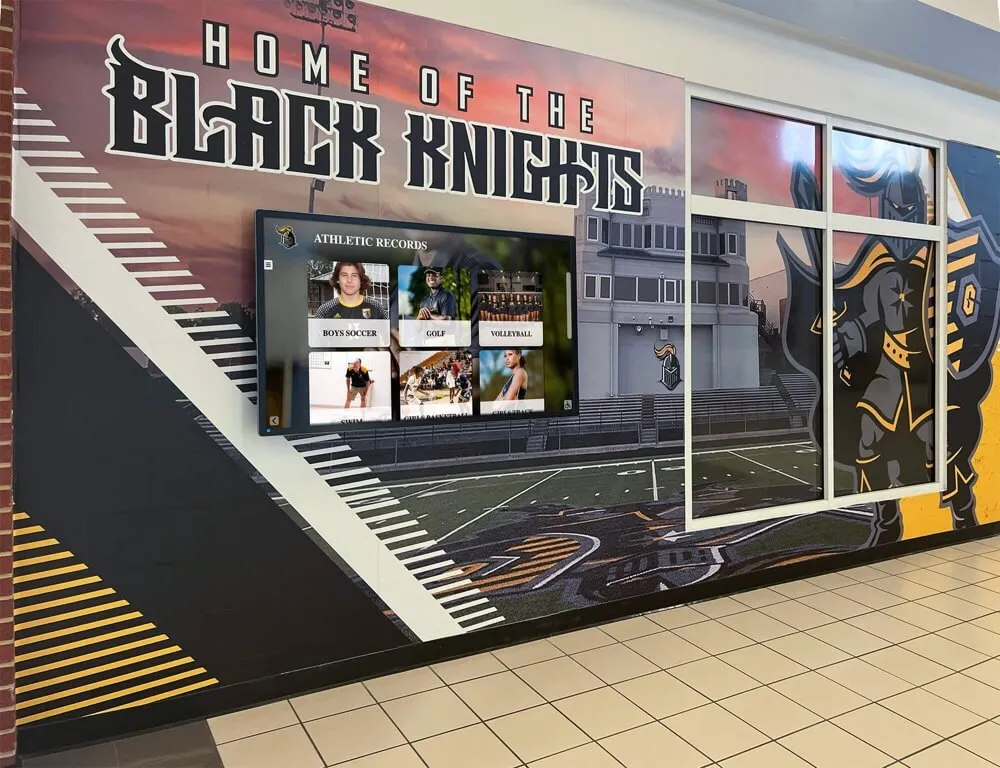
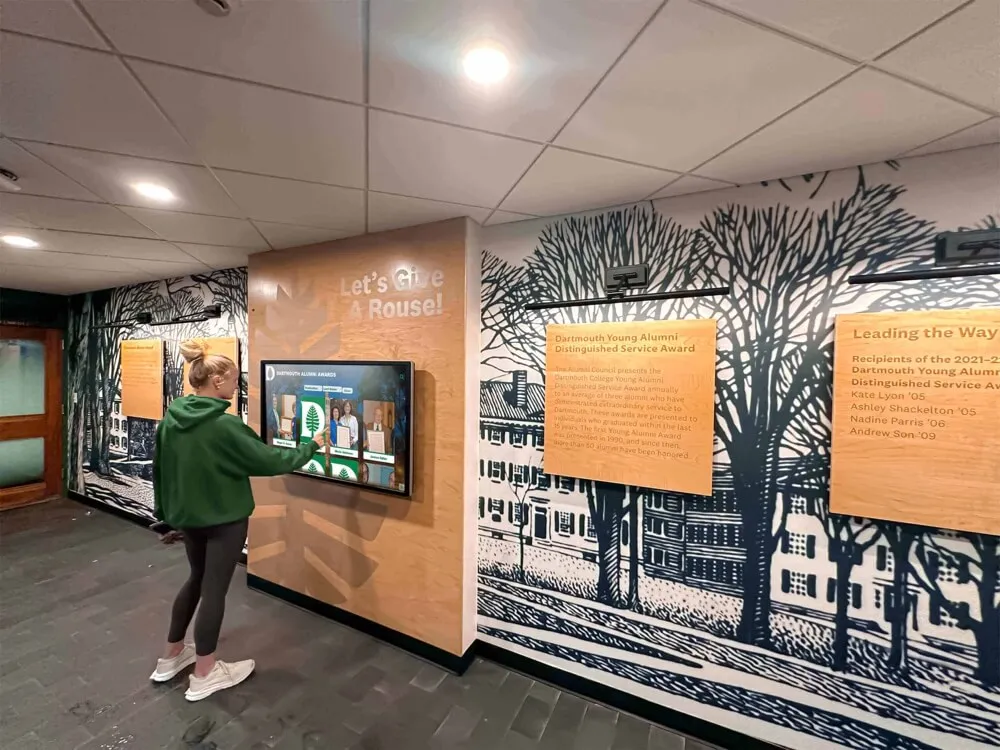
Unlimited layout variants — Different areas of campus may warrant different crest treatment hierarchies. Lobby entrance displays emphasizing arrival and institutional pride use the full heraldic composition at scale. Athletic hallway displays emphasizing achievement records use the shield icon as a recurring organizational element. The platform accommodates these variations without requiring separate design engagements for each display context.
Dynamic content with heraldic framing — Inductee portrait cards, championship records, and donor recognition content live within crest-branded interface templates. As content updates — new hall of fame inductees added, recent championships recorded, new donors recognized — the crest-anchored visual system maintains institutional authority throughout the content lifecycle.
Digital trophy walls and interactive gym banner recognition systems both benefit from crest integration — creating recognition environments where the digital and physical surfaces speak the same institutional language.
Activation Plan: Crest Rollout Sequence
Phase 1 — Foundation (Weeks 1–4) Commission or refresh crest design with full application suite. Document color specifications and usage guidelines. Distribute master files to all stakeholders.
Phase 2 — Physical Surfaces (Weeks 5–12) Apply crest to entrance signage, recognition wall masthead, diploma templates, and award plaque headers. Establish consistent material and finishing standards.
Phase 3 — Digital Integration (Weeks 8–16) Integrate crest into digital signage templates, interactive display environments, and website/social media properties. Verify color accuracy across screen types.
Phase 4 — Ongoing Governance Establish annual brand audit reviewing crest implementation across all touchpoints. Create onboarding materials for new staff and vendors. Schedule periodic visual refresh reviews (every 5–7 years).
Conclusion: The Crest as Recognition Infrastructure Investment
A school crest is not a design expense — it is recognition infrastructure. Well-designed crests anchor donor walls, dignify diplomas, elevate championship banners, and provide the visual authority that makes interactive touchscreen hall of fame displays feel like institutional statements rather than digital slideshow presentations. When schools approach crest design with the rigor it deserves — understanding heraldic tradition, specifying comprehensive application variants, managing color consistency across surfaces, and adapting thoughtfully for digital environments — the design asset compounds in value across every physical and digital surface where institutional identity appears.
The schools that alumni remember most vividly, that recruits respond to most powerfully, and that donors feel most compelled to support are almost invariably schools where institutional identity has been treated as a serious design discipline. The crest is where that discipline begins.
Bring Your School Crest to Life on Interactive Recognition Displays
Rocket Alumni Solutions builds custom touchscreen hall of fame displays, donor recognition walls, and digital recognition systems that integrate your school crest as a first-class design element — creating institutional recognition environments that honor your heritage and engage every visitor who encounters them.
Request a Custom Design PreviewSchools ready to strengthen their recognition environments can explore digital history and archival tools that bring institutional identity to life alongside crest-integrated display systems. The most powerful recognition installations unite visual heraldic authority with dynamic digital content — ensuring that the weight of institutional history is present in every interaction.