


Digital recognition displays serve diverse communities including visitors with disabilities who depend on accessibility features to explore content independently. Yet many touchscreen installations fail to meet Web Content Accessibility Guidelines (WCAG) 2.2 AA standards—creating barriers preventing full participation while exposing institutions to legal compliance risks.
WCAG 2.2 represents the current international standard for web and digital accessibility, defining specific success criteria ensuring content remains perceivable, operable, understandable, and robust for people with visual, auditory, motor, and cognitive disabilities. For digital recognition displays including interactive touchscreens, halls of fame, donor walls, and wayfinding kiosks, these guidelines translate directly to design decisions affecting contrast ratios, touch target sizes, text alternatives, keyboard navigation, and content structure.
This comprehensive guide examines all WCAG 2.2 success criteria across Level A (minimum requirements), Level AA (recommended standard), and Level AAA (enhanced support), explaining the importance of each criterion for digital recognition displays and providing practical implementation guidance ensuring accessible, inclusive touchscreen experiences serving all community members regardless of ability.
Organizations implementing WCAG 2.2 AA compliant digital displays report broader community engagement, reduced support requests, improved user satisfaction, and compliance with Americans with Disabilities Act (ADA) requirements increasingly scrutinized through accessibility audits and legal challenges facing educational institutions and public organizations.

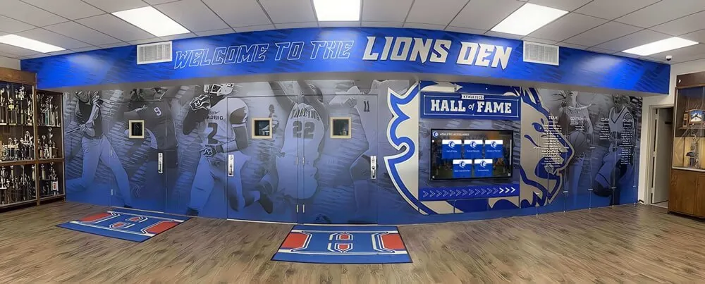
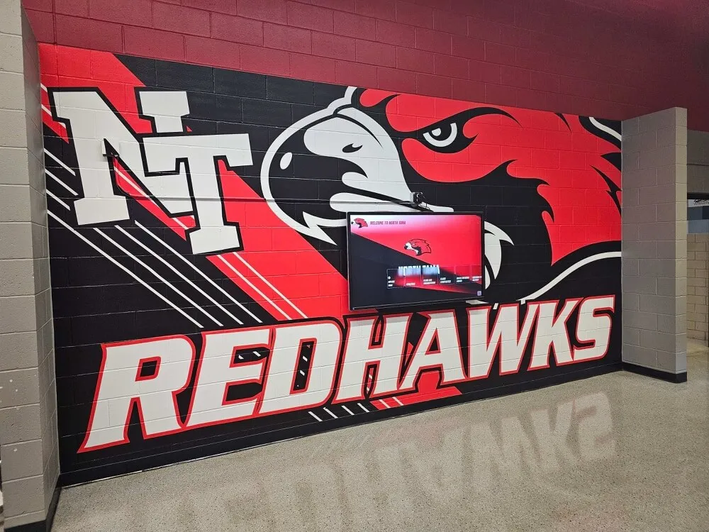
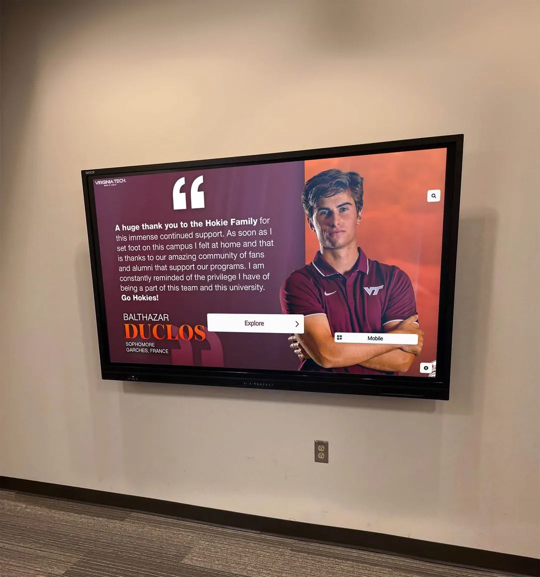
Accessible touchscreen interfaces enable independent exploration for all visitors through careful attention to WCAG compliance across visual, motor, and cognitive considerations
Understanding WCAG 2.2 Structure and Conformance Levels
Before examining specific success criteria, understanding how WCAG organizes accessibility requirements provides context for prioritizing implementation efforts and achieving conformance certification.
The Four Core Principles: POUR Framework
WCAG organizes all success criteria under four fundamental principles ensuring content accessibility:
Perceivable: Information and user interface components must be presentable to users in ways they can perceive—meaning content cannot be invisible to all senses. For digital recognition displays, this principle addresses visual contrast, text alternatives for images, captions for video content, and adaptable content structure enabling assistive technology interpretation.
Operable: User interface components and navigation must be operable—meaning interfaces cannot require interactions users cannot perform. Touchscreen implementations must address touch target sizes, keyboard alternatives for touch navigation, sufficient time for interactions, and avoidance of content causing seizures or physical reactions.
Understandable: Information and user interface operation must be understandable—meaning content cannot be beyond user comprehension. This principle requires predictable navigation, clear instructions, input assistance preventing errors, and consistent interface behaviors throughout experiences.
Robust: Content must be robust enough for reliable interpretation by diverse user agents including assistive technologies. Digital displays must generate proper semantic markup, provide name-role-value information for interface components, and maintain compatibility with current and future assistive technologies.
Three Conformance Levels: A, AA, and AAA
WCAG defines three conformance levels representing increasing accessibility rigor:
Level A (Minimum): Essential accessibility features required for basic access. Failure to meet Level A criteria creates severe barriers preventing many disabled users from accessing content entirely. All digital displays should meet Level A minimum requirements without exception.
Level AA (Recommended Standard): Enhanced accessibility addressing common barriers. Most organizations, educational institutions, and public entities target Level AA as the practical standard balancing accessibility needs with implementation feasibility. Federal agencies and many state governments legally require Level AA compliance.
Level AAA (Enhanced Support): Specialized accessibility features supporting specific needs. Level AAA represents aspirational goals rather than universal requirements—some criteria prove impossible for certain content types while others address narrow disability categories. Organizations implement selected Level AAA criteria where feasible but rarely achieve complete Level AAA conformance across all content.
For digital recognition displays, Level AA conformance represents the appropriate target balancing legal compliance requirements, accessibility best practices, and practical implementation considerations across touchscreen hardware and recognition software platforms.

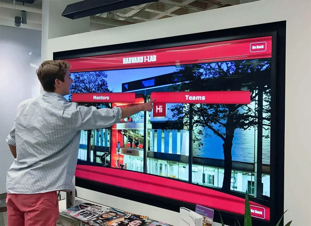
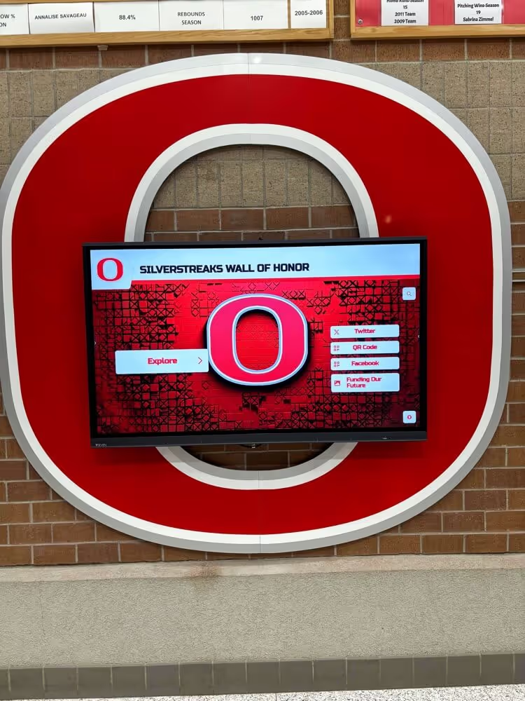
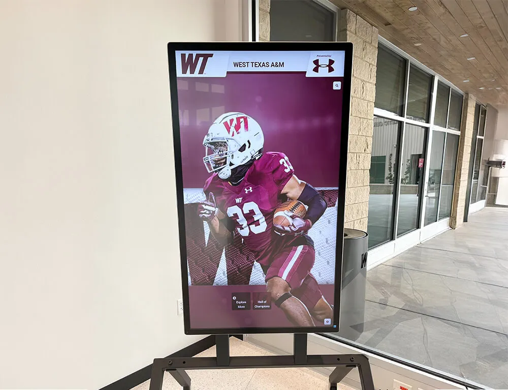
Touch-optimized interfaces meeting WCAG requirements feature appropriately sized targets, clear visual feedback, and logical navigation patterns
Level A Success Criteria: Essential Accessibility Requirements
Level A criteria represent fundamental accessibility requirements preventing major barriers. Digital recognition displays failing to meet these standards create unusable experiences for significant disability populations.
Perceivable Content: Level A Requirements
1.1.1 Non-text Content (Level A)
All non-text content—images, graphics, icons, buttons—must have text alternatives conveying equivalent information. For digital recognition displays, every profile photo requires alternative text describing the individual, decorative elements need null alt attributes signaling they convey no information, interactive controls need labels describing their function, and charts or infographics require textual data equivalents.
Importance: Screen readers serving blind users cannot interpret images without text alternatives. Missing alt text renders recognition displays completely inaccessible to blind visitors seeking information about honorees, requiring all visual content to provide equivalent textual information enabling full participation regardless of visual ability.
Implementation: Recognition software should provide mandatory alt text fields during content upload, generate descriptive alt text from available metadata like “Portrait photo of [Name], [Achievement Year]”, and distinguish decorative images from informational content requiring description.
1.2.1 Audio-only and Video-only (Prerecorded) (Level A)
Audio-only content like interviews requires text transcripts; video-only content like silent highlight reels requires audio descriptions or text alternatives. For recognition displays featuring video tributes or audio interviews, equivalent textual information must accompany media content.
Importance: Deaf users cannot access audio content without transcripts, while blind users cannot understand video-only content without descriptions. Comprehensive accessibility requires information availability through multiple sensory channels preventing single-mode content from excluding entire disability populations.
1.2.2 Captions (Prerecorded) (Level A)
Prerecorded video content must include synchronized captions. Digital displays showing championship game highlights, honoree interviews, or facility tours require caption tracks displaying spoken dialogue, sound effects, and speaker identification.
Importance: Captions serve deaf and hard-of-hearing visitors, individuals in sound-sensitive environments, non-native speakers, and anyone struggling with audio comprehension. Without captions, video content excludes these populations from meaningful engagement with multimedia recognition content.
Implementation: Generate captions during video production using automated transcription services with human review ensuring accuracy, embed caption tracks in video files rather than relying on platform-specific solutions, and verify captions display correctly on touchscreen playback before deployment.
1.2.3 Audio Description or Media Alternative (Prerecorded) (Level A)
Video content must provide either audio descriptions narrating visual information during dialogue gaps or complete text alternatives describing video content comprehensively. Recognition videos showing facilities, ceremonies, or visual achievements require either narrated descriptions or full textual equivalents.
Importance: Blind visitors cannot perceive visual-only information in videos including facility tours, achievement documentation, or ceremony footage. Audio descriptions or text alternatives ensure visual content accessibility enabling blind users to understand complete content rather than only hearing dialogue.
1.3.1 Info and Relationships (Level A)
Information, structure, and relationships conveyed through presentation must be programmatically determinable or available in text. Touchscreen interfaces must use proper semantic HTML including heading hierarchies, list structures, form labels, table markup, and ARIA attributes when native semantics prove insufficient.
Importance: Screen readers and assistive technologies depend on semantic markup to understand content structure, navigation hierarchies, and interface relationships. Visual-only structure creates confusion for blind users unable to perceive layout-based organization, requiring explicit markup making relationships programmatically determinable.
Implementation: Use proper heading tags (H1, H2, H3) establishing content hierarchy, employ list elements for navigation menus and grouped items, associate form labels with input fields programmatically, and implement ARIA roles and attributes for custom interactive components lacking native semantics.
1.3.2 Meaningful Sequence (Level A)
Content reading order must remain meaningful when presented sequentially. Touchscreen layouts with multiple columns, floating elements, or complex positioning must maintain logical sequence when assistive technologies linearize content.
Importance: Screen readers present content in source code order regardless of visual positioning. Illogical reading sequences create confusion and navigation difficulties for blind users, requiring careful source order consideration ensuring meaningful progression through content independent of visual presentation.
1.3.3 Sensory Characteristics (Level A)
Instructions cannot rely solely on sensory characteristics like shape, color, size, visual location, or sound. Navigation instructions like “tap the green button” or “select the item on the right” exclude blind users and colorblind visitors unable to perceive referenced characteristics.
Importance: Sensory-dependent instructions assume particular perceptual abilities, creating barriers for users with visual or auditory disabilities. Instructions must use multiple identifying characteristics including visible labels, enabling users with diverse abilities to locate and activate referenced elements.
Implementation: Replace “tap the green search button” with “tap the Search button in the navigation bar”, augment color-coded categories with text labels and icons, and provide textual landmark descriptions supplementing visual positioning references.
Operable Interfaces: Level A Requirements
1.4.1 Use of Color (Level A)
Color cannot be the only visual means conveying information, indicating actions, prompting responses, or distinguishing elements. Category color-coding, status indicators, error highlighting, and interactive states require additional visual differentiators beyond color alone.
Importance: Colorblind users—approximately 8% of males and 0.5% of females—cannot distinguish certain color combinations. Color-only information creates barriers requiring supplementary visual indicators like patterns, icons, text labels, or shape differences enabling perception independent of color discrimination ability.
Implementation: Add icons to color-coded categories, underline interactive links beyond color change alone, include textual labels on status indicators, and employ patterns or borders distinguishing elements beyond color differences.
1.4.2 Audio Control (Level A)
Audio playing automatically for more than three seconds must provide mechanisms to pause, stop, or control volume independent of system volume. Touchscreen displays with autoplay video or background audio require prominent, accessible audio controls.
Importance: Autoplay audio interferes with screen reader output making interfaces unusable for blind users, disturbs quiet environments, and creates confusion. User-controlled audio respects diverse needs while preventing automatic playback from overwhelming assistive technology speech output.
2.1.1 Keyboard (Level A)
All functionality available through touch must be available through keyboard interfaces except where underlying function requires path-dependent input like freehand drawing. Touchscreen kiosks in public spaces often cannot provide physical keyboards, but underlying web content must support keyboard operation when accessed through assistive technologies or alternative devices.
Importance: Blind users, people with motor disabilities, and individuals using assistive technologies often depend on keyboard navigation rather than touch. Keyboard accessibility ensures alternative input methods can access all functionality preventing touch-only implementations from excluding these populations.
Implementation: Ensure focus indicators clearly show keyboard position, establish logical tab order through interactive elements, provide keyboard shortcuts for complex interactions, and verify all functionality remains accessible through keyboard alone during testing.
2.1.2 No Keyboard Trap (Level A)
Keyboard focus must not get trapped in any component. Users must be able to navigate away from all interface elements using keyboard alone without requiring mouse or touch interaction.
Importance: Keyboard traps create impossible situations where keyboard-dependent users become stuck in interface components unable to proceed or exit, rendering applications completely unusable beyond the trap point.
2.1.4 Character Key Shortcuts (Level A - WCAG 2.1 and 2.2)
Single-character keyboard shortcuts must be remappable, deactivatable, or only active when relevant components have focus. This prevents conflicts with assistive technology commands and unintended activation through speech input.
Importance: Single-key shortcuts conflict with screen reader commands, activate unintentionally through speech recognition input, and create navigation difficulties. Customizable shortcuts respect diverse input methods preventing unintended activation while maintaining efficiency for users benefiting from shortcuts.
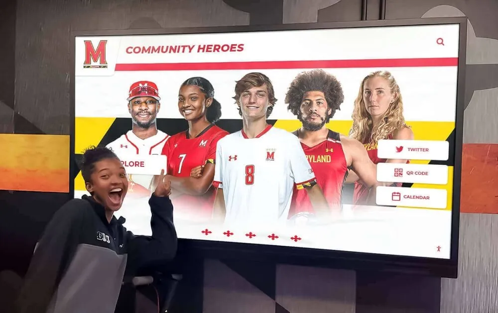
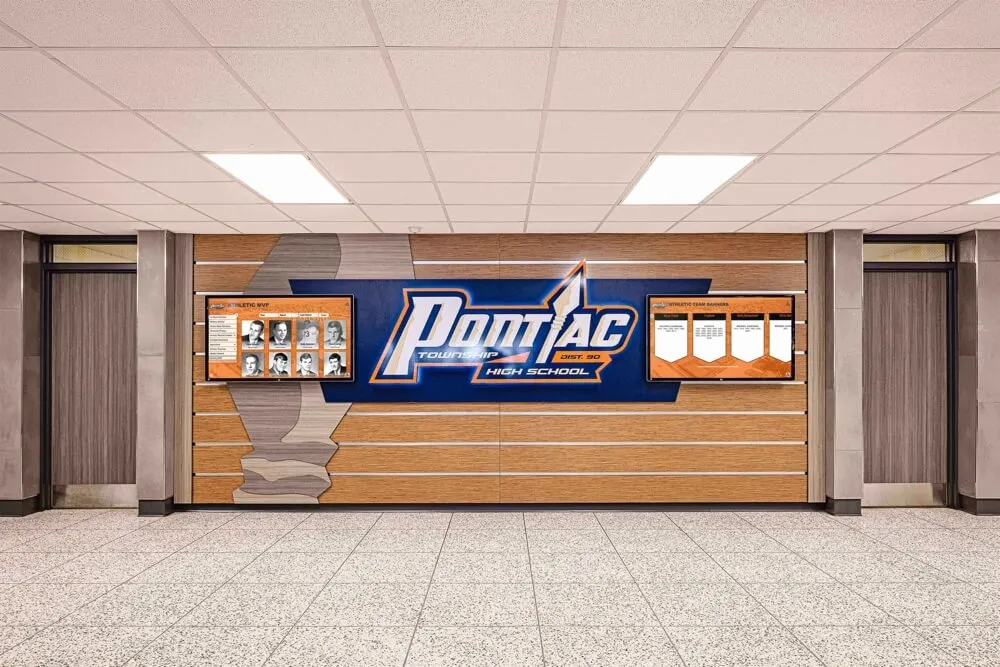
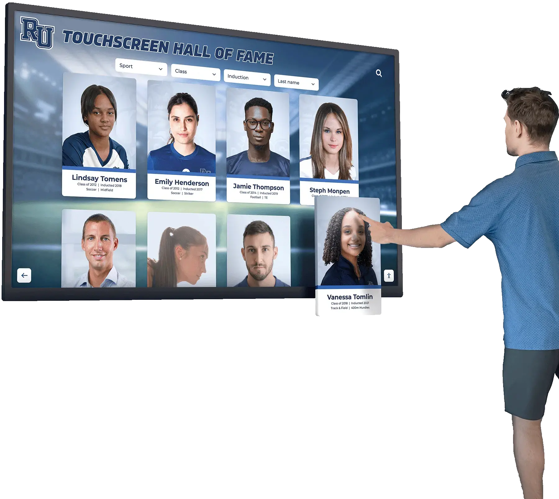
Well-designed kiosk interfaces incorporate accessibility features including proper contrast, logical navigation, and alternative input support
Time-Based and Motion-Sensitive: Level A Requirements
2.2.1 Timing Adjustable (Level A)
Time limits must be adjustable, allowing users to turn off, adjust, or extend time restrictions. Touchscreen sessions with automatic timeouts must provide warnings and extension options before expiration.
Importance: Users with cognitive disabilities, motor disabilities, or using assistive technologies require additional time for reading, interaction, and navigation. Fixed time limits create barriers preventing task completion, requiring flexible timing accommodating diverse processing speeds and interaction methods.
Implementation: Provide session timeout warnings 60 seconds before expiration, offer one-touch session extension buttons, allow timeout disabling when security does not require restrictions, and set generously long default timeout periods (10+ minutes of inactivity).
2.2.2 Pause, Stop, Hide (Level A)
Moving, blinking, scrolling, or auto-updating content lasting more than five seconds must be pausable, stoppable, or hidable. Attraction loops, carousels, news tickers, and animated elements require pause controls.
Importance: Motion content distracts users with attention deficit disorders, makes reading impossible for people with certain cognitive disabilities, and interferes with screen reader comprehension. User-controlled motion respects diverse needs while preventing automatic animation from creating unusability.
Implementation: Provide prominent pause buttons on carousels and animation, stop attraction loops on first touch, avoid auto-advancing slideshows without pause controls, and implement motion reduction preferences respecting system-level settings.
2.3.1 Three Flashes or Below Threshold (Level A)
Content must not flash more than three times per second unless flashes remain below general and red flash thresholds. Animation, video content, and transitions must avoid flash rates triggering photosensitive seizures.
Importance: Certain flash rates trigger seizures in people with photosensitive epilepsy, creating serious health risks. Flash restrictions protect vulnerable individuals from harm while typically not impacting typical content approaches, making compliance straightforward through flash-rate avoidance.
Navigation and Structure: Level A Requirements
2.4.1 Bypass Blocks (Level A)
Mechanisms must enable bypassing repeated content blocks. Touchscreens with consistent headers, navigation bars, or decorative elements across multiple screens should provide skip links or landmarks enabling rapid navigation to main content.
Importance: Keyboard users and screen reader users must otherwise tab through or listen to identical repeated content on every screen, creating tedious experiences and wasting time. Bypass mechanisms respect efficiency needs enabling direct access to unique content on each page.
Implementation: Provide “Skip to content” links as first focusable elements, use ARIA landmark roles (banner, navigation, main, contentinfo) enabling landmark navigation, and structure content with proper headings allowing screen readers to jump between sections.
2.4.2 Page Titled (Level A)
Each screen or view must have descriptive, informative titles. Recognition display screens showing search results, individual profiles, category listings, or featured content require unique titles describing current content.
Importance: Page titles appear in browser tabs, bookmarks, screen reader announcements, and navigation history. Descriptive titles enable orientation, navigation, and content identification particularly critical for screen reader users unable to scan pages visually.
Implementation: Generate dynamic titles reflecting current content like “[Name] - Athletic Hall of Fame”, “Search Results for [Query]”, or “[Category] - Recognition Display”, ensuring each view provides contextual identification through title attributes.
2.4.3 Focus Order (Level A)
Focus order through interactive elements must be logical and preserve meaning. Tab sequence must follow visual flow through navigation menus, content cards, form fields, and interactive components.
Importance: Illogical focus order creates confusion for keyboard users unable to predict which element receives focus next. Meaningful sequence enables efficient navigation matching visual layout expectations while supporting comprehension of content relationships.
2.4.4 Link Purpose (In Context) (Level A)
Link purposes must be determinable from link text alone or from link text combined with programmatically determined context. “Click here” and “Learn more” links without context fail this criterion unless surrounding content provides context assistive technologies can programmatically associate.
Importance: Screen reader users often navigate by pulling link lists without surrounding context. Ambiguous links like “Click here” appearing repeatedly in lists provide no information about destinations, requiring descriptive link text enabling informed navigation decisions.
Implementation: Write descriptive link text like “View John Smith’s athletic profile” instead of “Click here”, add ARIA labels providing context when concise visual text proves insufficient, and avoid generic link text appearing repeatedly without distinguishing information.
Pointer and Motion Input: Level A Requirements (WCAG 2.1 and 2.2)
2.5.1 Pointer Gestures (Level A - WCAG 2.1 and 2.2)
Functionality requiring multipoint or path-based gestures must have single-pointer alternatives. Pinch-to-zoom, multi-finger swipes, or drawing gestures require single-tap or simple-swipe alternatives.
Importance: Users with motor disabilities, tremors, or prosthetic devices often cannot perform complex gestures. Single-pointer alternatives ensure functionality remains accessible through simple taps or clicks without requiring precise multi-touch or path-based motions.
Implementation: Provide zoom buttons alongside pinch-to-zoom gestures, offer navigation buttons accompanying swipe gestures, add single-tap alternatives for drag-and-drop operations, and avoid requiring precise gesture paths.
2.5.2 Pointer Cancellation (Level A - WCAG 2.1 and 2.2)
For single-pointer functionality, at least one condition must be true: down-events do not execute functions, functions execute on up-events with abort mechanisms available, up-events reverse down-event outcomes, or completing down-events remains essential. This prevents accidental activation through touchscreen contact without release.
Importance: Users with tremors or motor control difficulties often accidentally touch screens or trigger actions unintentionally. Activation on release rather than touch-down enables error recovery through movement away from controls before lifting fingers.
Implementation: Implement activation on touch-up events rather than touch-down, provide visual feedback showing selection before activation, allow cancellation by moving away from controls before release, and add confirmation dialogs for destructive actions.
2.5.3 Label in Name (Level A - WCAG 2.1 and 2.2)
User interface components with visible text labels must include label text in accessible names. Voice control users speak visible labels to activate controls, requiring programmatic names containing visible label text.
Importance: Voice control users issue commands using visible labels. When accessible names differ from visible labels, voice commands fail creating confusion and requiring users to guess correct activation phrases through trial and error.
Implementation: Ensure button accessible names match visible button text, include visible text in longer accessible names providing additional context, and test voice control activation using visible labels to verify consistency.
2.5.4 Motion Actuation (Level A - WCAG 2.1 and 2.2)
Functionality triggered by device motion or user motion must have user interface alternatives and be disableable. Shake-to-refresh, tilt interactions, or gesture-based controls require alternative activation methods.
Importance: Users unable to move devices due to wheelchair mounting, motor disabilities, or device stability needs cannot trigger motion-based functionality. Motion-free alternatives ensure equal access while disabling prevents accidental activation through unintended movements.
Implementation: Provide button alternatives for motion-triggered functionality, include settings disabling motion activation, and avoid designing experiences depending solely on motion input.
Language and Context: Level A Requirements
3.1.1 Language of Page (Level A)
Primary language of content must be programmatically determinable through language attributes. Recognition displays in multilingual communities or featuring non-English honorees require proper language markup.
Importance: Screen readers use language declarations to apply correct pronunciation rules. Incorrect or missing language markup causes screen readers to mispronounce content creating comprehension difficulties for blind users relying on speech synthesis.
Implementation: Set appropriate lang attributes on HTML root elements (lang=“en” for English content), add lang attributes to passages in different languages, and verify screen readers pronounce content correctly using proper language declarations.
Input and Error Handling: Level A Requirements
3.2.1 On Focus (Level A)
Components receiving focus must not initiate unexpected context changes. Focusing on form fields, navigation elements, or interactive components through keyboard or touch should not automatically trigger navigation, form submission, or interface changes.
Importance: Unexpected context changes disorient users, particularly affecting people with cognitive disabilities, screen reader users unable to perceive visual changes immediately, and individuals using magnification viewing only interface portions. Predictable behavior enables confident navigation preventing confusion and navigation loss.
3.2.2 On Input (Level A)
Changing settings, entering data, or interacting with controls must not automatically cause context changes unless users receive advance warning. Form inputs should not automatically submit on entry, search fields should not auto-navigate on typing, and selections should not automatically apply without explicit confirmation.
Importance: Automatic context changes prevent error correction, create disorientation, and cause lost work particularly affecting users with cognitive disabilities or using assistive technologies. Explicit submission controls enable review and correction before committing changes.
3.2.6 Consistent Help (Level A - WCAG 2.2 only)
Help mechanisms appearing on multiple screens must appear in consistent locations. Help buttons, support links, or assistance features must maintain predictable positions throughout experiences.
Importance: Consistent help placement enables users to locate assistance predictably when needed. Position changes force repeated searching particularly affecting users with cognitive disabilities relying on spatial memory for navigation efficiency.
3.3.1 Error Identification (Level A)
Input errors must be identified and described to users in text. Form validation errors, search failures, or interaction problems require clear textual descriptions explaining issues and enabling correction.
Importance: Visual-only error indication through color or icons alone excludes blind users and individuals with cognitive disabilities. Textual error descriptions ensure all users understand problems regardless of perceptual abilities enabling appropriate corrective actions.
Implementation: Provide textual error messages adjacent to problematic fields, include error summaries at form tops linking to specific field errors, describe problems clearly explaining what corrections are needed, and use ARIA live regions announcing errors dynamically for screen reader users.
3.3.2 Labels or Instructions (Level A)
User input requiring data entry must have labels or instructions. Search fields, form inputs, and interactive elements requiring user action need clear labels describing expected input.
Importance: Unlabeled inputs create confusion about expected data, format requirements, and field purposes. Clear labels and instructions enable successful interaction preventing errors and supporting task completion across diverse user populations.
3.3.7 Redundant Entry (Level A - WCAG 2.2 only)
Information previously entered in processes must not require re-entry unless necessary for security or previously entered information becomes invalid. Multi-step interactions should preserve data across screens.
Importance: Re-entering identical information creates burden particularly affecting users with cognitive disabilities, motor difficulties, or using assistive technologies making data entry time-consuming. Data preservation respects user effort enabling efficient task completion.
Robust and Compatible: Level A Requirements
4.1.1 Parsing (Level A - Note: Obsolete in WCAG 2.2)
For WCAG 2.0 and 2.1 conformance, this criterion requires valid HTML ensuring proper parsing. The September 2023 errata update indicates this criterion is always considered satisfied with modern browsers’ error handling. WCAG 2.2 removes this criterion as obsolete, acknowledging browsers now handle parsing issues without accessibility impact.
4.1.2 Name, Role, Value (Level A)
User interface components must have programmatically determinable names, roles, states, and values. Interactive elements like buttons, links, form controls, and custom components require proper semantic markup or ARIA attributes exposing information to assistive technologies.
Importance: Assistive technologies depend on name, role, and state information to present interfaces meaningfully. Missing or incorrect information prevents blind users from understanding component purposes, current states, or how to interact effectively.
Implementation: Use native HTML elements providing built-in semantics when possible, add ARIA roles for custom components lacking native equivalents, ensure interactive elements have accessible names through labels or ARIA attributes, and expose state changes (expanded/collapsed, checked/unchecked) to assistive technologies.

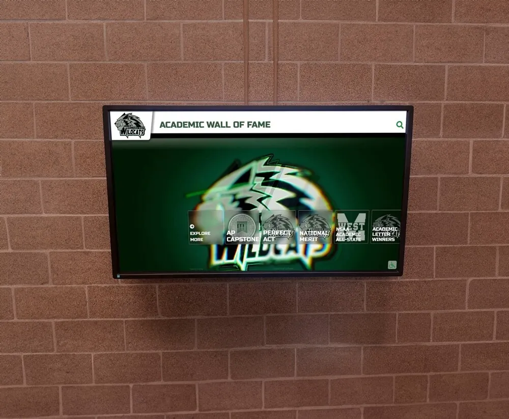
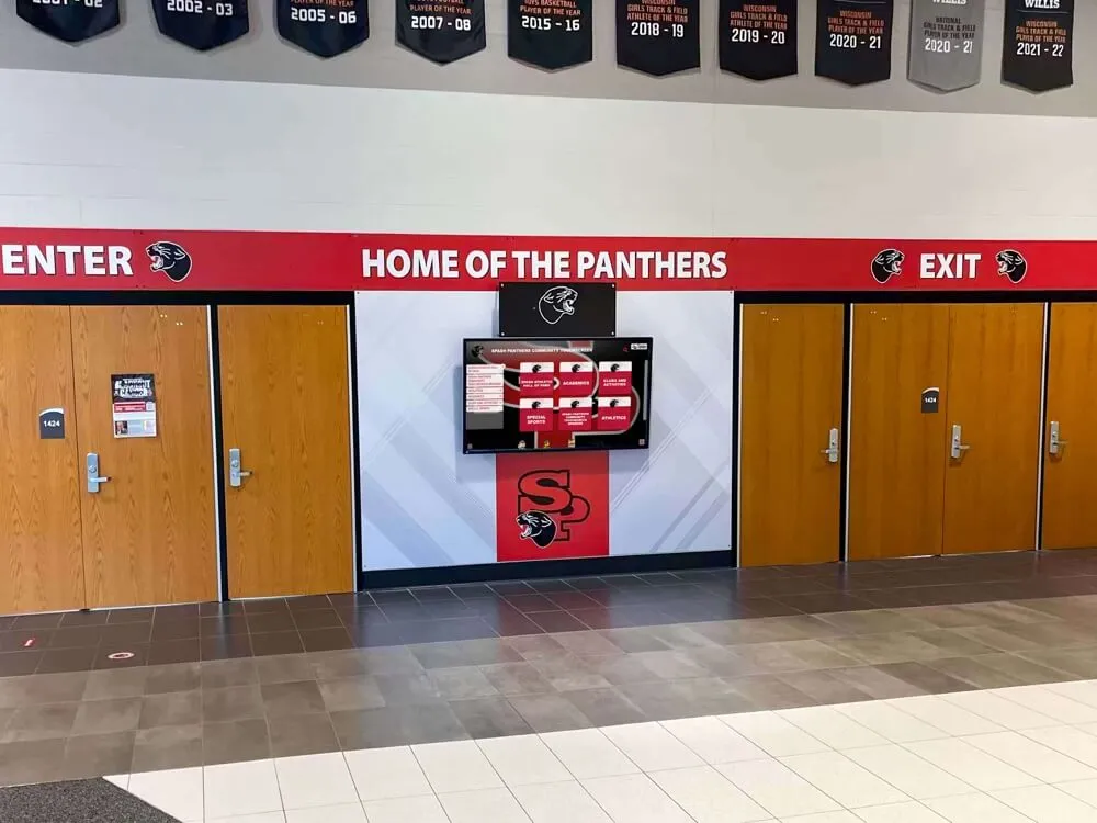
Accessible design enables independent exploration for all community members including individuals using assistive technologies
Level AA Success Criteria: Recommended Accessibility Standard
Level AA criteria address common barriers facing significant disability populations while remaining practically achievable for most content. Organizations targeting ADA compliance, federal accessibility requirements, or accessibility best practices should aim for Level AA conformance across digital recognition displays.
Enhanced Perceivability: Level AA Requirements
1.2.4 Captions (Live) (Level AA)
Live audio content must have synchronized captions. If recognition displays show live-streamed events, ceremonies, or real-time content, live captions must accompany audio content.
Importance: Live captions serve deaf audiences unable to access audio content in real-time situations. While less common for static recognition displays, installations featuring livestream capabilities or event coverage require real-time captioning maintaining accessibility during dynamic content presentation.
1.2.5 Audio Description (Prerecorded) (Level AA)
Prerecorded video requires audio description tracks narrating visual information. Video tributes, facility tours, or achievement documentation must include audio description providing equivalent information about visual content not conveyed through dialogue.
Importance: Audio descriptions enable blind users to understand visual information including settings, actions, expressions, and on-screen text not spoken in dialogue. Without descriptions, significant video content remains inaccessible to blind audiences missing context essential for comprehension.
1.3.4 Orientation (Level AA - WCAG 2.1 and 2.2)
Content must not restrict view orientation to portrait or landscape unless specific orientation proves essential. Touchscreen displays should support both orientations unless physical installation permanently fixes orientation.
Importance: Users with mounted devices, wheelchair users, and individuals with physical disabilities may depend on particular orientations. Orientation flexibility ensures accessibility regardless of how users must position themselves or devices relative to screens.
1.3.5 Identify Input Purpose (Level AA - WCAG 2.1 and 2.2)
Input fields collecting standard user information must identify input purposes programmatically. Form fields requesting names, emails, phone numbers, or addresses should include autocomplete attributes enabling browsers and assistive technologies to suggest appropriate values.
Importance: Programmatic input purpose identification enables autofill features helping users with cognitive disabilities, motor difficulties, or memory challenges complete forms efficiently. Proper markup reduces errors while accelerating data entry benefiting broad user populations.
1.4.3 Contrast (Minimum) (Level AA)
Text must maintain minimum 4.5:1 contrast ratio against backgrounds; large text (18pt or 14pt bold minimum) requires 3:1 minimum contrast. Touchscreen interfaces must verify sufficient contrast across text, navigation elements, and interactive components.
Importance: Insufficient contrast creates readability barriers for users with low vision, color blindness, or viewing in bright ambient light conditions common in public installations. Minimum contrast ratios ensure text remains readable across diverse vision abilities and environmental conditions without requiring magnification or accessibility tools.
Implementation: Test color combinations using contrast checking tools verifying ratios meet minimums, avoid light gray text on white backgrounds or subtle color contrasts, increase font weights when colors cannot change, and verify readability in actual installation lighting conditions before finalizing designs.
Many digital recognition displays fail this basic requirement through poor color choices creating unnecessary barriers easily addressed through thoughtful design decisions during development.
1.4.4 Resize Text (Level AA)
Text must be resizable to 200% without loss of content or functionality. Users must be able to enlarge text through browser zoom or system settings without horizontal scrolling, content cutoff, or overlapping elements.
Importance: Low vision users require text enlargement for readability. Fixed-size text or layouts breaking when enlarged create barriers preventing text magnification necessary for comprehension. Flexible layouts accommodate text scaling supporting diverse vision needs.
Implementation: Use relative font sizes enabling browser-based scaling, test layouts at 200% zoom verifying functionality remains intact, avoid fixed-width containers truncating enlarged text, and design responsive layouts adapting to various text sizes gracefully.
1.4.5 Images of Text (Level AA)
Images of text must be avoided except for logos, customizable text images, or essential presentations. Text rendered as images rather than actual text creates accessibility barriers and inflexibility.
Importance: Text images cannot be resized, recolored, or customized by users with vision needs. Screen readers cannot interpret images as text without perfect alternative text, and translation tools cannot process text embedded in graphics. Actual text provides flexibility supporting personalization and assistive technology access.
Implementation: Render text using HTML and CSS rather than text graphics, use web fonts for decorative typography, employ SVG text for scalable graphical text when necessary, and limit text images to true logos or specific cases where text presentation remains essential.
1.4.10 Reflow (Level AA - WCAG 2.1 and 2.2)
Content must reflow to single columns at 320 CSS pixel widths without requiring two-dimensional scrolling. Layouts must adapt gracefully to narrow viewports and high zoom levels without horizontal scrolling or content loss.
Importance: Users with low vision often zoom to 400% magnification creating narrow effective viewport widths. Fixed-width layouts requiring horizontal scrolling create impossible navigation requiring users to scroll horizontally to read each line then scroll back to start next lines. Responsive reflow enables single-direction scrolling supporting magnification users.
1.4.11 Non-text Contrast (Level AA - WCAG 2.1 and 2.2)
User interface components and graphical objects must maintain minimum 3:1 contrast against adjacent colors. Interactive elements like buttons, form fields, icons, and navigation controls require sufficient contrast enabling perception and identification.
Importance: Low-contrast UI components disappear for users with low vision, color blindness, or viewing in challenging lighting. Minimum contrast ensures interactive elements remain visible and distinguishable enabling confident interaction regardless of vision abilities.
Implementation: Verify button borders, form field outlines, focus indicators, and icon colors meet 3:1 contrast minimums, test interfaces using vision simulation tools, avoid subtle gray UI elements on white backgrounds, and verify visibility in actual installation environments.
1.4.12 Text Spacing (Level AA - WCAG 2.1 and 2.2)
Content must remain readable when users adjust text spacing to minimum values including line height 1.5x font size, paragraph spacing 2x font size, letter spacing 0.12x font size, and word spacing 0.16x font size.
Importance: Users with dyslexia and reading disabilities often require increased text spacing improving comprehension. Layouts must accommodate spacing adjustments without content loss, overlapping text, or truncation preventing readability.
Implementation: Avoid fixed-height containers constraining text expansion, test layouts with maximum text spacing values, use flexible spacing in CSS rather than absolute pixel values, and verify text remains visible and readable after user-applied spacing modifications.
1.4.13 Content on Hover or Focus (Level AA - WCAG 2.1 and 2.2)
Content appearing on pointer hover or keyboard focus must be dismissible without moving pointer or focus, hoverable when triggered by pointer, and persistent until dismissed or no longer valid. Tooltips, popovers, and dropdown menus must follow these principles.
Importance: Users with low vision magnifying content or motor control difficulties cannot read content disappearing immediately or inaccessible to pointer movement. Persistent, hoverable content enables examination without premature dismissal accommodating diverse interaction speeds and magnification needs.
Implementation: Keep tooltips visible until users explicitly dismiss or move away, enable pointer movement over tooltip content without dismissal, avoid auto-hiding content before users can reasonably read it, and provide dismiss controls when content obscures underlying interface elements.
Enhanced Operability: Level AA Requirements
2.4.5 Multiple Ways (Level AA)
Multiple navigation methods must exist for locating content within systems. Recognition displays should provide search functionality, browsing by category, alphabetical directories, and featured collections enabling diverse navigation approaches.
Importance: Users employ different navigation strategies based on disabilities, familiarity, and goals. Multiple pathways accommodate cognitive differences, screen reader navigation approaches, and diverse user preferences enabling efficient content discovery regardless of user characteristics or task contexts.
Implementation: Provide search boxes prominently placed enabling keyword-based discovery, organize content by multiple classification schemes, offer alphabetical indexes and browse-by-year options, and create curated collections highlighting content themes supporting different exploration patterns.
Digital platforms like Rocket Alumni Solutions build multiple navigation methods directly into recognition interfaces supporting diverse user approaches from the start.
2.4.6 Headings and Labels (Level AA)
Headings and labels must describe topics or purposes clearly. Navigation sections, content areas, and form fields require descriptive headings and labels eliminating ambiguity about content or required inputs.
Importance: Clear headings enable rapid page scanning, screen reader navigation by heading, and comprehension of content organization. Descriptive labels eliminate confusion about expected inputs supporting task completion across diverse cognitive abilities and familiarity levels.
2.4.7 Focus Visible (Level AA)
Keyboard focus must be visible. Interactive elements receiving keyboard focus require visible indicators showing current focus position enabling keyboard-only navigation.
Importance: Keyboard users cannot navigate interfaces without visible focus indicators showing which element currently has focus. Invisible focus creates impossible situations where users cannot determine position or predict navigation behavior.
Implementation: Preserve default browser focus indicators or implement enhanced custom focus styles, ensure focus indicators maintain 3:1 contrast against backgrounds, test keyboard navigation verifying focus remains visible throughout interfaces, and avoid CSS removing outline without replacement focus indication.
2.4.11 Focus Not Obscured (Minimum) (Level AA - WCAG 2.2 only)
When components receive keyboard focus, focus indicators must not be entirely hidden by author-created content. Sticky headers, popups, or overlays must not completely obscure focused elements preventing users from seeing which element has focus.
Importance: Hidden focus indicators prevent keyboard users from determining focus position creating navigation confusion and impossible interaction situations. Partially obscured focus proves acceptable but complete hiding creates barriers requiring content positioning avoiding complete focus obscuration.
2.5.7 Dragging Movements (Level AA - WCAG 2.2 only)
Functionality requiring dragging movements must have single-pointer alternatives. Drag-to-reorder, drag-and-drop uploads, or slider controls requiring dragging need button-based or tap-based alternatives.
Importance: Users with motor disabilities, tremors, or using alternative input devices often cannot perform precise dragging movements. Single-pointer alternatives ensure functionality remains accessible through simple taps or clicks without requiring sustained precise pointer movements.
2.5.8 Target Size (Minimum) (Level AA - WCAG 2.2 only)
Touch targets must be at least 24x24 CSS pixels unless excepted for inline links, user-agent controls, essential presentations, or when sufficient spacing surrounds smaller targets. Buttons, icons, form fields, and interactive elements require minimum sizes supporting touch interaction.
Importance: Small touch targets create barriers for users with motor disabilities, tremors, limited dexterity, or large fingers. Minimum target sizes ensure successful activation without excessive precision preventing missed activations, accidental incorrect selections, and frustration from repeated failed attempts.
Implementation: Design buttons, icons, and controls at minimum 44x44 pixel sizes matching iOS and Android touch target guidelines exceeding WCAG minimums, ensure adequate spacing between adjacent targets preventing accidental activation of neighboring controls, and verify targets remain activatable with fingers of various sizes without requiring extreme precision.
Enhanced Understandability: Level AA Requirements
3.1.2 Language of Parts (Level AA)
Content passages in different languages must identify language programmatically through lang attributes. Recognition profiles including non-English names, quotations, or content sections require proper language markup enabling correct screen reader pronunciation.
Importance: Screen readers cannot properly pronounce text in different languages without language declarations. Missing language markup causes mispronunciation creating comprehension difficulties for blind users encountering multilingual content.
3.2.3 Consistent Navigation (Level AA)
Navigation mechanisms appearing on multiple screens must occur in consistent relative order unless users initiate changes. Main menus, search boxes, and navigation controls should maintain consistent positions throughout experiences.
Importance: Consistent navigation enables predictable interaction particularly benefiting users with cognitive disabilities relying on spatial memory. Position changes force repeated searching creating confusion, extra effort, and navigation difficulties across individuals with learning disabilities or memory challenges.
3.2.4 Consistent Identification (Level AA)
Components with identical functionality must be identified consistently. Search buttons, home links, back controls, and recurring functions require consistent labels and iconography throughout interfaces.
Importance: Inconsistent identification creates confusion about component functions requiring users to relearn identical functionality appearing with different labels. Consistent identification enables recognition transfer across screens supporting comprehension and efficient interaction.
3.3.3 Error Suggestion (Level AA)
Input errors detected automatically must include suggestions for correction when possible. Form validation errors should provide guidance on expected formats, valid values, or correction approaches.
Importance: Error identification alone leaves users uncertain about correction approaches particularly affecting people with cognitive disabilities. Specific correction suggestions enable successful task completion reducing abandonment from repeated failed correction attempts.
3.3.4 Error Prevention (Legal, Financial, Data) (Level AA)
Forms causing legal commitments, financial transactions, or data modifications must be reversible, verified, or confirmed before final submission. Multi-step processes should enable review and correction before finalizing actions.
Importance: Preventing errors proves more effective than detecting errors particularly for consequential actions affecting users legally or financially. Confirmation mechanisms catch errors before commitment preventing costly mistakes especially protecting users with cognitive disabilities from irreversible unintended actions.
3.3.8 Accessible Authentication (Minimum) (Level AA - WCAG 2.2 only)
Cognitive function tests must not be required for authentication unless involving object recognition, personal content identification, or providing alternative authentication methods. Authentication should not require solving puzzles, remembering information, or transcribing characters.
Importance: Memory-based authentication and cognitive challenges create barriers for users with cognitive disabilities, older adults, and individuals with memory impairments. Alternative authentication methods enable security without excluding users unable to remember passwords or solve cognitive tests.
Enhanced Compatibility: Level AA Requirements
4.1.3 Status Messages (Level AA - WCAG 2.1 and 2.2)
Status messages must be presentable to assistive technology users through roles or properties without receiving focus. Search results, form submission confirmations, progress indicators, or error summaries require programmatic announcement to screen reader users.
Importance: Visual-only status messages exclude blind users unaware of content changes, submission confirmations, or error notifications. ARIA live regions announce dynamic content changes ensuring screen reader users receive equivalent information without moving focus disrupting current tasks.
Implementation: Use ARIA live regions (aria-live=“polite” or “assertive”) for dynamic status messages, implement role=“status” for non-critical updates, employ role=“alert” for important notifications requiring immediate attention, and test screen reader announcement ensuring messages convey appropriately to assistive technology users.

Touch interfaces meeting Level AA requirements support successful interaction across diverse abilities through careful attention to target sizes, contrast, and feedback
Level AAA Success Criteria: Enhanced Accessibility Support
Level AAA criteria represent aspirational goals rather than universal requirements. Some AAA criteria prove impossible for certain content types while others address specialized needs. Organizations implement selected AAA features where feasible but rarely achieve complete Level AAA conformance across all content.
Enhanced Media Access: Level AAA
Level AAA includes sign language interpretation for prerecorded media (1.2.6), extended audio descriptions with video pausing (1.2.7), text alternatives for prerecorded media (1.2.8), and live audio alternatives (1.2.9). While valuable for specialized applications serving deaf-blind users or audiences preferring sign language, these requirements prove impractical for most recognition display implementations.
Enhanced Visual Presentation: Level AAA
1.4.6 Contrast (Enhanced) (Level AAA) requires 7:1 contrast for normal text and 4.5:1 for large text—significantly higher than Level AA minimums. Enhanced contrast benefits users with more severe vision impairments but proves challenging aesthetically while providing diminishing accessibility returns beyond Level AA compliance for typical users.
1.4.8 Visual Presentation (Level AAA) requires extensive text customization including user-selectable foreground and background colors, narrow text block widths (80 characters maximum), full text justification prohibition, adjustable line spacing, and no horizontal scrolling at 200% zoom. While beneficial for users with reading disabilities, implementation complexity typically exceeds practical requirements for public touchscreen displays.
Enhanced Interaction Flexibility: Level AAA
2.1.3 Keyboard (No Exception) (Level AAA) removes exceptions from Level A keyboard requirement, requiring keyboard operation for all functionality including path-dependent input like drawing. Touchscreen applications requiring freehand signatures or drawing typically cannot achieve full Level AAA keyboard compliance.
2.2.3 No Timing (Level AAA) prohibits time limits except for real-time events and essential timing. While eliminating timeouts removes barriers for users requiring unlimited time, security and resource considerations often require eventual session timeouts for public touchscreen installations.
2.5.5 Target Size (Enhanced) (Level AAA) requires 44x44 pixel touch targets—significantly larger than Level AA 24x24 pixel minimums. Enhanced target sizes benefit users with more severe motor disabilities while proving challenging for dense interfaces or space-constrained layouts.
Enhanced Comprehension Support: Level AAA
Level AAA includes reading level support (3.1.5), pronunciation guides (3.1.6), and help documentation availability (3.3.5). While valuable for specialized audiences, comprehensive implementation across all content proves impractical for most recognition displays serving general audiences.
Organizations should evaluate specific Level AAA criteria for potential implementation based on audience needs, content characteristics, and available resources rather than pursuing complete Level AAA conformance rarely achieved even by accessibility-focused organizations.
Implementing WCAG 2.2 AA in Digital Recognition Displays
Understanding success criteria represents only the first step—practical implementation requires systematic approaches integrating accessibility throughout design, development, content creation, and testing processes.
Accessibility Integration in Design Process
Early Planning and Requirements
Define accessibility requirements during project planning phases rather than treating accessibility as late-stage remediation. Establish Level AA conformance as non-negotiable requirement, allocate sufficient budget for accessibility testing and remediation, and involve users with disabilities in design processes through usability testing providing firsthand feedback.
Design System Development
Create accessible component libraries ensuring reusable elements meet WCAG requirements from creation. Establish color palettes meeting contrast requirements, define button and touch target minimum sizes, document accessible interaction patterns, and provide developers with tested, conformant components preventing accessibility rework during implementation.
Visual Design Considerations
Balance aesthetic preferences with accessibility requirements through thoughtful design approaches. Use brand colors meeting contrast requirements through shade adjustments, employ sufficient font sizes and weights ensuring readability, design clear focus indicators matching brand aesthetics while maintaining visibility, and incorporate accessibility as design excellence criterion rather than constraint limiting creativity.
Organizations implementing accessible touchscreen displays find early accessibility integration prevents costly late-stage remediation while producing better user experiences benefiting all audiences.
Content Accessibility Workflows
Image and Media Preparation
Establish content workflows ensuring multimedia accessibility from creation. Write descriptive alternative text during photo upload, generate or commission captions for video content, create transcripts for audio interviews, and verify media files include proper accessibility metadata before publication.
Writing Accessible Content
Train content creators in accessibility principles affecting writing. Use clear, simple language appropriate for target audiences, structure content with proper headings enabling navigation, write descriptive link text conveying destinations, and provide context for complex information supporting comprehension across diverse cognitive abilities.
Form and Input Design
Create accessible data collection interfaces supporting task completion. Associate visible labels with form fields programmatically, provide clear instructions before form sections, implement helpful error messages suggesting corrections, and enable recovery from mistakes through confirmation screens and undo mechanisms.
Technical Implementation Best Practices
Semantic HTML Foundation
Build interfaces using proper semantic HTML providing native accessibility. Use heading elements (H1-H6) establishing content hierarchy, employ lists for grouped items and navigation, implement form labels correctly associating with inputs, and leverage native HTML elements providing built-in accessibility before resorting to ARIA attributes.
ARIA Enhancement
Apply ARIA attributes where semantic HTML proves insufficient. Use ARIA landmark roles (banner, navigation, main, contentinfo) when HTML5 elements cannot be used, implement ARIA live regions for dynamic content announcements, add ARIA labels providing context when visible labels prove insufficient, and ensure ARIA state attributes accurately reflect component states.
Responsive and Adaptive Design
Implement responsive layouts supporting diverse viewport sizes, zoom levels, and orientation preferences. Test interfaces at 200% zoom verifying content remains accessible, ensure layouts adapt gracefully to narrow viewports, support both portrait and landscape orientations when possible, and verify touch targets remain appropriately sized across responsive breakpoints.
Focus Management
Implement proper focus management supporting keyboard navigation. Establish logical tab order following visual flow, create visible focus indicators clearly showing keyboard position, manage focus during dynamic content changes, and restore focus appropriately after dialog dismissals or view transitions.
Testing and Validation
Automated Accessibility Testing
Use automated testing tools identifying common accessibility issues. Run tools like Lighthouse, aXe, WAVE, or Pa11y during development identifying missing alt text, contrast failures, missing labels, and other detectable issues. Remember automated tools detect only 20-30% of accessibility barriers requiring supplementary manual testing.
Manual Accessibility Testing
Conduct comprehensive manual testing verifying practical accessibility beyond automated detection. Test complete keyboard navigation without mouse or touch, verify screen reader experience using NVDA, JAWS, or VoiceOver, examine visual designs using color blindness simulation, and validate contrast measurements using reliable tools.
User Testing with Assistive Technologies
Involve users with disabilities testing with actual assistive technologies. Observe blind users navigating with screen readers, watch keyboard-only users completing typical tasks, evaluate effectiveness with low vision users employing magnification, and gather feedback from users with cognitive disabilities assessing comprehension and usability.
Conformance Evaluation
Perform formal WCAG conformance evaluation against Level AA success criteria. Document testing methodology, identify conformance status for each success criterion, remediate failures discovered during evaluation, and maintain accessibility conformance statements describing conformance level, evaluation date, and known issues.
Organizations pursuing digital recognition system implementation should prioritize vendors demonstrating accessibility commitment through conformant products and accessibility expertise rather than treating compliance as afterthought.
Accessibility Benefits Beyond Compliance
WCAG implementation delivers benefits extending far beyond legal compliance, improving experiences for all users while demonstrating institutional commitment to inclusion and equity.
Universal Usability Improvements
Accessibility features benefit users beyond disability populations. Captions serve viewers in sound-sensitive environments, clear navigation helps unfamiliar users orient quickly, keyboard support benefits power users preferring keyboard efficiency, and sufficient contrast improves readability in bright sunlight common near entrance locations where displays often install.
Design improvements supporting accessibility generally enhance overall user experience rather than creating specialized accommodations benefiting only narrow populations. The “curb cut effect” describes how accessibility modifications designed for specific disabilities benefit broader populations—ramps help parents with strollers and travelers with luggage beyond wheelchair users they initially served.
Reduced Support Requirements
Accessible interfaces reduce confusion and support needs. Clear labels eliminate questions about interface purpose, logical navigation reduces getting lost requiring assistance, error prevention reduces correction requests, and intuitive operation enables independent use without staff intervention. Organizations report decreased support requests and increased self-service success following accessibility improvements.
Expanded Audience Reach
Accessible displays serve broader audiences including older adults with age-related vision changes, individuals with temporary disabilities from injuries or medical conditions, visitors with undiagnosed or undisclosed disabilities, and international visitors with language challenges benefiting from clear visual design and logical structure.
Approximately 26% of American adults live with some form of disability according to CDC data. Accessible design enables full participation from this substantial population segment while benefiting many others experiencing temporary or situational limitations.
Legal Risk Mitigation
Organizations face increasing legal exposure from accessibility complaints and lawsuits targeting physical and digital properties. Title III of the Americans with Disabilities Act requires accessibility in places of public accommodation including educational institutions, museums, and many nonprofit organizations. Digital accessibility has become subject to ADA claims with courts increasingly ruling websites and digital interfaces fall under Title III coverage.
Proactive WCAG 2.2 AA implementation demonstrates good faith accessibility commitment while reducing vulnerability to legal challenges. Documentation of accessibility testing, remediation efforts, and conformance achievements provides evidence of diligence valuable in defending against accessibility claims.
Institutional Values Demonstration
Accessibility implementation demonstrates concrete commitment to inclusion, equity, and diversity beyond mission statements and policy documents. Accessible design shows respect for all community members, communicates that everyone deserves full participation, and establishes inclusive practices as operational priorities rather than aspirational goals.
Recognition displays specifically carry symbolic importance—celebrating community achievement while excluding disabled community members from accessing that recognition creates problematic contradictions. Accessible recognition demonstrates comprehensive commitment to honoring all community members.
Rocket Alumni Solutions Accessibility Commitment
Purpose-built recognition platforms incorporate accessibility throughout design and development rather than treating compliance as remediation concern. Rocket Alumni Solutions implements WCAG 2.2 AA conformance across touchscreen interfaces and web platforms ensuring inclusive recognition experiences serving all community members regardless of disability.
The platform incorporates mandatory alt text fields during content upload ensuring images include textual alternatives, provides accessible color themes meeting contrast requirements out-of-box, implements proper semantic HTML and ARIA attributes throughout interfaces, supports keyboard navigation for users unable to use touchscreens, includes focus indicators clearly showing keyboard position, maintains logical heading structures enabling screen reader navigation, and generates accessible web portals extending recognition beyond physical displays.
Beyond technical compliance, the platform emphasizes usable accessibility through intuitive navigation benefiting users with cognitive disabilities, clear visual hierarchy supporting users with learning disabilities, consistent interaction patterns across the interface, generous touch targets exceeding minimum requirements, and comprehensive testing with assistive technologies during development.
Organizations selecting digital recognition platforms should prioritize vendors demonstrating accessibility expertise and commitment through conformant products, accessibility documentation and conformance statements, willingness to discuss accessibility implementations, and evidence of ongoing accessibility improvements rather than treating accessibility as checkbox feature.
Conclusion: Accessibility as Recognition Excellence
WCAG 2.2 AA compliance represents more than legal obligation—it embodies commitment to serving all community members with dignity and respect. Digital recognition displays celebrate achievement and honor excellence; excluding disabled community members from accessing that recognition contradicts the inclusive values recognition programs should represent.
Implement Accessible Digital Recognition
Discover how purpose-built accessible recognition platforms deliver inclusive touchscreen experiences meeting WCAG 2.2 AA standards while celebrating achievement across entire communities. Rocket Alumni Solutions builds accessibility into every interface element ensuring equal access for all users.
Explore Accessible SolutionsThe comprehensive WCAG 2.2 success criteria examined throughout this guide provide systematic frameworks ensuring perceivable, operable, understandable, and robust digital experiences. Level A criteria address fundamental barriers preventing access entirely. Level AA criteria represent the practical standard balancing accessibility needs with implementation feasibility appropriate for institutional deployments. Level AAA criteria provide enhanced support for specialized needs implemented selectively based on audience requirements.
Implementing accessibility requires integration throughout design, development, content creation, and testing processes rather than late-stage remediation efforts. Early accessibility consideration proves more effective and less expensive than retrofitting non-compliant implementations. Purpose-built accessible platforms provide conformant foundations preventing common accessibility mistakes while supporting accessible content creation through guided workflows and validation.
Beyond compliance obligations, accessible design delivers universal benefits improving experiences for all users, reducing support requirements, expanding audience reach, and demonstrating institutional commitment to inclusive excellence. The curb cut effect demonstrates how accessibility accommodations benefit far broader populations than originally targeted disability groups.
Organizations implementing digital recognition displays should prioritize accessibility from project inception, select vendors with demonstrated accessibility commitment, establish Level AA conformance as non-negotiable requirement, involve users with disabilities in testing and feedback, document conformance status and ongoing improvements, and maintain accessibility as permanent operational priority rather than one-time compliance project.
Ready to implement accessible digital recognition? Explore touchscreen design principles supporting inclusive experiences, discover interactive display implementation guides, learn about accessible digital hall of fame design, and understand how recognition display platforms built on accessibility principles deliver inclusive celebration honoring achievement across entire communities through purposeful, compliant interactive technology.