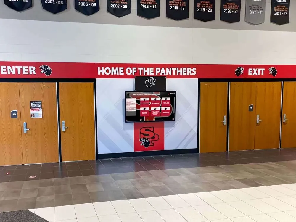


Interactive touchscreen displays serve increasingly diverse audiences in schools, museums, corporate facilities, and public spaces. Yet many organizations implement these systems without addressing accessibility requirements that determine whether everyone in their communities can use these installations independently—or whether significant populations face barriers preventing meaningful interaction.
The challenge extends beyond avoiding lawsuits, though legal compliance matters. Organizations that implement accessible touchscreen experiences serve broader audiences, demonstrate commitment to inclusion, and create better experiences for everyone—not just those with disabilities. Research consistently shows that accessibility improvements benefit all users through clearer interfaces, more intuitive navigation, and more forgiving interaction patterns.
This comprehensive guide explores WCAG 2.2 AA accessibility standards for touchscreen displays, examining what compliance means, why it matters for educational institutions and organizations, specific requirements affecting interactive kiosk design, legal considerations driving adoption, and practical implementation strategies ensuring your touchscreen installations serve all members of your community effectively.
Organizations implementing accessible touchscreen displays report not only reduced legal risk but also measurably improved user satisfaction across all demographics. Proper contrast ratios improve readability in bright lobbies. Adequate touch target sizing reduces errors for users of all abilities. Clear navigation benefits everyone from elderly visitors to hurried students. Accessibility creates better experiences universally rather than accommodating only those with recognized disabilities.

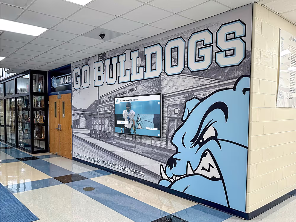
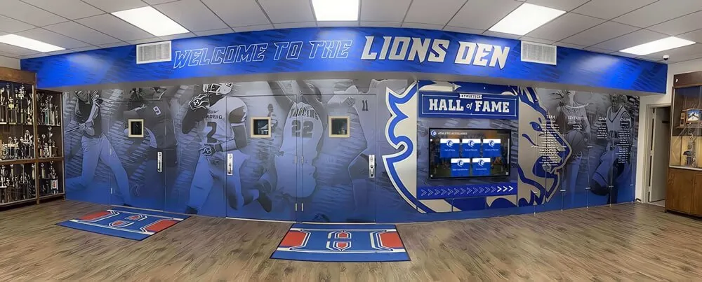
Accessible touchscreen installations enable independent exploration for all visitors regardless of age, ability, or technological familiarity
Understanding WCAG 2.2 AA Accessibility Standards
Before implementing accessibility features, understanding what WCAG 2.2 AA compliance actually requires provides essential context for design decisions and resource allocation.
What WCAG 2.2 AA Means for Interactive Displays
WCAG (Web Content Accessibility Guidelines) version 2.2 represents the latest international standard published by the World Wide Web Consortium (W3C) through its Web Accessibility Initiative. Released in October 2023, WCAG 2.2 builds upon previous versions while adding new success criteria addressing mobile accessibility, cognitive disabilities, and touch interaction patterns particularly relevant to public-facing kiosk applications.
The guidelines organize into three conformance levels: Level A addresses the most basic accessibility features; Level AA provides substantial accessibility serving most users with disabilities and represents the standard most organizations and regulations target; and Level AAA includes enhanced features for specialized needs. When organizations reference “WCAG 2.2 compliance,” they typically mean Level AA conformance—the practical middle ground between minimal effort and comprehensive coverage.
Four Core Accessibility Principles
WCAG organizes accessibility requirements around four fundamental principles that content and interfaces must satisfy:
Perceivable — Information and user interface components must be presentable to users in ways they can perceive. This means providing text alternatives for images, ensuring adequate color contrast, making content understandable without color alone, and offering captions for audio content. Users with visual impairments must perceive content through screen readers, while those with hearing impairments require visual alternatives to audio information.
Operable — User interface components and navigation must be operable through various input methods. All functionality must work via keyboard for users unable to use mouse or touch input. The interface must provide sufficient time for interaction, help users avoid and correct mistakes, and avoid content that causes seizures or physical reactions. For touchscreen displays specifically, this means supporting alternative input methods and ensuring touch targets meet minimum sizing requirements.
Understandable — Information and user interface operation must be understandable. Content should use clear language, provide predictable behavior, maintain consistent navigation, and help users avoid and correct errors. Interfaces shouldn’t require cognitive abilities beyond what content naturally demands. Forms need clear labels and helpful error messages guiding recovery.
Robust — Content must remain compatible with current and future assistive technologies. This requires valid code, proper semantic markup, and compatibility with screen readers and other assistive devices. As technologies evolve, properly structured content continues working rather than becoming obsolete.
Organizations implementing interactive display technology must address all four principles ensuring touchscreen experiences remain accessible across diverse user populations and assistive technologies.
Key Differences Between WCAG 2.1 and 2.2
WCAG 2.2 introduces nine new success criteria addressing gaps identified in previous versions, with several particularly relevant to touchscreen kiosk applications.
Target Size Requirements (2.5.8)
Perhaps most significant for touchscreen designers, WCAG 2.2 AA now requires minimum target sizes of 24 by 24 CSS pixels for all interactive elements—with exceptions only for inline links and controls whose size gets determined by user agents rather than authors. This represents substantial increase from informal best practices, ensuring users with motor control challenges, tremors, or simply large fingers can reliably activate intended targets without frustration.
Research on touch accuracy demonstrates that users commonly miss targets smaller than 44 pixels, though the 24-pixel minimum provides baseline protection. Organizations prioritizing excellent user experience rather than bare compliance typically implement 44-pixel or larger targets for primary interactions.
Focus Visibility Enhancement (2.4.11)
WCAG 2.2 moves enhanced focus visibility from AAA to AA level, requiring focus indicators meet minimum contrast requirements and minimum size thresholds. This ensures users navigating via keyboard or alternative input devices can clearly identify which interface element currently has focus—particularly important for touchscreen kiosks supporting keyboard access as alternative to touch interaction.
Dragging Movement Alternatives (2.5.7)
Many modern interfaces use drag-and-drop or dragging gestures for functionality. WCAG 2.2 AA now requires single-pointer alternatives for any dragging-based functionality. Users with motor control challenges often cannot perform precise dragging motions, so interfaces must provide equivalent functionality through simple taps or clicks.
For touchscreen applications supporting content reordering, zooming, or other drag-based features, designers must implement alternative methods accomplishing the same objectives through simpler interactions accessible to users unable to perform dragging gestures reliably.
Accessible Authentication (3.3.8)
WCAG 2.2 addresses cognitive accessibility by requiring that authentication processes don’t rely on cognitive function tests or remembering information. Instead, authentication should support recognized objects, personal content that users can access elsewhere, or simple mechanisms like clicking email links.
For touchscreen kiosks requiring user authentication—perhaps for personalized experiences or administrative access—this criterion ensures authentication doesn’t create barriers for users with cognitive disabilities affecting memory or problem-solving abilities.

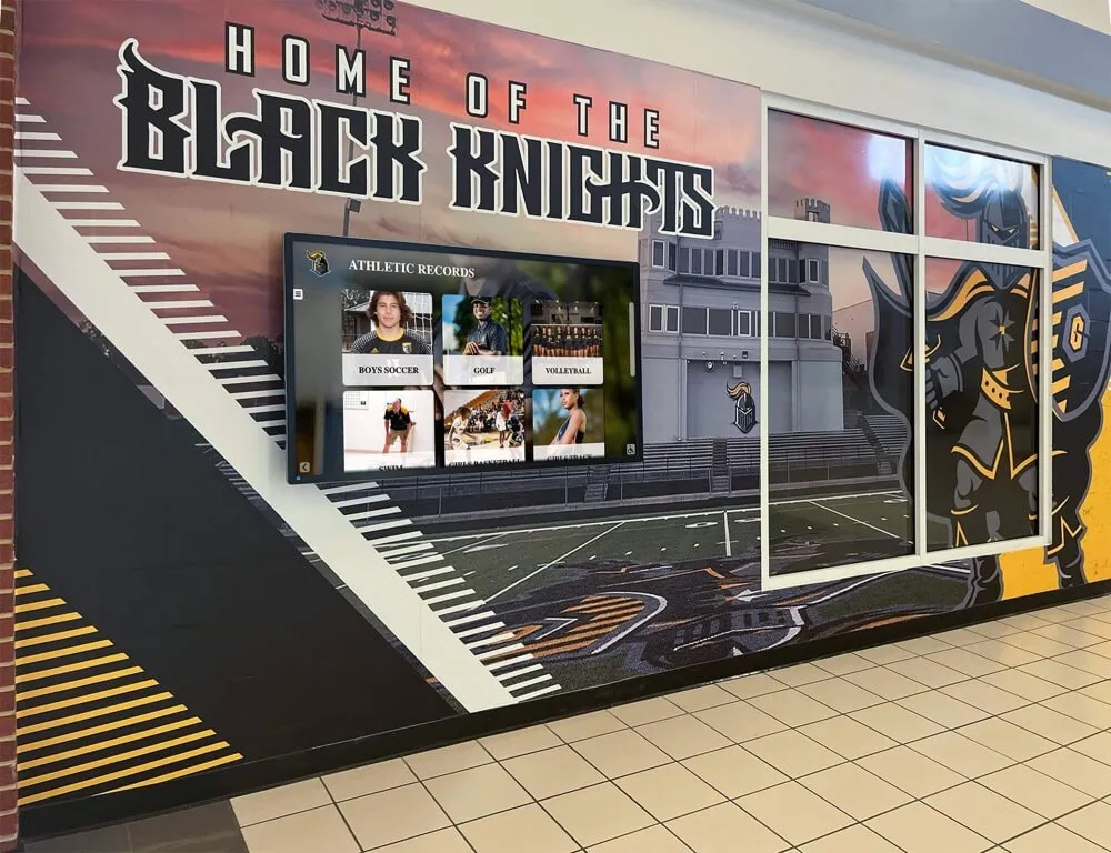
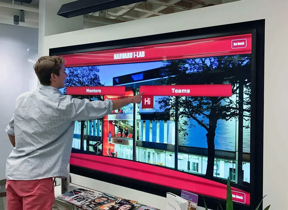
Modern touchscreen interfaces must balance visual appeal with accessibility requirements including adequate contrast, clear focus indicators, and appropriately sized interactive elements
Legal Requirements and Compliance Considerations
Accessibility compliance involves more than voluntary best practices—legal requirements increasingly mandate accessible design for digital interfaces including public-facing touchscreen installations.
Americans with Disabilities Act (ADA) Implications
The Americans with Disabilities Act prohibits discrimination against individuals with disabilities in all areas of public life including businesses and public accommodations. While the ADA predates modern digital technology, courts increasingly interpret Title III coverage as extending to websites and digital services offered by public accommodations—including interactive kiosk systems.
Evolving Legal Standards
Recent court decisions establish that organizations operating places of public accommodation must ensure their digital services, including self-service kiosks, remain accessible to people with disabilities. The Department of Justice has issued guidance indicating that websites and digital services should conform to WCAG 2.1 Level AA standards, though many organizations now adopt WCAG 2.2 as current best practice.
Schools, universities, museums, retail establishments, healthcare facilities, and government offices deploying touchscreen kiosks face potential ADA complaints if these systems exclude users with disabilities from accessing information or services available to others. The lack of explicitly codified technical standards doesn’t eliminate liability—courts evaluate accessibility based on whether reasonable accommodations enable equal access.
Section 508 and Federal Requirements
Section 508 of the Rehabilitation Act requires federal agencies and organizations receiving federal funding to make their electronic and information technology accessible to people with disabilities. This explicitly includes kiosks and self-service transaction machines.
Updated Standards Alignment
Section 508 standards were updated in 2017 to closely align with WCAG 2.0 Level AA, incorporating most WCAG success criteria directly. Federal procurement specifications increasingly reference WCAG 2.2 as procurement standard for new deployments, ensuring federal investments in interactive technology meet current accessibility best practices.
Educational institutions receiving federal funding, government facilities at all levels, and organizations contracting with federal agencies must ensure touchscreen installations comply with Section 508 requirements. Non-compliance can result in contract termination, funding loss, or legal action from federal agencies or affected individuals.
State and Local Accessibility Regulations
Beyond federal requirements, many states have enacted accessibility laws applying to both government and commercial entities operating within their jurisdictions.
State-Level Variations
California’s Unruh Civil Rights Act and Disabled Persons Act provide strong accessibility protections often exceeding federal standards. New York has actively pursued accessibility enforcement particularly for digital services. Illinois, Massachusetts, and other states maintain accessibility requirements for public-facing digital systems.
Organizations operating across multiple states must understand varying requirements and implement accessibility standards meeting the strictest applicable regulations—typically WCAG 2.2 AA represents safe baseline satisfying most jurisdictional requirements while demonstrating good-faith compliance efforts should disputes arise.
International Accessibility Standards
Organizations serving international audiences or operating globally face additional accessibility requirements varying by jurisdiction.
European Union Requirements
The EU Web Accessibility Directive requires public sector websites and mobile applications to conform to WCAG 2.1 Level AA (with updates expected to reference WCAG 2.2). The European Accessibility Act extends requirements to private sector organizations providing certain goods and services, including self-service terminals like kiosks and information displays.
Other International Standards
Canada’s Accessibility for Ontarians with Disabilities Act (AODA), the UK’s Equality Act and Public Sector Bodies Accessibility Regulations, and Australia’s Disability Discrimination Act all establish accessibility requirements referencing WCAG standards. Organizations implementing touchscreen kiosk software globally benefit from consistent WCAG 2.2 AA implementation satisfying requirements across multiple jurisdictions.

Proper installation height and positioning ensure touchscreen kiosks remain accessible to users of varying heights including wheelchair users
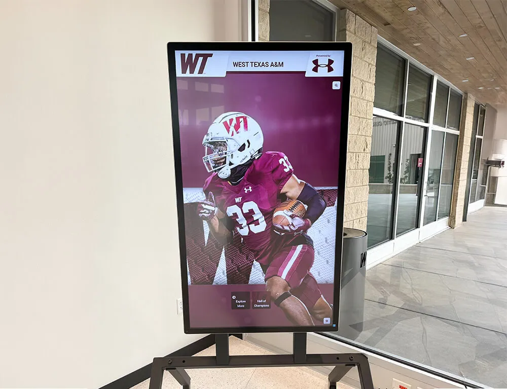
Specific Accessibility Requirements for Touchscreen Displays
Translating general WCAG principles into specific touchscreen design requirements ensures practical implementation serving all users effectively.
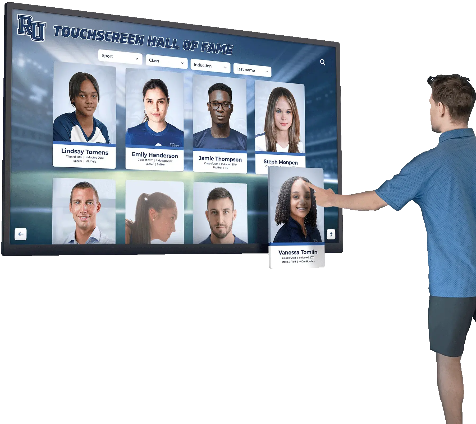
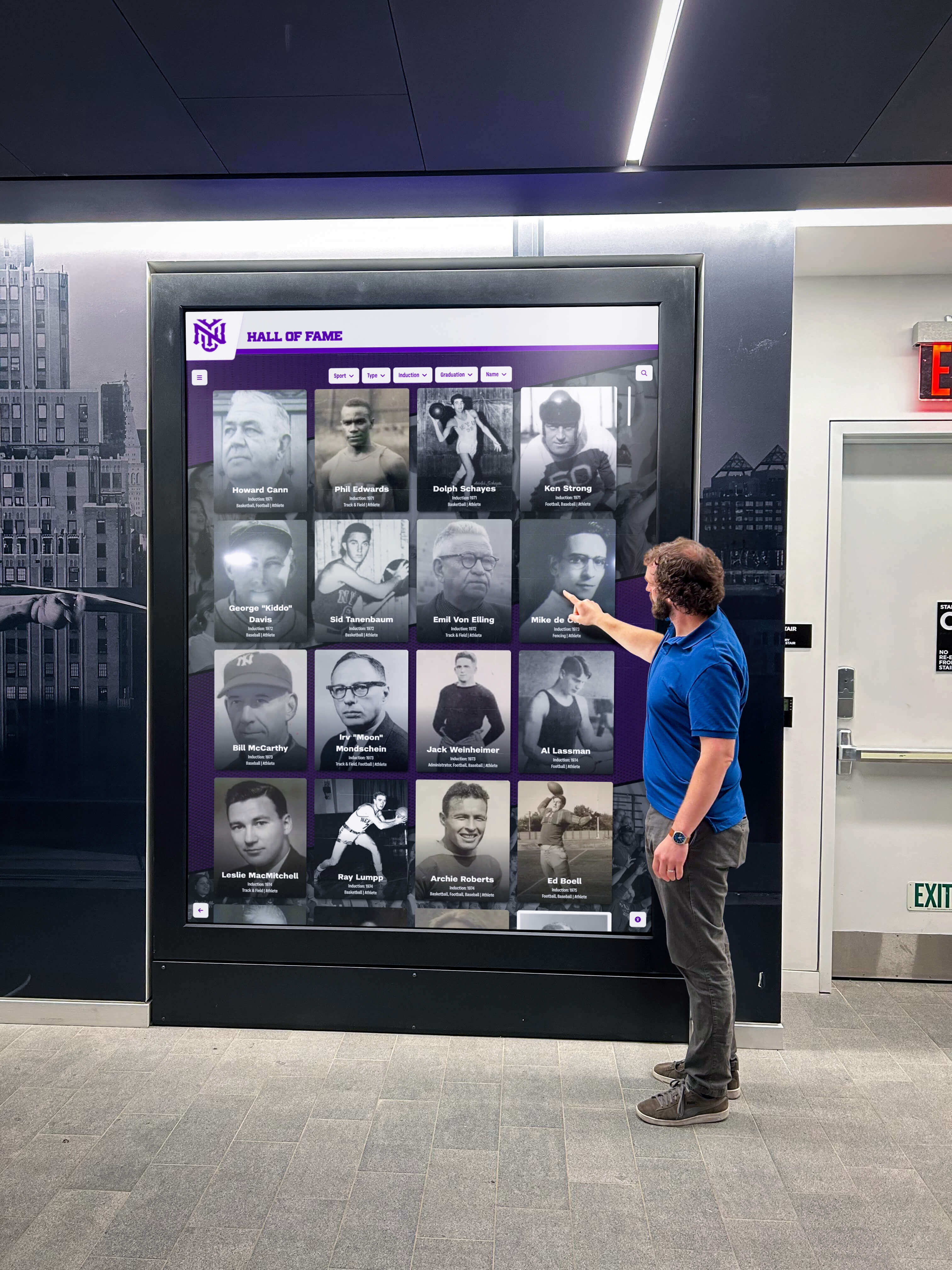
Touch Target Sizing and Spacing
Physical interaction with touchscreen interfaces demands careful attention to target sizing preventing errors and frustration.
Minimum Size Requirements
WCAG 2.2 AA establishes 24 by 24 CSS pixels as minimum target size for interactive elements. However, research on touch accuracy and usability best practices suggests substantially larger targets for optimal user experience—particularly in public kiosk contexts where users may interact quickly, from awkward angles, or with reduced dexterity.
Apple’s Human Interface Guidelines recommend 44 by 44 pixels minimum based on average fingertip dimensions. Google’s Material Design specifies 48 by 48 device-independent pixels for touch targets. Many accessibility experts advocate for 60-pixel or larger targets in public installations serving diverse populations including elderly users, children, and individuals with motor control challenges.
Organizations implementing digital recognition displays typically adopt 48-60 pixel touch targets for primary navigation elements, with larger targets for frequently accessed controls ensuring reliable activation across user populations.
Adequate Spacing Between Targets
Target size alone proves insufficient without proper spacing preventing accidental activation of adjacent elements. Research shows users commonly miss intended targets by 5-10 pixels in any direction, with greater variance under rushed conditions or challenging viewing angles common in public installations.
Minimum 8-pixel spacing between targets prevents most accidental activations, though 12-16 pixels provides more comfortable interaction. Critical actions like “delete” or “reset” buttons warrant 24+ pixel clearance from surrounding elements preventing catastrophic mistakes. Spacing proves particularly important when multiple small interactive elements appear together—filters, tag selectors, or navigation breadcrumbs require generous spacing ensuring reliable independent activation.
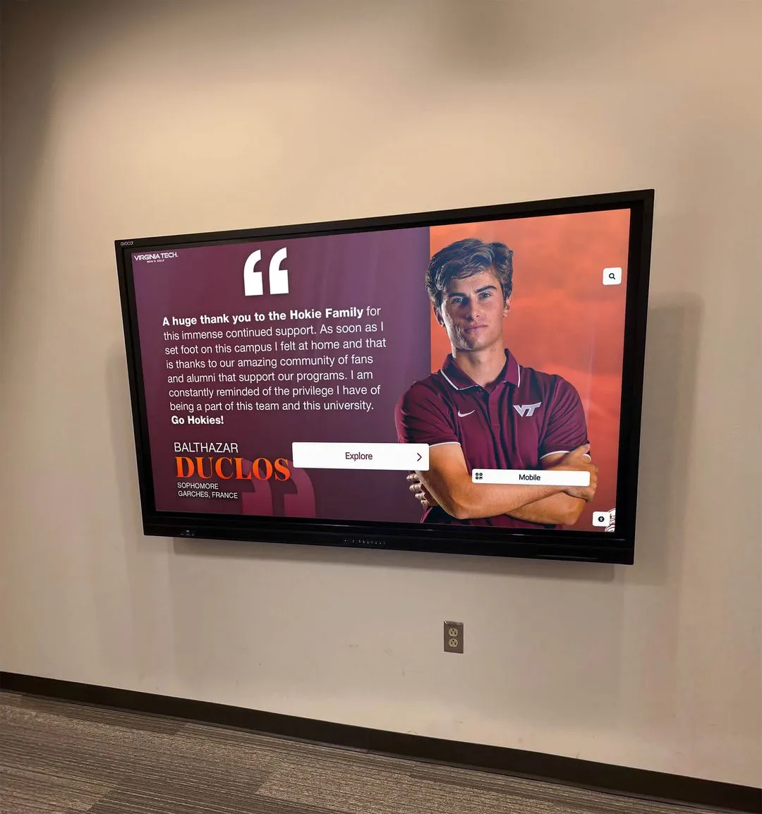
Color, Contrast, and Visual Design
Visual accessibility ensures interfaces remain perceivable and usable across diverse visual abilities and environmental conditions.
Contrast Ratio Requirements
WCAG 2.2 AA specifies minimum contrast ratios of 4.5:1 for normal text (below 18 point or 14 point bold) against background colors. Large text requires 3:1 minimum ratio. Graphical objects and user interface components need 3:1 contrast against adjacent colors.
Public touchscreen installations face particularly challenging viewing conditions including bright ambient lighting, reflection from glass surfaces, and viewing from angles rather than straight-on. These environmental factors often demand contrast ratios substantially exceeding WCAG minimums—7:1 or higher for body text and 5:1 for large elements ensures readability across diverse lighting conditions.
Testing tools like WebAIM’s Contrast Checker help designers verify color combinations meet accessibility requirements. However, testing under actual installation conditions proves essential—colors appearing adequate on desktop monitors may fail when displayed on touchscreens in bright lobbies or outdoor installations.
Color Independence
Information conveyed through color alone remains inaccessible to users with color vision deficiencies affecting approximately 8 percent of males and 0.5 percent of females globally. Accessible interfaces use multiple visual indicators beyond color—text labels, patterns, shapes, or icons—ensuring information remains perceivable regardless of color perception abilities.
Status indicators might combine color with iconography: green checkmarks indicate success, red X marks show errors, orange triangles signal warnings. Navigation elements use position and labeling rather than color coding alone. Interactive elements maintain visual distinction from static content through borders, shadows, or other non-color treatments.
Organizations creating interactive touchscreen experiences benefit from testing interfaces using color blindness simulation tools ensuring information remains clear across various color vision conditions.
Text Readability and Typography
Text legibility directly impacts whether users can comprehend interface content and instructions.
Font Size and Scaling
WCAG doesn’t mandate specific font sizes, instead requiring that users can scale text up to 200 percent without loss of content or functionality. However, starting with appropriate base sizes reduces need for scaling improving default experience across user populations.
Public touchscreen displays benefit from minimum 14-16 pixel base font sizes—substantially larger than typical web defaults of 12 pixels. Navigation labels and headings should use 18+ pixel sizes ensuring comfortable reading from standing viewing distances of 1-3 feet. Consider that touchscreen users stand rather than sit inches from screens as with desktop monitors.
Line height (leading) significantly affects readability. WCAG requires minimum 1.5 line height for paragraphs ensuring adequate vertical spacing preventing line confusion during reading. Letter spacing of at least 0.12em and word spacing of 0.16em improve readability particularly for users with dyslexia or other reading challenges.
Font Selection and Clarity
Sans-serif fonts generally provide better screen readability than serif fonts particularly at smaller sizes and lower resolutions. Popular accessible font choices include Arial, Helvetica, Verdana, Open Sans, and Roboto—all featuring clear letterforms with distinct characters avoiding confusion between similar letters like “I” and “l” or “O” and “0”.
Avoid decorative or script fonts for body text and functional interface elements. While such fonts may work for large headings or branding elements, they impair legibility for functional text requiring quick comprehension. Maintain adequate font weight—avoid ultra-thin weights that disappear in bright conditions or against busy backgrounds.

Properly sized touch targets with adequate spacing enable reliable interaction preventing frustration from missed taps or accidental activations
Alternative Input Methods and Keyboard Access
Touchscreen-only interfaces exclude users unable to perform touch gestures reliably, requiring alternative input method support for true accessibility.
Keyboard Navigation Support
Many users with motor disabilities rely on keyboard navigation or assistive devices emulating keyboard input. Accessible touchscreen software must support full keyboard access to all functionality.
Complete Keyboard Operability
Every interactive element—buttons, links, form fields, custom controls—must be keyboard accessible. Tab key should move focus between elements in logical order following visual layout. Enter or Space keys should activate focused elements. Arrow keys should navigate within complex components like lists or menus when appropriate.
Keyboard traps—situations where keyboard users become stuck unable to move focus away from elements—violate accessibility requirements. Users must always have keyboard methods to navigate backward, escape from modal dialogs, or return to known safe states without requiring mouse or touch input.
For touchscreen kiosks, keyboard support often means allowing attached physical keyboards or on-screen keyboards to fully control interface operation. This enables users who cannot reliably perform touch gestures to independently access all functionality through alternative input methods.
Focus Indicators and Visual Feedback
Users navigating via keyboard need clear visual indication of which element currently has focus—the element that will respond to keyboard input.
Visible Focus States
WCAG 2.2 requires focus indicators meet minimum contrast ratios and size thresholds ensuring visibility. Focus indicators must have at least 3:1 contrast ratio against adjacent colors and encompass at least 2 CSS pixels of outline or equivalent visual indicator around focused elements.
Default browser focus indicators often prove insufficient—faint blue outlines may disappear against certain backgrounds or prove difficult to perceive in bright public spaces. Custom focus styles using high-contrast borders, background color changes, or other obvious visual treatments ensure keyboard users always know where their focus currently resides.
Interactive elements should provide clear visual feedback for all interaction states including hover (when supported), focus, and active (during press). These state variations help all users—not just those requiring keyboard access—understand interface behavior and system responsiveness.
Screen Reader Compatibility
Users with visual impairments often interact with digital interfaces through screen readers that convert visual information to audio output or refreshable braille displays.
Semantic HTML and ARIA Attributes
Screen reader accessibility begins with proper HTML structure using semantic elements conveying meaning: headings (<h1> through <h6>), lists (<ul>, <ol>, <li>), form elements with associated labels, and other semantic markup enabling screen readers to communicate interface structure to users.
When semantic HTML proves insufficient for complex interactive components, ARIA (Accessible Rich Internet Applications) attributes provide additional context. ARIA roles identify component purposes: role="navigation", role="search", role="button". ARIA states communicate dynamic information: aria-expanded, aria-selected, aria-checked. ARIA properties provide additional context: aria-label, aria-describedby.
However, ARIA should supplement rather than replace semantic HTML. The first rule of ARIA states “Don’t use ARIA” when native HTML provides required semantics. Organizations developing digital hall of fame UX must ensure screen reader users can navigate, understand, and interact with recognition content as effectively as sighted users.
Alternative Text and Descriptions
Images require alternative text descriptions enabling screen reader users to understand visual content. Decorative images use empty alt attributes (alt="") indicating they should be ignored. Informational images include concise descriptions conveying essential information. Complex images like charts or diagrams may require extended descriptions providing comprehensive information equivalent to visual presentation.
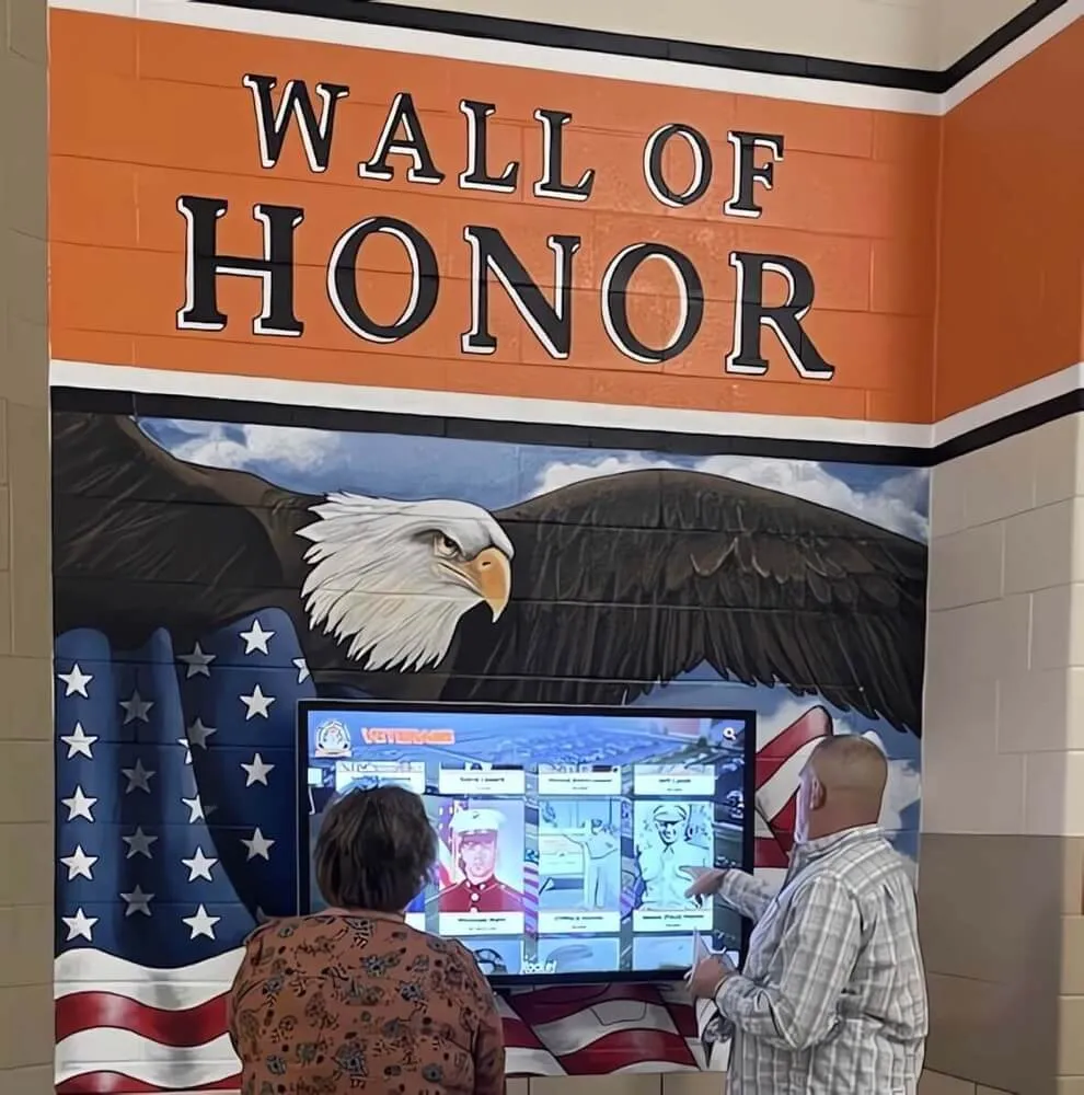
For touchscreen recognition displays featuring photos of honorees, proper alternative text identifies individuals and provides context: “Sarah Johnson, Class of 2020 Valedictorian” rather than generic “student photo.” This enables screen reader users to browse and discover honoree profiles comparably to sighted users exploring visual interfaces.

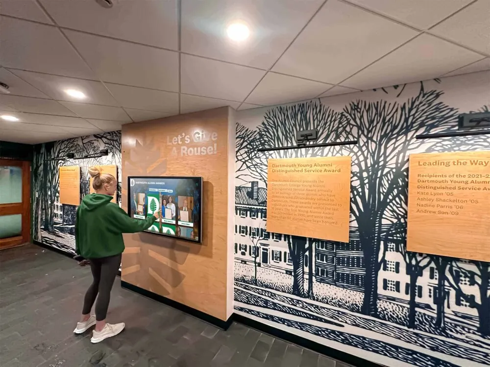
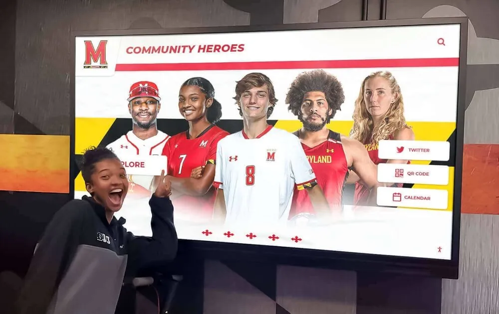
Accessible interfaces enable independent exploration by all users including those using assistive technologies like screen readers or alternative input devices
Practical Benefits Beyond Legal Compliance
While legal requirements provide compelling reasons for accessibility implementation, practical benefits extend far beyond avoiding lawsuits.
Expanded Audience Reach
Approximately 15-20 percent of the population experiences some form of disability—temporary or permanent, visible or invisible. Accessible design ensures these individuals can use your touchscreen installations independently without requiring assistance.
Serving Diverse User Populations
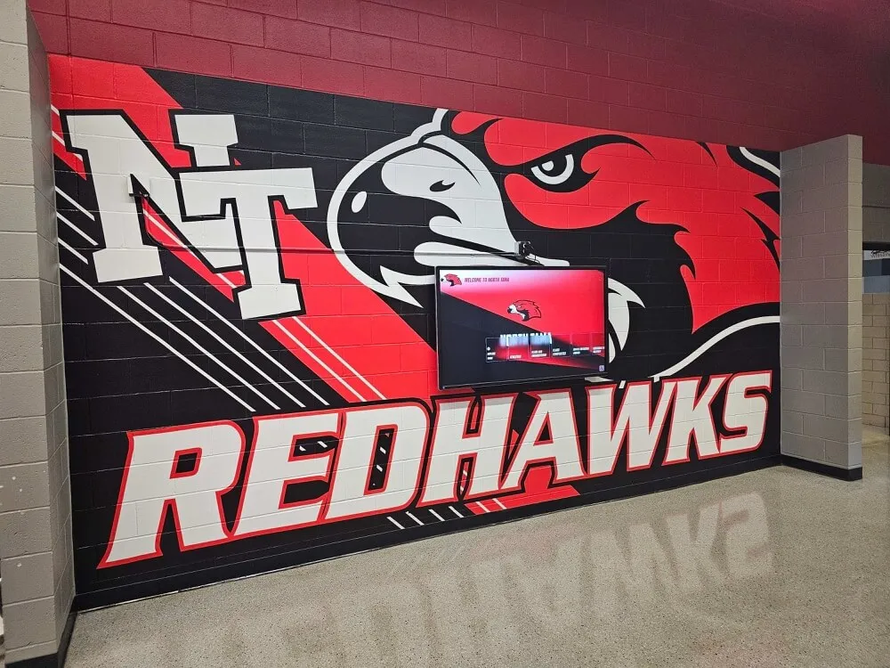
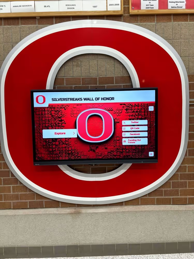
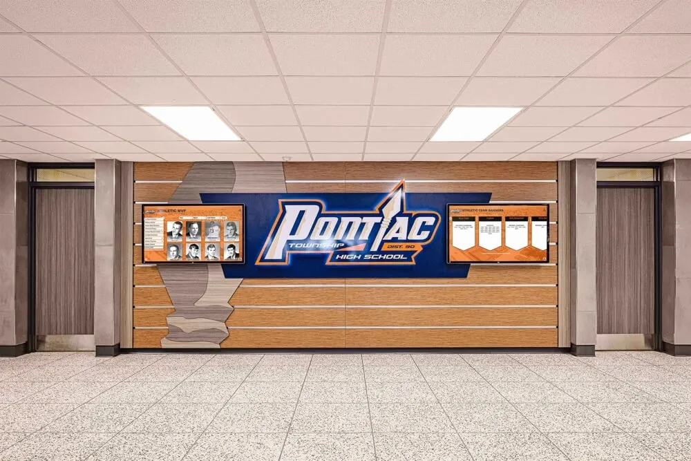
Schools implementing digital recognition displays serve communities spanning wide age ranges from young children to elderly alumni and visitors. Students with disabilities, aging alumni, visitors with temporary injuries, and parents holding children while interacting all benefit from accessible design.
Adequate touch target sizing helps elderly users with reduced dexterity and children with developing motor skills. High contrast benefits users with declining vision common with aging. Clear navigation assists users with cognitive disabilities or limited technological experience. Simple language serves users with intellectual disabilities and those with English as second language.
Organizations implementing interactive kiosk systems that prioritize accessibility demonstrate commitment to serving entire communities rather than only those without disabilities—building goodwill while ensuring valuable content reaches maximum audiences.
Improved Usability for Everyone
Accessibility improvements designed for users with disabilities typically enhance experiences for all users—a concept known as “curb cut effect” referencing how sidewalk curb cuts designed for wheelchair users benefit parents with strollers, travelers with luggage, and delivery workers with hand trucks.
Universal Design Principles
Larger touch targets reduce errors for everyone regardless of disability status. Users rushing between classes appreciate forgiving interfaces that don’t require precision targeting. Visitors wearing winter gloves benefit from generous hit areas. Parents holding children while interacting face reduced frustration from accidental activations.
High contrast and readable typography improve comprehension in bright lobbies where sunlight washes out displays. Clear error messages help all users recover from mistakes. Consistent navigation patterns reduce cognitive load for everyone from technologically sophisticated teenagers to elderly community members unfamiliar with touchscreen conventions.
Research consistently demonstrates that accessibility features improve user satisfaction metrics across all demographic groups. Organizations that view accessibility as benefiting only small disabled populations miss the broader usability improvements serving entire user bases.
Reduced Support Requirements
Accessible, intuitive interfaces reduce the need for staff assistance and support interventions—particularly valuable for self-service applications in schools, museums, and public facilities.
Independent Operation
When touchscreen kiosks require staff assistance to operate, they fail their fundamental purpose of enabling self-service access. Accessibility features including clear instructions, obvious affordances, forgiving error handling, and multiple navigation pathways enable independent operation across diverse user populations.
Fewer support calls, less staff time spent assisting confused users, and reduced frustration from malfunctioning or inaccessible systems all represent operational savings beyond initial accessibility investments. Educational institutions implementing ultra-responsive touchscreen systems report dramatically reduced support requirements when designs prioritize accessibility from initial development rather than retrofitting accessibility features after deployment.
Competitive Advantage in Procurement
As accessibility awareness grows and regulations tighten, procurement specifications increasingly include explicit accessibility requirements that vendors must meet to qualify for consideration.
Meeting RFP Requirements
Educational institutions, government agencies, and forward-thinking organizations include WCAG 2.2 AA compliance in requests for proposals (RFPs) and purchasing specifications. Vendors unable to demonstrate accessibility compliance face automatic disqualification regardless of other product strengths.
Organizations that proactively implement accessibility position themselves advantageously in competitive procurement processes. Third-party accessibility audits, VPAT (Voluntary Product Accessibility Template) documentation, and accessibility conformance statements all strengthen proposals demonstrating commitment to inclusive design.

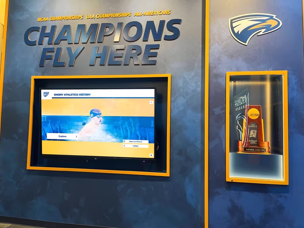
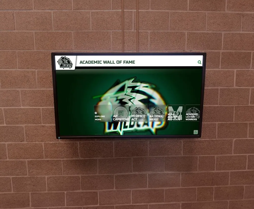
Accessible content management interfaces enable administrators of all abilities to maintain current, relevant content without technical barriers
Implementing WCAG 2.2 AA Compliance in Touchscreen Software
Translating accessibility requirements into practical implementation requires systematic approaches addressing design, development, testing, and ongoing maintenance.
Accessibility in Design Phase
Accessibility implementation begins during initial design rather than attempting to retrofit accessibility features after development completion—a process that proves more expensive and often less successful than accessible-first approaches.
Inclusive Design Process
Involve users with disabilities in design and testing processes. Direct feedback from people who rely on assistive technologies or have various disabilities provides insights that able-bodied designers and developers often miss. User testing with diverse participants—varying ages, abilities, technological sophistication—reveals accessibility gaps that theoretical reviews overlook.
Use accessibility checklists and guidelines during initial wireframing and prototyping. Consider keyboard navigation patterns while designing information architecture. Plan focus management for modal dialogs and dynamic content. Select color palettes meeting contrast requirements before committing to brand implementations requiring expensive redesigns.
Tools like color contrast analyzers, accessibility simulators, and automated scanning tools help identify potential issues during design phases when remediation costs minimal time and resources compared to post-development retrofitting.
Development Best Practices
Developers implementing touchscreen software must understand accessibility requirements and implement features correctly from initial coding.
Semantic HTML Foundation
Build interfaces using proper semantic HTML elements conveying meaning and structure. Use heading elements (<h1> through <h6>) in logical hierarchy enabling screen reader users to navigate content structure. Employ lists for grouped items, proper form elements with associated labels, and semantic landmarks (<nav>, <main>, <footer>) organizing page regions.
Avoid using generic <div> and <span> elements for interactive components when semantic alternatives exist. Buttons should use <button> elements, not <div> styled to look like buttons. Links should use <a> elements with proper href attributes. Form inputs require associated <label> elements explicitly connected via for/id relationships.
Responsive and Flexible Design
Implement responsive layouts adapting to various screen sizes and orientations. Support text scaling up to 200 percent without horizontal scrolling or content loss. Use relative units (em, rem, percentages) rather than fixed pixel dimensions enabling flexible scaling respecting user preferences and accessibility needs.
Test interfaces at various zoom levels and with operating system text scaling features enabled. Content should reflow appropriately maintaining readability and functionality. Touch targets should remain adequately sized even when default interface scales to accommodate user preferences.
Testing and Validation
Systematic testing across multiple dimensions ensures accessibility implementation actually works for users with diverse abilities and assistive technologies.
Automated Testing Tools
Accessibility scanners like WAVE, Axe DevTools, and Lighthouse identify common accessibility issues including missing alternative text, inadequate contrast ratios, missing form labels, and improper heading hierarchies. These tools provide valuable first-pass screening catching obvious problems quickly and inexpensively.
However, automated testing catches only 20-30 percent of accessibility issues according to accessibility experts. Many requirements demand human judgment—is alternative text meaningful? Does tab order make logical sense? Are error messages clear and helpful? Automated tools complement but never replace manual testing and user validation.
Manual Testing Procedures
Test all functionality using only keyboard navigation—no mouse or touch input. Verify every interactive element receives focus, focus indicators remain clearly visible, and logical tab order flows naturally through interface. Ensure users can escape from all interface states without traps requiring mouse or touch intervention.
Test with actual screen readers including NVDA (free Windows), JAWS (Windows), and VoiceOver (macOS, iOS). Listen to how interfaces sound to blind users—are images properly described? Do controls announce their purpose and current state? Can users understand content and complete tasks using only audio output?
User Testing with People with Disabilities
Engage actual users with various disabilities to test touchscreen installations under realistic conditions. Watch elderly users interact noting difficulties with targeting or comprehension. Observe users with motor disabilities identifying barriers preventing successful interaction. Listen to feedback from users with cognitive disabilities about confusing elements or unclear instructions.
Organizations that invest in user testing with diverse participants during development identify and resolve accessibility issues before public deployment—avoiding embarrassing failures, support nightmares, and potential legal complaints that surface when inaccessible systems launch to unprepared communities.
How Rocket Alumni Solutions Ensures WCAG 2.2 AA Compliance
While many touchscreen solutions treat accessibility as afterthought or optional feature, purpose-built recognition platforms understand accessibility as fundamental requirement serving diverse educational communities effectively.
Built-In Accessibility Features
Web-based touchscreen platforms like those from Rocket Alumni Solutions provide accessibility advantages through standards-compliant web technologies and responsive design principles.
Responsive Web Architecture
Web-based touchscreen software built on modern web standards inherently supports many accessibility features including text scaling respecting browser and operating system settings, semantic HTML enabling screen reader compatibility, keyboard navigation through standard web interaction patterns, and responsive layouts adapting to various screen sizes and orientations.
This foundation enables accessibility implementation that works consistently across desktop displays, large-format touchscreen kiosks, tablets, and smartphones—ensuring recognition content remains accessible regardless of how community members choose to access it.
Accessible Content Management
Content management systems enabling easy updates must themselves be accessible—allowing administrators with disabilities to maintain recognition content independently. Cloud-based platforms with accessible web interfaces ensure content management doesn’t require specialized software or technical expertise that may exclude team members with disabilities from content maintenance roles.
Ongoing Compliance and Updates
Accessibility represents ongoing commitment rather than one-time implementation as standards evolve and technologies advance.
Platform Updates and Improvements
Web-based platforms benefit from centralized updates maintaining current accessibility standards without requiring individual kiosk visits or manual installations. When WCAG guidelines update or new accessibility techniques emerge, cloud-based solutions can implement improvements benefiting all installations simultaneously.
Organizations implementing recognition displays should verify vendors demonstrate commitment to ongoing accessibility through regular platform updates, accessibility audit participation, and documented accessibility roadmaps showing continued investment in accessible design as standards and best practices evolve.
Conclusion: Accessibility as Foundation for Inclusive Recognition
WCAG 2.2 AA accessibility compliance represents far more than regulatory checkbox or legal risk mitigation—it embodies fundamental commitment to serving entire communities regardless of ability, age, or technological sophistication. Organizations that implement accessible touchscreen displays demonstrate values alignment with inclusion and equity while creating better experiences for all users.
The practical benefits extend beyond users with recognized disabilities. Larger touch targets reduce errors for everyone. Better contrast improves readability in challenging lighting. Clear navigation benefits users of all technological skill levels. Accessibility improvements create universally better experiences rather than accommodating only specific populations.
Experience Accessible Recognition Technology
Discover how purpose-built recognition platforms deliver WCAG 2.2 AA accessible experiences out of the box. Rocket Alumni Solutions creates touchscreen displays that serve entire communities while meeting accessibility requirements through thoughtful design rather than afterthought retrofitting.
Explore Accessible Recognition SolutionsSchools, universities, museums, and organizations implementing touchscreen recognition displays should prioritize accessibility from initial planning rather than attempting to retrofit compliance after deployment. Early accessibility consideration proves more cost-effective and delivers superior results compared to remediating inaccessible implementations after installation.
Legal requirements provide compelling motivation, but practical benefits justify accessibility investments independent of compliance mandates. Expanded audience reach, improved usability for all users, reduced support requirements, and competitive advantages in procurement all deliver measurable returns beyond avoiding lawsuits or regulatory fines.
As web technologies evolve and accessibility standards advance, web-based touchscreen platforms provide sustainable foundations for ongoing compliance. Organizations should evaluate vendors based not just on current accessibility implementation but on demonstrated commitment to accessibility as core value reflected through regular updates, accessibility audit participation, and documented roadmaps showing continued investment.
The future of interactive displays lies in universal design serving all users effectively rather than building separate accommodations for specific populations. WCAG 2.2 AA compliance provides practical framework for achieving this inclusive vision—creating touchscreen experiences that celebrate achievements, share information, and build community connections accessible to everyone regardless of ability.
Ready to implement accessible recognition displays for your school or organization? Learn more about touchscreen display technology, discover best practices for interactive kiosk design, and explore how accessible recognition platforms enable schools and organizations to celebrate excellence while serving entire communities through inclusive, compliant touchscreen technology.