

The yearbook cover represents far more than simple packaging—it’s the first impression, lasting keepsake, and visual anchor capturing an entire school year’s memories, achievements, and defining moments. That single design will grace bookshelves, coffee tables, and nostalgic reunions for decades, making the creative decisions you make today permanently significant in your school community’s collective memory.
Yet yearbook committees often struggle with cover design, facing creative pressure to deliver something fresh and meaningful while honoring school traditions, representing diverse student experiences, and working within budget constraints. The difference between generic, forgettable covers and truly memorable designs that students treasure lies in understanding proven design principles while finding authentic creative expressions of your unique school culture and year.
This comprehensive guide explores inspiring yearbook cover ideas, practical design strategies, and creative frameworks for producing covers that genuinely resonate with your school community. From classic design approaches through modern innovations, photography techniques, typography strategies, and production considerations, you’ll discover actionable inspiration for creating yearbook covers students will proudly display for years to come.
Schools investing thoughtful effort into yearbook cover design report dramatically higher student satisfaction with finished books, increased yearbook sales, and stronger engagement with recognition programs throughout the year as students anticipate how their experiences will be celebrated in the permanent record these covers protect.

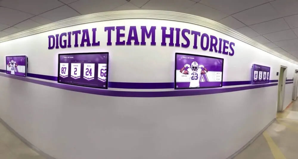
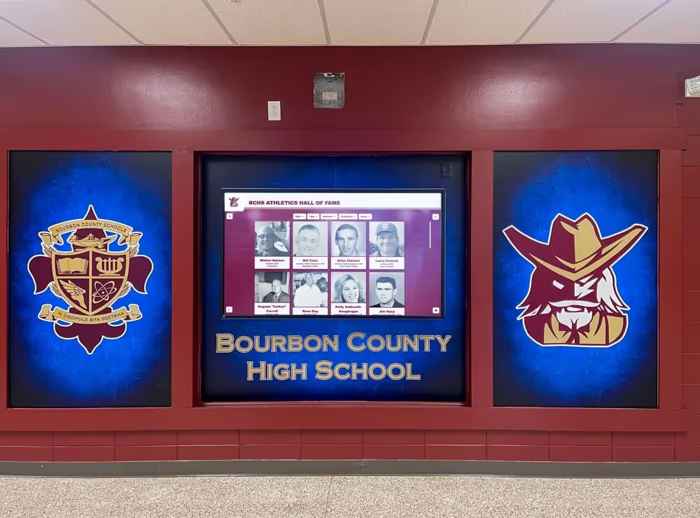
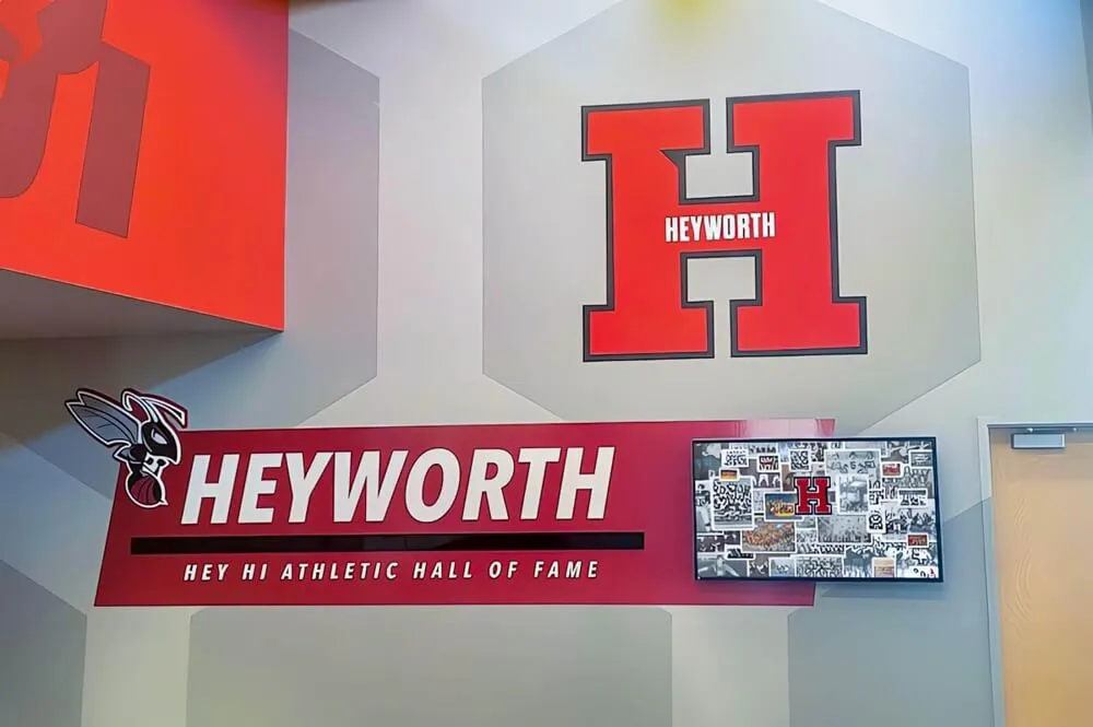
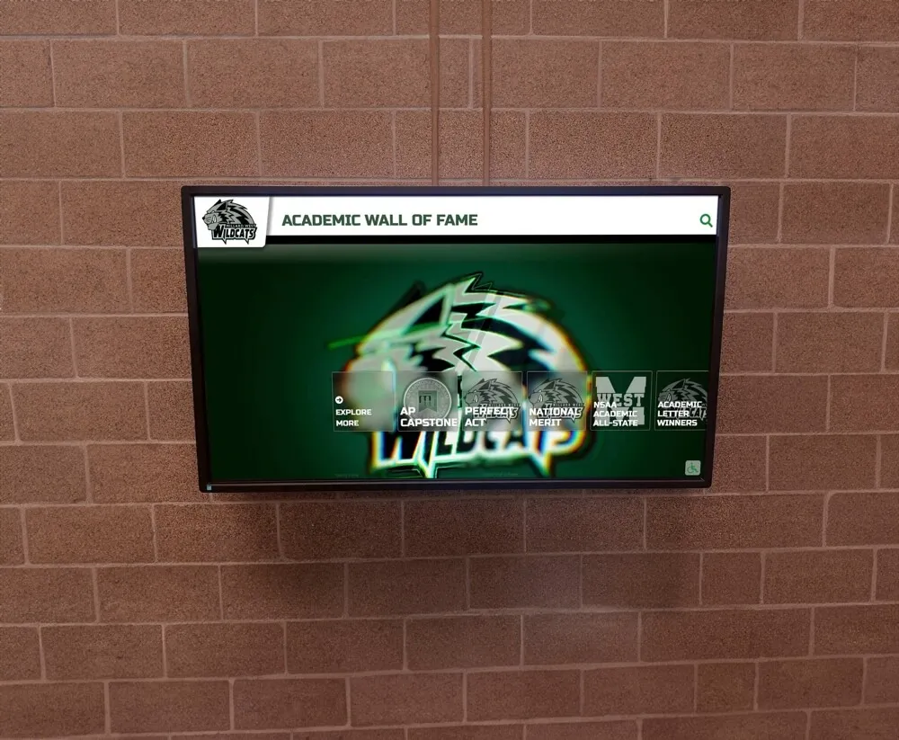
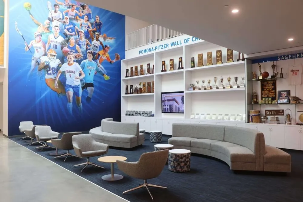
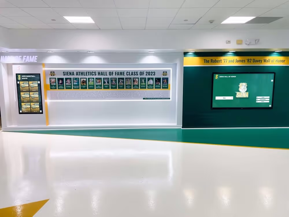
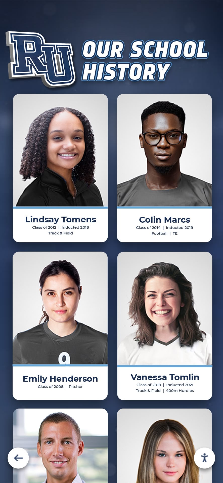
Yearbook design shares visual DNA with recognition displays—both celebrate student achievement and preserve institutional memory through compelling visual storytelling
Understanding Yearbook Cover Design Fundamentals
Before exploring specific design ideas, understanding what makes yearbook covers effective provides essential context for creative decisions.
The Purpose and Impact of Yearbook Covers
Yearbook covers serve multiple functions simultaneously, each influencing design direction differently.
First Impression and Year Identity
The cover immediately communicates the yearbook’s character and the school year it documents. Effective covers capture defining elements making that particular year distinctive—whether championship victories, significant anniversaries, cultural moments, or thematic concepts the yearbook staff selected to unify the book’s storytelling. This year-specific identity helps future readers instantly orient themselves while browsing old yearbooks, with covers triggering immediate memory associations before books even open.
Brand Representation and School Pride
Covers function as powerful expressions of school identity, incorporating mascots, colors, architectural landmarks, and visual traditions connecting current students with generations of alumni. This institutional branding builds pride and belonging while creating visual continuity across yearbook collections spanning decades.
Protection and Durability
Practical considerations matter immensely—yearbook covers protect hundreds of pages of memories through years of handling, shelving, and nostalgic browsing. Material selections, finishing treatments, and construction methods directly impact longevity, with well-constructed covers maintaining appearance and integrity across decades while cheaply produced alternatives deteriorate rapidly.
Essential Elements Every Cover Design Includes
Regardless of creative approach, successful yearbook covers incorporate several fundamental components.
School Name and Location
Clear identification proves essential, particularly as students move away and decades pass. Full school names prevent confusion, while city and state information helps alumni relocating to different regions maintain orientation. Typography choices for school names significantly impact overall aesthetic—traditional serif fonts communicate heritage and formality, contemporary sans-serif designs feel modern and clean, and custom lettering creates distinctive personality.
Year Indication
Obvious year identification enables instant recognition when browsing yearbook collections. Most designs incorporate years prominently through large numerals, though some creative approaches integrate years more subtly into artwork or photography. Regardless of treatment, viewers should identify publication year within seconds of seeing covers.
Volume Number
Long-established schools often include volume numbers connecting current yearbooks to historical publishing traditions. While less critical than year identification, volume numbers honor tradition and aid library organization.
Mascot or School Logo
Institutional marks strengthen brand identity and pride. Whether featuring detailed mascot illustrations, simplified logo treatments, or photographic representations of mascots, these elements create immediate visual recognition while connecting covers to broader school identity systems.
Theme or Concept Visualization
Many yearbook staffs select overarching themes unifying books—concepts like “journey,” “legacy,” “chapters,” or year-specific references to significant events. Covers introduce these themes visually through imagery, symbolism, color palettes, and design treatments establishing conceptual frameworks readers encounter throughout books.

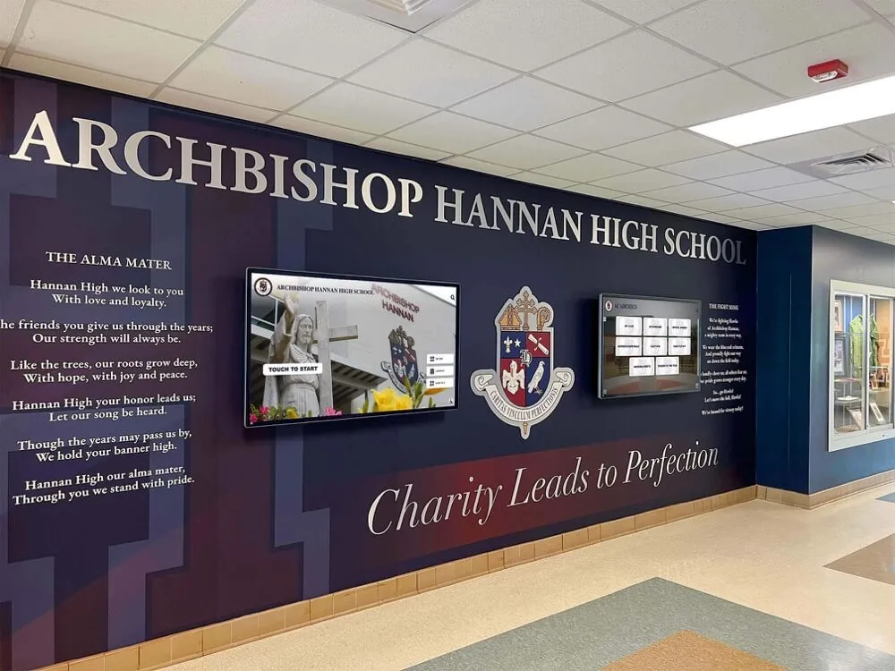
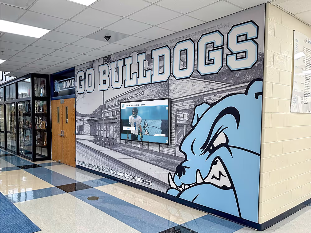
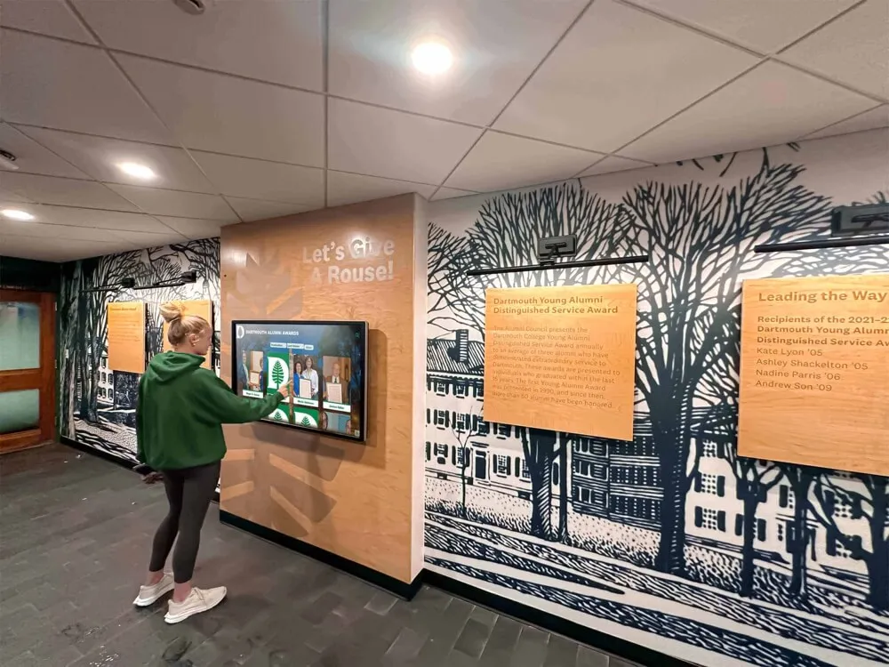
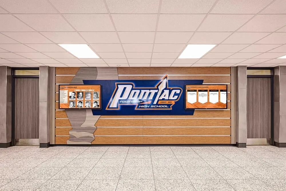
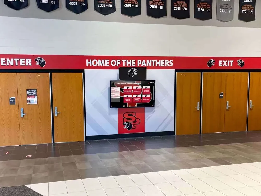
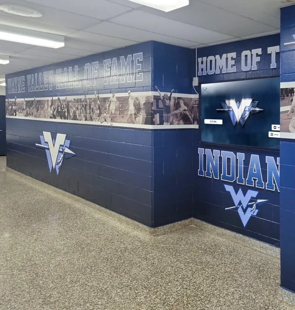
Yearbook design often draws inspiration from school environmental branding like hallway murals and athletic displays that reinforce institutional identity
Classic Yearbook Cover Design Approaches
Time-tested design strategies continue delivering beautiful, effective covers year after year across thousands of schools.
Traditional Photography-Based Covers
Photography-driven designs remain the most popular yearbook cover approach, offering authenticity and immediate emotional connection.
Campus Landmark Photography
Featuring iconic school buildings, athletic facilities, gathering spaces, or natural campus elements creates instant recognition while celebrating place. Effective landmark photography approaches include dramatic architectural shots emphasizing unique building details or perspectives, seasonal perspectives showing campus in peak fall colors or spring blooms, aerial views revealing overall campus layouts and relationships, and atmospheric conditions like sunrise/sunset lighting, fog, or dramatic skies adding emotional depth.
These landmark covers work beautifully for schools with distinctive architecture or beautiful settings. Consider how lighting conditions and perspectives might reveal familiar locations in fresh, compelling ways rather than capturing obvious straight-on shots everyone already knows.
Student Life Photojournalism
Authentic moments capturing real student experiences create powerful emotional resonance. Strong photojournalism covers feature candid action from athletic competitions showing intensity and determination, performance art moments with theater, music, or dance capturing creative expression, academic engagement in labs, studios, or collaborative learning spaces, and community celebrations including homecoming, prom, spirit events, or graduation moments.
The key to photojournalism covers involves selecting images that feel genuinely representative rather than staged or posed. Authentic emotion and real moments always outperform artificial compositions, even when technical execution isn’t perfect.
Composite Photography Montages
Rather than single images, montage covers combine multiple photographs representing diverse student experiences throughout years. Effective montage approaches include grid layouts presenting equal-sized photos in structured arrangements, layered compositions overlapping images with varying transparency and scale, photo strips mimicking filmstrip or contact sheet aesthetics, and shaped montages where collections of photos form larger recognizable shapes like mascot silhouettes, school letters, or year numerals.
Montage covers excel at representing diversity and inclusivity—showing that yearbooks celebrate everyone rather than singular experiences or perspectives. Balance representation across grades, activities, demographics, and seasons when selecting images for montage treatments.

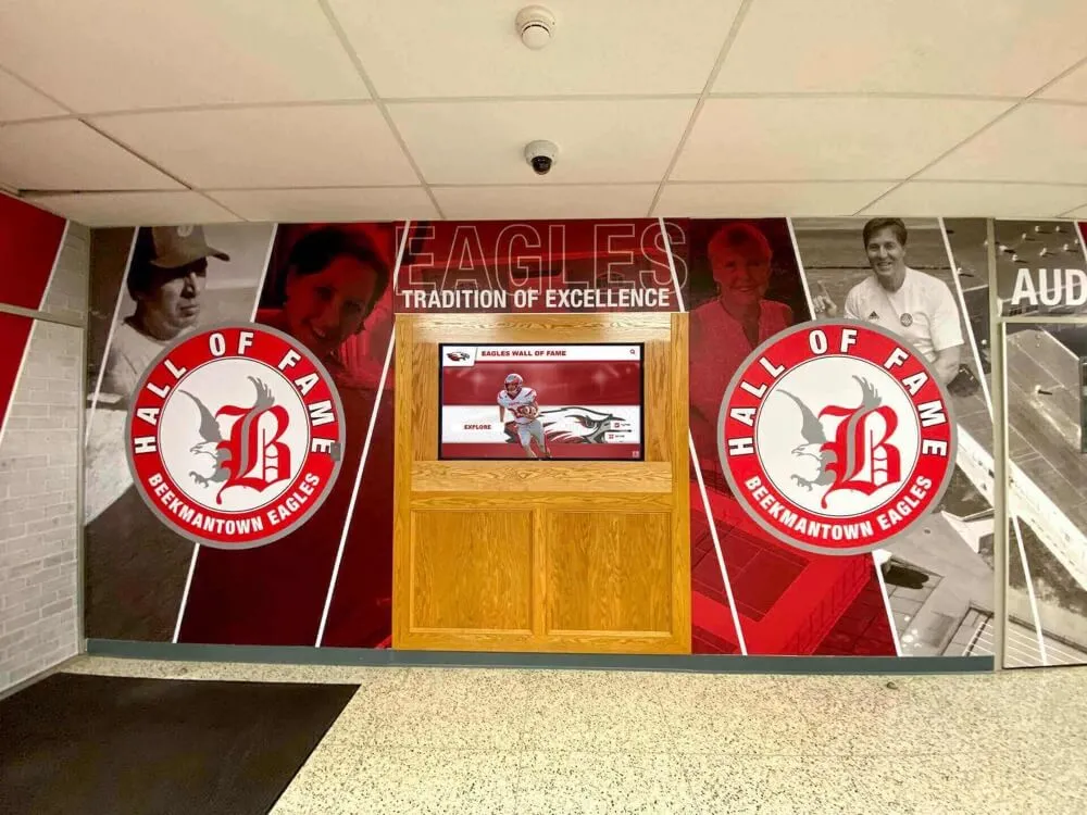
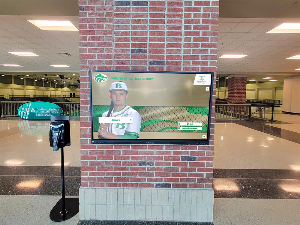
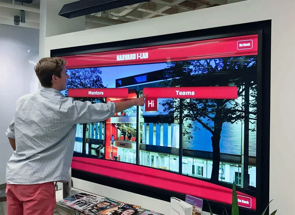
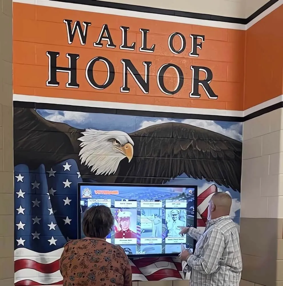
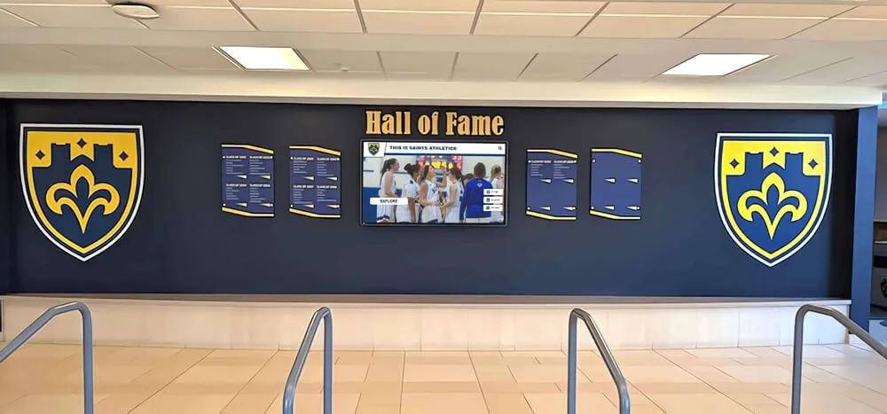
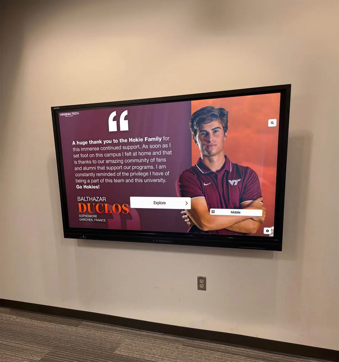
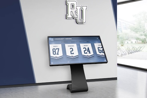
Digital recognition displays complement yearbook programs by extending celebration and memory preservation beyond printed pages to interactive experiences
Graphic Design and Illustration-Based Covers
Designs emphasizing graphics, patterns, and illustrations offer creative alternatives to photography while enabling distinctive artistic expression.
Bold Typography-Focused Designs
Covers using typography as primary visual elements create strong, confident aesthetics that remain timelessly appealing. Typography-driven approaches include oversized year numerals dominating covers with minimal supporting elements, stacked school names in varied typeface weights creating visual rhythm, typographic patterns where repeated text forms textures or backgrounds, and hand-lettering or custom typography showcasing student artistic talent.
Typography-focused designs work particularly well when paired with school colors and minimal supporting graphics—mascot silhouettes, geometric patterns, or texture overlays. This approach suits schools wanting modern, clean aesthetics without complex photography or illustration.
Illustrated Mascot Artwork
Custom mascot illustrations create distinctive, personality-rich covers impossible to replicate with photography. Illustration styles vary dramatically including realistic detailed artwork emphasizing character and personality, stylized graphic treatments with bold shapes and limited color palettes, retro aesthetics evoking specific era design sensibilities (1950s, 1980s), and student-created artwork showcasing school artistic talent while building community pride.
Illustrated covers benefit from professional graphic design execution or exceptional student talent—mediocre illustrations quickly date books and feel amateurish. Consider hiring local illustrators or working with art departments to develop high-quality custom artwork.
Geometric Patterns and Abstract Designs
Pattern-based covers using geometric shapes, lines, and abstract visual elements create sophisticated, contemporary aesthetics. Pattern approaches include school color gradients creating depth and visual interest, overlapping shapes suggesting movement and energy, line work creating rhythm and structure, and symbolic geometry where abstract patterns suggest thematic concepts like connection, growth, or journey.
Abstract and geometric designs suit schools wanting contemporary, design-forward aesthetics. These covers age well since they avoid trendy references while maintaining visual sophistication. Pair geometric elements with clean typography and strategic use of school colors for coherent compositions.

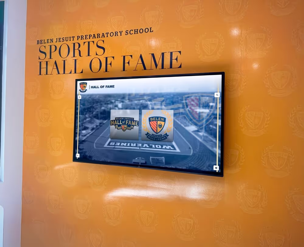
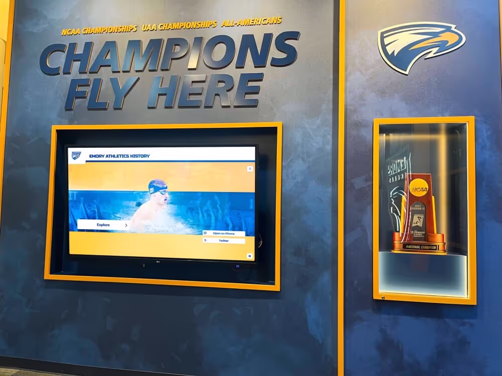
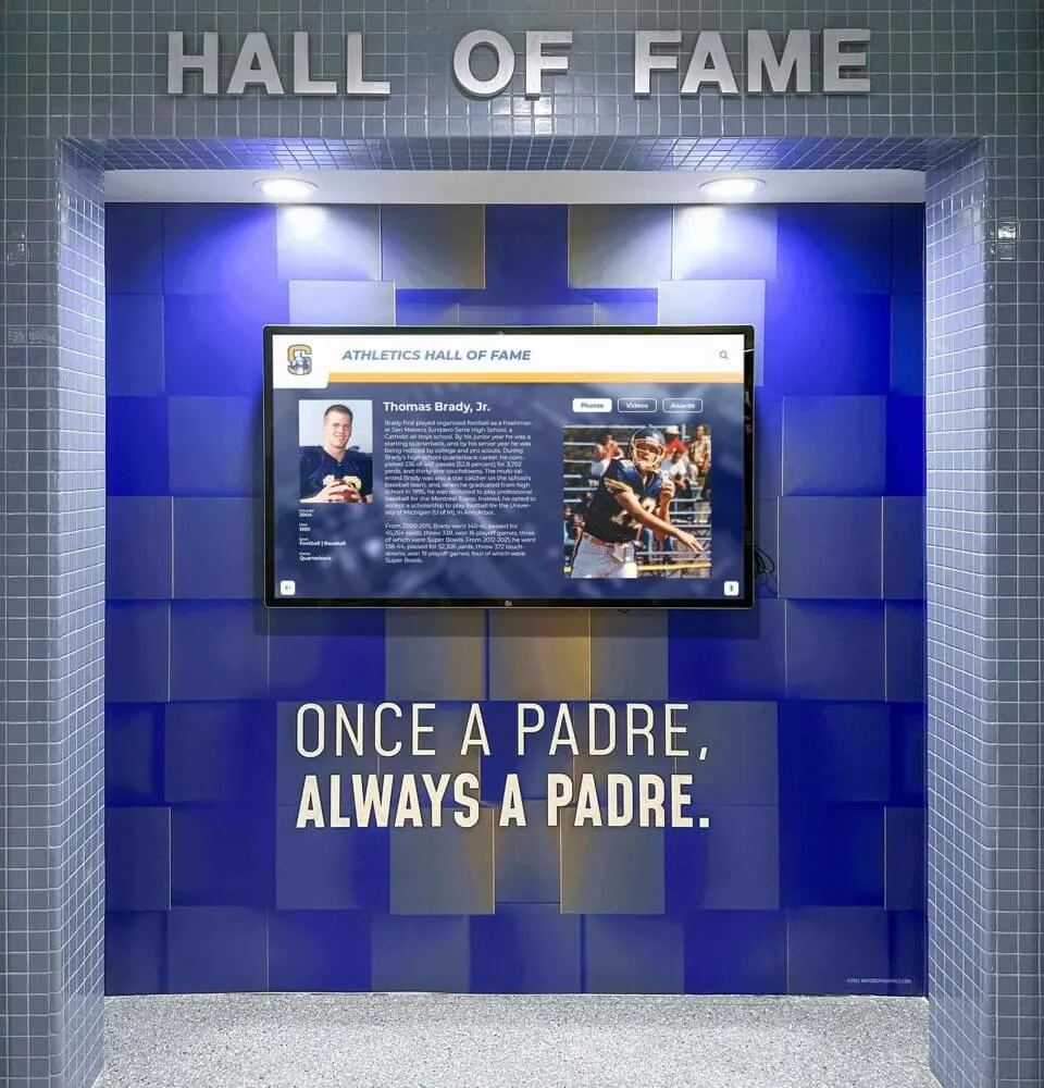
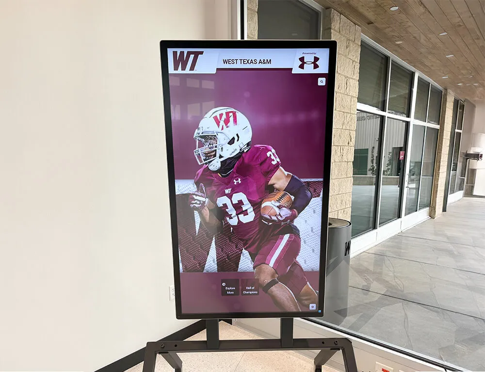
Schools increasingly integrate traditional recognition like trophy cases with modern [digital displays](https://touchscreenwebsite.com/blog/digital-trophy-case-modernizing-athletic-recognition/) that bring yearbook-style storytelling to year-round visibility
Creative Theme-Based Cover Ideas
Thematic approaches provide conceptual frameworks unifying cover designs with interior content while offering creative direction for entire yearbook staff teams.
Journey and Path Themes
Journey concepts resonate with graduation classes particularly, symbolizing transitions from beginning to end while acknowledging growth and transformation.
“The Road Ahead” Visual Metaphors
Road imagery creates powerful journey symbolism. Visual approaches include aerial or ground-level road photography showing paths forward, map aesthetics with routes, destinations, and wayfinding elements, footsteps or shoe prints suggesting forward movement, and pathway compositions leading viewer eyes toward destinations.
These covers work beautifully for senior yearbooks emphasizing transitions from high school to future chapters. Consider incorporating specific local roads, school driveways, or track/field paths familiar to students rather than generic highway imagery.
“Chapters” and Book Metaphors
Since yearbooks are literally books, meta-references to chapters, pages, and stories create clever thematic coherence. Chapter-themed approaches include page edge photography showing stacked pages or open books, chapter heading typography emphasizing beginning, middle, conclusion structure, bookmark elements suggesting places worth remembering, and written word elements like handwriting, typewriters, or journaling aesthetics.
Chapter themes pair naturally with literary references, favorite quotes, or school mottos that emphasize storytelling and memory preservation.
Unity and Community Themes
Designs emphasizing collective experience and belonging celebrate what connects students to each other and to broader school communities.
“Together” and Connection Concepts
Unity themes visualize relationships and collective identity. Connection-driven designs include puzzle piece arrangements where individuals combine into complete pictures, overlapping circles or shapes suggesting overlap and community, hand-holding or group formation photography, and network aesthetics with nodes and connections.
These themes suit schools emphasizing inclusive culture and community values. Consider how visual metaphors might represent specific school initiatives around diversity, equity, and belonging rather than generic unity concepts.
School Spirit and Pride Expressions
Spirit-focused covers celebrate passionate connections to schools through bold color use, energetic compositions, and pride-building elements. Spirit-driven approaches include bold school color blocking with minimal distractions, crowd photography from pep rallies or events showing collective energy, mascot-forward designs celebrating school symbols, and tradition elements referencing long-standing rituals, chants, or customs.
Spirit covers work particularly well for schools with strong athletic traditions or highly engaged student populations. Pair vibrant energy with authentic photography capturing genuine enthusiasm rather than forced performances.
Time and Memory Themes
Since yearbooks fundamentally preserve memories across time, temporal themes create philosophically appropriate conceptual frameworks.
“Moment in Time” Concepts
Designs emphasizing specific moments frozen in memory create emotional resonance. Moment-focused approaches include clock or watch imagery suggesting time preservation, snapshot aesthetics with instant camera or photo album treatments, calendar elements marking significant dates, and time-lapse suggestions showing change across school years.
These covers suit schools experiencing significant transitions—last years before renovations, anniversary years, or final years for closing institutions where memory preservation carries particular poignancy.
“Then and Now” Historical Comparisons
Anniversary years enable powerful then-and-now treatments comparing current students with historical counterparts. Historical comparison approaches include split-screen layouts showing same locations across decades, vintage photo treatments applied to current photography, timeline elements showing school evolution, and archival imagery integrated with contemporary photos.
Historical themes require research and archive access but create tremendously meaningful covers for milestone anniversary years. Consider partnerships with digital archives that preserve institutional history beyond print yearbooks.

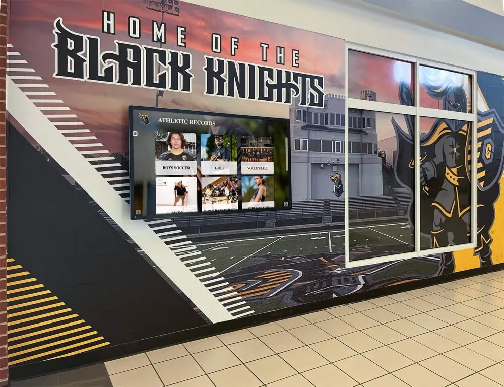
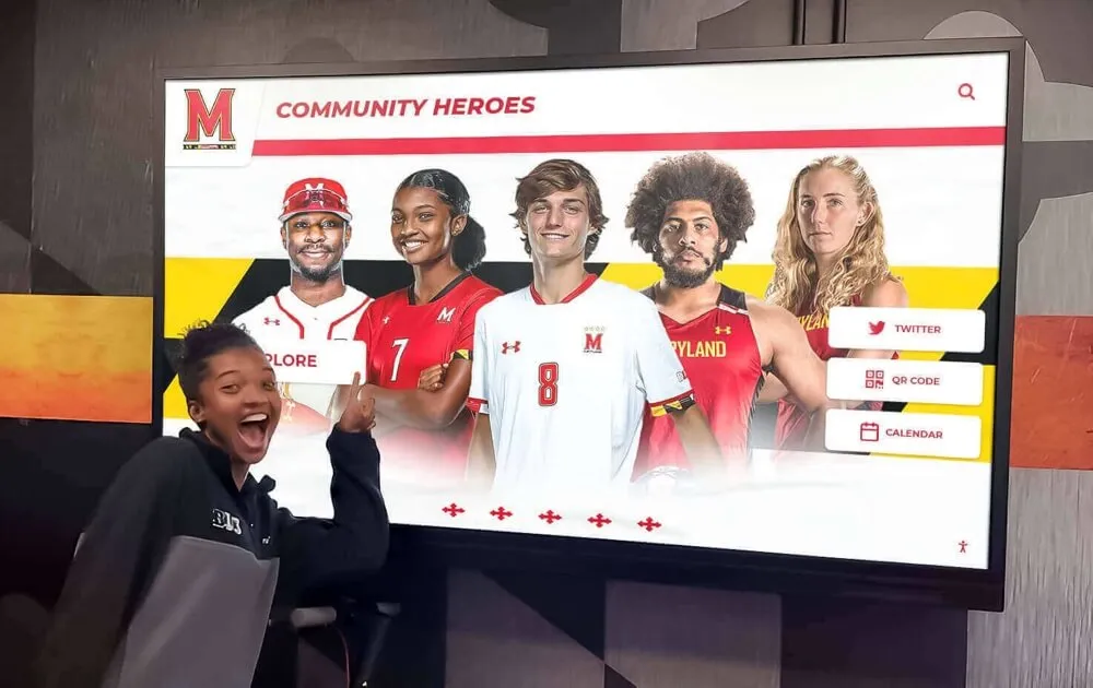
Yearbook design often mirrors the visual storytelling techniques used in [athletic recognition programs](https://digitalyearbook.org/blog/interactive-touchscreen-software-guide/) that celebrate achievement through compelling imagery and thoughtful layouts
Modern and Innovative Cover Design Trends
Contemporary design sensibilities and production technologies enable creative approaches that feel fresh and current.
Minimalist and Clean Design Aesthetics
Minimalism’s focus on essentials with maximum impact creates sophisticated, timeless covers that age gracefully.
Negative Space and Simplicity
Strategic use of empty space draws attention to essential elements while creating breathing room and elegance. Minimalist approaches include single-element focus where one photo, illustration, or typographic treatment dominates, high-contrast compositions using limited color palettes, white space emphasis allowing key elements to float in open fields, and reduction strategies stripping designs to absolute essentials.
Minimalist covers require exceptional execution of limited elements—photography, typography, and composition must be absolutely excellent since nothing distracts from flaws. This approach suits schools wanting sophisticated, design-forward aesthetics.
Monochromatic Color Schemes
Single-color or tone-on-tone treatments create visual unity and sophisticated restraint. Monochromatic approaches include grayscale photography with spot color accents on key elements, single school color variations in different tones and tints, black-and-white photography emphasizing form and composition, and duotone treatments mapping photography to two-color ranges.
Monochromatic designs feel contemporary and elegant while often reducing printing costs compared to full-color treatments. Consider how limiting color focuses attention on composition, form, and content rather than chromatic variety.
Bold and Maximal Design Approaches
Conversely, maximalist aesthetics embracing abundance, energy, and complexity create vibrant, engaging covers.
Vibrant Color Explosions
High-energy color treatments create excitement and youthful vibrancy. Vibrant approaches include neon or fluorescent color schemes, rainbow gradients and color spectrums, color blocking with bold geometric divisions, and saturated photography emphasizing intense hues.
Maximalist color demands confident execution—too much energy becomes chaotic rather than exciting. Ground vibrant treatments with strong compositional structures and clear focal hierarchies preventing visual confusion.
Layered Complexity and Collage
Dense compositions incorporating multiple elements create visual richness rewarding extended viewing. Complex approaches include collage aesthetics combining photos, graphics, text, and textures, layered transparency effects building depth, mixed media combining digital and analog elements, and information-rich designs incorporating timelines, lists, or data visualizations.
Complex covers work beautifully for large schools with diverse programs wanting to represent comprehensive student experiences. Balance density with clear focal points preventing overwhelming chaos.
Interactive and Dimensional Covers
Production innovations enable physical covers that engage tactile senses beyond visual appreciation.
Textured and Embossed Treatments
Adding physical dimension through embossing, debossing, or textured materials creates premium tactile experiences. Dimensional approaches include embossed mascots or logos readers can feel, debossed typography creating subtle depth, textured materials like fabric, leather, or specialty papers, and spot finishes combining glossy and matte treatments.
Dimensional treatments increase production costs but create truly distinctive covers students value as premium keepsakes. Consider dimensional treatments for milestone years or when seeking fundraising justification through perceived value.
Die-Cut and Shaped Covers
Non-rectangular covers or designs with cutout elements create memorable distinctive shapes. Die-cut approaches include windows revealing interior pages or secondary covers, shaped edges following mascot silhouettes or school letters, layered covers with cutout first covers revealing second layers, and partial covers with open areas.
Die-cutting requires careful planning and increases costs, but delivers covers that stand out dramatically from standard rectangles. Ensure structural integrity—cuts should enhance rather than weaken binding or protection.
![]()
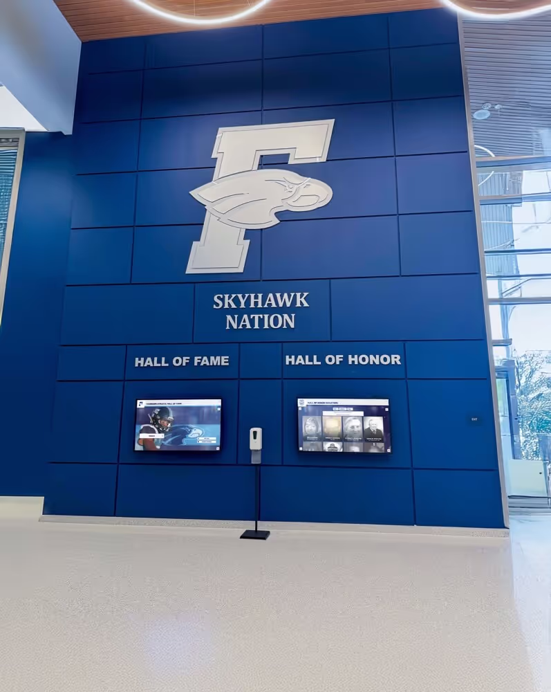
Athletic branding elements featured in yearbook covers often extend to permanent recognition installations like [digital athletic displays](https://best-touchscreen.com/blog/senior-night-posters-creative-ideas-every-high-school-sport/) that celebrate team achievements year-round
Photography Strategies for Yearbook Covers
Since photography dominates yearbook cover design, understanding effective photographic approaches dramatically improves cover quality.
Composition Techniques for Cover Photography
Strong compositional fundamentals separate compelling cover photography from snapshots.
Rule of Thirds and Visual Balance
Positioning key elements along rule-of-thirds gridlines (dividing frames into horizontal and vertical thirds) creates natural, balanced compositions. For covers, consider placing horizon lines, architectural features, or primary subjects along these divisions rather than centering elements which often feels static.
Visual balance doesn’t require symmetry—asymmetrical compositions with offsetting elements often feel more dynamic than centered arrangements. Ensure cover compositions feel intentionally balanced rather than accidentally lopsided.
Leading Lines and Depth
Lines within images guide viewer attention and create sense of depth. Architectural elements, paths, fences, or natural features can lead eyes toward focal points. For cover photography, consider how lines might draw attention toward school names, year numerals, or thematic elements.
Creating depth through foreground, midground, and background elements makes two-dimensional covers feel three-dimensional and immersive—far more engaging than flat compositions lacking spatial depth.
Perspective and Unique Angles
Standard eye-level perspectives feel familiar but often lack impact. Experiment with dramatic angles creating fresh perspectives on familiar subjects. Low angles looking upward make buildings and people feel monumental and impressive. High angles looking downward provide comprehensive overviews. Dutch angles tilting horizons create energy and dynamism.
For schools with distinctive architecture, aerial drone photography provides spectacular unique perspectives impossible from ground level—showcasing campus layouts and contexts beautifully.
Lighting Considerations for Cover Images
Lighting quality fundamentally impacts photographic mood and technical quality.
Golden Hour and Natural Light
Photographing during golden hour—the first hour after sunrise and last hour before sunset—produces warm, flattering light with long shadows creating dimensional modeling. Golden hour photography feels naturally beautiful and emotionally warm, perfect for nostalgic yearbook aesthetics.
Blue hour—the period of twilight before sunrise and after sunset—creates cool, ethereal lighting suited to atmospheric, contemplative covers. Consider timing photo shoots to capture optimal natural light rather than accepting whatever lighting conditions happen to exist.
Dramatic Lighting and Shadow Play
Beyond flattering illumination, dramatic lighting creates mood and visual interest. Strong directional light produces bold shadows adding graphic quality. Backlighting creates silhouettes and halos emphasizing forms. Side lighting reveals texture and dimension.
For athletic action photography, harsh light emphasizing sweat and intensity suits competitive energy better than soft flattering illumination. Match lighting quality to intended emotional tone.
Selecting and Editing Cover Photography
Technical execution and post-processing significantly impact final cover impact.
Image Resolution and Quality Requirements
Cover photography requires high resolution for sharp reproduction—minimum 300 DPI at actual print dimensions. For typical 9x12 inch yearbook covers, images should be at least 2700x3600 pixels. Larger files provide cropping flexibility.
Avoid using low-resolution social media images or web downloads—these look acceptable on screens but reproduce poorly in print. Shoot with quality cameras at high resolution settings, or commission professional photography for covers.
Color Grading and Mood Setting
Post-processing color adjustments dramatically impact emotional tone. Warm color grades emphasizing oranges and yellows feel nostalgic and welcoming. Cool grades emphasizing blues feel contemporary and energetic. Desaturated tones feel artistic and sophisticated. High-contrast treatments feel dramatic and intense.
Consider how color grading might reinforce thematic concepts or school color palettes. Subtle color adjustments often prove more effective than extreme filters creating obvious artificial appearances.

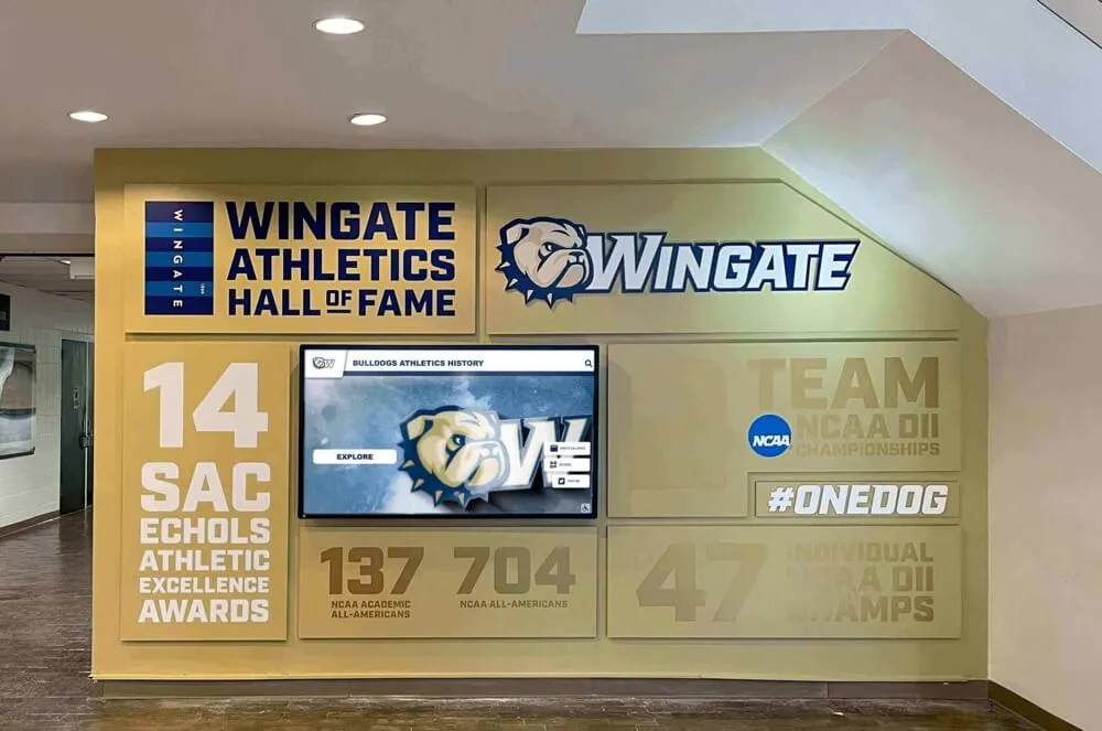
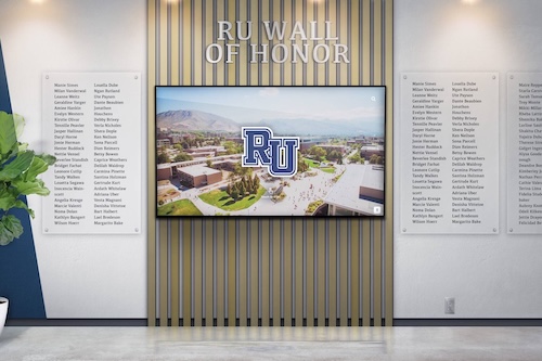
Yearbook covers often reflect the school's broader visual identity seen in [recognition displays](https://digitalwarming.net/blog/high-school-wall-of-fame-guide/) that celebrate student achievement through coordinated design systems
Typography and Text Treatment for Covers
Text elements—school names, years, themes, and supplementary copy—demand thoughtful typographic treatment balancing readability with aesthetic impact.
Font Selection and Pairing Strategies
Typography choices dramatically influence cover personality and readability.
Serif vs. Sans-Serif Aesthetics
Serif typefaces with decorative strokes feel traditional, formal, and established—appropriate for schools emphasizing heritage and academic rigor. Classic serif choices include Garamond, Baskerville, Caslon, or Playfair Display.
Sans-serif typefaces without decorative strokes feel modern, clean, and approachable—suited to contemporary, forward-looking aesthetics. Strong sans-serif options include Helvetica, Futura, Avenir, or Gotham.
Most effective covers use limited typefaces—one for headlines (school names) and another for supporting text (years, themes). Pair serif headlines with sans-serif supporting text, or vice versa, creating visual variety while maintaining coherence.
Display Fonts and Special Treatments
Display typefaces designed for headlines and large text enable distinctive personality impossible with general-purpose fonts. Display categories include script fonts mimicking handwriting (suited to personal, intimate themes), decorative or novelty fonts with unique personalities (use sparingly, quickly feel dated), geometric fonts with distinctive letterforms (create modern technical aesthetics), and custom or hand-lettered text (maximally distinctive but require design skills).
Display fonts demand restraint—use for single prominent elements like year numerals, not body text where they compromise readability. Ensure display choices remain legible at cover sizes since busy, complex fonts lose clarity when reduced.
Typographic Layout and Hierarchy
How text organizes spatially impacts both visual appeal and functional clarity.
Size and Weight Variations
Create clear hierarchies through size differences—school names typically dominate, years hold secondary prominence, and supplementary text (themes, volumes) receive smallest treatment. Weight variations (light, regular, bold, black) within single typeface families provide hierarchy without introducing multiple fonts.
Contrast matters—if school names use 120-point type, years should be notably smaller (perhaps 60-point) rather than similarly sized competing for attention. Hierarchy guides viewer eyes through information in intended order.
Alignment and Spacing Decisions
Text alignment impacts formality and visual rhythm. Centered alignment feels traditional and formal. Left alignment feels contemporary and organized. Right alignment creates unexpected visual interest but feels unconventional. Justified alignment fills predetermined spaces but creates uneven spacing challenges.
Letter spacing (tracking) adjustments enable fine-tuning of visual density. Increase tracking for elegant, airy treatments. Decrease tracking for compact, energetic feelings. Word spacing and line height similarly impact texture and readability.
Text as Graphic Element
Beyond simply labeling covers, text can function as primary graphic element. Approaches include oversized typography filling covers with minimal supporting imagery, text paths where copy follows curved or custom shapes, typographic patterns using repeated text creating texture, and text integration where copy wraps around or interacts with photographic elements.
Treating text graphically requires balancing artistic impact with functional readability—viewers must still quickly identify school names and years even within creative treatments.

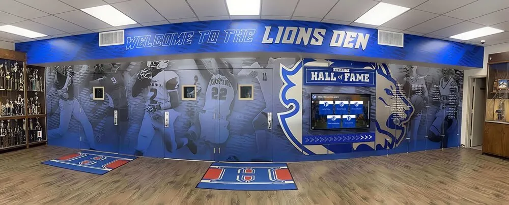
Recognition programs and yearbook designs both benefit from [thoughtful brand integration](https://best-touchscreen.com/blog/recognition-program-best-practices-building-culture-appreciation/) that honors school identity through consistent visual treatment
Color Theory and Palette Selection
Strategic color use dramatically impacts emotional resonance, brand alignment, and visual hierarchy.
School Color Integration Strategies
Honoring institutional colors creates pride and recognition while presenting creative challenges when official palettes feel limiting.
Traditional School Color Applications
Most straightforward approaches apply school colors prominently throughout covers. Traditional applications include solid color backgrounds in primary school colors, alternating color blocks dividing cover sections, mascot or logo presentations in authentic school colors, and typography in school color families.
Traditional color use suits schools with beautiful existing palettes and communities valuing visible school identity. Ensure color combinations maintain adequate contrast for readability—dark text on dark backgrounds or light on light becomes illegible regardless of color beauty.
Modern Color Interpretations
Creative teams sometimes reinterpret school colors through contemporary treatments maintaining connection while feeling fresh. Modern interpretations include gradient blends between school colors, desaturated or pastel versions of traditional hues, accent use where school colors highlight specific elements in primarily neutral compositions, and unexpected pairings combining school colors with complementary shades not traditionally associated with institutions.
Reinterpreting school colors requires balancing recognition with innovation—go too far and communities won’t recognize their colors, creating disconnection rather than pride.
Color Psychology and Emotional Impact
Colors trigger psychological associations influencing emotional responses.
Warm Colors and Energy
Warm hues—reds, oranges, yellows—create feelings of energy, excitement, warmth, and approachability. Red suggests passion and intensity. Orange feels friendly and creative. Yellow conveys optimism and happiness.
Warm palettes suit spirit-focused yearbooks, athletic-emphasis covers, or themes celebrating community and joy. Balance warm color intensity with neutral elements preventing overwhelming saturation.
Cool Colors and Sophistication
Cool hues—blues, greens, purples—feel calm, sophisticated, professional, and contemplative. Blue suggests trust and stability. Green feels fresh and growth-oriented. Purple conveys creativity and luxury.
Cool palettes work beautifully for academic-emphasis schools, contemporary design aesthetics, or themes emphasizing reflection and growth. Cool colors typically feel more formal than warm alternatives.
Neutral Foundations and Timelessness
Neutral palettes—blacks, whites, grays, beiges—create sophisticated, timeless foundations that age gracefully. Neutrals enable photography and other elements to dominate without competing with backgrounds. Accent neutral foundations with school colors or photography providing controlled chromatic interest.
Neutral approaches suit minimalist aesthetics, photography-forward designs, or schools wanting elegant restraint over energetic expression.
Creating Visual Interest Through Color Contrast
Strategic contrast creates visual hierarchy and prevents monotonous uniformity.
Complementary Color Pairings
Colors opposite on color wheels—blue and orange, red and green, yellow and purple—create maximum contrast and visual vibration. Complementary pairings generate energy and attention but risk feeling jarring when oversaturated.
Use complementary relationships strategically for specific elements requiring emphasis rather than covering entire designs in clashing complements.
Analogous Color Harmony
Adjacent colors on wheels—blues and greens, reds and oranges, yellows and greens—create harmonious, cohesive palettes feeling naturally unified. Analogous schemes work beautifully for gradient treatments and create soothing, pleasant aesthetic experiences.
These harmonious relationships suit elegant, sophisticated designs preferring unity over dramatic contrast.
Production Considerations and Technical Requirements
Understanding production realities ensures designs translate successfully from concepts to physical yearbooks.
Cover Material and Finish Options
Substrate choices dramatically impact durability, appearance, and cost.
Hardcover vs. Softcover Decisions
Hardcover yearbooks with rigid boards feel premium and durable, protecting pages through years of handling. Hardcovers support various covering materials including paper, fabric, or leather. They cost more but communicate quality and permanence—appropriate for yearbooks as long-term keepsakes.
Softcover yearbooks with heavy paper stock or thin board feel less substantial but reduce costs significantly. Softcovers suit smaller programs or supplemental publications but feel less appropriate for primary yearbooks students expect to treasure indefinitely.
Lamination and Protective Finishes
Surface finishes protect covers while influencing appearance. Options include gloss lamination creating shiny, color-saturated appearance with strong protection, matte lamination providing low-glare finish feeling sophisticated and reducing fingerprints, spot UV where glossy coatings selectively cover specific design elements creating contrast, and soft-touch lamination feeling velvety and premium.
Protective finishes dramatically extend cover life by resisting scratches, moisture, and wear. The incremental cost proves worthwhile for yearbooks intended as permanent keepsakes.
Specialty Materials and Premium Options
Beyond standard paper-covered boards, specialty materials create distinctive premium appearances. Options include fabric or cloth covering feeling traditional and substantial, leather or synthetic leather conveying luxury, textured papers adding physical dimension, and metallic or foil materials creating reflective shine.
Specialty materials increase costs considerably but deliver truly distinctive covers students value as special keepsakes. Consider premium materials for milestone years or when seeking enhanced perceived value.
Printing Specifications and File Preparation
Technical preparation prevents production problems and ensures intended designs reproduce accurately.
Resolution and File Format Requirements
Printers require high-resolution files—300 DPI minimum at actual print dimensions. Save final designs as CMYK (not RGB) color space matching printing processes. Acceptable file formats typically include PDF, TIFF, or high-resolution JPG.
Embed all fonts or convert text to outlines preventing font substitution problems. Include all linked images rather than references to files printers won’t have. Discuss specific requirements with chosen yearbook companies since specifications vary.
Bleed and Safe Area Guidelines
Bleed—extending design elements beyond trim edges—ensures no white borders appear after cutting variations. Standard bleed extends 0.125 inches beyond trim lines. Design elements intended to reach edges must extend into bleed areas.
Conversely, keep critical text and design elements inside safe areas (typically 0.25 inches from trim edges) preventing unintended cutting. Account for spine width when designing covers wrapping from front to back.
Color Matching and Proof Review
Digital displays show colors in RGB while printing uses CMYK—colors often shift during conversion, particularly vibrant blues and oranges. Request physical color proofs rather than approving designs based solely on screen appearance.
If precise school color matching matters critically, discuss Pantone Matching System (PMS) spot colors with printers. PMS inks reproduce specific colors exactly but increase costs compared to CMYK process printing.

Modern schools complement yearbook recognition with [interactive touchscreen displays](https://rocketalumnisolutions.com/?utm_source=organic&utm_medium=seo-auto&utm_content=touchscreenwebsite&utm_campaign=yearbook-cover-ideas&utm_term=seo) that bring student achievement celebration into year-round visibility
Collaborative Design Process and Student Involvement
Engaging students and stakeholders in cover design creates buy-in while generating diverse creative perspectives.
Brainstorming and Concept Development
Inclusive ideation processes generate richer possibilities than individuals working alone.
Student Surveys and Input Gathering
Solicit broad student input about defining year characteristics, memorable moments, favorite traditions, and design preferences. Simple surveys asking “What made this year special?” or “What images represent our school?” generate valuable insights while building anticipation.
Review survey responses to identify recurring themes and shared perspectives guiding design direction. Incorporate student language and references ensuring covers feel authentic to student experience rather than adult interpretations.
Design Thinking Workshops
Structured brainstorming sessions with yearbook staff, student government representatives, and interested volunteers generate collaborative ideas. Workshop techniques include mind mapping visual associations with school year concepts, mood boarding collecting inspirational images establishing aesthetic directions, sketching multiple rough concepts exploring diverse approaches, and critique sessions evaluating possibilities against established criteria.
Collaborative workshops generate ideas individuals wouldn’t discover alone while building team ownership of final directions.
Feedback and Iteration Cycles
Effective designs rarely emerge fully formed—refinement through feedback improves outcomes dramatically.
Presenting Concepts to Stakeholders
Develop 3-5 distinct concepts representing different aesthetic directions for stakeholder review. Present concepts to administration, faculty advisors, student representatives, and potentially broader student bodies depending on school culture.
Gather structured feedback using consistent criteria rather than simple preference voting. Ask evaluators which concepts best represent school identity, most effectively capture the specific year, feel most visually appealing, and will age best across decades.
Refinement Based on Constructive Input
Synthesize feedback to identify consistent themes rather than trying to accommodate every individual preference. Common feedback patterns reveal genuine issues worth addressing while isolated opinions may reflect personal taste rather than design flaws.
Refine leading concepts based on constructive input, then present revised versions for final selection. This iterative process dramatically improves outcomes compared to immediate commitment to initial ideas.
Managing Creative Compromise
Yearbook design involves balancing artistic vision with practical constraints and diverse preferences.
Budget Realities and Creative Solutions
Ideal creative visions frequently exceed available budgets. When facing financial constraints, prioritize elements delivering maximum impact. Simple covers with exceptional photography outperform complex designs with mediocre images. Clean typography on quality materials beats elaborate designs on cheap stock.
Consider phased approaches where current years implement affordable excellent basics while long-term plans work toward premium options as budgets allow or fundraising succeeds.
Honoring Tradition While Embracing Innovation
Schools with long yearbook histories face tension between maintaining recognizable continuity and exploring fresh approaches. Navigate tradition-innovation balance by identifying truly essential traditional elements communities genuinely value, then finding creative contemporary treatments for these requirements.
Often, retaining core elements like specific color treatments or mascot inclusion while updating composition, typography, or photographic styles successfully honors heritage while feeling current.
Beyond the Cover: Connecting to Interior Design
While covers dominate first impressions, connecting cover designs to interior layouts creates cohesive unified yearbook experiences.
Visual Continuity and Theme Integration
Extend cover aesthetics throughout books for consistent professional appearance.
Color Palette Consistency
Cover colors should appear in interior section dividers, headers, and graphic accents creating visual connections. Consistent palette use helps readers navigate sections while reinforcing thematic unity.
Develop formal color systems documenting primary, secondary, and accent colors used consistently by all staff members designing interior spreads.
Typography Systems
Extend cover typeface selections to interior headlines, captions, and body text. Establish hierarchical systems with specified fonts, sizes, and treatments for different content types ensuring visual consistency throughout books.
Typography consistency creates professional polish while making design decisions easier for staff members uncertain about aesthetic choices.
Graphic Element Libraries
Create libraries of graphic elements—patterns, borders, icons, decorative elements—echoing cover aesthetics for use throughout interiors. Consistent graphic language unifies disparate content by different designers into cohesive publications.
Thematic Storytelling Throughout Books
Strong themes introduced on covers should influence how content organizes and presents throughout yearbooks.
Section Dividers Reinforcing Themes
Major section dividers introducing academics, athletics, activities, and classes offer opportunities to develop thematic concepts. If covers introduce journey metaphors, section dividers might visualize different journey stages. Unity themes might show different aspects of community coming together.
Thoughtful thematic development transforms yearbooks from photo collections into cohesive narrative experiences.
Content Framing Through Thematic Lens
Encourage staff members to consider how thematic frameworks might influence caption writing, story angles, and photo selections. Journey themes might emphasize growth and change throughout years. Unity themes might highlight collaborations and relationships.
Thematic consistency distinguishes memorable yearbooks from generic compilations—covers introducing themes should influence entire publications.

Recognition programs using [digital displays](https://halloffamewall.com/blog/digital-photo-gallery-school-events-guide/) share design philosophies with yearbook programs—both celebrate community and preserve institutional memory through visual storytelling
Inspiration from Award-Winning Yearbook Designs
Studying excellent examples provides concrete inspiration while revealing what makes covers succeed.
National Competition Winners
Organizations including Columbia Scholastic Press Association, National Scholastic Press Association, and Jostens conduct annual competitions recognizing outstanding yearbook designs.
Common Characteristics of Award Winners
Analyzing winning covers reveals recurring patterns. Winners typically demonstrate cohesive design unity where all elements work together intentionally, authentic representation of genuine school character rather than generic templates, technical excellence in photography, typography, and production quality, creative risk-taking that stands out without sacrificing readability, and meaningful concept development with depth beyond surface aesthetics.
Study competition winners not to copy specific designs but to internalize principles distinguishing exceptional work from adequate alternatives.
Learning from Diverse School Contexts
Recognize that award-winning designs succeed within specific school contexts—what works beautifully for large suburban high schools may not suit small rural schools or urban institutions. Study examples from similar contexts rather than assuming all award winners provide relevant models.
Online Resources and Design Galleries
Numerous resources showcase yearbook design inspiration online.
Yearbook Company Design Galleries
Major yearbook companies including Jostens, Herff Jones, Walsworth, and Balfour maintain extensive design galleries showcasing client work. These galleries provide searchable inspiration organized by themes, colors, or design approaches.
Browse galleries to bookmark appealing examples, noting specific elements that resonate—composition approaches, color treatments, typography choices, or photographic techniques you might adapt.
Pinterest and Social Media Inspiration
Pinterest proves particularly valuable for visual inspiration, with countless yearbook design boards curating examples. Search terms like “yearbook cover design,” “yearbook layout,” or “school publication design” surface extensive inspiration.
Follow yearbook-focused Instagram accounts and hashtags like #yearbookdesign or #yearbookadvisor for current trends and community insights from advisors nationwide.
Design Competition Archives
Competition organizations often maintain online archives of past winners enabling study of historically successful approaches. Analyze how winning designs evolve over years, revealing shifting aesthetic preferences and emerging trends.
Extending Yearbook Recognition Beyond Print
While covers protect traditional printed yearbooks, modern recognition programs increasingly complement physical publications with digital experiences.
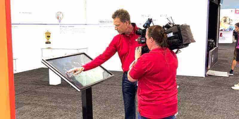
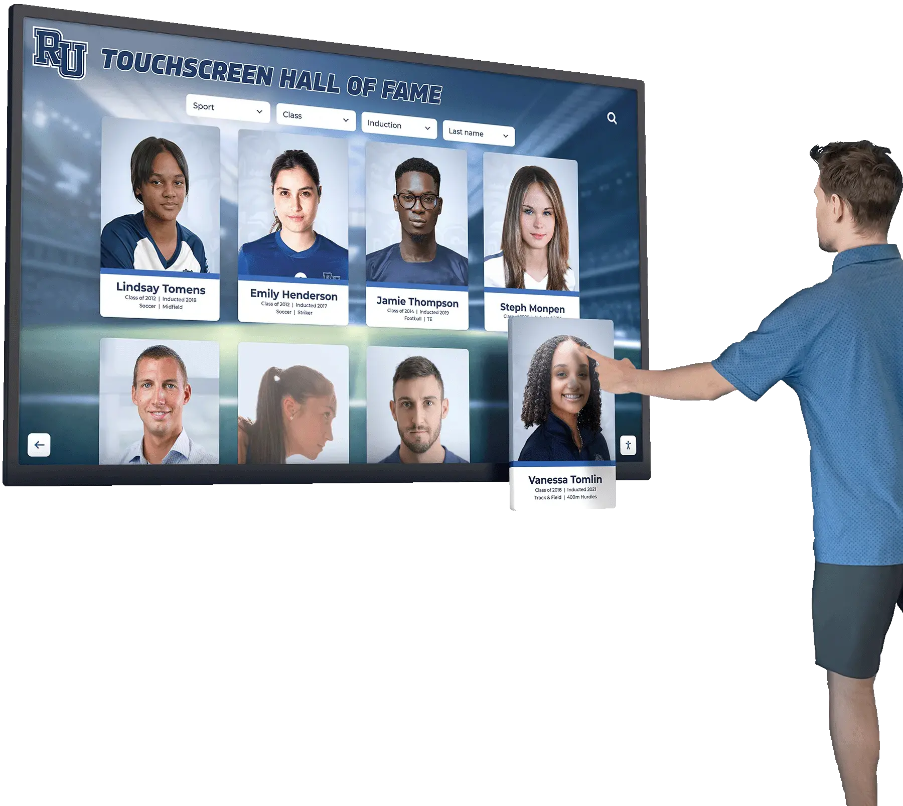
Digital Recognition Displays
Forward-thinking schools implement digital touchscreen displays showcasing student achievements, athletic accomplishments, and school history—effectively creating year-round dynamic yearbook experiences.
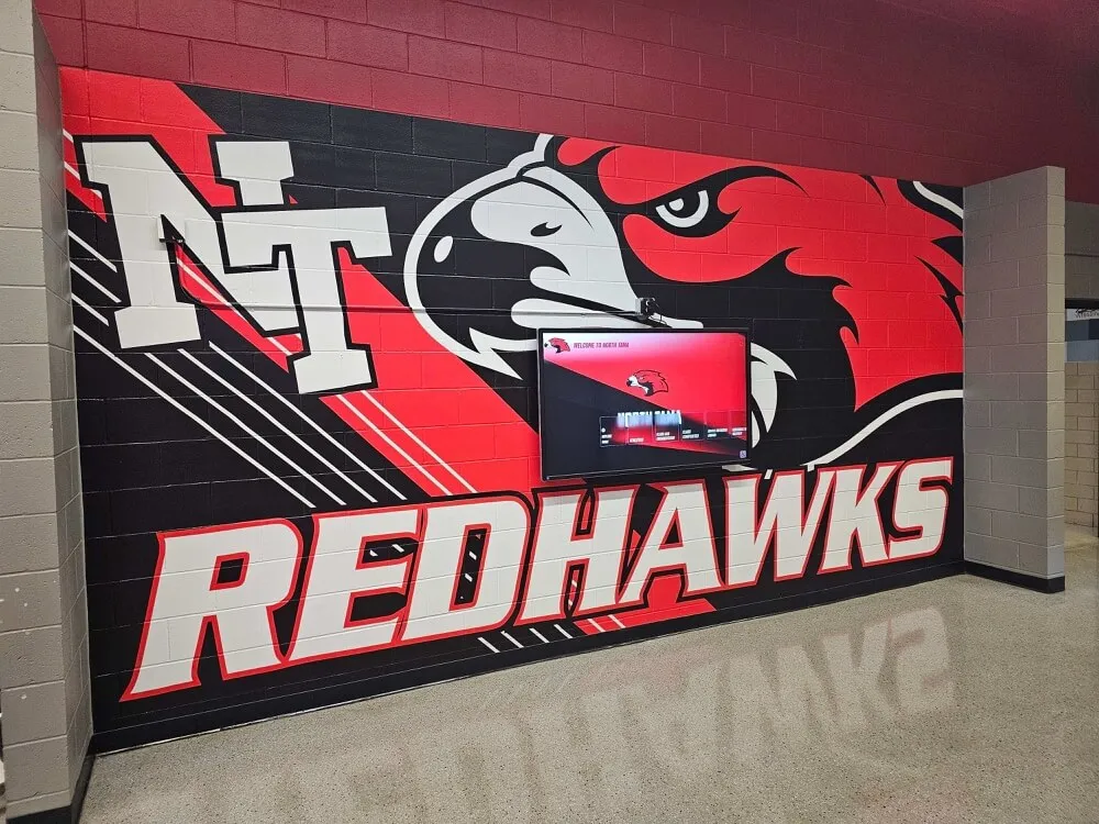
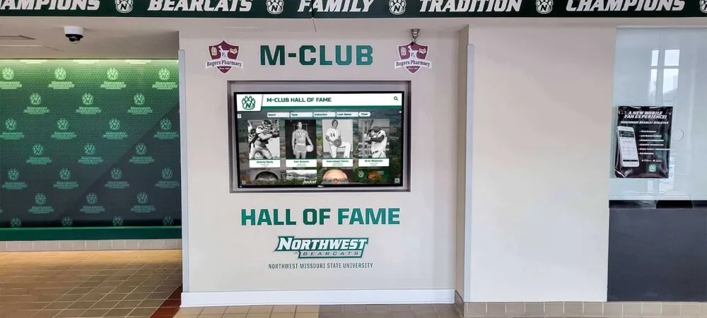
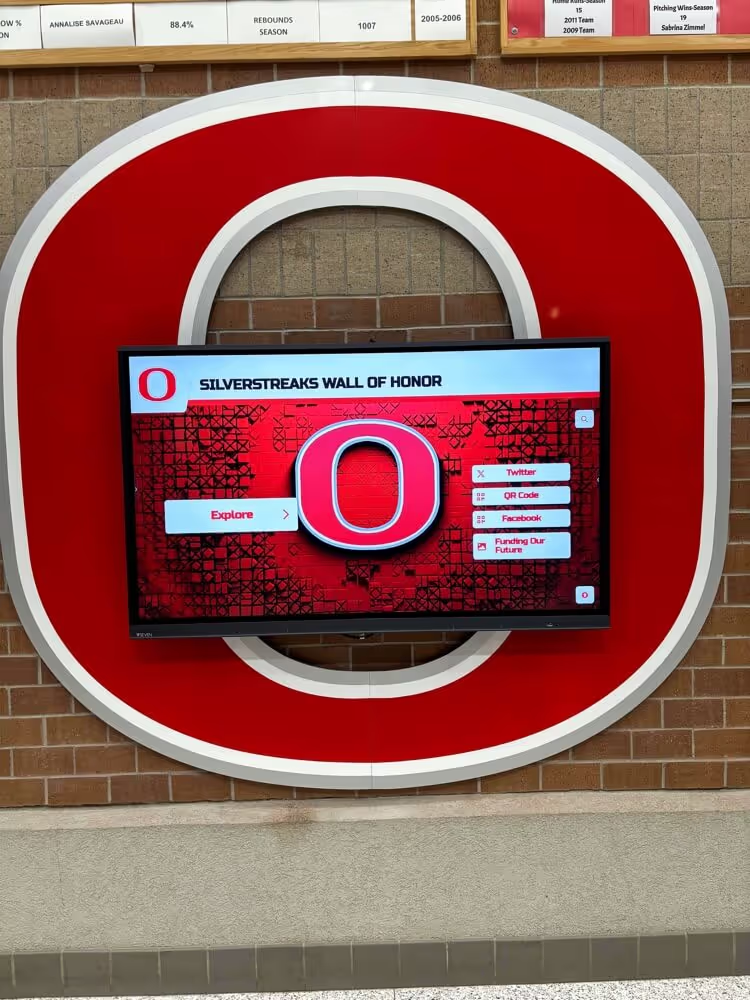
Solutions like Rocket Alumni Solutions enable schools to celebrate recognition continuously rather than limiting celebration to annual yearbook distribution. Interactive displays allow community members to explore student achievements, championship teams, and institutional history through engaging touchscreen experiences that extend yearbook storytelling throughout facilities and across time.
These digital recognition systems complement rather than replace printed yearbooks—displays showcase content dynamically while physical yearbooks remain treasured personal keepsakes. Together, they create comprehensive recognition ecosystems celebrating student excellence through both permanent printed and continuously updated digital formats.
Social Media Integration
Extend yearbook themes and content to social media platforms building anticipation throughout design processes and publication cycles.
Behind-the-Scenes Content
Share yearbook staff working on covers, design development processes, photoshoot preparations, and production milestones. Behind-scenes content builds community investment while generating excitement about upcoming publications.
Create hashtags for each yearbook (like #WestfieldYearbook2026) encouraging students to share relevant photos and memories potentially incorporated into designs or content.
Digital Supplements to Physical Books
Some yearbook programs create digital galleries, video supplements, or online extensions showcasing additional content beyond what physical page counts accommodate. Digital supplements enable richer multimedia storytelling while maintaining printed yearbooks as primary deliverables.
Consider how digital components might extend rather than replace traditional publications—enhancing rather than competing with physical yearbooks students treasure.
Conclusion: Creating Covers Students Treasure
Yearbook cover design represents far more than aesthetic exercise—it’s opportunity to capture school year essence in single lasting image students will revisit across decades, triggering memories and emotions long after graduation. Thoughtful design investment creates covers that genuinely honor student experiences while building pride, preserving tradition, and celebrating community.
Successful covers emerge from understanding your unique school identity, authentically representing defining characteristics of specific years, engaging students throughout creative processes ensuring genuine representation, balancing creative innovation with practical production realities, extending thematic concepts throughout interior designs, and maintaining professional quality worthy of treasured keepsakes.
Whether embracing classic photography-driven approaches, exploring bold contemporary aesthetics, developing meaningful thematic frameworks, or combining multiple strategies into distinctive hybrid designs, remember that yearbook covers ultimately serve communities rather than designers. The best covers resonate deeply with students who lived those years—triggering instant recognition, emotional connection, and justified pride in their schools and shared experiences.
Extend Recognition Beyond Yearbook Pages
While yearbooks preserve annual memories beautifully, digital recognition displays bring student achievement celebration into year-round visibility. Rocket Alumni Solutions creates interactive touchscreen experiences that honor students, athletes, and school history through engaging displays complementing your yearbook programs.
Discover Digital Recognition SolutionsAs you develop yearbook covers, consider how recognition programs might extend beyond annual publications into dynamic ongoing celebration. Printed yearbooks remain irreplaceable personal keepsakes, but complementary digital displays enable continuous recognition visibility throughout facilities while interactive touchscreen experiences let entire communities explore student achievements and school history.
The most effective recognition strategies embrace both formats—traditional printed yearbooks providing personal treasured keepsakes alongside modern digital recognition displays offering interactive year-round visibility. Together, they create comprehensive ecosystems celebrating student excellence through timeless print and dynamic digital experiences that honor your school community completely.
Ready to create unforgettable yearbook covers? Apply the design principles, creative inspiration, and production insights in this guide to develop covers your school community will treasure for generations. And consider how extending recognition beyond yearbook pages through digital touchscreen displays might complement your yearbook program while bringing student achievement celebration into continuous year-round prominence throughout your school.