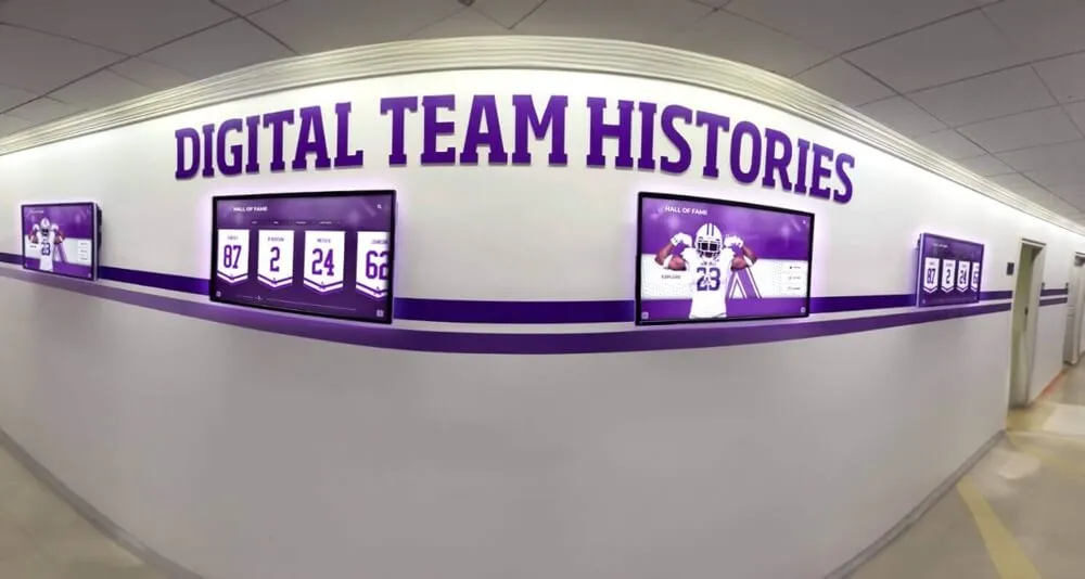
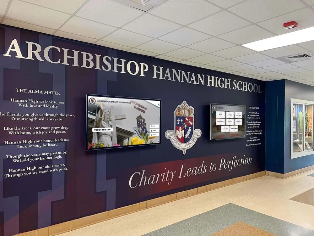
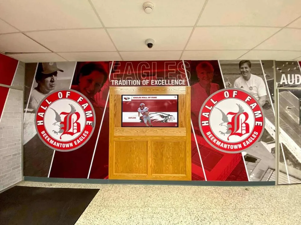
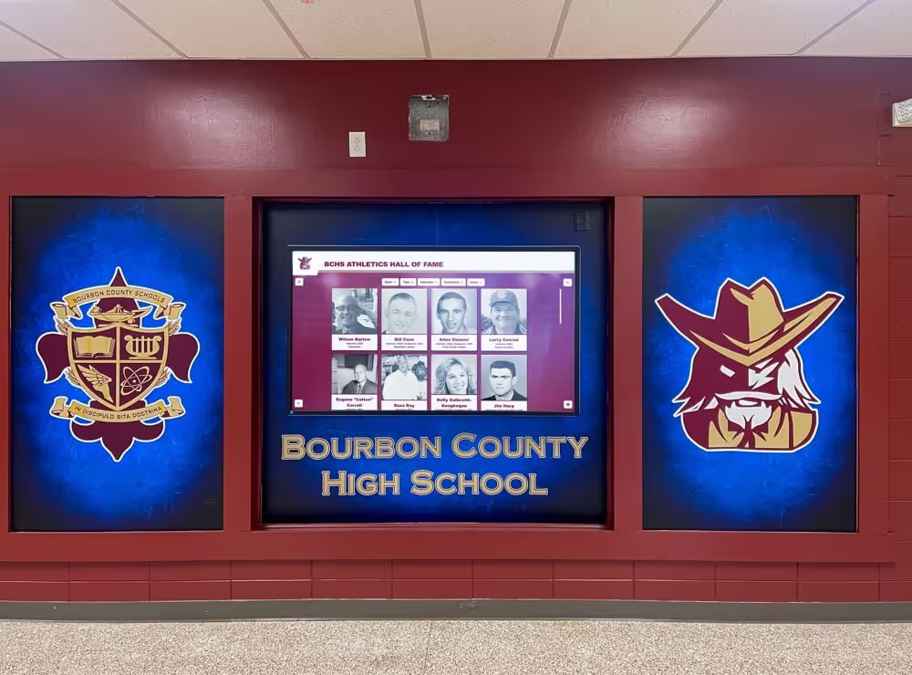
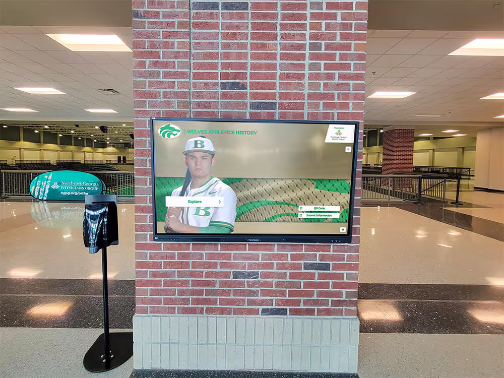
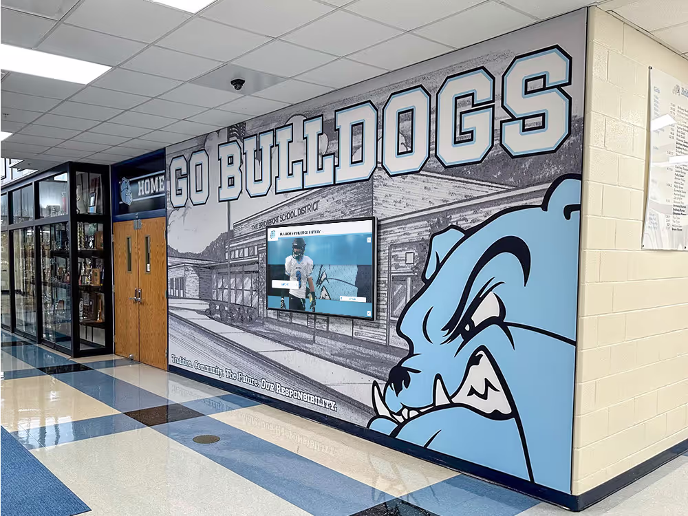
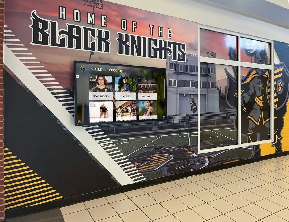
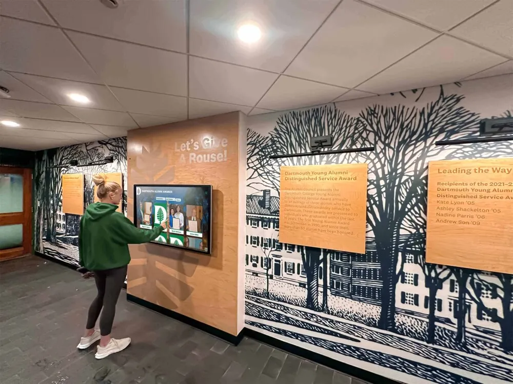
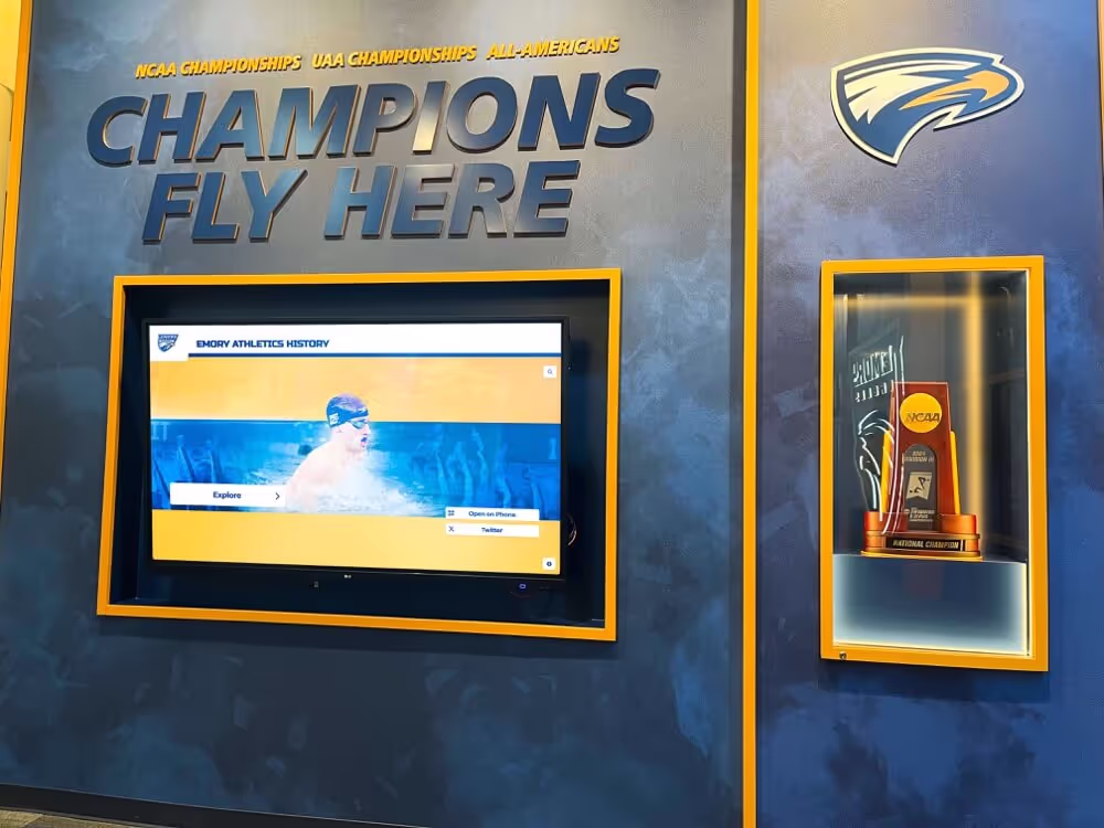
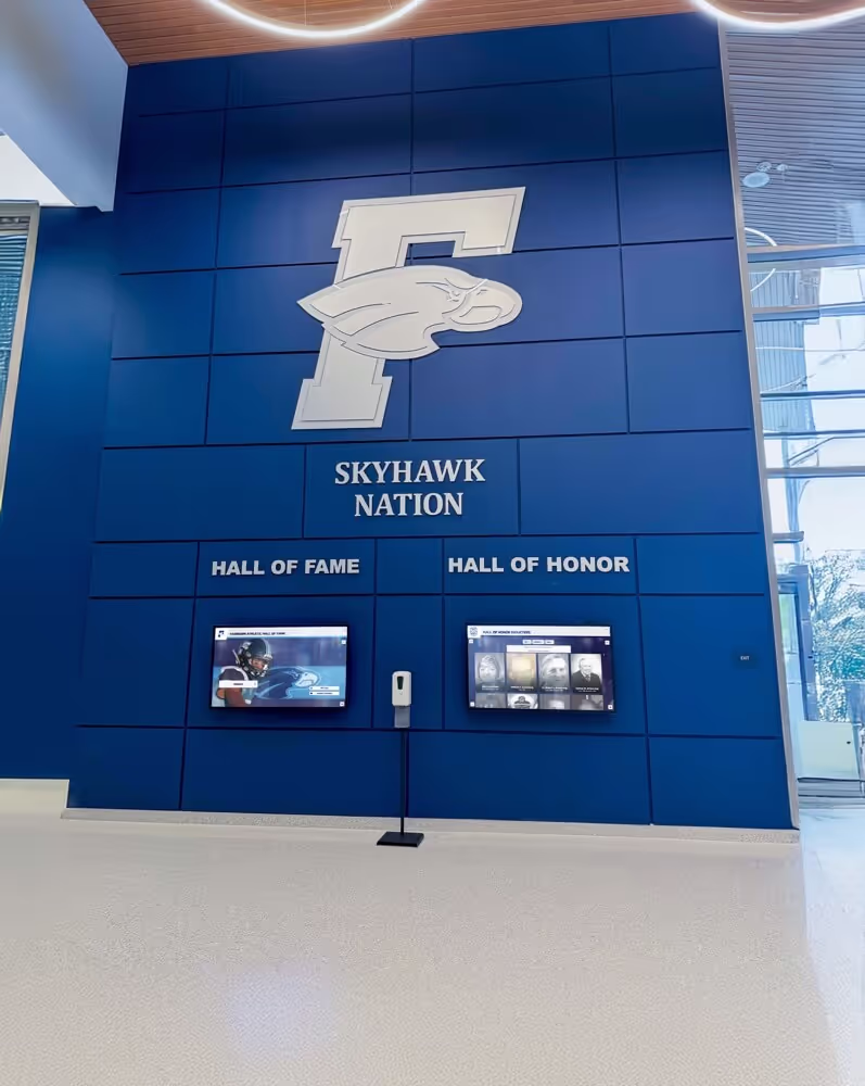
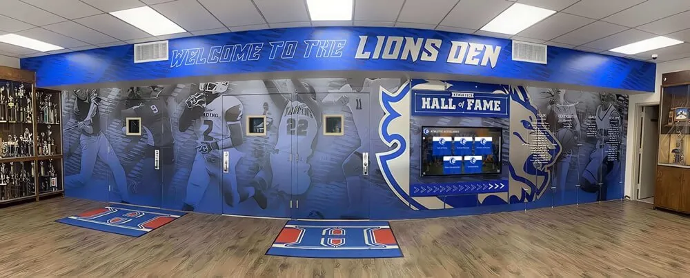
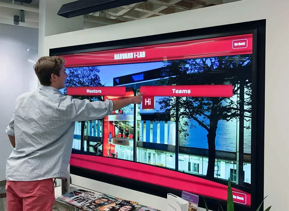
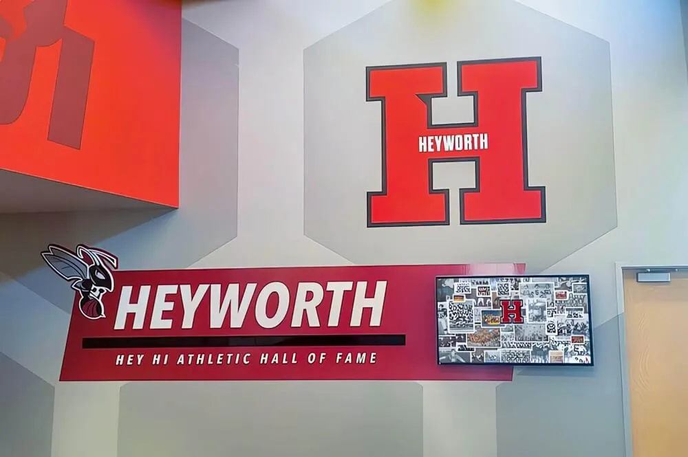
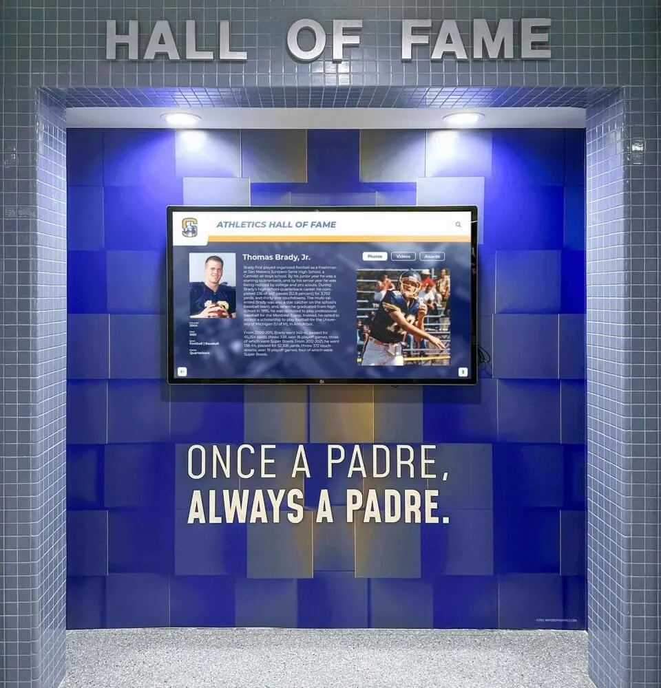
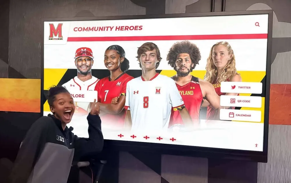
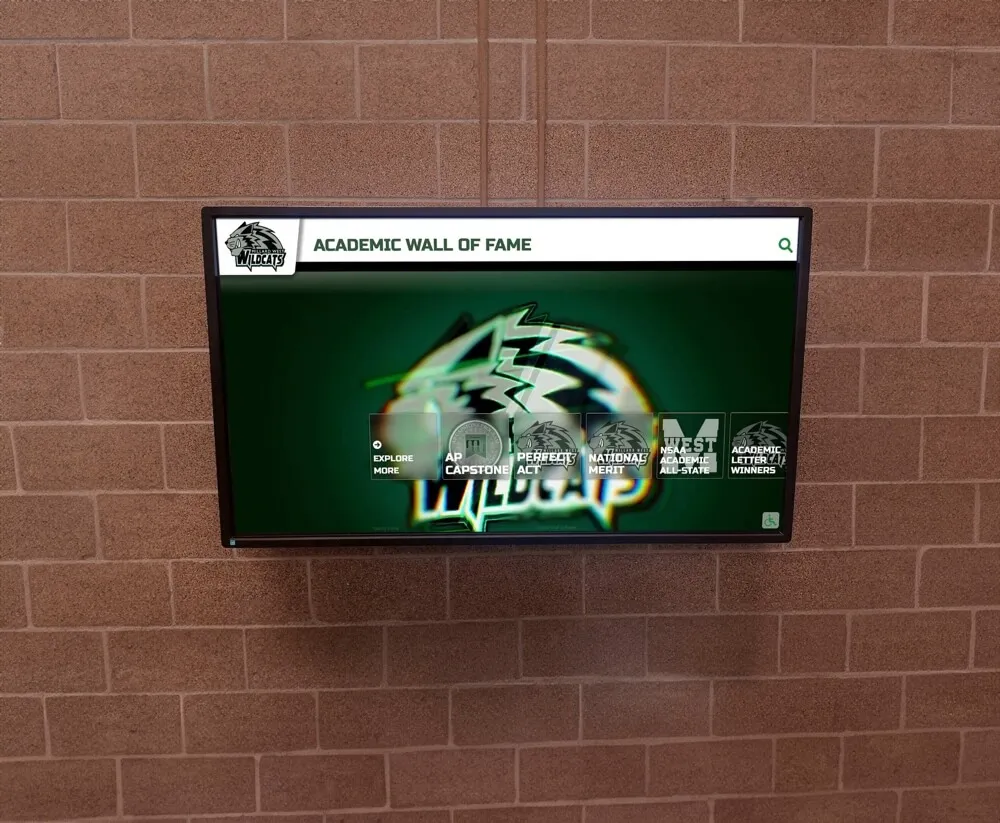
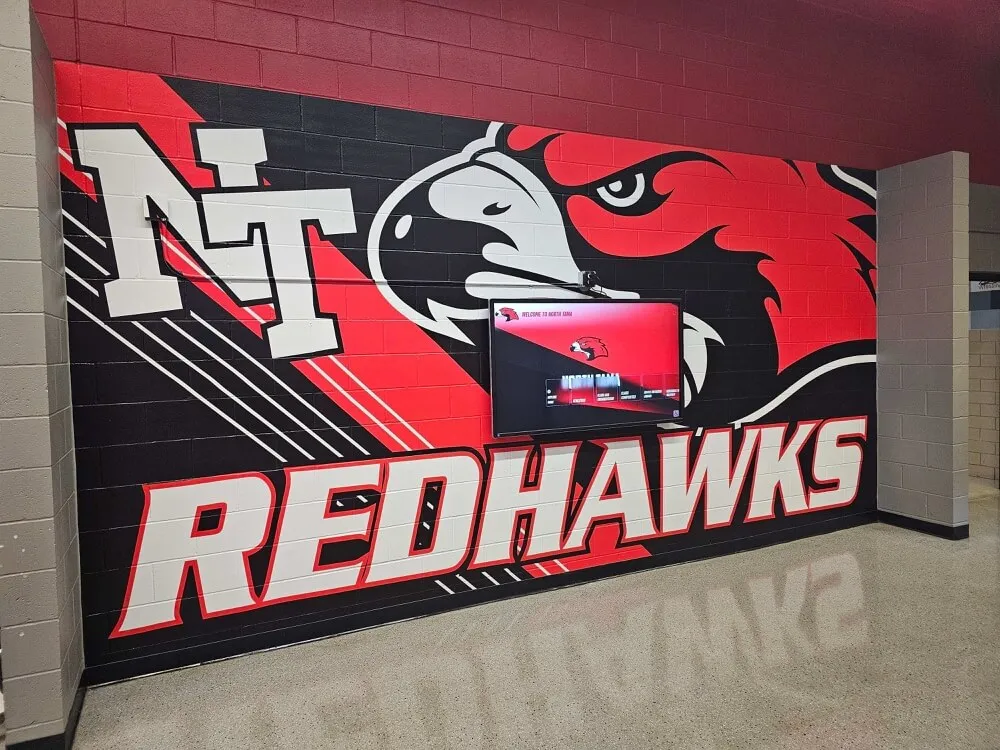
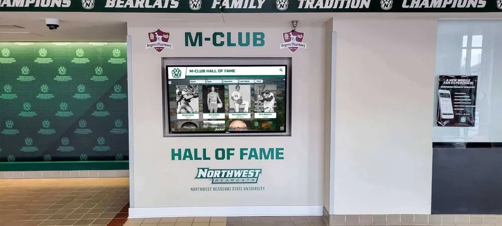
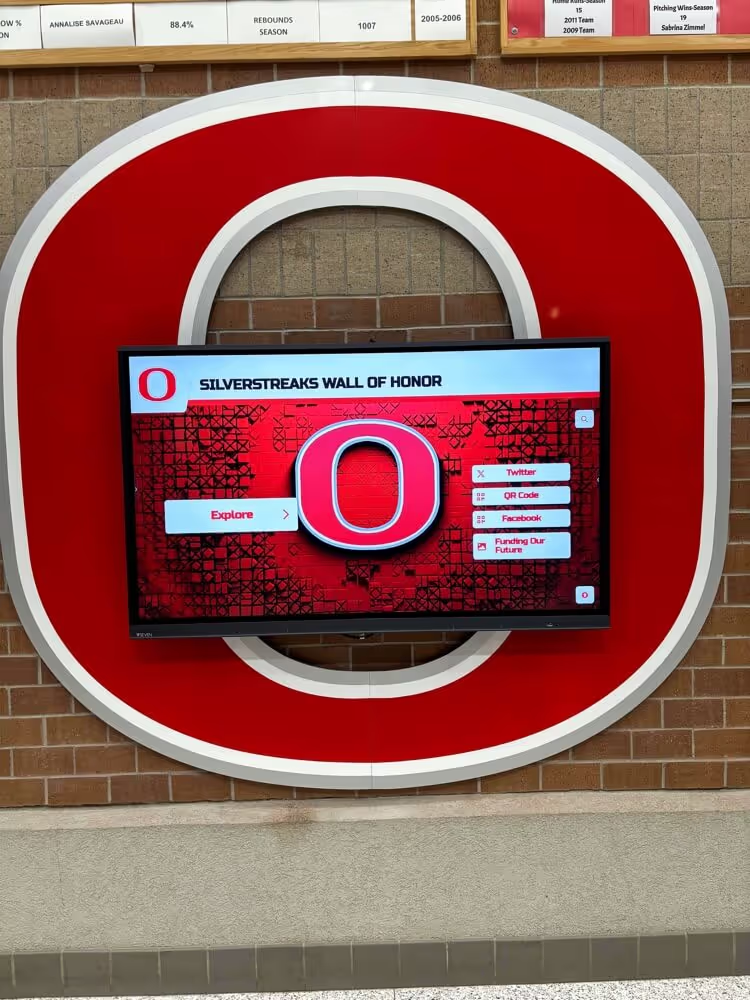
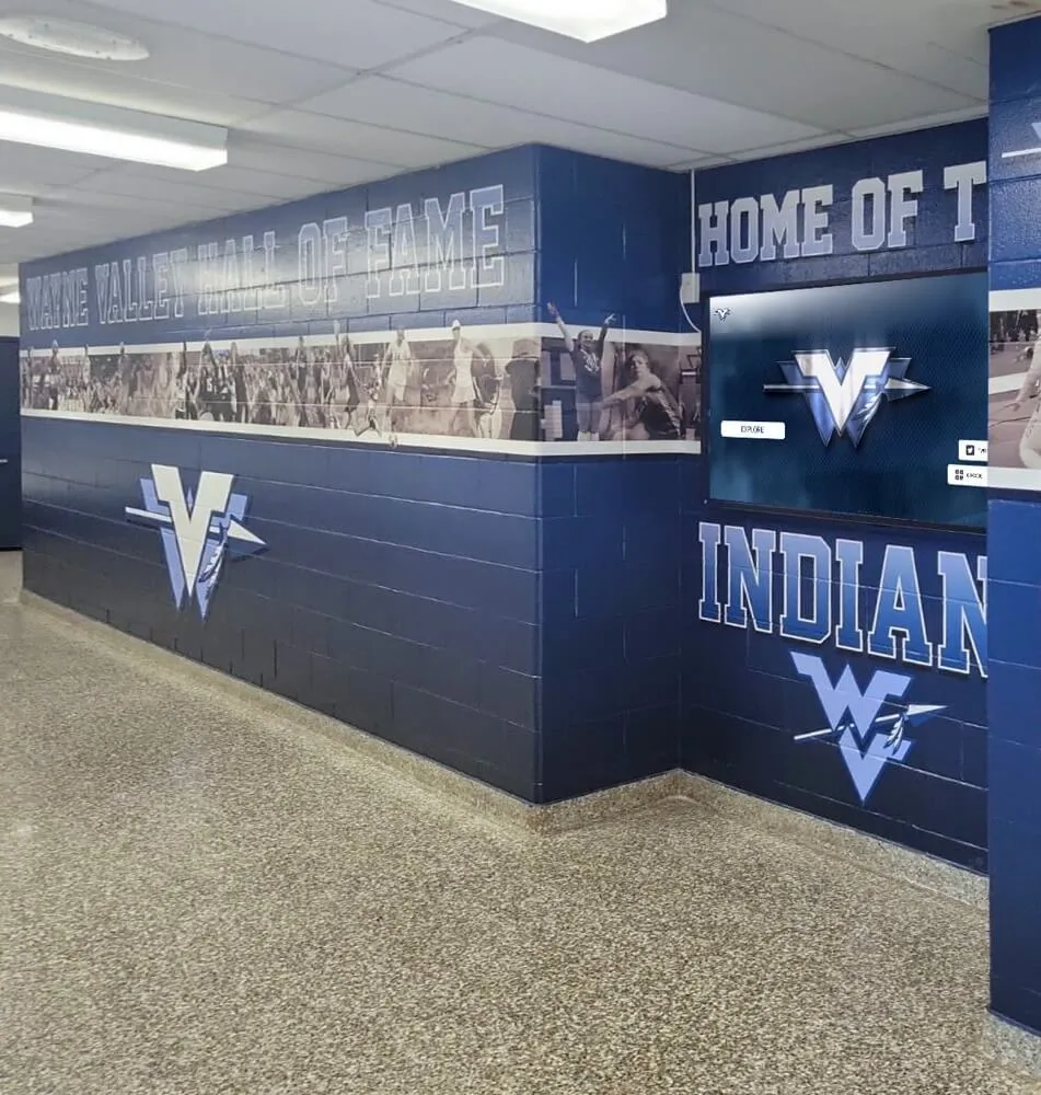
Museum & Exhibit Touchscreen Website
Design museum and exhibit touchscreens as a fullscreen touchscreen website: timelines, artifact explorers, multilingual UI, accessibility-first controls, and QR handoff for deeper reading. WCAG 2.1 AA.
Intent: inspire — museum touchscreens that increase dwell time (and respect the exhibit)
The best museum touchscreens behave like a touchscreen website displayed in fullscreen: calm, fast, readable, and structured around discovery—without turning the exhibit into a UI demo.
Experience Goal
- Encourage exploration (timelines, maps, collections)
- Keep reading comfortable (short + deep layers)
- Support multilingual audiences and accessibility
Experience Layout (wireframe)
┌───────────────────────────────────────────────────────────────┐
│ (A) Header: Exhibit title | Language | Accessibility | Home │
├───────────────┬───────────────────────────────────────────────┤
│ (B) Explore │ (C) Feature Canvas │
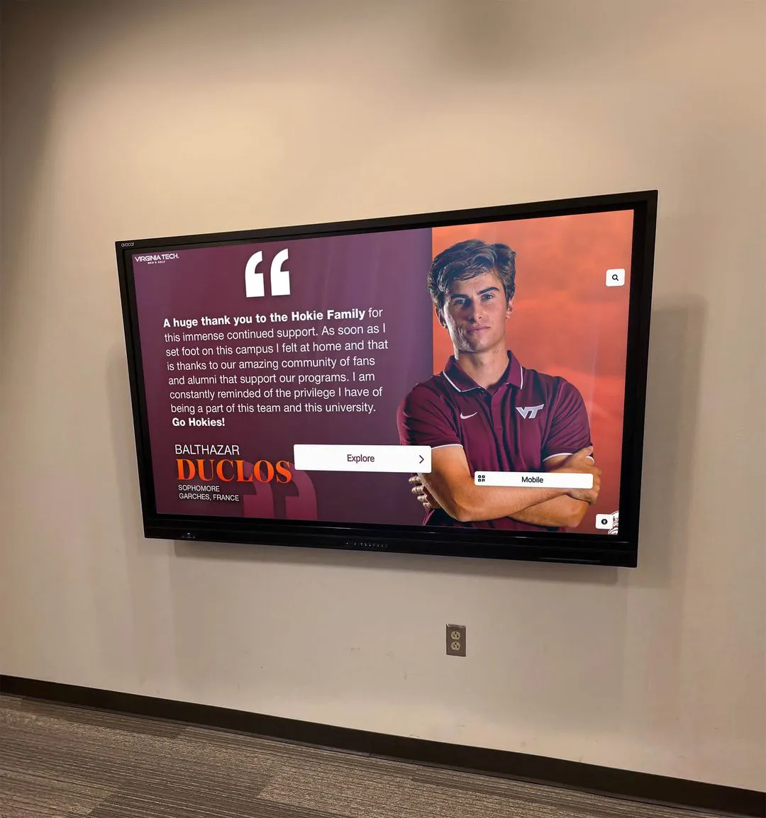
│ - Timeline │ - Artifact/story detail │
│ - Map │ - Media (images/video) │
│ - Collections │ - “Listen / Read / Watch” tabs │
│ - Search │ - QR: “Save to my phone” │
├───────────────┴───────────────────────────────────────────────┤
│ (D) Context Strip: related items, curator notes, next steps │
└───────────────────────────────────────────────────────────────┘
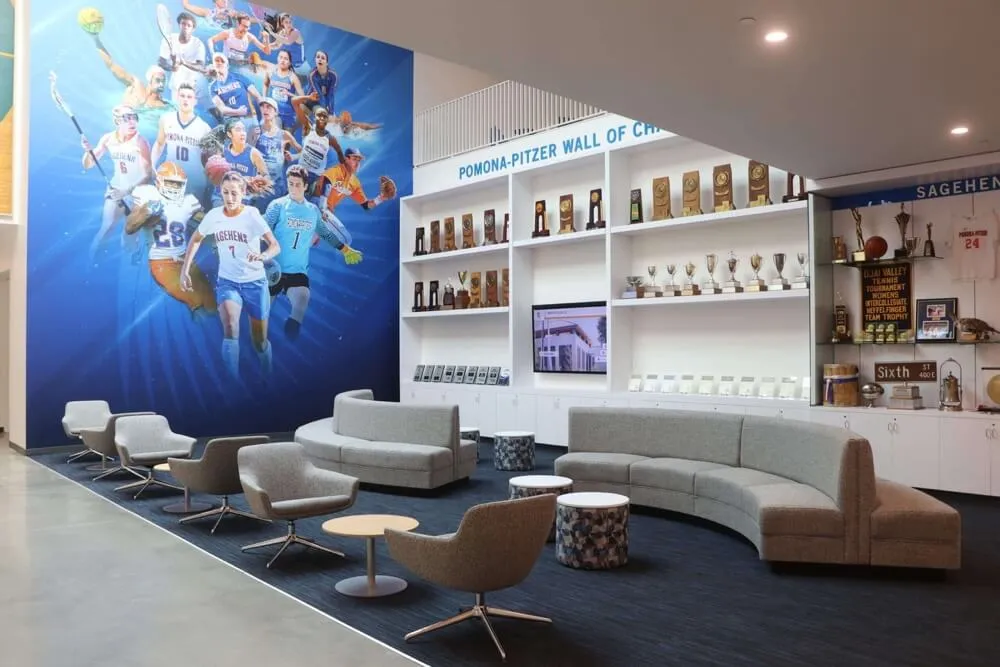
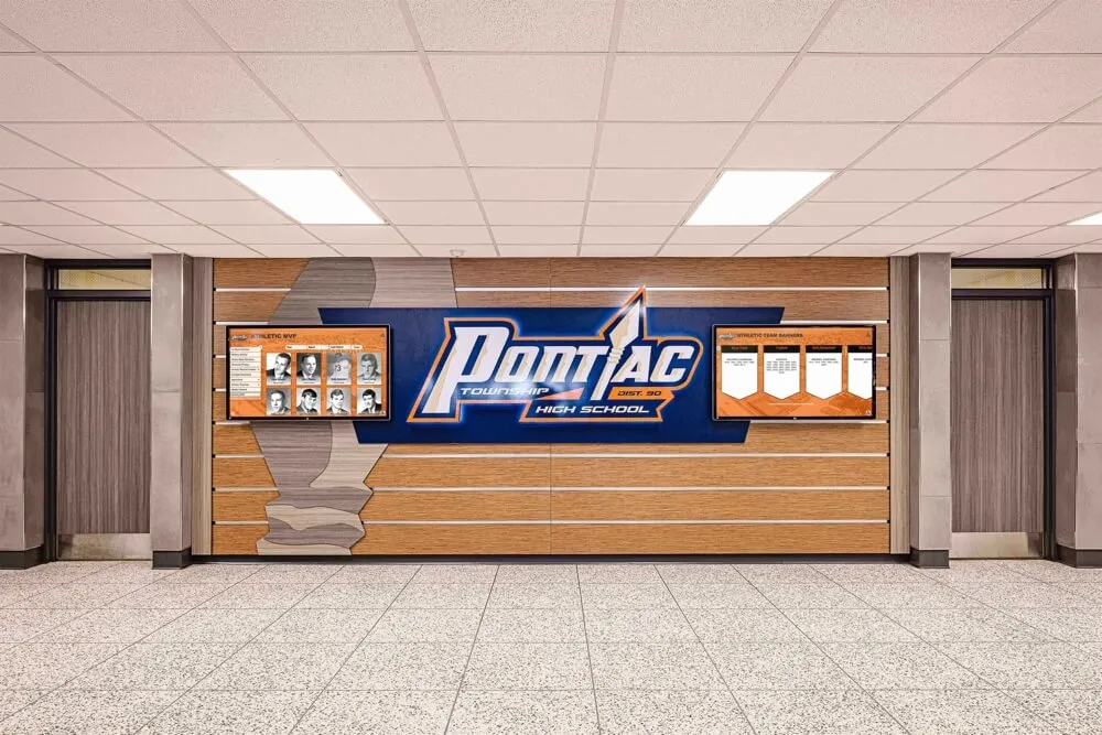
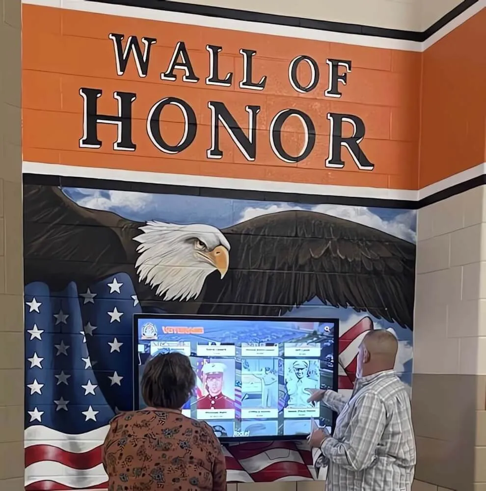
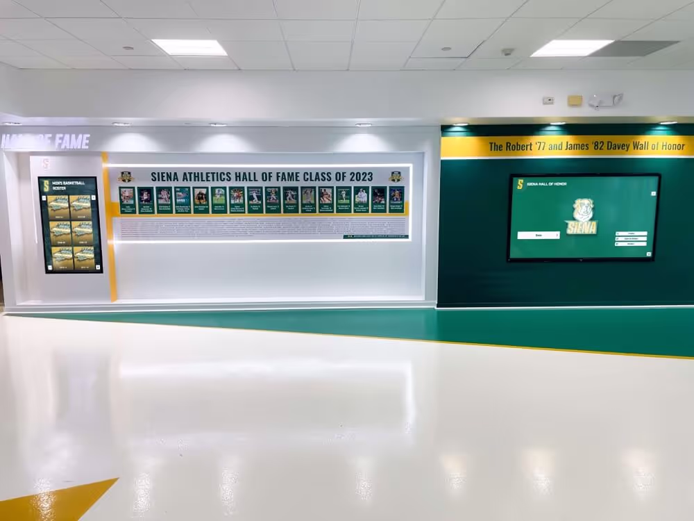
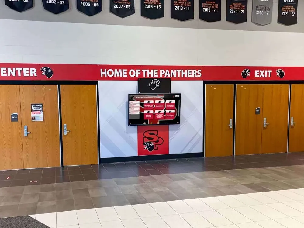
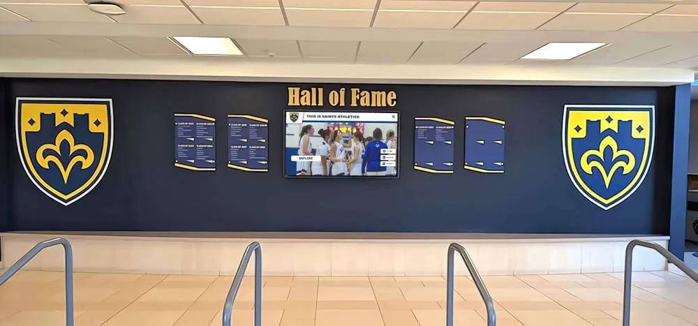
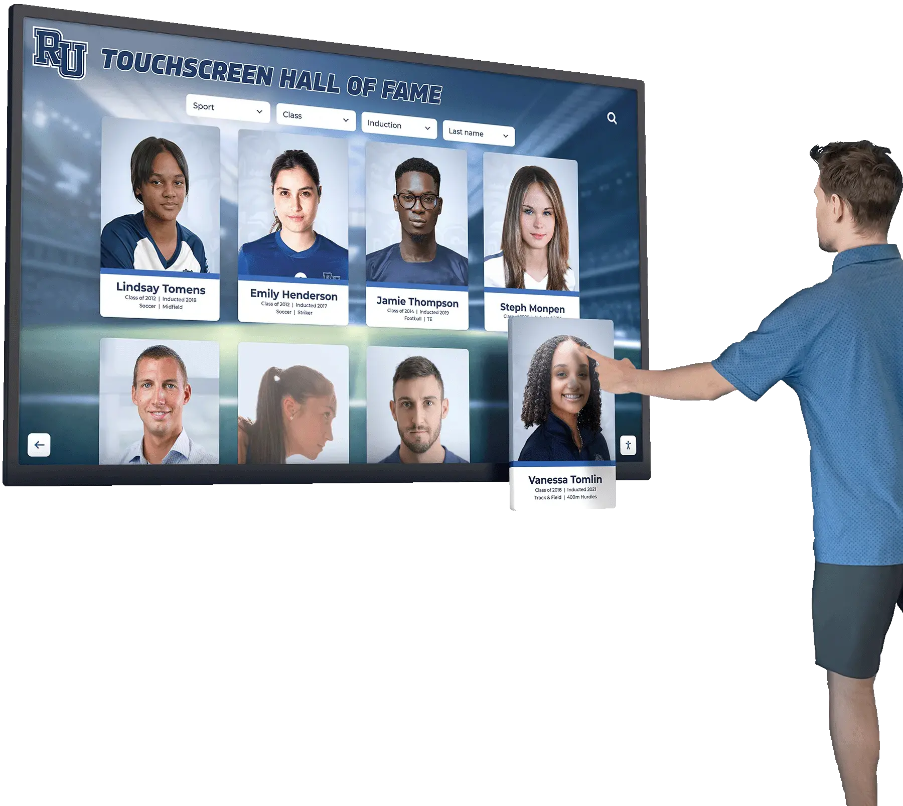
Content Blocks & Motion
- Timeline explorer: Snap-to-era with large nodes and short labels.
- Collection browser: Card grid with filters (material, era, theme).
- Detail view: Tabs for Read/Watch/Listen; QR for full citations.
- Attract mode: Gentle “Tap to explore” with 1–2 featured artifacts.
Accessibility & UX Checklist (WCAG 2.1 AA)
- High-contrast text and controls; avoid low-contrast on imagery.
- Scalable type for multi-age audiences; avoid dense paragraphs.
- Large touch targets; keep primary nav persistent.
- Reduced-motion friendly; avoid fast animation and autoplay audio.
- Provide a clear “Home” and “Back” model for public use.
Brand Integration Checklist
- Custom background + typographic system aligned to exhibit design
- Optional video loops (muted) for attract mode only
- Sponsorship zone (optional) placed away from reading content
- QR access for takeaways, reading lists, and related links
Rocket Mapping
- Story profiles → artifact detail pages
- Search + filters → collections
- QR handoff → mobile continuation
- Signage mode → attract loop between interactions
Activation Plan
- Launch: Timeline + 20–50 key items + bilingual UI
- Month 1: Add collections filtering + audio clips + QR takeaways
- Ongoing: Rotate featured items monthly; seasonal exhibit refreshes
CTA
Common questions
Quick answers to help you scope a touchscreen website that runs in fullscreen mode.
What makes a museum touchscreen different from a standard kiosk?
Museums need longer dwell time, multilingual support, accessible reading, and content structures like timelines and collections—plus an idle mode that invites interaction without overwhelming the exhibit.
How do we handle long reading on a touchscreen?
Use layered content: short summaries on the wall, plus QR handoff to mobile for long-form stories, citations, and extended media.
How do we keep exhibits accessible?
Design for WCAG 2.1 AA: contrast, scalable type, large touch targets, reduced motion, and clear navigation with a persistent 'Home' control.
Want this designed for your space?
Get a free mock-up mapped to your kiosk, directory, donor wall, or recognition display.
Get your touchscreen mock-up